
optimus-ui-theme-designer
v2.0.2
Published
Standalone Theme Designer for Optimus UI

Maintainers
 fidlip
Readme
optimus-ui-theme-designer
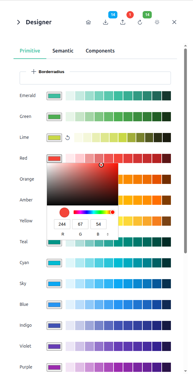
A standalone visual theme editor for Optimus UI design tokens. Drop <optimus-theme-designer> into any Angular app, hand it an Optimus UI preset, and let users tweak primitive, semantic, and per-component tokens live — with instant preview, {token.path} references, and an exportable theme file.
Features
- Live editing of primitive, semantic, and per-component design tokens, organized in the same shape as an Optimus UI preset.
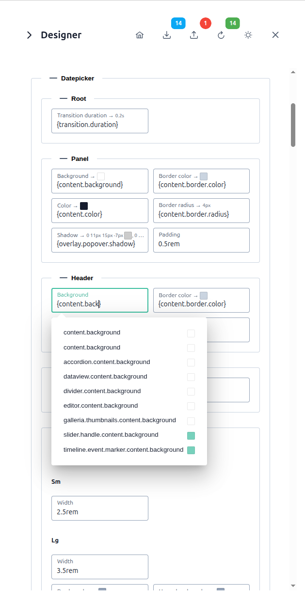
- Token references — type
{in any value field to autocomplete a reference to another token, with the resolved value previewed inline. - Palette editor — pick a base color and the whole 50–950 palette scale is generated automatically.
- Apply instantly to
Theme.setTheme(...)so changes are visible in the running app without a reload. - Persistence — edits are saved to
localStorageand restored automatically; "Reset to default" clears them. - Export the current theme as a ready-to-use
definePreset(...)TypeScript file, either in full or as a diff against the stock preset. - Dark mode toggle, collapsible panel, and deep-linkable sections (jump straight to
components.button, for example).
Installation
npm install optimus-ui-theme-designer @openng/optimus-ui @openng/optimus-ui-themes@angular/core, @angular/common, and @angular/forms are expected to already be present in an Angular app; Optimus UI's own peer dependencies (such as animations support) apply as usual.
Versioning
This package's major version tracks the Optimus UI major version it targets (the same way Angular Material tracks Angular) — install the major that matches your Optimus UI version:
| optimus-ui-theme-designer | Optimus UI |
| --- | --- |
| ^2.0.0 | ^2.0.0 |
| ^1.0.0 | ^1.0.0 |
# Optimus UI 2
npm install optimus-ui-theme-designer@^2 @openng/optimus-ui@^2 @openng/optimus-ui-themes@^2

# Optimus UI 1
npm install optimus-ui-theme-designer@^1 @openng/optimus-ui@^1 @openng/optimus-ui-themes@^1
Because the major version is dictated by Optimus UI compatibility rather than this library's own API, a major bump doesn't necessarily mean breaking changes here — check the releases for what actually changed. Older majors are maintained on their own release/<major>.x branch for backports; main tracks the latest supported Optimus UI major.
Usage
import { Component } from '@angular/core';
import { ThemeDesignerComponent } from 'optimus-ui-theme-designer';
import Material from '@openng/optimus-ui-themes/material';

@Component({
  selector: 'app-root',
  standalone: true,
  imports: [ThemeDesignerComponent],
  template: `
    <optimus-theme-designer
      [initialTheme]="theme"
      (closed)="showDesigner = false" />
  `,
})
export class AppComponent {
  theme = Material;
  showDesigner = true;
}
Pass any object built with @openng/optimus-ui-themes' definePreset(...) (or a stock preset like Material) as initialTheme — that's the only required input.
API
Inputs
| Input | Type | Default | Description |
| --- | --- | --- | --- |
| initialTheme | Record<string, unknown> | required | The Optimus UI preset to edit. |
| title | string | undefined | Panel header text. Falls back to a translated "Designer" (see Internationalization) when not set. |
| activeSection | string | — | Dot-separated section to open and scroll to, e.g. components.button. |
| collapsed | boolean | false | Whether the panel is collapsed to a small tab. Supports two-way binding: [(collapsed)]. |
Outputs
| Output | Payload | Description |
| --- | --- | --- |
| closed | void | Emitted when the user clicks the close button. |
| openDemoPage | void | Emitted when the user clicks the "demo page" button — wire this up to navigate back to your own preview. |
| componentSectionSelected | string | Emitted with a component key (e.g. 'button') when the user opens a components.* section — handy for syncing a showcase anchor. |
| collapsedChange | boolean | Companion to [(collapsed)]. |
Component showcase
Developer tool, not for production end-user UI.
ComponentShowcaseComponentandShowcaseSectionComponent— like the theme designer itself — are meant for previewing a theme while you build it, not for shipping to your app's users. The showcase force-opens overlays (popovers, confirm dialogs, ...) that would otherwise render nothing until interacted with, temporarily patchesHTMLElement.prototype.focusto stop that from stealing scroll position, and renders one instance of nearly every Optimus UI component at once — none of which is a trade-off you want in a real page.
import { Component } from '@angular/core';
import { ComponentShowcaseComponent, ShowcaseSectionComponent } from 'optimus-ui-theme-designer';

@Component({
  selector: 'app-root',
  standalone: true,
  imports: [ComponentShowcaseComponent, ShowcaseSectionComponent],
  template: `
    <optimus-component-showcase (editTheme)="openDesignerFor($event)">
      <optimus-showcase-section title="MyComponent" anchor="mycomponent" (editTheme)="openDesignerFor($event)">
        <!-- your own component, previewed alongside the built-in Optimus UI ones -->
      </optimus-showcase-section>
    </optimus-component-showcase>
  `,
})
export class AppComponent {
  openDesignerFor(anchor: string) { /* e.g. sync with ThemeDesignerComponent's activeSection */ }
}
editTheme emits the clicked section's anchor string — wire it up the same way as
componentSectionSelected above to jump the designer to the matching components.* section.
Internationalization (i18n)
Every string the designer and showcase render is looked up through PtdTranslateService
(translate(key, params?)), bundled with built-in English and Czech dictionaries — no i18n library
is a hard dependency of this package. To use a different language your app already has translations
for, provide the PTD_TRANSLATE_ADAPTER injection token with an object implementing
translate(key, params?): string (and, optionally, a reactive lang: Signal<string>) to redirect
lookups to your own i18n solution (ngx-translate, Transloco, ...). See the demo project's
app.config.ts and i18n/ngx-ptd-translate-adapter.ts for a complete example.
Demo
See the demo project in the GitHub repository for a full example, including a language switcher and the component showcase above wired up to the designer.
License
MIT. If you find this useful, you can buy me a coffee.