
opus-react
v0.6.32
Published
A production-ready React design system for modern business applications, dashboards and data-rich workflows.

Maintainers
 carlfearby
Readme
Opus React
Build modern business applications without rebuilding the foundations.
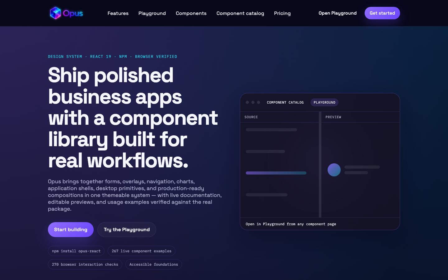
Opus is a production-ready, themeable React design system for dashboards, CRM products, internal tools, data-rich workflows, and browser-based desktop experiences. It combines polished visual design with accessible interaction patterns, strong TypeScript support and a broad component catalogue—from form primitives to complete application layouts and draggable multi-window workspaces.
Why Opus
- Hundreds of composable components covering forms, content, navigation, overlays, charts, dashboards, media and desktop-style experiences.
- Build complete web desktops with draggable and resizable windows, desktop shortcuts, a responsive dock, minimise/maximise behaviour, focus management, and application-defined window content.
- Designed for real application interfaces, with responsive layouts, resizable panes, rich data views and reusable workflow components.
- Themeable by default, including light and dark modes, CSS design tokens and runtime accent colours.
- Accessible and typed, with keyboard-aware interactions and complete TypeScript definitions.
- Preview before you build in the live component library and editable playground.
Requirements
- React
^18.2.0or^19.0.0 - React DOM
^18.2.0or^19.0.0 three^0.185.0— optional, only needed for 3D model components
API stability and upgrades
Published APIs are labelled Stable, Beta, or Experimental. Most current primitives are Beta while their final cross-browser and accessibility reviews complete; Labs, games, and provider-specific integrations are Experimental. See the API stability policy for compatibility guarantees, deprecation handling, and the supported-browser matrix. All user-facing changes and migrations are recorded in the changelog.
Install
npm install opus-reactPeer dependencies:
npm install react react-domOptional peer for 3D model viewers:
npm install threeQuick start
Import Opus styles, then wrap your app with OpusThemeProvider.
import "opus-react/styles.css";
import "opus-react/index.css";

import { OpusThemeProvider, Button, TextField } from "opus-react";

export function App() {
  return (
    <OpusThemeProvider theme="dark">
      <Button variant="primary">Save</Button>
      <TextField label="Full name" placeholder="Jane Cooper" />
    </OpusThemeProvider>
  );
}
Styles
| Import | Purpose |
| --- | --- |
| opus-react/styles.css | Theme tokens (--opus-* CSS variables) for light and dark mode |
| opus-react/index.css | Component CSS modules plus bundled country-flag assets for PhoneNumberField |
| opus-react/flags.css | Standalone flag stylesheet (optional — already included in index.css) |
OpusThemeProvider sets data-theme on document.documentElement by default, so themed CSS variables apply everywhere — including portalled content such as modals, drawers, and toasts.
Next.js
Add opus-react to transpilePackages:
// next.config.ts
const nextConfig = {
  transpilePackages: ["opus-react"],
};

export default nextConfig;
Import styles in your root layout:
import "opus-react/styles.css";
import "opus-react/index.css";
Theme provider
import { OpusThemeProvider } from "opus-react";

export function App() {
  return (
    <OpusThemeProvider theme="light">
      <YourApp />
    </OpusThemeProvider>
  );
}
Available themes: "light" | "dark"
Pass applyToDocument={false} if you manage data-theme yourself (for example on a scoped container in embedded widgets).
Accent colour
Opus supports runtime accent colours via CSS variables.
import { OpusThemeProvider, createAccentStyle } from "opus-react";

export function App() {
  return (
    <OpusThemeProvider theme="dark">
      <div style={createAccentStyle("#8f6cff")}>
        <YourApp />
      </div>
    </OpusThemeProvider>
  );
}
Or use the included picker:
import { AccentColorPicker } from "opus-react";

<AccentColorPicker value={accent} onChange={setAccent} />;
What's included
Forms
Button,TextField,TextAreaField,RichTextFieldSelectField,FilterSelectField,MultiSelectField,TreeSelectField,CascaderFieldCheckboxField,RadioGroup,SwitchFieldNumberField,RangeField,SliderRangeField,RatingFieldDateField,ColorField,FileField,HiddenFieldChipInput,PhoneNumberField,CountryPickerFieldPasswordStrengthField,TransferListField,SegmentedControlFieldThemeToggleField,FieldShell
Overlays and feedback
Modal,Dialog,Drawer,PopoverDropdownMenu,ContextMenuProvider,CommandPaletteTooltip,Toast,ToastProvider,Alert
Content and data
OpusBrand— canonicalicon,wordmark, andfulllogo variantsCard,Panel,Section,Table,DataGridTabs,Accordion,AccordionGroup,ShowMoreBadge,Avatar,AvatarGroup,List,DescriptionListPropertyGrid,Statistic,EmptyState,SkeletonContentTimeline,TreeView,MasonryGrid,JsonViewer
Layout
Stack,Columns,Grid,Splitter,ResizablePanelDockLayout,ScrollArea,AspectRatio,Container,SpacerBreadcrumb,Pagination,PageHeader,ToolbarBottomNavigation,NavigationRail,SplitButton,FloatingActionButton
Navigation
Sidebar,TopNavigation,MegaMenu
Charts and metrics
Chart— bar, line, area, pie, donut, scatter, funnel, radar, sankey, treemap, and moreGauge,Sparkline,ProgressRing,ProgressBar,SpeedometerStatCard,MetricTile,StatusIndicator,TrendBadgeTiles,Tile,StatTile,StatTiles
Dashboard widgets
DashboardContentContainerPipelineOverview,DealsOverTimeUpcomingTasks,RecentActivity,TopPerformingUsers
Compose dashboard rows with Columns:
import {
  Columns,
  DashboardContentContainer,
  UpcomingTasks,
  RecentActivity,
  TopPerformingUsers,
} from "opus-react";

<Columns direction="row" columns={3} gap={16}>
  <DashboardContentContainer data-component="upcoming-tasks" width="full">
    <UpcomingTasks title="Upcoming Tasks" tasks={tasks} />
  </DashboardContentContainer>
  <DashboardContentContainer data-component="recent-activity" width="full">
    <RecentActivity title="Recent Activity" items={activity} />
  </DashboardContentContainer>
  <DashboardContentContainer data-component="top-performing-users" width="full">
    <TopPerformingUsers title="Top Performing People" users={people} />
  </DashboardContentContainer>
</Columns>;
Desktop applications
Create browser-based desktop and workspace experiences from reusable primitives. Opus supplies the shell and interaction model while your application owns every shortcut, dock item, window, and piece of content.
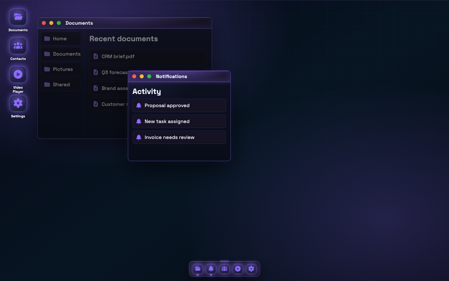
Desktop— stateful workspace shell with wallpaper, shortcuts, windows, dock placement, and edge-to-edge modeDesktopWindow— draggable, resizable, focus-aware windows with close, minimise, maximise, and restore transitionsDesktopDock— resizable dock with bottom, left, and right placement plus optional auto-hideDesktopIcon— keyboard-accessible, selectable shortcuts with single- or double-click openingVideoPlayer— window-ready media playback with responsive controls and ambient blurred video fill
import {
  Desktop,
  type DesktopDockItem,
  type DesktopShortcut,
  type DesktopWindowItem,
} from "opus-react";

const shortcuts: DesktopShortcut[] = [
  { id: "documents", icon: "folder-open", label: "Documents", x: 20, y: 20 },
  { id: "contacts", icon: "users", label: "Contacts", x: 20, y: 124 },
];

const dockItems: DesktopDockItem[] = shortcuts.map(({ id, icon, label }) => ({
  id,
  icon,
  label,
}));

const windows: DesktopWindowItem[] = [
  {
    id: "documents",
    title: "Documents",
    icon: "folder-open",
    open: true,
    rect: { x: 180, y: 64, width: 640, height: 420 },
    content: <div style={{ padding: 24 }}>Your documents application</div>,
  },
  {
    id: "contacts",
    title: "Contacts",
    icon: "users",
    open: false,
    rect: { x: 320, y: 120, width: 560, height: 400 },
    content: <div style={{ padding: 24 }}>Your contacts application</div>,
  },
];

export function Workspace() {
  return (
    <Desktop
      dockAutoHide
      dockItems={dockItems}
      edgeToEdge
      onAction={(action, id) => console.log(action, id)}
      shortcuts={shortcuts}
      wallpaper="aurora"
      windows={windows}
    />
  );
}
The same React composition works in a normal web application or inside a desktop wrapper such as Electron—without moving application behaviour into the shell component.
Media and 3D
Carousel,Lightbox,ImageThumbnail,ImageGalleryModelViewer,ModelLightbox,ModelThumbnail,ModelGallery(requiresthree)
Builders and planning
FilterBuilder,QueryBuilder,RuleBuilderPermissionsMatrix,DualListBuilderScheduler,KanbanBoard,Calendar,ResourcePlannerPropertyInspector
Utilities
OpusThemeProvider,useOpusThemeAccentColorPicker,createAccentStyle,useAccentPreferenceIconPicker,CatalogIcon,IconPortal,FocusTrap,VisuallyHiddenHotkeyManager,useHotkey,KeyboardShortcutClipboard,CopyButtonThemeProvider,ThemeSwitcherResizeObserver,IntersectionObserver,Spinner
Examples
Button
import { Button } from "opus-react";

<Button variant="primary">Create project</Button>
<Button variant="secondary">Cancel</Button>
Text field with validation
import { TextField } from "opus-react";

<TextField
  label="Email address"
  placeholder="[email protected]"
  error="Enter a valid email address"
/>
Toast notifications
import { OpusThemeProvider, ToastProvider, useToast, Button } from "opus-react";

function NotifyButton() {
  const { showToast } = useToast();

  return (
    <Button
      variant="primary"
      onClick={() => showToast({ title: "Saved", description: "Your changes were saved." })}
    >
      Save
    </Button>
  );
}

export function App() {
  return (
    <OpusThemeProvider theme="dark">
      <ToastProvider>
        <NotifyButton />
      </ToastProvider>
    </OpusThemeProvider>
  );
}
Chart
import { Chart } from "opus-react";

<Chart
  variant="bar-chart-vertical"
  title="Revenue by region"
  data={[
    { label: "EMEA", value: 42 },
    { label: "APAC", value: 28 },
    { label: "AMER", value: 35 },
  ]}
/>
TypeScript
Type definitions ship with the package (dist/index.d.ts). Component prop types and shared tokens (for example ChartVariant, ButtonVariant, Theme) are exported from opus-react.
Package exports
{
  ".": "./dist/index.js",
  "./styles.css": "./dist/styles.css",
  "./index.css": "./dist/index.css",
  "./flags.css": "./dist/flags.css"
}
ESM and CommonJS builds are both published.
Not included in the package
The published npm package does not include:
- Documentation site shells and routing
- Component preview / settings tooling
- Generated usage-code helpers
- Internal monorepo build scripts
Those live in the Opus Library workspace and are for development and docs only.
Publishing (maintainers)
From the Library workspace root:
cd Library
npm run build:lib
npm publish -w opus-react --access public
prepublishOnly runs the package build automatically. Bump the version in packages/opus-react/package.json before publishing.
Contribute to Opus
We are looking for contributors who want to help improve Opus. Useful contributions range from small component refinements, accessibility fixes, tests, examples, and documentation through to new primitives, application compositions, dashboard patterns, and desktop features.
You do not need to commit to a large feature. If you would like to get involved, tell us what you are interested in and which part of Opus you would like to work on:
- Email [email protected]
- WhatsApp +44 7940 147138
- Browse the source, fork the project, or open a pull request at Carl-Fearby/Opus
License
MIT — see LICENSE.