
pagination-ross
v1.0.3
Published
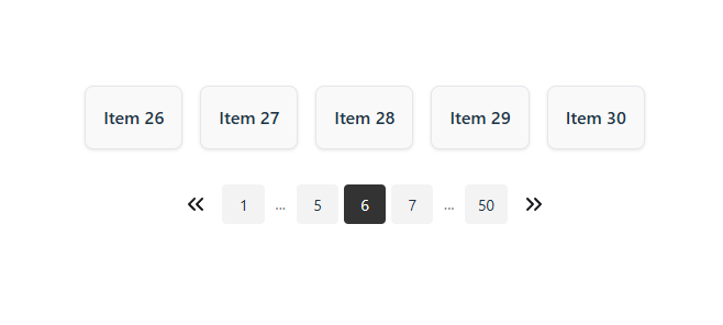
Pagination-ross is a lightweight and flexible pagination component designed for React applications. It gives developers full control over styling without enforcing any default look, making it perfect for clean, customizable UIs

Readme
pagination-ross
Un componente de paginación para React, fácil de usar y personalizable.
Instalación
npm install pagination-rossUso básico
import Pagination from "pagination-ross";
function App() {
  return (
    <Pagination
      currentPage={3}
      totalPages={10}
      onPageChange={(page) => console.log("Nueva página:", page)}
    />
  );
}
🔗 Demo y ejemplo
Ejemplo de lógica de paginación
Aquí tienes una lógica básica para paginar tu lista de ítems:
const itemsPerPage = 5;
const currentPage = Number(page); // page index empieza en 1

// Calcular total de páginas
const totalItems = listItems.length;
const totalPages = Math.ceil(totalItems / itemsPerPage);

// Obtener los ítems de la página actual
const startIndex = (currentPage - 1) * itemsPerPage;
const endIndex = startIndex + itemsPerPage;
const currentItems = listItems.slice(startIndex, endIndex);

// Manejador para cambiar de página
function handleClick(page: number) {
  console.log(String(page));
}
Props
| Propiedad | Tipo | Requerido | Descripción |
| ------------------- | ---------------------- | --------- | ----------------------------------------------------------------- |
| currentPage | number | Sí | Página actual que está siendo visualizada. |
| totalPages | number | Sí | Número total de páginas disponibles. |
| onPageChange | (page: number) => void | No | Callback que se ejecuta al cambiar de página. |
| className | string | No | Clase CSS para el contenedor principal. |
| style | React.CSSProperties | No | Estilos en línea para el contenedor principal. |
| colorIcon | string | No | Color de los íconos de navegación. Por defecto: "#18181b". |
| buttonClassName | string | No | Clase CSS para los botones de navegación (anterior/siguiente). |
| listClassName | string | No | Clase CSS para el <ul> que contiene los botones de página. |
| itemClassName | string | No | Clase CSS para cada ítem de paginación (<li>). |
| activeItemClassName | string | No | Clase CSS para el ítem activo (página actual). |
| ellipsisClassName | string | No | Clase CSS para los ítems que muestran puntos suspensivos ("..."). |
Puedes combinar esto con el componente:
<Pagination
  currentPage={1}
  totalPages={5}
  onPageChange={handleClick}
  buttonClassName="buttonClass"
  listClassName="listClass"
  itemClassName="itemClass"
  activeItemClassName="activeItemClass"
  ellipsisClassName="ellipsisClass"
/>
Licencia
MIT