
painless-pdf
v1.4.1
Published
Painless PDF generation for node and the browser
Maintainers
 leoko
leokoReadme

Painless PDF is a lightweight library designed to simplify PDF generation in Node.js and the browser. Built on top of the jsPDF library, Painless PDF provides an intuitive and declarative API to create and manipulate PDF components, making it easy to design complex PDF layouts. One of its key features is the ability to dynamically detect page breaks and adjust the layout and components accordingly.
Features
- Easy to use and understand API for creating PDF documents
- Flexible layout system with support for rows, columns, tables, and nesting
- Dynamic page break detection and automatic layout adjustments
- Customizable breaking behavior for different components
- Advanced customization options, such as styling, borders, and padding
- Compatible with both Node.js and browser environments
Disclaimer
This library is relatively new and, although already used in production projects, it may still contain bugs and has not been rigorously tested. If you encounter any issues or have suggestions for improvements, please feel free to open an issue or submit a pull request.
Install Painless PDF using npm:
Installation
npm install painless-pdfGetting started
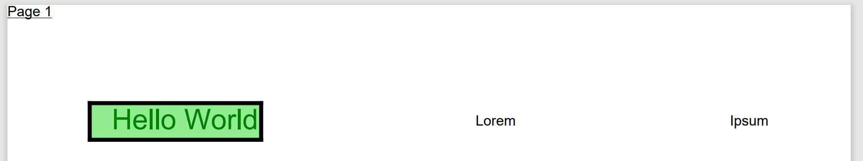
We design PDF files my nesting various components.
Let's start by defining a simple text component:
const helloWorldText = ppText("Hello World", {
    fontSize: 20,
    textColor: "green",
  })
Now let us wrap this text component in a div component, which has a background, padding and border:
const helloWorldDiv = ppDiv(helloWorldText, {
    backgroundColor: "lightgreen",
    border: { width: 1, color: "black" },
    padding: { left: 5 },
  })
To arrange multiple components together, we can use Column, Row or Table components like so:
ppRow([
        helloWorldDiv,
        ppText("Lorem"),
        ppText("Ipsum"),
      ], {
        width: { relative: 1 },
        mainAxisAlignment: "space-between",
        crossAxisAlignment: "center",
      })
Now to bring it all together we construct a new PdfDocument object, which has a component as the document body and can additionally have a header and footer
const doc = new PdfDocument(
    ppDiv(
      ppRow([helloWorldDiv, ppText("Lorem"), ppText("Ipsum")], {
        width: { relative: 1 },
        mainAxisAlignment: "space-between",
        crossAxisAlignment: "center",
      }),
      { padding: 20 }
    ),
    {
      header: (page) => ppText(`Page ${page + 1}`, { underline: true }),
    }
  );
Calling the build() function on the document applies the components to the PDF. We can then get the jsPDF object rhough getJsPdf()
await doc.build();

const jsPdfDoc = doc.getJsPdf();
const pdfBuffer = jsPdfDoc.output("arraybuffer");
API Reference
Note: When using the library, you can think of the PdfBlueprint type as a PdfComponent. Internally, utility functions such as ppText generate a PdfBlueprint, which is then used to instantiate the actual components at a later stage.
PdfDocument
new PdfDocument(
  blueprint: PdfBlueprint,
  options: {
    header?: PdfBlueprint | ((page: number, totalPages: number) => PdfBlueprint);
    footer?: PdfBlueprint | ((page: number, totalPages: number) => PdfBlueprint);
  }
)
Creates a PDF document from a component. A header or footer can be supplied as either static components or callbacks which get passed the current page number (starting at 0) and the number of pages. The header will be placed on top of each page and the footer at the bottom.
Calling the build() function on the document give us a jsPDF document object.
Sizes, paddings and widths
All sizes are defined in millimeters except font size, which is defined in points. Most widths can also be defined relative to their parents width (0-1). Omitting the width equals to "fit-component".
type Width = number | { relative: number };div option
Most component functions also support a div option within their options parameter. Specifying this property will cause the component to be wrapped in a ppDiv component with the specified div options.
So
ppDiv(ppText("foo"), { backgroundColor: 'red' })is equivalent to
ppText("foo", { div: { backgroundColor: 'red' } })ppText
ppText(
  text: string,
  options?: {
    width?: Width;
    fontSize?: number;
    lineHeightFactor?: number;
    align?: "left" | "center" | "right";
    noWrap?: boolean;
    textColor?: string;
    italic?: boolean;
    bold?: boolean;
    fontFamily?: string;
    underline?: boolean;
    div?: DivOptions;
  }
)
When no width is specified, the component will be as wide as the text, so for a one-lined text the align option will have no effect.
The text will break automatically according to the defined/available width.
ppImage
ppImage(options: {
  base64: string;
  width?: Width;
  height?: number;
  maxWidth?: Width;
  maxHeight?: number;
})
Either width or height should be specified. The other dimension will be scaled accordingly.
If width is specified, maxHeight can be used to limit the computed height of the image. If height is specified, maxWidth can be used to limit the computed width of the image.
The image will never be stretched. An image will never break between pages (tough it can be shifted to the next page) so it must not be higher than the available page height.
In NodeJS, you can get the base64 image data like so:
const base64Image = fs.readFileSync("src/assets/test.png", { encoding: "base64" });ppSvg
ppSvg(options: {
  svg: string;
  width?: number;
  height?: number;
})
The svg string should be a valid svg string, not a path to a file. Provide either a width or a height, the other dimension will be scaled accordingly.
ppSizedBox
ppSizedBox(options: {
  height?: number | "max";
  width?: Width;
})
The sized box is an invisible spacer and won't draw anything to the PDF. Useful for defining a margin between components.
ppPageBreak
ppPageBreak()Place this as a child of a ColumnComponent to force a page break.
ppDiv
ppDiv(
  child: PdfBlueprint,
  options: {
    width?: Width;
    padding?:
      | { top?: number; right?: number; bottom?: number; left?: number }
      | number
      | { x?: number; y?: number };
    backgroundColor?: string;
    border?:
      | {
          top?: BorderOptions;
          right?: BorderOptions;
          bottom?: BorderOptions;
          left?: BorderOptions;
        }
      | BorderOptions;
    keepTogether?: boolean;
    text?: TextOptions;
  }
)
type BorderOptions = {
width: number;
color: string;
}The text options are inherited by (indirect) text children components.
keepTogether prevents the div from being split between pages.
ppRow
ppRow(
  children: PdfBlueprint[],
  options: {
    width?: Width;
    mainAxisAlignment?: "start" | "center" | "end" | "space-between" | "space-around";
    crossAxisAlignment?: "top" | "center" | "bottom" | "stretch";
    growIndex?: number;
    text?: TextOptions;
    div?: DivOptions;
  }
)
The text options are inherited by (indirect) text children components.
A width has to specified for the mainAxisAlignment to have an effect.
In the current version an individual row never breaks across pages (same as keepTogether = true) so you have to make sure that they are smaller then the height of a page.
ppColumn
ppColumn(
  children: (PdfBlueprint | "spacer")[],
  options: {
    crossAxisAlignment?: CrossAxisAlignment;
    width?: Width;
    keepTogether?: boolean;
    text?: TextOptions;
    div?: DivOptions;
  }
)
The text options are inherited by (indirect) text children components.
You can place a "spacer" element between the child components to push the adjacent child components as much apart as possible. This only works when the column is placed inside a row component with mainAxisAlignment set to "stretch".
ppTable
ppTable(
  options: {
    header?: TableHeaderBlueprint;
    rows: (TableRowBlueprint | "spacer")[];
    widths?: (null | Width)[];
    footer?: TableHeaderBlueprint;
    options?: { text?: TextOptions };
    cellOptions?: DivOptions;
    borders?: {
      color: string;
      verticalWidth: number | number[];
      horizontalWidth: number;
    };
    div?: DivOptions;
  }
)
The text options are inherited by indirect text children components.
header, footer and rows should be created with their respective utility functions.
header will be displayed as the first row and will be displayed repeatedly if the table is broken across pages. Footer works the same but as the last row.
cellOptions are applied to the container of every cell and a good place to define padding for the cells.
widths specifies the width of each column. One value can be defined as null causing the column to take the remaining available space. If no widths are defined, then all columns have the same width.
borders.verticalWidth can be assigned an array, where each value represents the vertical border width of a border from left to right.
ppTableHeader
ppTableHeader(
  cells: PdfBlueprint[] | ((page: number) => PdfBlueprint[]),
  options: {
    rowOptions?: DivOptions;
    cellOptions?: DivOptions;
  }
)
Used to define a header (or footer) row for a table.
cells can be defined as a callback where page is the number of times the table has been split to the next page (starting at 0).
rowOptions are applied to the container for the row and can be used to override the horizontal borders or define a background color for the row.
cellOptions are applied to the container of each cell.
ppTableRow
ppTableRow(
  cells: PdfBlueprint[],
  options: {
    rowOptions?: DivOptions;
    cellOptions?: DivOptions;
  }
)
rowOptions are applied to the container for the row and can be used to override the horizontal borders or define a background color for the row.
cellOptions are applied to the container of each cell.