
pardis-jalali-datepicker
v1.0.2
Published
A modern, zero-dependency Persian (Jalali/Shamsi) datepicker — multi-instance, inline mode, range selection, input masking, and three built-in themes.

Maintainers
 alirezakdl
Readme
Pardis Jalali Datepicker
A modern, zero-dependency Persian (Jalali/Shamsi) datepicker built with a headless architecture. Supports multiple independent instances, inline mode, range selection, input masking, and three built-in themes.
Screenshots
| Popover — Single Date | Popover — Range Selection |
|---|---|
| 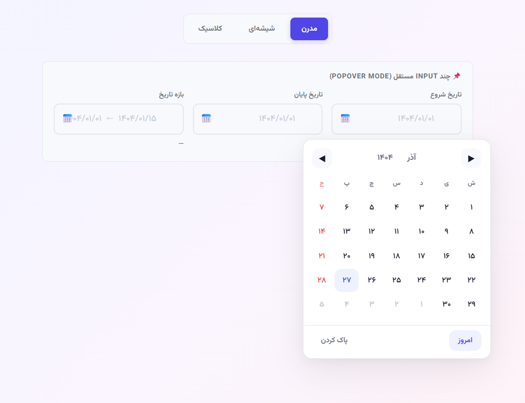 |
| 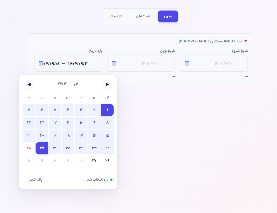 |
|
Inline Mode — Glassmorphism Theme
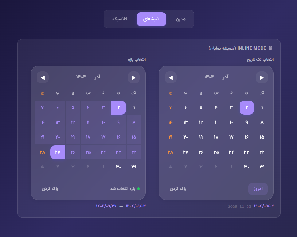
Features
- Zero dependencies — pure vanilla JS, no external libraries
- Headless architecture — engine, renderer, and input mask are fully decoupled
- Multi-instance — any number of independent pickers on one page
- Inline mode — always-visible calendar without an input field
- Range selection — pick a start and end date with hover preview
- Input masking — auto-formats Persian digits with slash separators
- Three themes — Modern, Glassmorphism, Classic/Dark
- Dual output — returns both Jalali and Gregorian date data simultaneously
- Precise conversion — correct Jalaali ↔ Gregorian algorithm (integer division, not
Math.floor) - RTL — fully right-to-left layout
Project Structure
pardis-jalali-datepicker/
├── lib/
│   ├── pardis-jalali-datepicker.js   # Library — classes only
│   └── pardis-jalali-datepicker.css  # Library — CSS variables, themes, component styles
├── demo/
│   ├── demo.js                        # Demo page script
│   └── demo.css                       # Demo page styles
└── index.html                         # Interactive demo page
Quick Start
Include the library files and create a datepicker on any <input>:
<link rel="stylesheet" href="lib/pardis-jalali-datepicker.css">

<input id="myInput" class="pardis-input" type="text" placeholder="۱۴۰۴/۰۱/۰۱">

<script src="lib/pardis-jalali-datepicker.js"></script>
<script>
  const dp = new PardisDatepicker('#myInput', {
    outputFormat: 'both',
    onChange: (payload) => {
      console.log(payload.jalali.formatted);    // '1404/01/01'
      console.log(payload.gregorian.formatted); // '2025-03-21'
    }
  });
</script>
Installation
npm
npm install pardis-jalali-datepickerManual
Copy lib/pardis-jalali-datepicker.js and lib/pardis-jalali-datepicker.css into your project and include them directly.
Note: The library uses the
Vazirmatnfont by default (via CSS variable--pardis-font). Load it yourself (e.g. from Google Fonts) or override the variable with your preferred font.
API Reference
new PardisDatepicker(target, options)
| Option | Type | Default | Description |
|---|---|---|---|
| inline | boolean | false | Render calendar always-visible inside the target element (no input needed) |
| rangeMode | boolean | false | Enable range selection (start + end date) |
| outputFormat | 'both' | 'jalali' | 'gregorian' | 'both' | Shape of the payload passed to callbacks |
| initialYear | number | current year | Jalali year to display on first render |
| initialMonth | number | current month | Jalali month (1–12) to display on first render |
| minDate | {jy, jm, jd} | null | Earliest selectable date |
| maxDate | {jy, jm, jd} | null | Latest selectable date |
| onChange | function | null | Called when a single date is selected. Receives a date payload |
| onRangeStart | function | null | Called when the first date of a range is picked. Receives a date payload |
| onRangeSelect | function | null | Called when both range dates are selected. Receives { start, end } where each is a date payload |
| onClear | function | null | Called when the selection is cleared |
Methods
| Method | Description |
|---|---|
| dp.open() | Open the popover (no-op in inline mode) |
| dp.close() | Close the popover (no-op in inline mode) |
| dp.getValue() | Returns the current date payload, or null if nothing is selected |
| dp.setValue(jy, jm, jd) | Programmatically select a Jalali date |
| dp.clear() | Clear the current selection |
| dp.setOption(key, value) | Update an option after construction (currently supports rangeMode and outputFormat only) |
| dp.destroy() | Remove all event listeners and DOM elements created by this instance |
Access the underlying engine directly via dp.engine for advanced use.
Date Payload
When outputFormat: 'both' (default), callbacks receive:
{
  jalali: {
    year,             // 1404
    month,            // 1
    day,              // 1
    monthName,        // 'فروردین'
    formatted,        // '1404/01/01'
    formattedPersian, // '۱۴۰۴/۰۱/۰۱'
    timestamp         // Unix ms
  },
  gregorian: {
    year,             // 2025
    month,            // 3
    day,              // 21
    monthName,        // 'March'
    formatted,        // '2025-03-21'
    date,             // native Date object
    timestamp         // Unix ms
  },
  iso,                // '2025-03-21'
  timestamp           // Unix ms
}
When outputFormat: 'jalali', the Jalali fields are returned directly (no nesting).
When outputFormat: 'gregorian', the Gregorian fields are returned directly.
Usage Examples
Popover — Single Date
const dp = new PardisDatepicker('#dateInput', {
  outputFormat: 'both',
  onChange: ({ jalali, gregorian, iso }) => {
    console.log(jalali.formattedPersian); // '۱۴۰۴/۰۱/۰۱'
    console.log(gregorian.formatted);     // '2025-03-21'
    console.log(iso);                     // '2025-03-21'
  },
  onClear: () => console.log('cleared')
});
Popover — Range Selection
const dp = new PardisDatepicker('#rangeInput', {
  rangeMode: true,
  outputFormat: 'both',
  onRangeSelect: ({ start, end }) => {
    console.log(start.jalali.formatted); // '1404/01/05'
    console.log(end.jalali.formatted);   // '1404/01/15'
  }
});
Inline — Always Visible
// target must be a container element, not an input
const dp = new PardisDatepicker('#calendarContainer', {
  inline: true,
  outputFormat: 'both',
  onChange: (payload) => console.log(payload.jalali.formatted)
});
Inline — Range
const dp = new PardisDatepicker('#rangeContainer', {
  inline: true,
  rangeMode: true,
  onRangeSelect: ({ start, end }) => {
    console.log(start.jalali.formatted, '→', end.jalali.formatted);
  }
});
With Min/Max Dates
const dp = new PardisDatepicker('#input', {
  minDate: { jy: 1404, jm: 1, jd: 1 },
  maxDate: { jy: 1404, jm: 6, jd: 31 },
  onChange: (payload) => console.log(payload)
});
Programmatic Control
const dp = new PardisDatepicker('#input');

dp.setValue(1404, 3, 15);   // select 1404/03/15
dp.getValue();               // returns current payload
dp.clear();                  // clear selection
dp.open();                   // open popover
dp.close();                  // close popover
dp.destroy();                // clean up

// Toggle range mode at runtime
dp.setOption('rangeMode', true);
Low-Level Engine Access
dp.engine.goToNextMonth();
dp.engine.goToPrevMonth();
dp.engine.goToNextYear();
dp.engine.goToPrevYear();
dp.engine.goToToday();
dp.engine.setViewMode('month'); // 'day' | 'month' | 'year'
dp.engine.on('viewChange', ({ year, month, monthName, viewMode }) => {
  console.log(monthName, year);
});
Static Helper
// Convert any Jalali date to a full payload without creating a picker
const payload = PardisEngine.buildDatePayload(1404, 1, 1, 'both');
payload.jalali.formatted;    // '1404/01/01'
payload.gregorian.formatted; // '2025-03-21'
payload.iso;                 // '2025-03-21'
payload.timestamp;           // Unix ms
Themes
Apply a theme by setting data-pardis-theme on <html> and a body class:
| Theme | data-pardis-theme | <body> class |
|---|---|---|
| Modern (default) | (remove attribute) | theme-modern |
| Glassmorphism | glass | theme-glass |
| Classic / Dark | classic | theme-classic |
// Switch to glass theme
document.documentElement.setAttribute('data-pardis-theme', 'glass');
document.body.className = 'theme-glass';

// Switch back to modern
document.documentElement.removeAttribute('data-pardis-theme');
document.body.className = 'theme-modern';
Input Styling
Add the pardis-input class to your <input> for the built-in styled input:
<div class="pardis-input-wrapper">
  <input class="pardis-input" id="myInput" type="text"
         placeholder="۱۴۰۴/۰۱/۰۱" autocomplete="off">
  <span class="pardis-input-icon">📅</span>
</div>
The input wrapper is created automatically by PardisDatepicker if it does not already exist. You can also wrap it yourself for custom layouts.
Internal Architecture
The library is composed of four independent classes:
| Class | Role |
|---|---|
| JalaaliUtil | Pure Jalaali ↔ Gregorian math (no DOM, no state) |
| PardisEngine | Calendar state machine — selection, navigation, event emitter |
| PardisRenderer | Binds engine state to a DOM container, re-renders on change |
| PardisInputMask | Handles Persian digit input and auto-slash formatting |
| PardisDatepicker | Public API — wires the above together, manages popover/inline lifecycle |
You can use PardisEngine and PardisRenderer directly to build a fully custom UI without using PardisDatepicker.
Browser Support
Works in all modern browsers (Chrome, Firefox, Safari, Edge). No polyfills required.
License
MIT