
parvus
v3.1.1
Published
An open source, dependency free image lightbox with the goal of being accessible.

Maintainers
 deoostfrees
Readme
Parvus
Overlays suck, but if you need one, consider using Parvus. Parvus is an open source, dependency free image lightbox with the goal of being accessible.
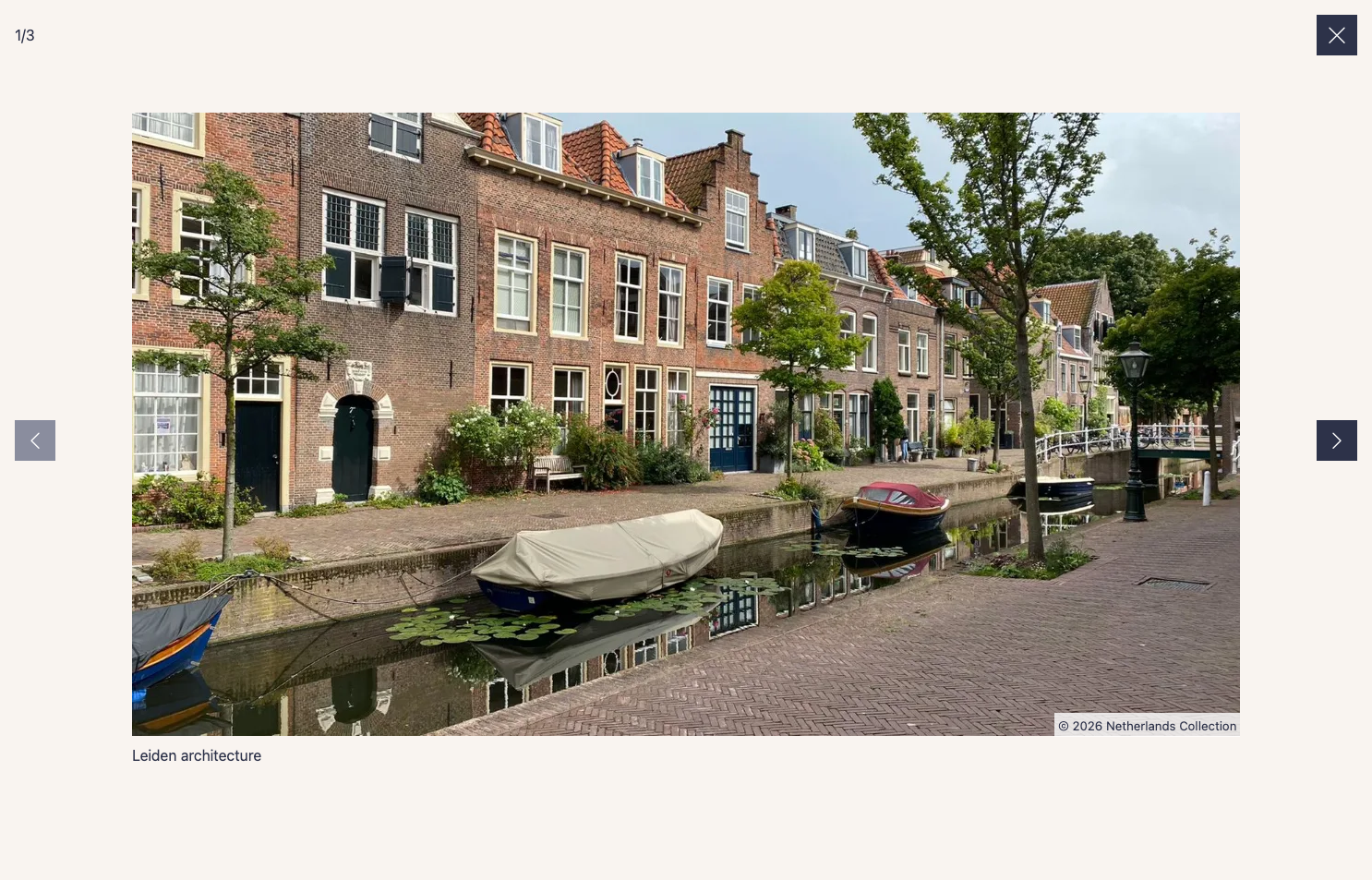
Table of Contents
Installation
Download
- CSS:
dist/css/parvus.min.css(minified) ordist/css/parvus.css(un-minified)
- JavaScript:
dist/js/parvus.min.js(minified) ordist/js/parvus.js(un-minified)
Link the .css and .js files in your HTML:
<!DOCTYPE html>
<html lang="en">
<head>
  <meta charset="UTF-8">
  <meta name="viewport" content="width=device-width, initial-scale=1">
  <title>Page title</title>

  <!-- CSS -->
  <link href="path/to/parvus.min.css" rel="stylesheet">
</head>
<body>
  <!-- HTML content -->

  <!-- JS -->
  <script src="path/to/parvus.min.js"></script>
</body>
</html>
Package Managers
You can also install Parvus using npm or yarn:
npm install parvusor
yarn add parvusAfter installation, import Parvus into your JavaScript codebase:
import Parvus from 'parvus'Be sure to include the corresponding SCSS or CSS file.
Usage
Link a thumbnail image with the class lightbox to a larger image:
<a href="path/to/image.jpg" class="lightbox">
  <img src="path/to/thumbnail.jpg" alt="">
</a>
Initialize the script:
const prvs = new Parvus()Captions
There are three ways to add a caption to an image:
Reference by ID
You can add an ID to your caption element and reference it from the trigger element using the data-caption-id attribute.
<figure>
  <a href="path/to/image.jpg" class="lightbox" data-caption-id="caption-1">
    <img src="path/to/thumbnail.jpg" alt="">
  </a>

  <figcaption id="caption-1">
    I'm a caption, and I live outside the link.
  </figcaption>
</figure>
Direct Attribute
You can add a data-caption attribute directly to the trigger element.
<a href="path/to/image.jpg" class="lightbox" data-caption="I'm a simple caption">
  <img src="path/to/thumbnail.jpg" alt="">
</a>
Child Element
Alternatively, set the option captionsSelector to select a caption from a child element's innerHTML.
<a href="path/to/image.jpg" class="lightbox">
  <figure class="figure">
    <img src="path/to/thumbnail.jpg" alt="">

    <figcaption class="figure__caption">
      I'm a caption inside a child element
    </figcaption>
  </figure>
</a>
const prvs = new Parvus({
captionsSelector: '.figure__caption',
})Copyright
There are three ways to add copyright information to an image:
Reference by ID
You can add an ID to your copyright element and reference it from the trigger element using the data-copyright-id attribute.
<a href="path/to/image.jpg" class="lightbox" data-copyright-id="copyright-1">
  <img src="path/to/thumbnail.jpg" alt="">
</a>

<small id="copyright-1" hidden>
  © 2026 Photographer Name
</small>
Direct Attribute
You can add a data-copyright attribute directly to the trigger element.
<a href="path/to/image.jpg" class="lightbox" data-copyright="© 2026 Photographer Name">
  <img src="path/to/thumbnail.jpg" alt="">
</a>
Child Element
Alternatively, set the option copyrightSelector to select a copyright from a child element's innerHTML.
<a href="path/to/image.jpg" class="lightbox">
  <figure class="figure">
    <img src="path/to/thumbnail.jpg" alt="">

    <small class="figure__copyright">
      © 2026 Photographer Name
    </small>
  </figure>
</a>
const prvs = new Parvus({
copyrightSelector: '.figure__copyright',
})Gallery
To group related images into a set, add a data-group attribute:
<a href="path/to/image.jpg" class="lightbox" data-group="Berlin">
  <img src="path/to/thumbnail.jpg" alt="">
</a>

<a href="path/to/image_2.jpg" class="lightbox" data-group="Berlin">
  <img src="path/to/thumbnail_2.jpg" alt="">
</a>

//...

<a href="path/to/image_8.jpg" class="lightbox" data-group="Kassel">
  <img src="path/to/thumbnail_8.jpg" alt="">
</a>
Alternatively, set the option gallerySelector to group all images with a specific class within a selector:
<div class="gallery">
  <a href="path/to/image.jpg" class="lightbox">
    <img src="path/to/thumbnail.jpg" alt="">
  </a>

  <a href="path/to/image_2.jpg" class="lightbox">
    <img src="path/to/thumbnail_2.jpg" alt="">
  </a>

  // ...
</div>
const prvs = new Parvus({
gallerySelector: '.gallery',
})Responsive Images
Specify different image sources and sizes using the data-srcset and data-sizes attributes:
<a href="path/to/image.jpg" class="lightbox"

data-srcset="path/to/small.jpg 700w,
             path/to/medium.jpg 1000w,
             path/to/large.jpg 1200w"

data-sizes="(max-width: 75em) 100vw,
            75em"
>
  <img src="path/to/thumbnail.jpg" alt="">
</a>
Localization
Import the language module and set it as an option for localization:
import de from 'parvus/src/l10n/de'

const prvs = new Parvus({
  l10n: de
})
Options
Customize Parvus by passing an options object when initializing:
const prvs = new Parvus({
  // Clicking outside does not close Parvus
  docClose: false
})
Available options include:
{
  // Selector for elements that trigger Parvus
  selector: '.lightbox',

  // Selector for a group of elements combined as a gallery, overrides the `data-group` attribute.
  gallerySelector: null,

  // Display zoom indicator
  zoomIndicator: true,

  // Display captions if available
  captions: true,

  // Selector for the element where the caption is displayed; use "self" for the `a` tag itself.
  captionsSelector: 'self',

  // Attribute to get the caption from
  captionsAttribute: 'data-caption',

  // Display copyright if available
  copyright: true,

  // Selector for the element where the copyright is displayed; use "self" for the `a` tag itself.
  copyrightSelector: 'self',

  // Attribute to get the copyright from
  copyrightAttribute: 'data-copyright',

  // Clicking outside closes Parvus
  docClose: true,

  // Close Parvus by swiping up/down
  swipeClose: true,

  // Accept mouse events like touch events (click and drag to change slides)
  simulateTouch: true,

  // Touch dragging threshold in pixels
  threshold: 100,

  // Hide browser scrollbar
  hideScrollbar: true,

  // Icons
  lightboxIndicatorIcon: '<svg xmlns="http://www.w3.org/2000/svg" viewBox="0 0 24 24" aria-hidden="true" focusable="false"><path d="M8 3H5a2 2 0 00-2 2v3m18 0V5a2 2 0 00-2-2h-3m0 18h3a2 2 0 002-2v-3M3 16v3a2 2 0 002 2h3"/></svg>',
  previousButtonIcon: '<svg xmlns="http://www.w3.org/2000/svg" viewBox="0 0 24 24" aria-hidden="true" focusable="false"><path stroke="none" d="M0 0h24v24H0z"/><polyline points="15 6 9 12 15 18" /></svg>',
  nextButtonIcon: '<svg xmlns="http://www.w3.org/2000/svg" viewBox="0 0 24 24" aria-hidden="true" focusable="false"><path stroke="none" d="M0 0h24v24H0z"/><polyline points="9 6 15 12 9 18" /></svg>',
  closeButtonIcon: '<svg xmlns="http://www.w3.org/2000/svg" viewBox="0 0 24 24" aria-hidden="true" focusable="false"><path d="M18 6L6 18M6 6l12 12"/></svg>',

  // Localization of strings
  l10n: en
}
API
Parvus provides the following API functions:
| Function | Description |
| --- | --- |
| open(element) | Open the specified element (DOM element) |
| close() | Close Parvus |
| previous() | Show the previous image |
| next() | Show the next image |
| select(index) | Select a slide with the specified index (integer) |
| add(element) | Add the specified element (DOM element) |
| remove(element) | Remove the specified element (DOM element) |
| destroy() | Destroy Parvus |
| isOpen() | Check if Parvus is currently open |
| currentIndex() | Get the index of the currently displayed slide |
| use(plugin, options) | Register a plugin |
| addHook(hookName, callback) | Add a hook callback |
| getPlugins() | Get list of registered plugins |
Events
Bind and unbind events using the .on() and .off() methods:
const prvs = new Parvus()

const listener = () => {
  console.log('eventName happened')
}

// Bind event listener
prvs.on(eventName, listener)

// Unbind event listener
prvs.off(eventName, listener)
Available events:
| eventName | Description |
| --- | --- |
| open | Triggered after Parvus has opened |
| select | Triggered when a slide is selected |
| close | Triggered after Parvus has closed |
| destroy | Triggered after Parvus has destroyed |
Plugins
Parvus supports a plugin system that allows you to extend its functionality.
Using Plugins
To use a plugin, call the .use() method after initialization:
import Parvus from 'parvus'
import MyPlugin from './my-plugin.js'

const prvs = new Parvus()

// Register plugin
prvs.use(MyPlugin, {
  // Plugin-specific options
  option1: 'value1',
  option2: 'value2'
})
Creating Plugins
A plugin is an object with a name and an install function:
const MyPlugin = {
  name: 'MyPlugin',

  install(parvus, options = {}) {
    // Plugin initialization code
    console.log('Plugin installed with options: ', options)
  }
}

export default MyPlugin
Plugin Hooks
Plugins can hook into various lifecycle events:
| Hook Name | When Triggered | Provided Data |
| --- | --- | --- |
| afterInit | After lightbox DOM is created (once) | { state } |
| afterOpen | After lightbox opens | { element, state } |
| afterClose | After lightbox closes | { state } |
| slideChange | When slide changes | { index, oldIndex, state } |
Example using hooks:
const MyPlugin = {
  name: 'MyPlugin',

  install(parvus, options) {
    // Add a custom button on init
    parvus.addHook('afterInit', ({ state }) => {
      const btn = document.createElement('button')

      btn.classList.add('parvus__btn')
      btn.classList.add('parvus__btn--my-plugin')
      btn.textContent = 'Custom'
      btn.type = 'button'

      // Add to controls as first element
      if (state.controls) {
        state.controls.prepend(btn)
      }
    })

    // Track slide changes
    parvus.addHook('slideChange', ({ index, oldIndex }) => {
      console.log(`Changed from slide ${oldIndex} to ${index}`)
    })
  }
}
Browser Support
Parvus is supported on the latest versions of the following browsers:
- Chrome
- Edge
- Firefox
- Safari