
passport-ui
v1.0.68
Published
A modern, customizable UI component library with motion primitives and theme support built with React, TypeScript, Tailwind CSS, and shadcn/ui components.
Maintainers
 praveentcom
Readme
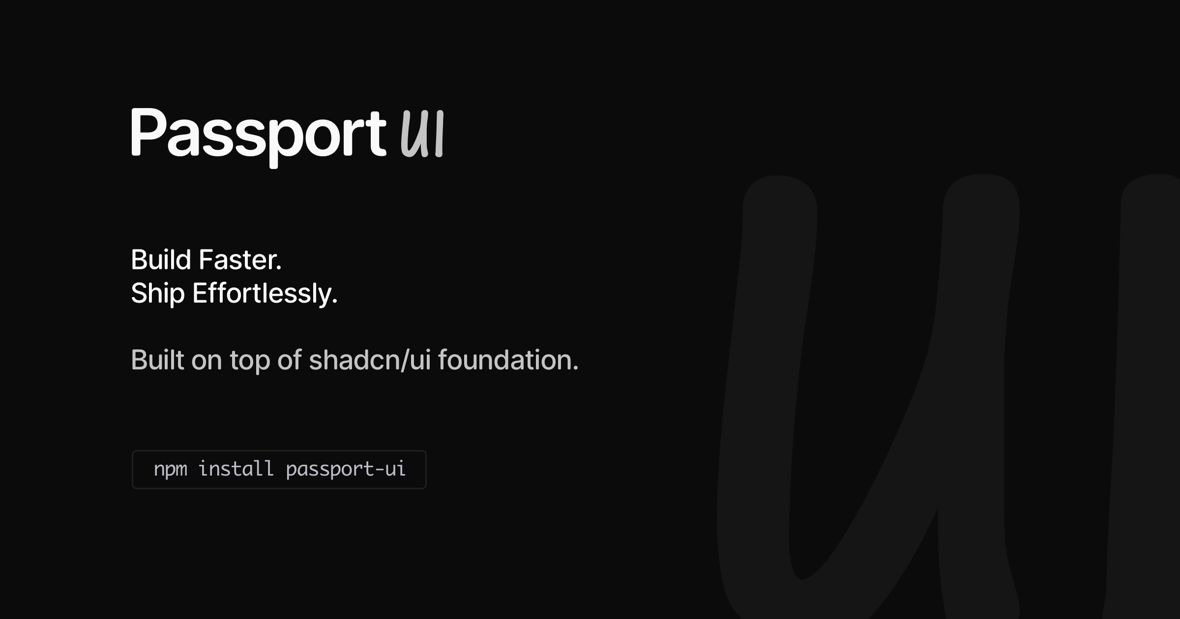
Passport UI

Built on top of shadcn/ui's excellent foundation, but designed as a complete library solution. Explore the collection of 75+ premium components, composed with Tailwind CSS, Radix UI, and Motion.
View documentation at passportui.com. If you're someone who loves Storybook, you can view the components at storybook.passportui.com.
Installation
npm install passport-uiUsing PostCSS
Add the PostCSS plugin to your postcss.config.mjs:
export default {
  plugins: ["@tailwindcss/postcss"],
};
Import Styles
Import the library styles in your main CSS file:
@source "../../node_modules/passport-ui/src"
@import "passport-ui/styles.css";

/* Optional styles based on requirement */
@import "passport-ui/hljs-themes.css"; /* for code highlighting */
@import "passport-ui/tailwind-colors.css"; /* for runtime usage */- For themed syntax highlighting in
CodeBlockandMarkdowncomponents, import the theme styles. - For dynamic usage of tailwind colors, import the tailwind colors styles.
Import Pattern
Passport UI uses individual component exports for optimal tree-shaking and React Server Components compatibility. Import components individually:
import { Button } from "passport-ui/button";
import { Card, CardContent } from "passport-ui/card";

function App() {
  return (
    <Card>
      <CardContent>
        <Button>Click me</Button>
      </CardContent>
    </Card>
  );
}
With Theme Support
import { ThemeButton } from "passport-ui/theme-button";
import { ThemeProvider } from "passport-ui/theme-provider";

function App() {
  return (
    <ThemeProvider attribute="class" defaultTheme="system" enableSystem>
      <div className="min-h-screen bg-background text-foreground">
        <ThemeButton />
        {/* Your app content */}
      </div>
    </ThemeProvider>
  );
}
Available Themes
Light- Light themeDark- Dark themeSystem- System theme
Use ThemeProvider to wrap your app and ThemeButton to toggle between themes.
Available Components
Layout Containers
Providers
Components
AccordionAlertAlertDialogAnalyticsAspectRatioAvatarBadgeBlockquoteBreadcrumbBulletListButtonCardCarouselCheckboxCodeBlockCollapsibleComboboxCommandContextMenuDatePickerDialogDrawerDropdownMenuFormHoverCardInputInputOTPLabelLiveRegionMarkdownMenubarPaginationPopoverPrefetchLinkProgressRadioGroupResizableScrollAreaSelectSeparatorSheetSidebarSkeletonSliderSonnerStructuredDataSwitchTableTabsTextareaToggleToggleSelectTooltipVisuallyHidden