
phonix-input
v1.0.11
Published
A modern, customizable React phone input component with country code selection, flags, and validation. Features responsive design, TypeScript support, and easy integration.


Readme
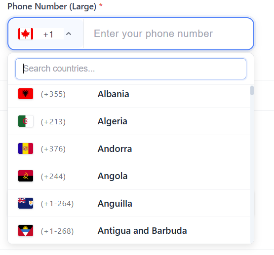
React Phone Input with Country Selection
A modern, customizable React component for phone number input with country code selection. Features a clean design, country flags, validation, and responsive layout that works seamlessly across all devices.
✨ Features
- 🎨 Modern Design: Clean, professional interface with premium styling
- 🏳️ Country Flags: Visual country selection with flag icons
- 📱 Responsive: Mobile-first design that adapts to all screen sizes
- ✅ Validation: Built-in phone number validation with custom error messages
- 🎛️ Customizable: Extensive styling options and configuration props
- 🔧 TypeScript: Full TypeScript support with comprehensive type definitions
- ⚡ Lightweight: Minimal dependencies and optimized bundle size
- 🔄 Easy Integration: Simple API that fits into any React application
📦 Installation
npm install phonix-inputPeer Dependencies
This package requires the following peer dependencies:
npm install react react-domSupported versions:
- React: ^17.0.0 || ^18.0.0 || ^19.0.0
- React DOM: ^17.0.0 || ^18.0.0 || ^19.0.0
🎨 CSS Import
The component includes built-in styles that are automatically imported. However, if you're experiencing styling issues, you can manually import the CSS:
Option 1: Automatic Import (Recommended)
The styles are automatically imported when you import the component.
Option 2: Manual CSS Import
# Import CSS in your main CSS file
@import 'phonix-input/dist/index.css';
Option 3: JavaScript Import
import { importStyles } from 'phonix-input';
importStyles(); // Call this in your app initialization
Option 4: CDN Import
<link rel="stylesheet" href="https://unpkg.com/[email protected]/dist/index.css">🚀 Quick Start
Note: The component defaults to India (+91) as the selected country. You can change this by providing a different initial value.
import React, { useState } from 'react';
import { PhoneInputWithCountrySelectList } from 'phonix-input';

function App() {
  const [phoneData, setPhoneData] = useState({
    countryCode: '+91',
    phone: ''
  });

  const handlePhoneChange = (value: { countryCode: string; phone: string }) => {
    setPhoneData(value);
  };

  return (
    <PhoneInputWithCountrySelectList
      countryFieldId="country"
      phoneFieldId="phone"
      label="Phone Number"
      placeholder="Enter your phone number"
      countryPlaceholder="Select country"
      required={true}
      value={phoneData}
      onChange={handlePhoneChange}
      validationMessages={{
        phoneRequired: "Please enter your phone number",
        phoneInvalid: "Invalid phone number format",
        countryRequired: "Please select a country"
      }}
    />
  );
}
📖 Documentation
Props
| Prop | Type | Default | Description |
|------|------|---------|-------------|
| countryFieldId | string | - | Required. Unique ID for the country select input |
| phoneFieldId | string | - | Required. Unique ID for the phone input |
| label | string | "Phone Number" | Label text displayed above the inputs |
| placeholder | string | "Enter phone number" | Placeholder text for the phone input |
| countryPlaceholder | string | "Select country" | Placeholder text for the country dropdown |
| required | boolean | false | Shows a red asterisk (*) next to the label when true |
| disabled | boolean | false | Disables both inputs |
| value | object | { countryCode: "", phone: "" } | Current value of the inputs |
| onChange | function | - | Callback fired when the value changes |
| validationMessages | object | - | Custom validation error messages |
Styling Props
Customize the appearance with these optional styling props:
| Prop | Type | Default | Description |
|------|------|---------|-------------|
| inputHeight | string | "48px" | Height of both input fields |
| inputPadding | string | "12px 16px" | Internal padding of input fields |
| countryWidth | string | "180px" | Width of the country dropdown |
| phoneWidth | string | "auto" | Width of the phone input field |
| dropdownHeight | string | "280px" | Maximum height of the dropdown menu |
| dropdownWidth | string | "200px" | Minimum width of the dropdown menu |
| inputHeightMobile | string | "52px" | Height of inputs on mobile devices |
Value Object
interface PhoneValue {
  countryCode: string; // e.g., "+91", "+1", "+44"
  phone: string;       // The phone number without country code
}
Validation Messages
interface ValidationMessages {
  phoneRequired?: string;      // When phone number is required but empty
  phoneInvalid?: string;       // When phone number format is invalid
  phoneLengthInvalid?: string; // When phone number length is incorrect
  countryRequired?: string;    // When country selection is required but empty
}
🎨 Styling & Customization
Basic Styling
The component comes with a modern, clean design out of the box. You can customize the appearance using the styling props:
<PhoneInputWithCountrySelectList
  // ... other props
  inputHeight="56px"
  inputPadding="16px 20px"
  countryWidth="200px"
  phoneWidth="300px"
  dropdownHeight="320px"
/>
Custom CSS Classes
The component uses CSS classes that you can override:
/* Main container */
.phone-input-container {
  /* Your custom styles */
}

/* Country dropdown */
.country-select {
  /* Your custom styles */
}

/* Phone input field */
.phone-input {
  /* Your custom styles */
}

/* Required asterisk styling */
.required::after {
  content: "*";
  color: #dc3545;
  padding-left: 0.25rem;
  font-weight: bold;
}
🌍 Supported Countries
The component includes support for 195+ countries with:
- Country names in English
- ISO country codes
- International dialing codes
- Flag icons
- Proper phone number formatting
📱 Mobile Responsiveness
The component is designed with mobile-first principles:
- Touch-friendly input sizes
- Responsive dropdown menus
- Optimized for small screens
- Separate mobile styling options
🔧 Advanced Usage
Form Integration
import { useForm, Controller } from 'react-hook-form';

function ContactForm() {
  const { control, handleSubmit } = useForm();

  return (
    <form onSubmit={handleSubmit(onSubmit)}>
      <Controller
        name="phone"
        control={control}
        rules={{ required: "Phone number is required" }}
        render={({ field, fieldState }) => (
          <PhoneInputWithCountrySelectList
            countryFieldId="country"
            phoneFieldId="phone"
            value={field.value}
            onChange={field.onChange}
            validationMessages={{
              phoneRequired: fieldState.error?.message
            }}
          />
        )}
      />
    </form>
  );
}
With Custom Validation
const validatePhoneNumber = (countryCode: string, phone: string) => {
  // Your custom validation logic
  return phone.length >= 7 && phone.length <= 15;
};

<PhoneInputWithCountrySelectList
  // ... other props
  onChange={(value) => {
    if (validatePhoneNumber(value.countryCode, value.phone)) {
      // Handle valid phone number
    }
    handlePhoneChange(value);
  }}
/>
🛠️ Development
Building the Library
npm run buildPublishing
The package includes a prepublishOnly script that automatically builds the library before publishing:
npm publish🤝 Contributing
Contributions are welcome! Please feel free to submit a Pull Request. For major changes, please open an issue first to discuss what you would like to change.
- Fork the repository
- Create your feature branch (
git checkout -b feature/amazing-feature) - Commit your changes (
git commit -m 'Add some amazing feature') - Push to the branch (
git push origin feature/amazing-feature) - Open a Pull Request
📄 License
This project is licensed under the MIT License - see the LICENSE file for details.
🔧 Troubleshooting
CSS Not Loading
If the component appears unstyled, try these solutions:
- Check CSS Import: Make sure the CSS is properly imported
- Clear Cache: Clear your browser cache and node_modules
- Manual Import: Use one of the CSS import options above
- Build Issues: Rebuild your project after installing the package
Common Issues
- Dropdown not showing: Check z-index conflicts
- Mobile responsiveness: Ensure viewport meta tag is set
- TypeScript errors: Make sure you have the latest version
💝 Support
If you find this package helpful, please consider:
- ⭐ Starring the repository
- 🐛 Reporting bugs
- 💡 Suggesting new features
- 📢 Sharing with others
Made with ❤️ by Irfan Haidar Mukhi