
photon-grid-angular
v3.0.4
Published
Angular wrapper for Photon Grid — an enterprise-grade, framework-agnostic TypeScript data grid.

Maintainers
 wahidkhan
Keywords
Readme
Photon Grid for Angular — Angular Data Grid & Data Table Component
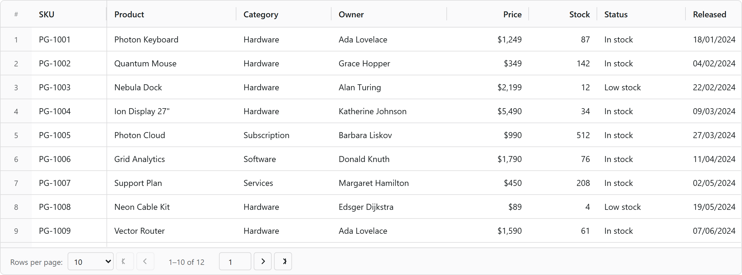
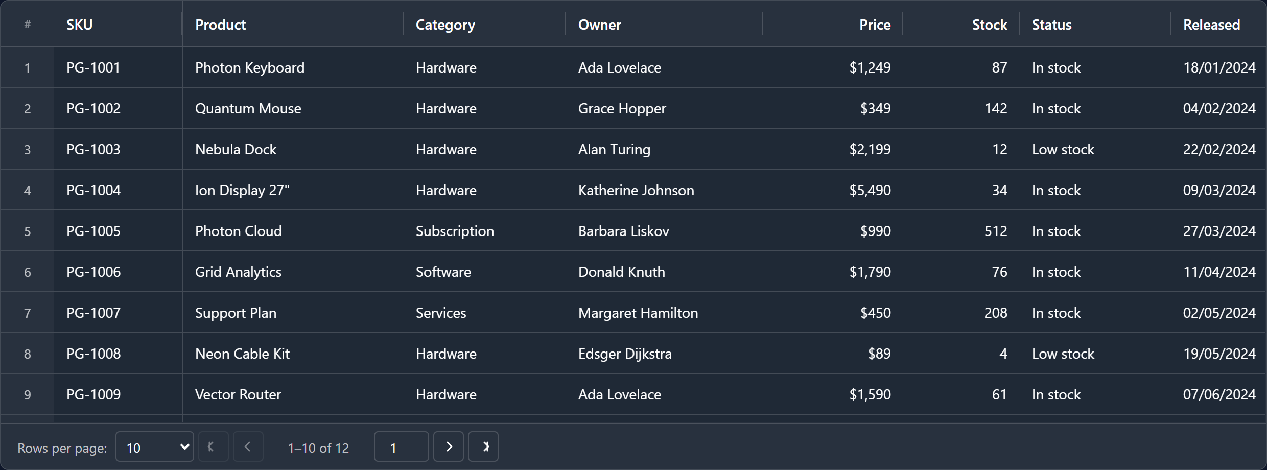
Overview
Photon Grid for Angular (photon-grid-angular) is the official Angular wrapper for Photon Grid Core — a framework-agnostic data grid / data table engine written in TypeScript with zero runtime dependencies.
It exposes one standalone <photon-grid-angular> component that binds Angular inputs and outputs to the core engine: virtual scrolling, sorting, filtering, grouping, editing, and cell renderers written as ordinary Angular components or templates.
A modern, lightweight alternative to AG Grid, Handsontable and PrimeNG Table for Angular applications.
Installation
npm install photon-grid-angular photon-grid-coreyarn add photon-grid-angular photon-grid-corepnpm add photon-grid-angular photon-grid-core@angular/core (≥18.2), @angular/common (≥18.2) and photon-grid-core are peer dependencies — install photon-grid-core alongside the wrapper.
No CSS import is required: the core injects its own stylesheet on first render.
Quick start
PhotonGridComponent is standalone — import it directly into a standalone component, or use PhotonGridModule from an NgModule.
import { Component } from '@angular/core';
import { PhotonGridComponent } from 'photon-grid-angular';
import type { ColumnDef } from 'photon-grid-angular';
import type { GridApi, GridOptions } from 'photon-grid-core';

@Component({
  selector: 'app-products',
  standalone: true,
  imports: [PhotonGridComponent],
  template: `
    <photon-grid-angular
      [columns]="columns"
      [dataSet]="rows"
      [options]="options"
      (gridReady)="onGridReady($event)"
      (cellValueChanged)="onCellValueChanged($event)">
    </photon-grid-angular>
  `,
  // The grid fills its host, so give the host a height.
  styles: [`:host { display: block; height: 460px; }`],
})
export class ProductsComponent {
  // Only `field` is required — colId, header and type are defaulted for you.
  columns: ColumnDef[] = [
    { field: 'sku',      header: 'SKU',      width: 110, pinned: 'left' },
    { field: 'product',  header: 'Product',  width: 190 },
    { field: 'category', header: 'Category', width: 140 },
    { field: 'price',    header: 'Price',    width: 120, type: 'number', editable: true },
    { field: 'released', header: 'Released', width: 130, type: 'date' },
  ];

  rows: Record<string, unknown>[] = [
    { sku: 'PG-1001', product: 'Photon Keyboard', category: 'Hardware', price: 1249, released: '2024-01-18' },
    { sku: 'PG-1002', product: 'Quantum Mouse',   category: 'Hardware', price:  349, released: '2024-02-04' },
    { sku: 'PG-1003', product: 'Nebula Dock',     category: 'Hardware', price: 2199, released: '2024-02-22' },
  ];

  options: Partial<GridOptions> = {
    mode: 'light',
    rowHeight: 40,
    showSerialNumber: true,
    pagination: { enabled: true, pageSize: 10 },
    editing: { mode: 'cell' },
  };

  onGridReady(api: GridApi): void {
    api.sizeColumnsToFit();
  }

  onCellValueChanged(event: unknown): void {
    console.log('cell changed', event);
  }
}
NgModule consumers
import { PhotonGridModule } from 'photon-grid-angular';

@NgModule({ imports: [PhotonGridModule] })
export class AppModule {}
Inputs
| Input | Type | Description |
| --------- | --------------------------- | ----------- |
| columns | GridColumnDef[] | Column definitions. Renderer slots accept Angular components and TemplateRefs as well as plain functions. Bound to GridApi.setColumns on change. |
| dataSet | Record<string, unknown>[] | Row data. Bound to GridApi.setData on change. |
| options | Partial<GridOptions> | Everything else — theme, selection, editing, pagination, row model, master/detail, AI panel. Changing this input recreates the grid. |
| loading | boolean | Toggles the loading overlay through GridApi.setLoading, so scroll position, selection and column layout survive. Configure its look with options.loadingOverlay. |
Outputs
gridReady emits the GridApi, which is full programmatic control over the grid.
| Group | Outputs |
| --- | --- |
| Lifecycle | gridReady, dataChanged, loadingChanged |
| Rows | rowClicked, rowDoubleClicked, rowSelected |
| Cells | cellClicked, cellDoubleClicked, cellValueChanged, cellSelectionChanged |
| Columns | columnResized, columnMoved, columnsStateChanged |
| Data ops | sortChanged, filterChanged, pageChanged |
| Summary | summaryChanged, summaryRowsChanged |
| Server row model | serverRequest, serverSuccess, serverError, serverRefresh, serverRetry |
| Misc | themeChanged, exportComplete, toolbarTabChanged, toolbarSearchChanged |
Angular component & template renderers
Cell, header and editor renderers may be plain functions (identical to the core API), or declarative Angular specs:
// Component-based renderer
columns: ColumnDef[] = [{
  field: 'status', header: 'Status',
  renderer: {
    display: {
      kind: 'component',
      component: StatusBadgeComponent,
      inputs: (params) => ({ value: params.value }),
    },
  },
}];
<!-- Template-based renderer -->
<ng-template #statusTpl let-params>
<span class="badge">{{ params.value }}</span>
</ng-template>The wrapper mounts and disposes these views as rows are virtualized and recycled, so nothing leaks.
Features
- Standalone component plus an optional
PhotonGridModule - Angular component and
TemplateRefcell renderers - Virtual row and column rendering — millions of rows, thousands of columns
- Column pinning, resizing, reordering, auto-size, size-to-fit, column groups
- Sorting, multi-column sorting, filtering, quick filter, filter panels
- Row grouping with aggregations, tree data, master–detail rows
- Client, server-side and infinite row models
- 15+ cell editors, declarative and async validation, fill handle, clipboard, undo/redo
- Excel-style formula engine (
=A1+B1) with 55+ functions - Light/dark modes and five variants, all CSS-custom-property driven
- CSV / Excel export and import, summary rows, status bar, context menus, charts
- Full keyboard navigation, ARIA roles, screen-reader support, RTL
- Natural-language AI panel (optional, with a Gemini back-end)
Links
- GitHub — https://github.com/abdulwahid-csit/photon-grid
- Issues — https://github.com/abdulwahid-csit/photon-grid/issues
- Core engine — https://www.npmjs.com/package/photon-grid-core
- React wrapper — https://www.npmjs.com/package/photon-grid-react
- Vue wrapper — https://www.npmjs.com/package/photon-grid-vue
Keywords
angular, angular grid, angular data grid, angular table, angular data table, angular datatable, angular table component, angular material table alternative, ng grid, ngx datatable alternative, primeng table alternative, ag-grid angular alternative, grid, data grid, datagrid, table, data table, datatable, table data, spreadsheet, excel grid, editable table, virtual scroll, virtualized table, infinite scroll, large dataset, million rows, tree grid, row grouping, sorting, filtering, pagination, column pinning, column resize, column reorder, row selection, cell selection, csv export, excel export, enterprise data grid, typescript, standalone component
License
MIT © Abdul Wahid
⭐ If Photon Grid is useful to you, consider starring the repository.