
pickem
v1.0.7
Published
Usage-sorted searchable autocomplete for CLI tools
Downloads
179

Maintainers
 calebogden
Readme
pickem
Usage-sorted, searchable autocomplete for CLI tools. Give every command-line tool the same fast, interactive picker: type to filter, arrow to choose — and the options you reach for most float to the top on their own.


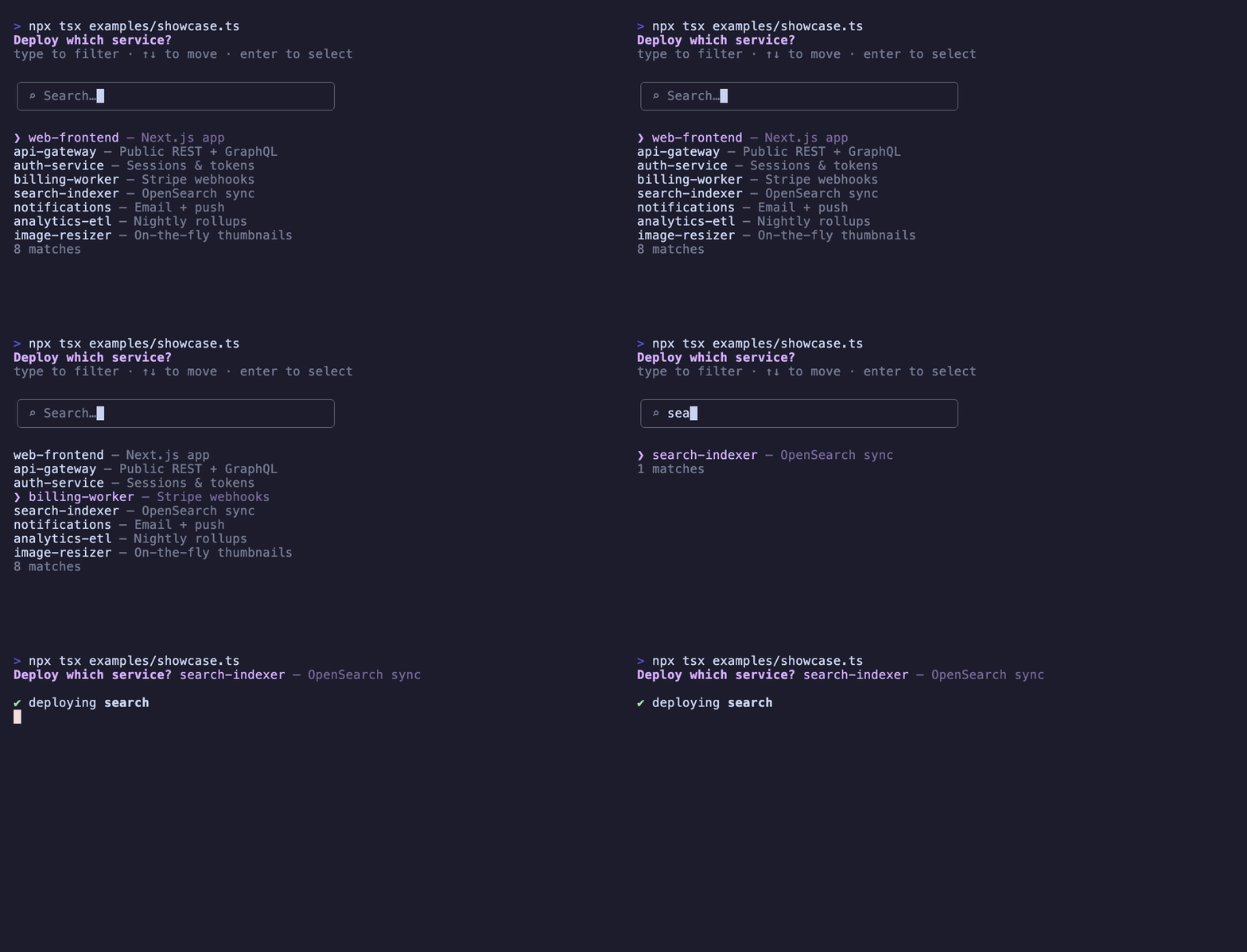
- Search as you type — filter on labels, descriptions, or any field you name
- Usage-aware ordering — frequently chosen items sort to the top automatically
- Single- and multi-select — with optional free-text entry for ad-hoc values
- Wizard flows — chain prompts with branching and conditional steps
- Light and fully typed — zero dependencies, ESM, ships with types
Install
npm install pickemQuick start
import { pickem } from 'pickem'

const choice = await pickem([
  { label: 'Deploy', value: 'deploy', description: 'Push to production' },
  { label: 'Test',   value: 'test',   description: 'Run test suite' },
  { label: 'Lint',   value: 'lint',   description: 'Check formatting' },
])
Type to filter, arrow keys to move, Enter to choose. The selected value is returned.
Multi-select
pickem.checkbox(items, opts) returns the values of every checked item.
import { pickem } from 'pickem'

const choices = await pickem.checkbox([
  { label: 'Deploy', value: 'deploy' },
  { label: 'Test',   value: 'test' },
  { label: 'Lint',   value: 'lint' },
], { message: 'Which steps?', defaultChecked: ['test'] })
// => ['deploy', 'test']
Space toggles a selection, Enter submits, type to filter, Esc clears the filter, Backspace removes filter characters.
Pass searchable: false to fall back to a plain checkbox list with no search bar:
const choices = await pickem.checkbox(items, { searchable: false })Pass allowFreeText: true to let users add ad-hoc entries: type text that matches nothing, press Enter, and it's appended to the list as a checked item — the filter clears and the picker stays open so they can keep going.
const tags = await pickem.checkbox(KNOWN_TAGS, { allowFreeText: true })Usage-aware ordering
Items sort by how often they've been chosen, so the picker adapts to how each user actually works. Enable it with track: true:
const choice = await pickem(items, {
  track: true,                              // stored in ~/.pickem/usage.json
  // or point it somewhere of your own:
  track: { storePath: '~/.myapp/usage.json' },
})
Ordering is a 3-tier sort: usage count, then most-recently-used, then alphabetical.
Multiple sources
Pull items from several places at once — they load in parallel and merge into one picker.
import { pickem, defineSource } from 'pickem'

const scripts = defineSource('scripts', async () => [
  { label: 'deploy.sh', value: './scripts/deploy.sh' },
  { label: 'backup.sh', value: './scripts/backup.sh' },
])

const npm = defineSource('npm', async () => [
  { label: 'build', value: 'npm run build' },
  { label: 'test',  value: 'npm test' },
])

const choice = await pickem.from([scripts, npm], { track: true })
// Set badgeStyle to label each item by source, e.g. [scripts], [npm]
Wizard flows
Chain multiple prompts together, with branching and conditional steps.
import { wizard } from 'pickem'

const result = await wizard([
  { id: 'action', type: 'pick',   message: 'What to do?', items: allScripts },
  { id: 'env',    type: 'select', message: 'Environment:', choices: [
    { label: 'Production', value: 'prod' },
    { label: 'Staging',    value: 'staging' },
  ], when: ctx => ctx.action === 'deploy' },
  { id: 'confirm', type: 'confirm', message: 'Are you sure?' },
  { id: 'route',   type: 'branch',  on: ctx => ctx.confirm ? 'done' : 'action' },
])
| Step type | Purpose |
|------------|---------|
| pick | Searchable, usage-sorted selection |
| checkbox | Searchable multi-select, returns an array |
| select | Simple choice list |
| input | Free text entry |
| confirm | Yes / no |
| branch | Route to a step ID or inject steps dynamically |
Every step supports when (run conditionally) and before (a pre-step hook).
Standalone usage tracker
The usage tracker works on its own, too — handy for ranking anything by frequency.
import { UsageTracker } from 'pickem'

const tracker = new UsageTracker({ storePath: '~/.myapp/usage.json' })
await tracker.track('deploy')
await tracker.track('deploy')

const sorted = await tracker.sortItems(items)
const top    = await tracker.getTop(10)
const stats  = await tracker.getStats('deploy') // { count: 2, lastUsed: ... }
Options
await pickem(items, {
  message: 'Pick one:',                    // Prompt message
  pageSize: 15,                            // Visible items per page
  track: true,                             // Enable usage tracking (true | TrackOptions)
  searchable: true,                        // false skips the search bar
  searchFields: ['label', 'description'],  // Fields to search (dot-notation for nested meta)
  search: (item, term) => boolean,         // Custom match function
  format: (item, stats) => string,         // Custom row formatter
  badgeStyle: 'none',                      // Group badge style: 'none' | 'bracket' | 'dot' | fn
  badgeColors: { npm: 'red' },             // Per-group badge colors
  sort: (a, b) => number,                  // Tiebreaker applied after usage sort
  onSelect: (item) => {},                  // Callback fired on selection
  allowFreeText: false,                    // Surface unmatched input as a selectable option
})
pickem.checkbox accepts the same options, plus:
await pickem.checkbox(items, {
  required: false,          // Require at least one selection before Enter submits
  defaultChecked: ['test'], // Values checked on open
  allowFreeText: true,      // Type unmatched text + Enter to add it as a checked item
})
Requirements
- Node.js >= 18
- ESM only
Contributing
Issues and pull requests are welcome at github.com/calebogden/pickem-oss. See CONTRIBUTING.md for setup, tests, and conventions.
License
MIT
Acknowledgments
pickem's prompt interactions were inspired by Inquirer.js.