
pimo-player
v1.1.0
Published
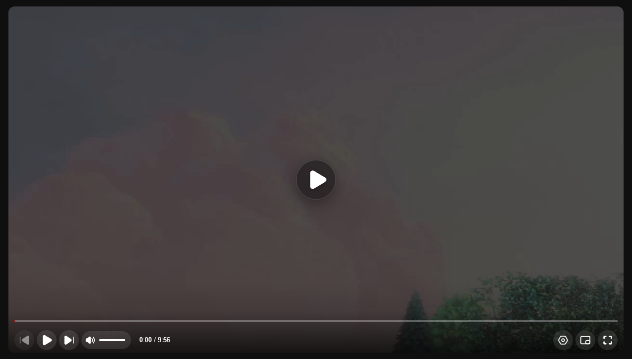
A pixel-perfect, YouTube-inspired video player for React and TypeScript with glassmorphism effects and modern controls.
Maintainers
 rajanprajapati
Readme
Pimo Player


A pixel-perfect, YouTube-inspired video player for React and TypeScript. Pimo is designed to be lightweight, highly customizable, and visually stunning with built-in glassmorphism effects and modern controls.
✨ Features
- 🎨 YouTube Aesthetics — Pixel-perfect replica of the YouTube player UI
- 🧪 Glassmorphism — Modern glass effects on overlays and big play button
- 📱 Fully Responsive — Works seamlessly across all screen sizes
- ⌨️ Keyboard Shortcuts — Familiar controls (Space, J/K/L, M, F, etc.)
- 🛠️ Highly Customizable — Easy to theme, configure, and extend
- 📦 Lightweight — Zero heavy dependencies, optimized for performance
- 🎯 TypeScript Ready — Full type definitions included
- 🖼️ Multiple Aspect Ratios — 16:9, 9:16, 1:1, 4:5, 4:3, 21:9, and custom
- 🌙 Dark & Light Themes — Built-in theme support
- 📋 Playlist Support — Queue panel with auto-play functionality
- ⚙️ Settings Menu — Playback speed, quality, ambient mode, and more
- 🎬 Picture-in-Picture — Native PiP support
- �️ Theater & Mini Player Modes — Multiple viewing modes
📦 Installation
npm install pimo-playeryarn add pimo-playerpnpm add pimo-player🚀 Quick Start
import { VideoPlayer } from 'pimo-player';
// CSS is bundled automatically - no separate import needed!

const App = () => {
  return (
    <VideoPlayer
      src="https://example.com/video.mp4"
      poster="https://example.com/poster.jpg"
      theme="dark"
    />
  );
};

export default App;
📖 Props
Basic Props
| Prop | Type | Default | Description |
|------|------|---------|-------------|
| src | string \| VideoSource[] | required | Video source URL or array of sources for quality switching |
| poster | string | — | Poster image URL shown before video loads |
| autoPlay | boolean | false | Auto-play video on load |
| loop | boolean | false | Loop video playback |
| muted | boolean | false | Start video muted |
| controls | boolean | true | Show player controls |
| playsInline | boolean | true | Play inline on mobile (prevents fullscreen on iOS) |
Appearance Props
| Prop | Type | Default | Description |
|------|------|---------|-------------|
| theme | 'dark' \| 'light' | 'dark' | Player color theme |
| className | string | — | Custom CSS class name |
| width | string \| number | — | Player width |
| height | string \| number | — | Player height |
| aspectRatio | string | '16:9' | Aspect ratio (see supported values below) |
Supported Aspect Ratios
'16:9'— YouTube, standard widescreen'9:16'— TikTok, Instagram Reels (vertical)'1:1'— Instagram square'4:5'— Instagram portrait'4:3'— Traditional TV'21:9'— Ultrawide/Cinema'auto'— Natural video aspect ratio- Custom string like
'3:2'
Advanced Props
| Prop | Type | Default | Description |
|------|------|---------|-------------|
| playlist | PlaylistItem[] | — | Playlist items for queue panel |
| currentIndex | number | 0 | Current playlist index |
| previewThumbnails | string \| string[] | — | Preview thumbnails VTT file or array |
| qualities | string[] | ['Auto', '1080p', '720p', ...] | Available quality options |
| keyboard | boolean | true | Enable keyboard shortcuts |
| controlsConfig | ControlsConfig | — | Control visibility options |
⚙️ Controls Configuration
Customize which controls are visible using the controlsConfig prop:
<VideoPlayer
  src="video.mp4"
  controlsConfig={{
    playPause: true,
    progress: true,
    volume: true,
    time: true,
    settings: true,
    fullscreen: true,
    pictureInPicture: true,
    playbackSpeed: true,
    quality: true,
    ambient: true,
    annotations: true,
    sleepTimer: true,
    playlist: true,
    miniPlayer: true,
    theaterMode: true,
  }}
/>
ControlsConfig Options
| Option | Type | Default | Description |
|--------|------|---------|-------------|
| playPause | boolean | true | Show play/pause button |
| progress | boolean | true | Show progress bar |
| volume | boolean | true | Show volume control |
| time | boolean | true | Show time display |
| settings | boolean | true | Show settings gear icon |
| fullscreen | boolean | true | Show fullscreen button |
| pictureInPicture | boolean | true | Show PiP button |
| playbackSpeed | boolean | true | Show speed in settings |
| quality | boolean | true | Show quality in settings |
| ambient | boolean | true | Show ambient mode toggle |
| annotations | boolean | true | Show annotations toggle |
| sleepTimer | boolean | true | Show sleep timer option |
| playlist | boolean | true | Show playlist panel button |
| miniPlayer | boolean | true | Show mini player button |
| theaterMode | boolean | true | Show theater mode button |
📡 Event Callbacks
<VideoPlayer
  src="video.mp4"
  onTimeUpdate={(currentTime) => console.log('Time:', currentTime)}
  onEnded={() => console.log('Video ended')}
  onPlay={() => console.log('Playing')}
  onPause={() => console.log('Paused')}
  onVolumeChange={(volume, muted) => console.log('Volume:', volume, muted)}
  onQualityChange={(quality) => console.log('Quality:', quality)}
  onFullscreenChange={(isFullscreen) => console.log('Fullscreen:', isFullscreen)}
  onPlaylistItemChange={(index, item) => console.log('Playlist item:', index, item)}
/>
| Event | Parameters | Description |
|-------|------------|-------------|
| onTimeUpdate | (currentTime: number) | Fired on playback time update |
| onEnded | () | Fired when video ends |
| onPlay | () | Fired when video starts playing |
| onPause | () | Fired when video pauses |
| onVolumeChange | (volume: number, muted: boolean) | Fired when volume changes |
| onQualityChange | (quality: string) | Fired when quality changes |
| onFullscreenChange | (isFullscreen: boolean) | Fired on fullscreen toggle |
| onPlaylistItemChange | (index: number, item: PlaylistItem) | Fired when playlist item changes |
⌨️ Keyboard Shortcuts
| Key | Action |
|-----|--------|
| Space / K | Play / Pause |
| J / ← | Seek backward 10s |
| L / → | Seek forward 10s |
| ↑ | Volume up |
| ↓ | Volume down |
| M | Mute / Unmute |
| F | Toggle fullscreen |
| I | Toggle mini player |
| T | Toggle theater mode |
| 0-9 | Seek to 0%-90% |
| Home | Seek to beginning |
| End | Seek to end |
📋 Playlist Example
import { VideoPlayer, PlaylistItem } from 'pimo-player';

const playlist: PlaylistItem[] = [
  {
    id: '1',
    src: 'https://example.com/video1.mp4',
    title: 'First Video',
    thumbnail: 'https://example.com/thumb1.jpg',
    duration: 120,
    channel: 'My Channel',
  },
  {
    id: '2',
    src: 'https://example.com/video2.mp4',
    title: 'Second Video',
    thumbnail: 'https://example.com/thumb2.jpg',
    duration: 180,
    channel: 'My Channel',
  },
];

const App = () => {
  return (
    <VideoPlayer
      src={playlist[0].src}
      playlist={playlist}
      currentIndex={0}
      onPlaylistItemChange={(index, item) => {
        console.log('Now playing:', item.title);
      }}
    />
  );
};
🎨 Theming
Dark Theme (Default)
<VideoPlayer src="video.mp4" theme="dark" />Light Theme
<VideoPlayer src="video.mp4" theme="light" />Custom Styling
You can override styles using CSS custom properties or by targeting the Pimo class names:
/* Override player background */
.pimo-player {
  --pimo-bg: #1a1a1a;
  --pimo-accent: #ff0000;
}

/* Custom progress bar */
.pimo-progress-bar {
  height: 5px;
}
📐 Responsive Example
<div style={{ maxWidth: '800px', margin: '0 auto' }}>
  <VideoPlayer
    src="video.mp4"
    aspectRatio="16:9"
    poster="poster.jpg"
  />
</div>
🛠️ TypeScript
Full TypeScript support with exported types:
import {
  VideoPlayer,
  VideoPlayerProps,
  VideoSource,
  PlaylistItem,
  ControlsConfig,
  Chapter,
} from 'pimo-player';
📁 Type Definitions
VideoSource
interface VideoSource {
  src: string;
  type?: string;
  quality?: string;
}
PlaylistItem
interface PlaylistItem {
  id: string;
  src: string;
  title: string;
  thumbnail?: string;
  duration?: number;
  channel?: string;
}
Chapter
interface Chapter {
  title: string;
  startTime: number;
  endTime: number;
}
🌐 Browser Support
| Browser | Version | |---------|---------| | Chrome | 60+ | | Firefox | 55+ | | Safari | 11+ | | Edge | 79+ | | Opera | 47+ |
📄 License
MIT © Rajan Prajapati
🤝 Contributing
Contributions, issues and feature requests are welcome! Feel free to check the issues page.
⭐ Show Your Support
Give a ⭐ if this project helped you!