placeholder-alerts
v1.3.5
Published
Small script to add font awesome icons as alerts in placeholder on form validation
Maintainers
 nmelentjevs
Readme
placeholder-alerts
Small package to add font-awesome icon alerts inside the placeholder to show incorrect input on form validation.
Features
- Create small alerts on incorrect input in the form to notify user.
- Very lightweight at 1.5Kb.
- Currently needs FontAwesome Cdn to be supplied for it to display correctly.
Install
npm i placeholder-alertsimport { createAlert } from '.placeholder-alerts';
createAlert(target, options);<body>
...
<script src="https://kit.fontawesome.com/Your Font Awesome Code"></script>
</body>Usage
Choose an input box where you would like to show side alert:
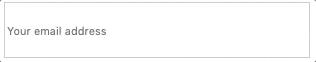
Html
<h2>Example of input target</h2>

<form id="form">
  <label>
    <input id="email" type="text" placeholder="Your email address" />
  </label>
</form>
####Javascript
const email = document.getElementById('email');

createAlert(email);
Will display this:
The icon will stay on the DOM forever as theree is no callback to remove it after x seconds supplied to options

Options
Usage
  createAlert(target, options)

  Options parameter should be an object of options:

  Options
    none            Alert will be shown with default bell icon.
                    Font size - 14px, color - red.

    iconClasses     String. Supply font-awesome icon classes to
                    display an icon of your choice.

    time            Int. Time in ms after which the alert icon will
                    dissapear from the page. Default: icons will stay
                    on the page.

    style           Object. CSS Object containing any styled to be
                    applied to the icon.

    display         String. Default: 'absolute' - great if you want
                    to set time to hide the icon after some x seconds.
                    'relative' - if you want to control where the icon
                    is placed relative to parent where the form input
                    is located.

    percent         Int. Used with display: 'absolute' to control %
                    placement of input width.

    positionY,      String. Used with  display: 'relative' to place icon
    positionX       exactly where you want it to be relative to label.
                    Provide px or em or rem values. (ex: '10px')
Javascript
const email = document.getElementById('email');

createAlert(email, {
  iconClasses: 'fas fa-exclamation-circle',
  time: 2000,
  style: {
    color: 'green'
  }
});
Will display this:
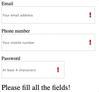
Form Validation Example
Html
<form id="form">
  <label>
    Email
    <input id="email" type="text" placeholder="Your email address" />
  </label>
  <label>
    Phone number
    <input id="phone" type="text" placeholder="Your mobile number" />
  </label>
  <label>
    Password
    <input id="password" type="password" placeholder="At least 4 characters" />
  </label>
  <label id="error">
    <span> </span>
  </label>
  <div>
    <button id="send-button" type="submit">Send</button>
    <button id="reset-button" type="submit">Reset</button>
  </div>
</form>
Javascript
  const validateInput = (emailInput, phoneInput, passwordInput) => {
    const re = /^(([^<>()\[\]\\.,;:\s@"]+(\.[^<>()\[\]\\.,;:\s@"]+)*)|(".+"))@((\[[0-9]{1,3}\.[0-9]{1,3}\.[0-9]{1,3}\.[0-9]{1,3}\])|(([a-zA-Z\-0-9]+\.)+[a-zA-Z]{2,}))$/;
    if (emailInput == '' && phoneInput == '' && passwordInput == '') {
      createAlert([email, phone, password], {
        iconClasses: 'fas fa-exclamation',
        time: 1500,
        style: {
          color: 'red'
        }
      });
      return 'Please fill all the fields';
    }

    if (re.test(String(emailInput).toLowerCase()) !== true) {
      createAlert(email, { time: 2000 });
      return 'Please enter a correct email';
    }

    if (passwordInput.length < 4) {
      createAlert(password, {
        time: 2000
      });
      return 'Your password must be at least 4 characters';
    }

    if (typeof phoneInput == 'string') {
      createAlert(phone, {
        time: 2000
      });
    }
    return true;
  };
};
If submitted without filling the fields validation will trigger alert on all inputs: