
plug-and-play-editor
v0.6.3
Published
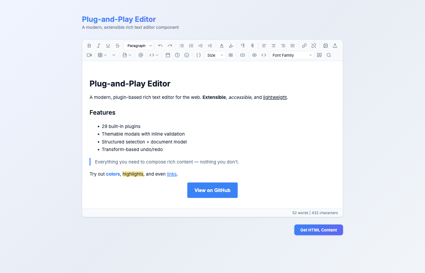
A modern, extensible rich text editor component for the web. Use it with vanilla JavaScript/TypeScript or directly in React apps — zero config needed.

Readme
Plug-and-Play Editor
A modern, extensible rich text editor component for the web. Use it with vanilla JavaScript/TypeScript or directly in React apps — zero config needed.


Version history and breaking-change notes live in CHANGELOG.md.
✨ Features
| Category | Features |
|----------|----------|
| Formatting | Bold, Italic, Underline, Strikethrough, Headings (H1–H6) |
| Undo / Redo | Toolbar buttons + keyboard shortcuts (Ctrl/Cmd+Z, Ctrl/Cmd+Y) |
| Lists | Unordered, Ordered, Indent, Outdent |
| Color | Text color picker, Background highlight color |
| Alignment | Left, Center, Right, Justify |
| Direction | LTR / RTL support |
| Links | Insert link via modal (with URL validation & inline error), Unlink |
| Media | Insert image (URL, modal-based), Upload image (file picker, 10 MB limit), Paste image (clipboard), Insert video/embed via modal (sanitized iframes) |
| Modals | Themable openFormModal / openInfoModal helpers — text / url / textarea / color / number / select fields, row grouping, inline errors, ESC / backdrop close, per-modal submit & cancel button theming |
| Tables | Insert table, Add/Delete rows, Add/Delete columns |
| Code | Inline code, Code blocks (dark theme), HTML source view toggle |
| Mentions | @mention dropdown with keyboard navigation, configurable user list, debounced async search |
| Emoji | Tabbed emoji picker (Smileys, Gestures, Hearts, Objects, Arrows) |
| Structure | Accordion, Page break, Horizontal rule, Table of Contents |
| Date/Time | Insert formatted date or time badges |
| Template Variables | Insertable {{token}} placeholders for email templates, searchable picker, grouped by category, configurable delimiters |
| Font Size | Dropdown with 12 preset sizes (10px–48px), applies as inline styles for email compatibility |
| Spacing | Line height (1.0–2.5) and paragraph spacing (compact–double) controls |
| Button Block | CTA button builder with text, URL, colors, radius, padding — email-client-compatible inline styles |
| Paste Cleanup | Automatically strips Word/Google Docs junk on paste, Ctrl+Shift+V for plain text paste |
| Image Resize | Click-to-select images with drag handles for proportional resizing |
| Preview Mode | Toggle preview with token replacement (e.g. {{first_name}} → "Alice"), 600px email-width view |
| Source Code | Toggle HTML source code editing mode with syntax-friendly monospace view |
| Font Family | Dropdown with 11 font families (Arial, Georgia, Times New Roman, Courier New, etc.) |
| Block Quote | Toggle blockquote formatting with active state tracking |
| Find & Replace | Search with live highlighting, match counter, Find Next, Replace, Replace All — Ctrl/Cmd+F shortcut |
| Word Count | Live word & character count in status bar, selection-aware counts |
| Editing | Tab key inserts spaces (doesn't leave editor) |
| Keyboard Shortcuts | Ctrl/Cmd+B (Bold), Ctrl/Cmd+I (Italic), Ctrl/Cmd+U (Underline), Ctrl/Cmd+Z (Undo), Ctrl/Cmd+Shift+Z / Ctrl/Cmd+Y (Redo), Ctrl/Cmd+Shift+V (Paste Plain Text), Ctrl/Cmd+F (Find & Replace) |
| Accessibility | ARIA roles & labels on toolbar, buttons, dropdowns; focus-visible outlines |
| Print | Print-ready styles (toolbar hidden, clean layout) |
| Responsive | Mobile-friendly emoji picker and toolbar |
📦 Installation
npm install plug-and-play-editor🚀 Quick Start
Vanilla JavaScript / TypeScript
<!-- index.html -->
<textarea id="editor">
  <p>Hello, world!</p>
</textarea>

<script type="module">
  import { Editor, FormattingPlugin, UndoRedoPlugin, ListsPlugin, EmojiPlugin } from 'plug-and-play-editor';

  const editor = new Editor('#editor', [
    FormattingPlugin,
    UndoRedoPlugin,
    ListsPlugin,
    EmojiPlugin,
  ]);

  // Get content
  console.log(editor.getContent());

  // Set content
  editor.setContent('<p>New content</p>');

  // Clean up when done
  editor.destroy();
</script>
React
npm install plug-and-play-editor react react-domimport { PlayEditor } from 'plug-and-play-editor/react';
function App() {
return (
<PlayEditor
defaultValue="<p>Start editing...</p>"
onChange={(html) => console.log(html)}
minHeight={400}
/>
);
}That's it — all 29 plugins load automatically in the React component (including email template features: tokens, button blocks, font size, spacing, paste cleanup, image resize, preview mode, source code editing, font family, block quote, find & replace, and word count).
📖 Detailed Usage
Vanilla JS — Full Example
import {
  Editor,
  FormattingPlugin,
  UndoRedoPlugin,
  ListsPlugin,
  ColorPlugin,
  AlignmentPlugin,
  DirectionalityPlugin,
  LinksPlugin,
  MediaPlugin,
  TablesPlugin,
  AccordionPlugin,
  PageBreakPlugin,
  TocPlugin,
  PasteImagePlugin,
  MentionsPlugin,
  CodeBlockPlugin,
  DateTimePlugin,
  EmojiPlugin,
  TokensPlugin,
  PasteCleanupPlugin,
  FontSizePlugin,
  SpacingPlugin,
  ButtonBlockPlugin,
  ImageResizePlugin,
  PreviewPlugin,
  SourceCodePlugin,
  FontFamilyPlugin,
  BlockQuotePlugin,
  FindReplacePlugin,
  WordCountPlugin,
} from 'plug-and-play-editor';

const editor = new Editor('#my-textarea', [
  FormattingPlugin,
  UndoRedoPlugin,
  ListsPlugin,
  ColorPlugin,
  AlignmentPlugin,
  DirectionalityPlugin,
  LinksPlugin,
  MediaPlugin,
  TablesPlugin,
  AccordionPlugin,
  PageBreakPlugin,
  TocPlugin,
  PasteImagePlugin,
  MentionsPlugin,
  CodeBlockPlugin,
  DateTimePlugin,
  EmojiPlugin,
  TokensPlugin,
  PasteCleanupPlugin,
  FontSizePlugin,
  SpacingPlugin,
  ButtonBlockPlugin,
  ImageResizePlugin,
  PreviewPlugin,
  SourceCodePlugin,
  FontFamilyPlugin,
  BlockQuotePlugin,
  FindReplacePlugin,
  WordCountPlugin,
]);
React — With Ref Control
import { useRef } from 'react';
import { PlayEditor } from 'plug-and-play-editor/react';
import type { PlayEditorRef } from 'plug-and-play-editor/react';

function App() {
  const editorRef = useRef<PlayEditorRef>(null);

  const handleSave = () => {
    const html = editorRef.current?.getContent();
    // Send html to your API
    fetch('/api/save', {
      method: 'POST',
      body: JSON.stringify({ content: html }),
    });
  };

  return (
    <>
      <PlayEditor
        ref={editorRef}
        defaultValue="<p>Edit me</p>"
        onChange={(html) => console.log('Changed:', html)}
        minHeight={300}
      />
      <button onClick={handleSave}>Save</button>
    </>
  );
}
React — Custom Plugin Selection
By default, all plugins load. Pass a plugins prop to use only what you need:
import { PlayEditor } from 'plug-and-play-editor/react';
import { FormattingPlugin, UndoRedoPlugin, ListsPlugin, EmojiPlugin } from 'plug-and-play-editor';

function LightEditor() {
  return (
    <PlayEditor
      plugins={[FormattingPlugin, UndoRedoPlugin, ListsPlugin, EmojiPlugin]}
      onChange={(html) => console.log(html)}
    />
  );
}
Need the full list programmatically? Import ALL_PLUGINS from the dedicated subpath (this is also what PlayEditor loads by default):
import { PlayEditor } from 'plug-and-play-editor/react';
import { ALL_PLUGINS } from 'plug-and-play-editor/react/defaults';
import { MyCustomPlugin } from './my-custom-plugin';

<PlayEditor plugins={[...ALL_PLUGINS, MyCustomPlugin]} />
React — Disabled / Read-Only
// Disabled — no interaction at all
<PlayEditor defaultValue="<p>Locked content</p>" disabled />

// Read-only — content visible but not editable
<PlayEditor defaultValue="<p>View-only content</p>" readOnly />
Modals (for plugin authors)
openFormModal / openInfoModal are the primitives plugins use for data entry and messages. They render a centered dialog inside the editor container, support inline validation errors, ESC / backdrop close, and accept per-modal button theming.
import { openFormModal, openInfoModal } from 'plug-and-play-editor';

// Form modal — rich field types + row grouping
openFormModal(editor, {
  title: 'Insert Button',
  submitLabel: 'Insert',
  fields: [
    { name: 'text', label: 'Label', type: 'text', value: 'Click' },
    { name: 'url',  label: 'URL',   type: 'url',  value: 'https://' },
    [
      { name: 'bg',    label: 'Background', type: 'color',  value: '#3b82f6' },
      { name: 'color', label: 'Text',       type: 'color',  value: '#ffffff' }
    ],
    {
      name: 'size', label: 'Size', type: 'select', value: 'md',
      options: [{ value: 'sm', label: 'Small' }, { value: 'md', label: 'Medium' }, { value: 'lg', label: 'Large' }]
    }
  ],
  theme: {
    submit: { background: '#10b981', color: '#fff', fontFamily: 'Inter', fontWeight: '600' },
    cancel: { color: '#64748b' }
  },
  onSubmit: (values, { showError, close }) => {
    if (!values.url) return showError('URL is required.');
    // ... do work ...
    close();
  }
});

// Info modal — read-only message or preformatted content
openInfoModal(editor, {
  title: 'Content',
  content: editor.getContent(),
  preformatted: true,
  theme: { submit: { background: '#10b981' } }
});
Supported field types: text, url, textarea, color, number, select. Arrays of fields render side-by-side as a row.
🔌 Plugins Reference
Built-in Plugins
| Plugin | Import Name | What It Does |
|--------|-------------|--------------|
| Formatting | FormattingPlugin | Bold, Italic, Underline, Strikethrough, Headings (H1–H6) dropdown |
| Undo / Redo | UndoRedoPlugin | Undo and Redo toolbar buttons |
| Lists | ListsPlugin | Unordered/Ordered lists, Indent/Outdent |
| Color | ColorPlugin | Text color & background color pickers |
| Alignment | AlignmentPlugin | Left, Center, Right, Justify |
| Directionality | DirectionalityPlugin | LTR / RTL text direction |
| Links | LinksPlugin | Insert/remove hyperlinks (URL validated, javascript: blocked) |
| Media | MediaPlugin | Insert image (URL + file picker, 10 MB max), sanitized video embed |
| Tables | TablesPlugin | Insert 3x3 table, add/delete rows, add/delete columns |
| Accordion | AccordionPlugin | Collapsible accordion sections |
| Page Break | PageBreakPlugin | Horizontal rule & page break |
| TOC | TocPlugin | Auto-generated Table of Contents from headings |
| Paste Image | PasteImagePlugin | Cmd+V / Ctrl+V paste images from clipboard |
| Mentions | MentionsPlugin | @mention dropdown (uses default empty user list) |
| Code Block | CodeBlockPlugin | Inline code, fenced code blocks, HTML source toggle |
| Date/Time | DateTimePlugin | Insert current date or time as styled badge |
| Emoji | EmojiPlugin | Tabbed emoji picker popup |
| Tokens | TokensPlugin | Template variable picker with default email tokens ({{first_name}}, etc.) |
| Paste Cleanup | PasteCleanupPlugin | Auto-cleans pasted HTML from Word/Docs, Ctrl+Shift+V for plain text |
| Font Size | FontSizePlugin | Font size dropdown (10–48px) with inline style output |
| Spacing | SpacingPlugin | Line height & paragraph spacing controls |
| Button Block | ButtonBlockPlugin | CTA button builder with colors, padding, radius — click to re-edit |
| Image Resize | ImageResizePlugin | Click images to show resize handles, drag to resize proportionally |
| Preview | PreviewPlugin | Preview mode with token replacement and 600px email-width view |
| Source Code | SourceCodePlugin | Toggle raw HTML source code editing with monospace view, disables other toolbar controls in source mode |
| Font Family | FontFamilyPlugin | Font family dropdown with 11 fonts (Arial, Georgia, Times New Roman, Courier New, etc.) |
| Block Quote | BlockQuotePlugin | Toggle blockquote formatting with active state tracking |
| Find & Replace | FindReplacePlugin | Search panel with live highlighting, match counter, Find Next, Replace, Replace All — Ctrl/Cmd+F shortcut |
| Word Count | WordCountPlugin | Live word & character count status bar, shows selection-aware counts when text is selected |
Configurable Plugins
Mentions — Custom User List
import { createMentionsPlugin } from 'plug-and-play-editor';

// Static user list
const mentions = createMentionsPlugin({
  users: [
    { id: '1', name: 'Alice Johnson', avatar: 'https://...' },
    { id: '2', name: 'Bob Smith' },
  ],
  trigger: '@', // default
});

// OR async user fetching (automatically debounced at 200 ms)
const asyncMentions = createMentionsPlugin({
  users: async (query) => {
    const res = await fetch(`/api/users?search=${query}`);
    return res.json(); // must return { id, name, avatar? }[]
  },
});

// Use in vanilla JS
const editor = new Editor('#editor', [FormattingPlugin, mentions]);

// Use in React
<PlayEditor plugins={[FormattingPlugin, asyncMentions]} />
Tokens — Custom Variables for Email Templates
import { createTokensPlugin } from 'plug-and-play-editor';

// Custom token list with categories
const tokens = createTokensPlugin({
  tokens: [
    { key: 'first_name', label: 'First Name', category: 'Recipient' },
    { key: 'last_name', label: 'Last Name', category: 'Recipient' },
    { key: 'order_id', label: 'Order ID', category: 'Order' },
    { key: 'total', label: 'Order Total', category: 'Order' },
  ],
});

// With a different delimiter style
const percentTokens = createTokensPlugin({
  tokens: [{ key: 'name', label: 'Name' }],
  delimiter: 'percent',   // renders %name% instead of {{name}}
  // Also supports: 'single-curly' → {name}
});

// Use in vanilla JS
const editor = new Editor('#editor', [FormattingPlugin, tokens]);

// Use in React
<PlayEditor plugins={[FormattingPlugin, tokens]} />
The default TokensPlugin export includes common email template variables:
| Variable | Description |
|----------|-------------|
| {{first_name}} | Recipient's first name |
| {{last_name}} | Recipient's last name |
| {{full_name}} | Recipient's full name |
| {{email}} | Recipient's email address |
| {{company}} | Company name |
| {{unsubscribe_url}} | Unsubscribe link |
| {{preferences_url}} | Email preferences link |
| {{current_year}} | Current year |
| {{current_date}} | Current date |
Preview — Custom Sample Data
import { createPreviewPlugin } from 'plug-and-play-editor';

const preview = createPreviewPlugin({
  sampleData: {
    first_name: 'John',
    company: 'My Corp',
    order_id: 'ORD-12345',
    // Add any custom token keys your templates use
  },
});

const editor = new Editor('#editor', [FormattingPlugin, TokensPlugin, preview]);
⌨️ Keyboard Shortcuts
| Shortcut | Action |
|----------|--------|
| Ctrl/Cmd + B | Bold |
| Ctrl/Cmd + I | Italic |
| Ctrl/Cmd + U | Underline |
| Ctrl/Cmd + Z | Undo |
| Ctrl/Cmd + Shift + Z | Redo |
| Ctrl/Cmd + Y | Redo |
| Ctrl/Cmd + Shift + V | Paste as plain text |
| Ctrl/Cmd + F | Find & Replace |
| Tab | Insert tab space |
🎨 Styling
The editor ships with its own CSS that loads automatically. You can customize it by overriding CSS custom properties:
/* Override design tokens */
:root {
  --pe-bg: #ffffff;
  --pe-text: #1e293b;
  --pe-text-muted: #64748b;
  --pe-font: 'Inter', system-ui, sans-serif;
  --pe-border: #e2e8f0;
  --pe-radius: 10px;
  --pe-accent: #3b82f6;
  --pe-toolbar-bg: #f8fafc;
  --pe-btn-hover: rgba(0, 0, 0, 0.06);
  --pe-focus: rgba(59, 130, 246, 0.45);
}
Dark Mode Example
.dark .play-editor-container {
  --pe-bg: #1e293b;
  --pe-text: #e2e8f0;
  --pe-text-muted: #94a3b8;
  --pe-border: #334155;
  --pe-toolbar-bg: #0f172a;
  --pe-btn-hover: rgba(255, 255, 255, 0.08);
}
🏛️ Advanced Architecture
The editor ships with three layered subsystems on top of the contentEditable DOM — opt in when you need them. They are structured, path-based, and DOM-independent, giving you a principled way to observe and mutate content without touching the live tree directly.
Selection model
Structured, path-based selection that survives DOM churn. editor.getSelection() returns a discriminated union (caret / range / none) you can pattern-match on:
const sel = editor.getSelection();
if (sel.kind === 'caret') {
  console.log('caret at', sel.point.path, sel.point.offset);
} else if (sel.kind === 'range') {
  console.log('range', sel.anchor, '→', sel.focus);
}
editor.setSelection(sel) writes the selection back to the DOM, and editor.resolvePoint(node, offset) converts a DOM position into a structured Point.
Document model
A full Node ADT (Doc / Paragraph / Heading / Text / Link / List / …), schema validation, HTML ↔ Doc conversion, and a diffing reconciler. The model runs alongside the DOM — the DOM remains the source of truth, the Doc is an observable projection you can snapshot or re-render.
import { parseDom, serializeToHtml } from 'plug-and-play-editor';

const doc = parseDom(editor.editorArea);
for (const block of doc.children) {
  console.log(block.type, 'children:', block.children?.length ?? 0);
}
const html = serializeToHtml(doc);
serializeToDom(doc) and render(container, prev, next) round out the pipeline for headless mutation and diffed re-rendering.
Transform system
A 14-variant Transform ADT (Insert / Delete / Replace / SetAttr / AddMark / RemoveMark / Move / Split / Join / Wrap / Unwrap / ReplaceNode) with pure apply() + invert(), a TransformLog that tracks an undo/redo cursor with subscribers, and a MutationObserver-based startRecording that auto-captures every edit as a Transform.
import { TransformLog, startRecording, apply, parseDom } from 'plug-and-play-editor';

const log = new TransformLog();
const stop = startRecording(editor.editorArea, log);
// ... user types ...
log.stepUndo();                            // walk back one transform
const next = apply(parseDom(editor.editorArea), someTransform);
stop();
Each log entry is round-trippable (invert gives you the inverse transform), so undo/redo is derived rather than reconstructed from snapshots.
Full design rationale lives in docs/specs/2026-04-19-custom-selection-model-design.md.
📐 API Reference
Editor Class
const editor = new Editor(selector: string | HTMLTextAreaElement, plugins: Plugin[]);| Method | Returns | Description |
|--------|---------|-------------|
| getContent() | string | Get the current HTML content |
| setContent(html) | void | Set the editor HTML content |
| execCommand(command, value?) | void | Run a document.execCommand |
| addToolbarButton(iconHtml, tooltip, onClick, command?) | HTMLButtonElement | Add a custom toolbar button. Pass command to enable active state tracking. |
| addToolbarDivider() | void | Add a visual divider to the toolbar |
| onSelectionChange(fn) | () => void | Subscribe to selection changes inside the editor. Handler fires at most once per frame (rAF-coalesced) and only when the selection is inside the editor. Returns an unsubscribe function. |
| onInput(fn) | () => void | Subscribe to editor input changes. Handler fires at most once per frame, after the backing textarea is synced. Returns an unsubscribe function. |
| getSelection() | Selection | Read the current selection as a structured, path-based value (caret / range / none). DOM-independent. |
| setSelection(sel) | void | Write a structured Selection back to the DOM. |
| resolvePoint(node, offset) | Point \| null | Resolve a DOM (node, offset) pair into a structured Point, or null if the position is outside the editor. |
| onDestroy(fn) | void | Register a cleanup function called on destroy() |
| destroy() | void | Tear down the editor, clean up plugins and event listeners, restore the textarea |
| Property | Type | Description |
|----------|------|-------------|
| editorArea | HTMLDivElement | The contentEditable div |
| toolbar | HTMLDivElement | The toolbar container |
| textArea | HTMLTextAreaElement | The backing textarea |
| container | HTMLElement | The root wrapper element |
PlayEditor React Component
<PlayEditor
  defaultValue?: string          // Initial HTML
  onChange?: (html: string) => void  // Change callback
  plugins?: Plugin[]             // Custom plugins (all by default)
  className?: string             // Wrapper CSS class
  minHeight?: number             // Min editor height in px
  disabled?: boolean             // Disable editor entirely
  readOnly?: boolean             // Read-only mode (visible but not editable)
  ref?: React.Ref<PlayEditorRef> // Imperative handle
/>
PlayEditorRef (via useRef)
| Method / Property | Type | Description |
|-------------------|------|-------------|
| getContent() | string | Get current HTML |
| setContent(html) | void | Set HTML programmatically |
| editor | Editor \| null | Access underlying Editor instance |
🧩 Writing Custom Plugins
Create your own plugin by implementing the Plugin interface:
import type { Plugin } from 'plug-and-play-editor';
import type { Editor } from 'plug-and-play-editor';

export const MyPlugin: Plugin = {
  name: 'my-plugin',
  init(editor: Editor) {
    // Add a toolbar button with active state tracking
    editor.addToolbarButton(
      '<svg>...</svg>',   // icon HTML (SVG recommended)
      'My Action',         // tooltip (also used as aria-label)
      () => {
        editor.execCommand('insertHTML', '<strong>Hello!</strong>');
      },
      'bold'               // optional: command name for active state tracking
    );

    // Add a divider before your buttons
    editor.addToolbarDivider();

    // Access the contentEditable area
    const handler = (e: KeyboardEvent) => {
      // Custom keyboard handling
    };
    editor.editorArea.addEventListener('keydown', handler);

    // Register cleanup for when the editor is destroyed
    editor.onDestroy(() => {
      editor.editorArea.removeEventListener('keydown', handler);
    });
  },
  // Optional: called when editor.destroy() is invoked
  destroy() {
    // Clean up any external resources
  }
};
Then use it:
import { Editor, FormattingPlugin } from 'plug-and-play-editor';
import { MyPlugin } from './my-plugin';

const editor = new Editor('#editor', [FormattingPlugin, MyPlugin]);

// Later, clean up
editor.destroy();
📦 Bundle Size & Tree-Shaking
The package is published with "sideEffects" limited to CSS files, so bundlers that support tree-shaking (esbuild, Rollup, Vite, Webpack 5+) drop everything you don't import:
// Vanilla — selective imports yield ~10 KB bundled (gzipped), not ~21 KB.
import { Editor, FormattingPlugin, LinksPlugin } from 'plug-and-play-editor';
For React, default plugins load synchronously so the toolbar paints on the first frame. If you want the smallest React bundle, pass your own plugins prop and optionally pull the full list from the subpath import:
import { PlayEditor } from 'plug-and-play-editor/react';
import { FormattingPlugin, LinksPlugin } from 'plug-and-play-editor';

<PlayEditor plugins={[FormattingPlugin, LinksPlugin]} />
No runtime dependencies. CSS ships once at plug-and-play-editor/style.css (22 KB, 4.5 KB gzipped).
⚡ Performance
Internal hot paths are optimized for large documents and fast typing:
- rAF-coalesced selection/input dispatch —
document.selectionchangefires on every cursor move; the editor subscribes once and fans out to plugins at most once per frame, after a single "is selection in editor?" check. - Cached command buttons —
updateActiveStatesiterates a pre-built array instead of re-querying the toolbar DOM. - Plugin subscription APIs —
editor.onSelectionChange(fn)andeditor.onInput(fn)let plugins hook into the same coalesced dispatch instead of adding their own document-level listeners. - Short-circuited word count — text stats are cached; selection changes re-render without rescanning
textContent.
Rapid cursor movement (50 events) dispatches in <1 ms and collapses into a single update.
🔒 Security
The editor includes built-in protections against common web vulnerabilities:
- XSS prevention — User input in links, media embeds, TOC headings, and mentions is sanitized/escaped before insertion
- URL validation — Only
http:,https:, andmailto:URLs are allowed for links;javascript:URLs are blocked - Iframe sanitization — Video/media embeds are parsed and rebuilt with only safe attributes; only
http:/https:iframe sources are permitted - File size limits — Image uploads are capped at 10 MB
- Safe link defaults — All inserted links get
target="_blank"andrel="noopener noreferrer"
📁 Project Structure
plug-and-play-editor/
├── src/
│   ├── core/
│   │   ├── Editor.ts       # Core editor class (lifecycle, shortcuts, rAF-coalesced selectionchange/input)
│   │   ├── Plugin.ts       # Plugin interface (init + optional destroy)
│   │   ├── icons.ts        # SVG icon library
│   │   └── modal.ts        # Reusable openFormModal / openInfoModal helpers
│   ├── plugins/
│   │   ├── formatting.ts   # Bold, Italic, Headings, Undo/Redo
│   │   ├── lists.ts        # UL, OL, indent
│   │   ├── color.ts        # Color pickers
│   │   ├── alignment.ts    # Text alignment
│   │   ├── directionality.ts # LTR/RTL
│   │   ├── links.ts        # Hyperlinks (with URL validation)
│   │   ├── media.ts        # Images & video (with sanitization)
│   │   ├── tables.ts       # Table management (add/delete rows & cols)
│   │   ├── accordion.ts    # Accordion blocks
│   │   ├── page-break.ts   # HR & page breaks
│   │   ├── toc.ts          # Table of Contents (XSS-safe)
│   │   ├── paste-image.ts  # Clipboard paste
│   │   ├── mentions.ts     # @mentions (debounced, ARIA, XSS-safe)
│   │   ├── code-block.ts   # Code blocks
│   │   ├── datetime.ts     # Date/Time insert
│   │   ├── emoji.ts        # Emoji picker (ARIA, scoped cleanup)
│   │   ├── tokens.ts       # Template variable tokens (configurable, searchable)
│   │   ├── paste-cleanup.ts # Paste cleanup (Word/Docs sanitization)
│   │   ├── font-size.ts    # Font size dropdown (inline styles)
│   │   ├── spacing.ts      # Line height & paragraph spacing
│   │   ├── button-block.ts # CTA button builder (email-compatible)
│   │   ├── image-resize.ts # Image resize handles
│   │   ├── preview.ts      # Preview mode with token replacement
│   │   ├── source-code.ts  # HTML source code editing toggle
│   │   ├── font-family.ts  # Font family dropdown
│   │   ├── block-quote.ts  # Blockquote formatting
│   │   ├── find-replace.ts # Find & Replace panel
│   │   └── word-count.ts   # Word & character count status bar
│   ├── styles/
│   │   └── core.css        # All styles (responsive, print, a11y)
│   ├── index.ts            # Vanilla JS entry
│   ├── react.tsx           # React component (with disabled/readOnly)
│   └── react-defaults.ts   # ALL_PLUGINS constant, re-exported from `/react/defaults`
├── package.json
├── vite.config.ts
└── tsconfig.json
🧪 Testing
Unit tests live alongside their sources as *.test.ts and run under vitest with the happy-dom environment:
npm testCoverage spans selection path math, document schema validation, parser/serializer round-trip, and transform apply + invert correctness — the building blocks behind the Advanced Architecture section above.
📄 License
MIT