
postcss-oldschool-grid
v1.0.9
Published
post-css grid system with wrapping columns and padding as gutters
Maintainers
 lordgiotto
Readme
Old School Grid
Trustworthy postcss grid system we learnt to love, with wrapping columns and padding gutters.
Visit official website for live demo and documentation
What's that?
postcss-oldschool-grid is a postcss plugin that provide an easy to use and intuitive grid system based on padding gutters and wrapping columns.
No calc(), no right margins with :last-child and :nth-child(), simply nested containers with padding gutters.
Under the hood it behave like Bootstrap grid system, so all you have to do is to put content inside a column, put the column inside a row and eventually put the row inside a wrapper. Easy! :)
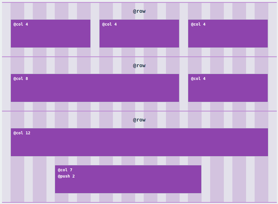
Example
Install
First of all you have to install and configure postcss in order to use this plugin: if you don't know what f***ing I'm talking about, take a look to the guide on the postcss github page.
Next step is to use npm to instll postcss-oldschool-grid:
$ npm install postcss-oldschool-grid`And add it to your postcss processors:
var osg = require('postcss-oldschool-grid');
...
postcss([ osg({config}) ])
...
Options
There are two ways to configure postcss-oldschool-grid:
- Pass an object as parameter when you call the processor
var config = {
    wrapperWidth: '40px';
    gutterWidth: '20px',
    totalColumns: 16
}
...
postcss([ osg(config) ]);- Set options in the CSS, inside the special at-rule @grid (you can use either camelCase or param-case)
@grid {
    wrapper-width: 40px;
    gutter-width: 20px;
    total-columns: 16
}
totalColumns
Accepted Values: string, number Default Value: 12
Set the total number of columns used to calculate the grid.
wrapperWidth
Accepted Values: string, number Default Value: "1024px"
Set the width of @wrapper element
wrapperPadding
Accepted Values: string, number, true|false Default Value: Inherit form GutterWidth
Set the padding of @wrapper element, so its external gutter. If setted to true it will inherit gutterWidth; if false it will be removed.
gutterWidth
Accepted Values: string, number Default Value: "30px"
The gutter width used in the grid.
verticalSpace
Accepted Values: string, number, true|false Default Value: Not set
Set the vertical space between columns and rows.
debugMode
Accepted Values: true|false Default Value: false
Activate debug mode for all rows: a background rappresenting the grid will be applied (like the exemple in this page).
Functions
@wrapper [width]
[width]: Width of the wrapper
Create a wrapper, fluid and centered in the page.
It also add border-box property to the element and all the children.
.wrapper {
    @wrapper 960px;
}
compiles:
.wrapper{
    width: 100%;
    margin-left: auto;
    margin-right: auto;
    max-width: 960px;
    padding-left: 30px;
    padding-right: 30px;
    box-sizing: border-box;
}
.wrapper *, .wrapper *:after, .wrapper *:before {
    box-sizing: border-box;
}
@row
Create a row: better to use inside the wrapper, because it applies a negative margin to compensate wrapper and columns padding.
It also adds a clearfix.
.row {
@row;
}
compiles:
.row{
    width: 100%;
    padding-left: 15px;
    padding-right: 15px;
    margin-left: -30px;
    margin-right: -30px;
    zoom: 1;
}
.row:after {
    content: "";
    display: table;
    clear: both;
}
.row:before {
    content: "";
    display: table;
}
@col [number]
[number]: The number of cols to span this element.
Span the element for [number] cols.
.col {
    @col 960px;
}
compiles
.col{
    position: relative;
    float: left;
    width: 33.33333333333333%;
    padding-left: 15px;
    padding-right: 15px;
}
@pull [number] or @push [number]
[number]: The number of cols to pull or push this element
Pull or push the element for [number] cols. Uses relative position and right or left properties.
.push {
    @push 2;
}
compiles:
.push {
    left: 16.666666666666664%;
}
@clearfix
Utility to add a clearfix to an element.
@borderbox or @border-box
Utility to set an element and his children in box-sizing: border-box;.
If used outside any selector, il will apply border-box globally.
@borderbox;compiles:
*, *:after, *:before {
    box-sizing: border-box;
}
@debug-grid
Utility to debug the grid with background guides.
Apply it only to a row element to prevent unexpected behaviours.