
pptx-angular-viewer
v4.10.1
Published
pptx-viewer for Angular: a PowerPoint viewer and editor component to render, edit, and export PPTX slides in the browser.

Maintainers
 christophervr
Readme
pptx-angular-viewer


Show, edit, and present Microsoft PowerPoint (.pptx) files directly in an
Angular app: no server, no conversion step, no PowerPoint install required. Drop
in a <pptx-viewer> component, hand it the file's bytes, and it renders slides
as real HTML and CSS with full editing and export support.
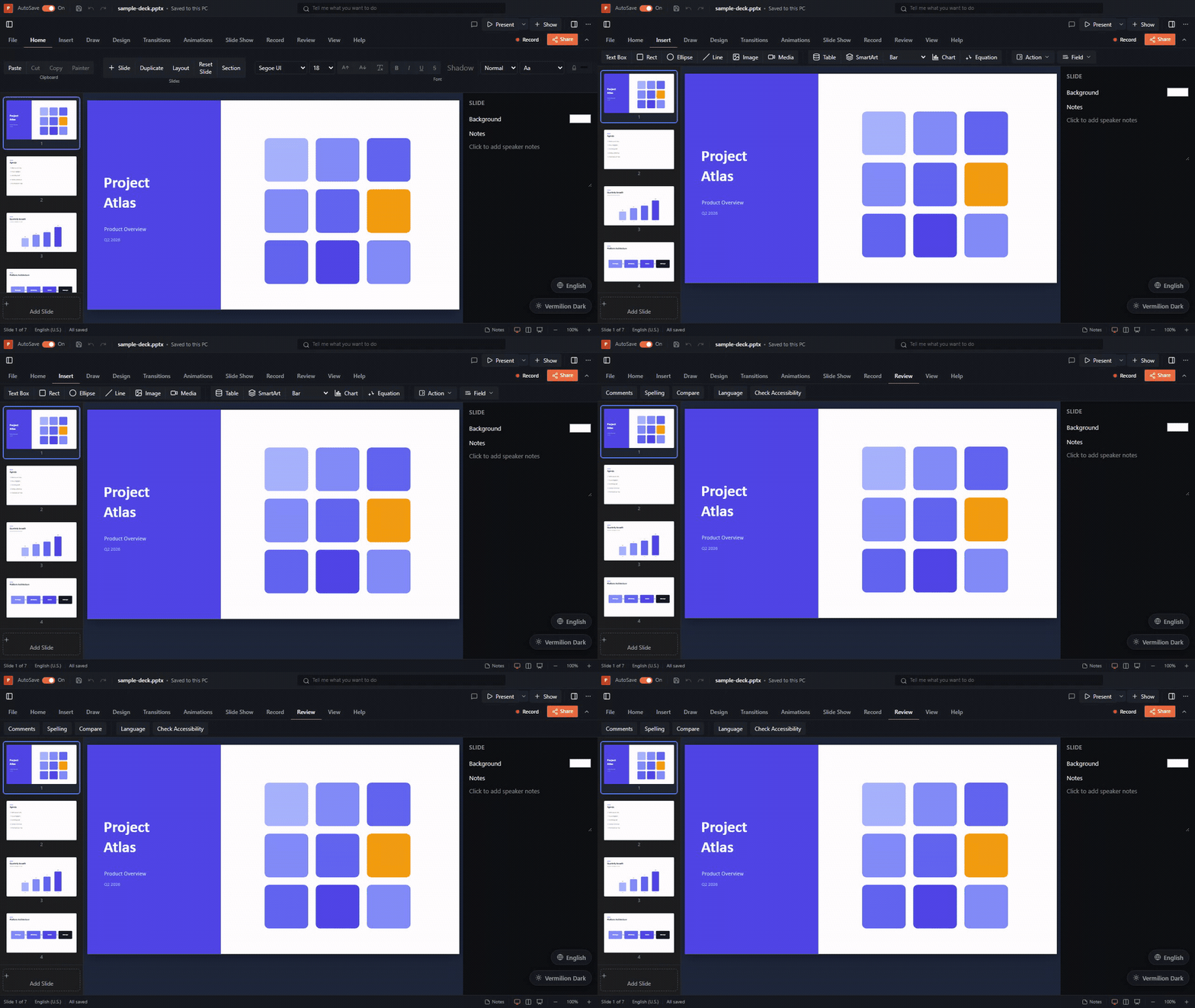
The rendering is done by the framework-agnostic pptx-viewer-core engine, which turns a .pptx file into a structured slide model. This package is the Angular layer that draws that model on screen, and the engine is bundled in, so you install just one package.
▶️ Try the live demo · 📦 npm · 📖 Full docs · 🧩 Core SDK
Features
- Standalone component:
<pptx-viewer>, no NgModule needed. - Modern Angular: built on signals and
OnPush, and works without Zone.js. - Real HTML rendering: slides are drawn as ordinary HTML and SVG, not as a picture, so text stays sharp at any zoom and is selectable and accessible.
- Editing: select, drag, resize, rotate; inline text and table-cell editing; format painter; shape adjustment handles; align, distribute, group, flip, and z-order; undo/redo; snap-to-grid, snap-to-shape, H/V guides, and rulers.
- Full Office-style ribbon: all tabs wired (Home, Insert incl. Table/SmartArt/ Equation, Draw incl. freehand ink, Design incl. theme gallery, Transitions, Animations, Slide Show incl. custom shows, Review, View incl. grid/rulers/guides/ snap/eyedropper/selection pane) plus a status bar and context menu.
- Inspector: element and slide property panels, including chart data editor.
- Presentation mode: animation playback, presenter view, slide transitions, custom-show playback, rehearse timings, and freehand ink.
- Export: PNG, PDF, GIF, and WebM video; print; Save As (pptx/ppsx/pptm).
- Collaboration: real-time Yjs-based co-editing with cursor/selection presence.
- Comments, find/replace, accessibility panel, digital signatures, and more.
- Mobile chrome: touch toolbar, bottom bar with sheets, and touch editing.
- Slide navigation: a thumbnail rail, previous/next, and a slide counter.
- Zoom: in, out, and reset.
- Themeable: change colours through CSS custom properties.
- Loads from anywhere: an
ArrayBufferorUint8Arrayfrom a file input, afetch, drag-and-drop, and so on.
Installation
npm install pptx-angular-viewerPeer requirements: Angular 19-22 (@angular/core, @angular/common), rxjs,
and @ngx-translate/core (all UI labels go through it, see
Localization):
npm install @angular/core @angular/common rxjs @ngx-translate/coreOptional peers: three enables interactive GLB/GLTF 3D models and the
smartArt3D and 3D chart renderers; yjs + y-websocket (or y-webrtc for serverless
peer-to-peer) enable real-time collaboration. Without them those features
degrade gracefully (poster images, no live session).
Usage
import { Component, signal } from '@angular/core';
import { PowerPointViewerComponent } from 'pptx-angular-viewer';

// Base chrome styles (toolbar, thumbnails, layout). Import once.
import 'pptx-angular-viewer/styles';

@Component({
	selector: 'app-root',
	standalone: true,
	imports: [PowerPointViewerComponent],
	template: `
		<input type="file" accept=".pptx" (change)="onFile($event)" />

		<div style="height: 80vh">
			@if (content()) {
				<pptx-viewer [content]="content()" (activeSlideChange)="onSlide($event)" />
			}
		</div>
	`,
})
export class AppComponent {
	readonly content = signal<ArrayBuffer | null>(null);

	async onFile(event: Event) {
		const file = (event.target as HTMLInputElement).files?.[0];
		if (file) this.content.set(await file.arrayBuffer());
	}

	onSlide(index: number) {
		console.log('active slide', index);
	}
}
Theming
Pass a partial theme; unset tokens fall back to the built-in dark palette. Values
accept any CSS color (hex, rgb(), hsl(), oklch(), …).
import type { ViewerTheme } from 'pptx-angular-viewer';

theme: ViewerTheme = {
	colors: { primary: '#6366f1', background: '#0b1020' },
	radius: '0.5rem',
};
<pptx-viewer [content]="content()" [theme]="theme" />For app-wide theming you can also provide a theme through DI:
import { provideViewerTheme } from 'pptx-angular-viewer';

bootstrapApplication(AppComponent, {
	providers: [provideViewerTheme({ colors: { primary: '#6366f1' } })],
});
Two ready-made presets ship with the package: vermilionLightTheme (warm paper
canvas) and vermilionDarkTheme (dimmed presenter room), the same vermilion
brand look as the documentation site:
import { vermilionLightTheme } from 'pptx-angular-viewer';
// [theme]="vermilionLightTheme" or provideViewerTheme(vermilionLightTheme)
The underlying palettes (vermilionLightColors, vermilionDarkColors) and
radius (vermilionRadius) are exported too for deriving your own variant.
Reading the current presentation back
getContent() turns the current presentation back into .pptx bytes. Reach it
via a template reference or viewChild:
@ViewChild(PowerPointViewerComponent) viewer!: PowerPointViewerComponent;

async save() {
  const bytes = await this.viewer.getContent();
  // write `bytes` (Uint8Array) to a Blob / download / upload
}
Composing your own custom viewer host
<pptx-viewer> (PowerPointViewerComponent) is the bundled, batteries-included
chrome, but its building blocks are curated exports too, so you can compose
your own host component instead: bring your own layout/toolbar and reuse the
ribbon and slide canvas directly, wired to the same shared DI state via
POWER_POINT_VIEWER_PROVIDERS, the exact provider list PowerPointViewerComponent
itself uses.
import { Component, inject, signal } from '@angular/core';
import {
	DEFAULT_CANVAS_HEIGHT,
	DEFAULT_CANVAS_WIDTH,
	EditorStateService,
	LoadContentService,
	POWER_POINT_VIEWER_PROVIDERS,
	RibbonComponent,
	SlideCanvasComponent,
} from 'pptx-angular-viewer';

@Component({
	selector: 'my-custom-viewer',
	standalone: true,
	providers: [...POWER_POINT_VIEWER_PROVIDERS],
	imports: [RibbonComponent, SlideCanvasComponent],
	template: `
		<pptx-ribbon
			[slideIndex]="loader.activeSlideIndex()"
			[slideCount]="editor.slides().length"
			[canEdit]="true"
			(save)="onSave()"
		/>
		<pptx-slide-canvas
			[slide]="editor.slides()[loader.activeSlideIndex()]"
			[canvasSize]="{ width: DEFAULT_CANVAS_WIDTH, height: DEFAULT_CANVAS_HEIGHT }"
			[editable]="true"
		/>
	`,
})
export class MyCustomViewerComponent {
	protected readonly loader = inject(LoadContentService);
	protected readonly editor = inject(EditorStateService);
	protected readonly DEFAULT_CANVAS_WIDTH = DEFAULT_CANVAS_WIDTH;
	protected readonly DEFAULT_CANVAS_HEIGHT = DEFAULT_CANVAS_HEIGHT;

	onSave() {
		/* ... */
	}
}
RibbonComponent and SlideCanvasComponent are plain, DI-free input()/output()
signal components (the ribbon renders ~90 bindings for the full Office-style tab
set; the snippet above shows an illustrative subset, not the exhaustive list),
so this recipe scales down too: provide only the services the pieces you use
actually need instead of the full POWER_POINT_VIEWER_PROVIDERS list, as long
as you cover whatever inject() calls those pieces make (EditorStateService
and LoadContentService are the two nearly everything depends on).
Viewport fit options
<pptx-viewer [content]="content()" [fitPadding]="0" [maxFitScale]="null" />fitPadding is a per-side CSS-pixel number or { horizontal, vertical };
maxFitScale is a positive fit-factor ceiling or null for unlimited enlargement.
Omission preserves 8 px horizontal / 16 px vertical padding and a ceiling of 1.
The same inputs are available on SlideCanvasComponent; [autoFit]="false"
continues to bypass automatic fitting. These options do not change document
geometry or user zoom. See the cross-binding defaults.
API
Inputs
| Input | Type | Default | Description |
| -------------------------------------------------------------------------- | ------------------------------------ | ------- | --------------------------------------------------------------------------------------------------------------------------------------------------------------------------------------------------------------------------------------------------------------------------------------------------------------------------------------------------------------------- |
| content | Uint8Array \| ArrayBuffer \| null | null | The .pptx bytes to render. |
| theme | ViewerTheme | n/a | Color/radius overrides applied as CSS custom properties. Always wins over the File > Options theme picker. |
| class | string | '' | Class applied to the root element. |
| canEdit | boolean | false | Enables the editor toolbar, inspector, and drag-and-drop editing. |
| filePath | string | n/a | Host file path/identifier keying the version-history store. |
| fileName | string | n/a | Display name of the open document, shown in the title bar. |
| fonts | ViewerFontSource[] | [] | Licensed font sources supplied by the host application. |
| authorName | string | n/a | Display name for the local user in collaboration/broadcast sessions and presence avatars. |
| collaboration | CollaborationConfig | n/a | Yjs real-time collaboration config (server URL, room, role). |
| shareDefaults | { roomId?, userName?, serverUrl? } | n/a | Seed values for the Share dialog's start form. |
| onOpenFile | () => void | n/a | Host override for File > Open; bypasses the built-in file picker. |
| smartArt3D | boolean | false | Opt-in Three.js 3D SmartArt renderer (needs the optional three peer; falls back to SVG without it). |
| surfaceChart3D, barChart3D, lineChart3D, areaChart3D, pieChart3D | boolean | false | Independently opt in to interactive Three.js renderers for the matching 3D chart kinds; each falls back to SVG when WebGL is unavailable. |
| ai | PptxAiConfig | n/a | Optional AI assistant configuration. The SDK peer loads only when its panel is opened. |
| hiddenActions | ToolbarActionId[] | [] | Toolbar buttons/ribbon tabs to hide individually (e.g. ['share', 'broadcast']), instead of hiding the whole toolbar. |
| customization | ViewerCustomization | - | Hide, lock or remap any part of the UI (ribbon tabs/buttons, File > Options pages/sections/settings, File tab, context menus, shortcuts, panels, AI/collaboration, dialogs); the same helpers (hideRibbonTab, lockSetting, ...) are on the component instance. See the UI Customization guide. |
| defaultThemeKey | string | n/a | Initial File > Options > Appearance selection when no persisted preference exists. |
| availableThemes | ThemeCatalogEntry[] | n/a | Theme choices offered by File > Options > Appearance (defaults to the built-in catalog). |
| onThemeChange | (key: string) => void | n/a | Host hook for the appearance picker; when set, the host owns persisting the choice. |
| defaultLocale | string | n/a | Initial locale code when no persisted preference exists. |
| availableLocales | LocaleCatalogEntry[] | n/a | Locale choices offered by File > Options > Language (defaults to the registered TranslateService languages). |
| onLocaleChange | (code: string) => void | n/a | Host hook for the language picker; when set, the host owns applying/persisting the switch. |
| accountAuth | AccountAuthConfig | n/a | Optional sign-in hook point for File > Account (disabled unless enabled: true). |
Outputs
| Output | Payload | Description |
| -------------------- | ----------------------------- | -------------------------------------------------------------------- |
| activeSlideChange | number | Emits the active slide index on navigation. |
| dirtyChange | boolean | Emits true/false when the dirty state changes. |
| contentChange | Uint8Array | Emits updated bytes after any editing change. |
| modeChange | string | Emits the new mode ('preview', 'edit', 'present', 'master'). |
| zoomChange | number | Emits the new zoom level (1 = 100%). |
| selectionChange | string[] | Emits the selected element IDs when selection changes. |
| slideCountChange | number | Emits the total slide count when slides change. |
| propertiesChange | Partial<PptxCoreProperties> | Emits when the user edits document properties in the Info dialog. |
| startCollaboration | CollaborationConfig | Emits when a collaboration/broadcast session starts. |
| stopCollaboration | void | Emits when the collaboration/broadcast session stops. |
Methods
| Method | Returns | Description |
| ------------------------- | --------------------- | ---------------------------------------------- |
| getContent() | Promise<Uint8Array> | Serialise the current presentation to .pptx. |
| goTo(index) | void | Navigate to a slide by zero-based index. |
| goPrev() | void | Navigate to the previous slide. |
| goNext() | void | Navigate to the next slide. |
| undo() | void | Undo the last editing action. |
| redo() | void | Redo the last undone action. |
| canUndo() | boolean | Whether an undo action is available. |
| canRedo() | boolean | Whether a redo action is available. |
| getZoom() | number | Get the current zoom level. |
| setZoom(level) | void | Set the zoom level (clamped to 0.2 - 3.0). |
| zoomIn() | void | Zoom in by one step. |
| zoomOut() | void | Zoom out by one step. |
| zoomReset() | void | Reset zoom to 100%. |
| getMode() | string | Get the current viewer mode. |
| setMode(mode) | void | Switch mode programmatically. |
| getActiveSlideIndex() | number | Get the zero-based active slide index. |
| getSlideCount() | number | Get the total number of slides. |
| isDirty() | boolean | Whether the document has unsaved changes. |
| getSelectedElementIds() | string[] | Get IDs of currently selected elements. |
| selectElements(ids) | void | Programmatically select elements by ID. |
| clearSelection() | void | Clear the current selection. |
The component implements the full shared PowerPointViewerAPI, so the
following slide/element manipulation methods are also available:
setActiveSlideIndex(index), getSlides(), getSlide(index),
getActiveSlide(), addSlide(afterIndex?), deleteSlides(indexes),
duplicateSlides(indexes), moveSlide(from, to), toggleHideSlides(indexes),
getElements(slideIndex?), getElementById(id, slideIndex?),
addElement(element), updateElement(id, patch), deleteElements(ids), and
duplicateElement(id).
See element insertion
for the addElement contract and a core-factory example.
Exported components & helpers
PowerPointViewerComponent, SlideCanvasComponent, RibbonComponent,
ElementRendererComponent, LoadContentService, POWER_POINT_VIEWER_PROVIDERS,
provideViewerTheme, VIEWER_THEME, and the ViewerTheme / CanvasSize /
CollaborationConfig types. See "Composing your own custom viewer host" above
for using RibbonComponent and SlideCanvasComponent outside
PowerPointViewerComponent.
Internal building blocks & slide-transition helpers
Most of this package's cross-framework logic (colour/geometry/connector/animation/chart math,
slide transitions, and more) lives in pptx-viewer-shared, an internal package that is never
published to npm. Everything not part of the curated API above (~150 internal services,
components, and helpers) is importable from pptx-angular-viewer/internals instead, not covered
by semver. That includes the slide-transition resolver/keyframes
(resolveSlideTransition, resolveTransitionDurationMs, SLIDE_TRANSITION_KEYFRAMES) and the
PresentationTransitionOverlayComponent behind presentation mode, so you never need
pptx-viewer-shared yourself:
import {
	resolveSlideTransition,
	PresentationTransitionOverlayComponent,
} from 'pptx-angular-viewer/internals';
See the services reference for the full list.
Localization (i18n)
UI labels go through @ngx-translate/core with dotted keys such as pptx.statusBar.allSaved. Provide it with provideTranslateService() (the demo's src/i18n.ts shows a minimal config, including a MissingTranslationHandler that derives Title Case labels for any key you don't explicitly translate):
import { translationsEn, keyToLabel } from 'pptx-angular-viewer';
import { inject } from '@angular/core';
import { TranslateService } from '@ngx-translate/core';

// register the English dictionary, e.g. in your root component
inject(TranslateService).setTranslation('en', translationsEn);
// later, to switch:
inject(TranslateService).use('fr');
Unlike React/Vue, translationsEn, keyToLabel, and the TranslationKey type (for type-checking a new locale dictionary as Record<TranslationKey, string>) are exported from the package root, not an /i18n subpath. See the Localization guide for the full picture across all five viewer bindings and how to contribute a translation upstream; the live demo's language picker is a working reference.
Limitations
- 3D models need the Three.js peer - GLB/GLTF models render interactively when
the optional
threepeer dependency is installed, and fall back to their poster image otherwise. - CSS-rendering approximations - A handful of effects (
backdrop-filter, path gradients) are approximated on screen, and a few effects flatten in raster export; see the root README's Limitations for details.
The pptx-viewer-core engine parses all element data, so you can access it from
the model even where the UI does not expose it yet.
Build (contributing)
bun run build      # ng-packagr → dist (Angular Package Format)
bun run typecheck  # tsc against tsconfig.lib.json
bun run test       # vitest
Reference translations
Optional French, Spanish, German, and Simplified Chinese dictionaries ship with this package. Import only the language you need:
import { translationsZhCN } from 'pptx-angular-viewer/i18n/zh-CN';The other subpaths are i18n/fr (translationsFr), i18n/es
(translationsEs), and i18n/de (translationsDe). See the
localization guide
for registration and runtime switching. Existing English imports are unchanged.
License
Apache-2.0. Please keep the NOTICE file with redistributions.