
pptx-vue-viewer
v2.17.9
Published
Vue 3 PowerPoint viewer and editor component: render, edit, and export PPTX slides in the browser.

Maintainers
 christophervr
Readme
pptx-vue-viewer


Show, edit, and present Microsoft PowerPoint (.pptx) files directly in a
Vue 3 app: no server, no conversion step, no PowerPoint install required. Drop
in a <PowerPointViewer> component, hand it the file's bytes, and it renders
slides as real HTML and CSS with full editing and export support.
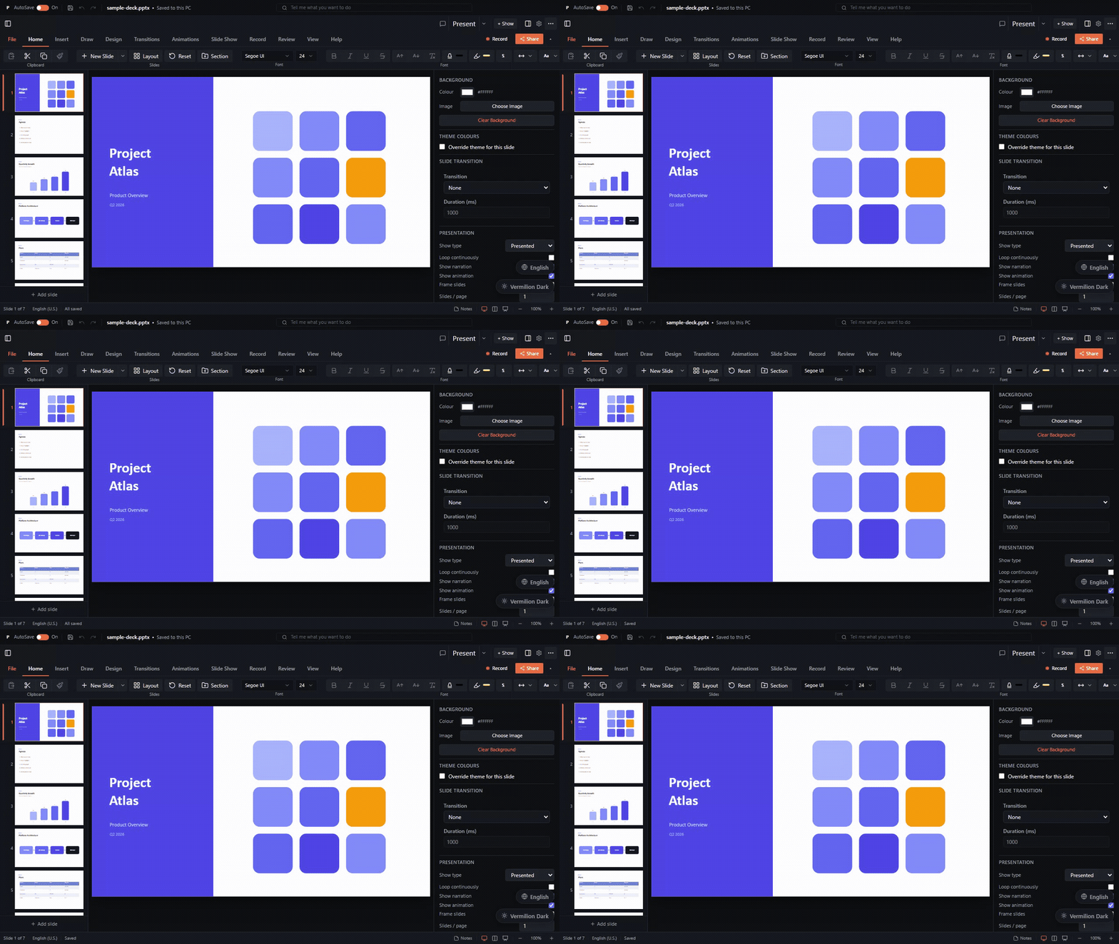
The rendering is done by the framework-agnostic pptx-viewer-core engine, which turns a .pptx file into a structured slide model. This package is the Vue layer that draws that model on screen, and the engine is bundled in, so you install just one package.
▶️ Try the live demo · 📦 npm · 📖 Full docs · 🧩 Core SDK
Features
- A single component:
<PowerPointViewer>, written in<script setup>style. - Real HTML rendering: slides are drawn as ordinary HTML and SVG, not as a picture, so text stays sharp at any zoom and is selectable and accessible.
- Editing: select, drag, resize, rotate; inline text editing; format painter; shape adjustment handles; align, distribute, group, flip, and z-order; undo/redo; snap-to-grid, snap-to-shape, H/V guides, and rulers.
- Full Office-style ribbon: all tabs wired (Home, Insert, Draw, Design, Transitions, Animations, Slide Show, Review, View) plus a status bar and context menu.
- Inspector: element and slide property panels, including chart data editor.
- Presentation mode: animation playback, presenter view, slide transitions, rehearse timings, subtitles, and freehand ink.
- Export: PNG, PDF, GIF, and WebM video; print; Save As (pptx/ppsx/pptm).
- Collaboration: real-time Yjs-based co-editing with cursor/selection presence.
- Comments, find/replace, accessibility panel, version history, and more.
- Mobile chrome: touch toolbar, bottom bar with sheets, and touch editing.
- Slide navigation: live thumbnail previews, previous/next, and a slide counter.
- Zoom: in, out, and reset.
- Themeable: change colours through CSS custom properties.
- Loads from anywhere: an
ArrayBufferorUint8Arrayfrom a file input, afetch, drag-and-drop, and so on.
Installation
npm install pptx-vue-viewerPeer requirements: Vue 3.5+, vue-i18n (all UI labels go through it, see
Localization), and the engine's jszip /
fast-xml-parser peers:
npm install vue vue-i18n jszip fast-xml-parserOptional: three enables interactive GLB/GLTF 3D models and the
smartArt3D renderer; without it those elements fall back to poster images /
flat SVG.
The pptx-viewer-core engine is bundled in, so you don't install it
separately unless you want to call the SDK directly.
Usage
<script setup lang="ts">
import { ref, onMounted } from 'vue';
import { PowerPointViewer, type PowerPointViewerExpose } from 'pptx-vue-viewer';

// Base chrome styles (toolbar, thumbnails, layout). Import once.
import 'pptx-vue-viewer/styles';

const content = ref<Uint8Array>();
const viewer = ref<PowerPointViewerExpose>();

onMounted(async () => {
	const res = await fetch('/example.pptx');
	content.value = new Uint8Array(await res.arrayBuffer());
});

function onSlide(index: number) {
	console.log('active slide', index);
}
</script>

<template>
	<PowerPointViewer
		v-if="content"
		ref="viewer"
		:content="content"
		:theme="{ colors: { primary: '#6366f1' } }"
		@active-slide-change="onSlide"
		style="height: 100vh"
	/>
</template>
Loading from a file input
<script setup lang="ts">
import { ref } from 'vue';
const content = ref<ArrayBuffer>();

async function onFile(event: Event) {
	const file = (event.target as HTMLInputElement).files?.[0];
	if (file) content.value = await file.arrayBuffer();
}
</script>

<template>
	<input type="file" accept=".pptx" @change="onFile" />
</template>
Theming
Pass a partial theme; unset tokens fall back to the built-in dark palette.
Values accept any CSS color (hex, rgb(), hsl(), oklch(), …) and map to
--pptx-* CSS custom properties (shadcn/ui token names).
import type { ViewerTheme } from 'pptx-vue-viewer';

const theme: ViewerTheme = {
	colors: { primary: '#6366f1', background: '#0b1020' },
	radius: '0.5rem',
};
For app-wide theming you can also provide a theme to a subtree:
import { provideViewerTheme } from 'pptx-vue-viewer';
// call inside a parent component's setup()
provideViewerTheme({ colors: { primary: '#6366f1' } });
Two ready-made presets ship with the package: vermilionLightTheme (warm paper
canvas) and vermilionDarkTheme (dimmed presenter room), the same vermilion
brand look as the documentation site:
import { vermilionLightTheme } from 'pptx-vue-viewer';
// <PowerPointViewer :theme="vermilionLightTheme" … />
The underlying palettes (vermilionLightColors, vermilionDarkColors) and
radius (vermilionRadius) are exported too for deriving your own variant.
Reading the current presentation back
getContent() turns the current presentation back into .pptx bytes. Reach it
through a template ref:
const viewer = ref<PowerPointViewerExpose>();

async function save() {
	const bytes = await viewer.value!.getContent();
	// write `bytes` (Uint8Array) to a Blob / download / upload
}
API
Props
| Prop | Type | Default | Description |
| -------------------- | ------------------------------------ | ------- | ------------------------------------------------------------------------------------------------------------------------- |
| content | Uint8Array \| ArrayBuffer | n/a | The .pptx bytes to render. Required. |
| theme | ViewerTheme | n/a | Color/radius overrides applied as CSS custom properties. Always wins over the File > Options theme picker. |
| class | string | n/a | Class applied to the root element. |
| canEdit | boolean | false | Enables the editor toolbar, inspector, and drag-and-drop editing. |
| filePath | string | n/a | Original file path, used for autosave recovery and version history. |
| fileName | string | n/a | Display name of the open document, shown in the title bar. |
| fonts | ViewerFontSource[] | n/a | Licensed font sources supplied by the host application. |
| autosave | boolean | false | Enables debounced autosave (emits @autosave with serialised bytes). |
| autosaveIntervalMs | number | 2000 | Autosave debounce window in milliseconds. |
| authorName | string | n/a | Author name for comments/annotations and collaboration presence. |
| collaboration | CollaborationConfig | n/a | Yjs real-time collaboration config (server URL, room, role). |
| shareDefaults | { roomId?, userName?, serverUrl? } | n/a | Seed values for the Share dialog fields. |
| onOpenFile | () => void | n/a | Host override for File > Open; bypasses the built-in file picker. |
| smartArt3D | boolean | false | Opt-in Three.js 3D SmartArt renderer (needs the optional three peer; falls back to SVG without it). |
| hiddenActions | ToolbarActionId[] | n/a | Individual toolbar buttons and/or ribbon tabs to hide (e.g. ['share', 'broadcast', 'insert']). Omit to show everything. |
| defaultThemeKey | string | n/a | Initial File > Options > Appearance selection when no persisted preference exists. |
| availableThemes | ThemeCatalogEntry[] | n/a | Theme choices offered by File > Options > Appearance (defaults to the built-in catalog). |
| onThemeChange | (key: string) => void | n/a | Host hook for the appearance picker; when set, the host owns persisting the choice. |
| defaultLocale | string | n/a | Initial locale code when no persisted preference exists. |
| availableLocales | LocaleCatalogEntry[] | n/a | Locale choices offered by File > Options > Language (defaults to the host vue-i18n locales). |
| onLocaleChange | (code: string) => void | n/a | Host hook for the language picker; when set, the host owns applying/persisting the switch. |
| accountAuth | AccountAuthConfig | n/a | Optional sign-in hook point for File > Account (disabled unless enabled: true). |
Events
| Event | Payload | Description |
| --------------------- | --------------------- | ------------------------------------------------------------------------------------ |
| active-slide-change | number | Emits the active slide index on navigation. |
| content-change | Uint8Array | Emits updated bytes after any editing change. |
| dirty-change | boolean | Emits true/false when the dirty state changes. |
| mode-change | string | Emits the new mode when it changes ('preview', 'edit', 'present', 'master'). |
| zoom-change | number | Emits the new zoom level (1 = 100%). |
| selection-change | string[] | Emits the selected element IDs when selection changes. |
| slide-count-change | number | Emits the total slide count when slides are added/removed. |
| autosave | Uint8Array | Emits serialised bytes when autosave persists the presentation (autosave prop). |
| start-collaboration | CollaborationConfig | Emits when the user starts a collaboration session from the Share dialog. |
| stop-collaboration | - | Emits when the user stops a collaboration session. |
Exposed methods (template ref)
| Method | Returns | Description |
| ------------------------- | --------------------- | ---------------------------------------------- |
| getContent() | Promise<Uint8Array> | Serialise the current presentation to .pptx. |
| goTo(index) | void | Navigate to a slide by zero-based index. |
| goPrev() | void | Navigate to the previous slide. |
| goNext() | void | Navigate to the next slide. |
| undo() | void | Undo the last editing action. |
| redo() | void | Redo the last undone action. |
| canUndo() | boolean | Whether an undo action is available. |
| canRedo() | boolean | Whether a redo action is available. |
| getZoom() | number | Get the current zoom level. |
| setZoom(level) | void | Set the zoom level (clamped to 0.2 - 3.0). |
| zoomIn() | void | Zoom in by one step. |
| zoomOut() | void | Zoom out by one step. |
| zoomReset() | void | Reset zoom to 100%. |
| getMode() | ViewerMode | Get the current viewer mode. |
| setMode(mode) | void | Switch mode programmatically. |
| getActiveSlideIndex() | number | Get the zero-based active slide index. |
| getSlideCount() | number | Get the total number of slides. |
| isDirty() | boolean | Whether the document has unsaved changes. |
| getSelectedElementIds() | string[] | Get IDs of currently selected elements. |
| selectElements(ids) | void | Programmatically select elements by ID. |
| clearSelection() | void | Clear the current selection. |
The exposed surface implements the full shared PowerPointViewerAPI, so the
following slide/element manipulation methods are also available:
setActiveSlideIndex(index), getSlides(), getSlide(index),
getActiveSlide(), addSlide(afterIndex?), deleteSlides(indexes),
duplicateSlides(indexes), moveSlide(from, to), toggleHideSlides(indexes),
getElements(slideIndex?), getElementById(id, slideIndex?),
updateElement(id, patch), deleteElements(ids), and
duplicateElement(id).
Exported components & helpers
PowerPointViewer, SlideCanvas, SlideStage, ElementRenderer,
RibbonToolbar, provideViewerTheme, useViewerTheme, and the ViewerTheme /
CanvasSize / CollaborationConfig / ToolbarActionId / RibbonProps types.
Composing a custom viewer shell
<PowerPointViewer> bundles the slide canvas, ribbon, inspector, and every
dialog into one component. If you only want a subset, for example your own
chrome around just the ribbon and the slide canvas, import the pieces
independently instead: RibbonToolbar (from pptx-vue-viewer, same as
SlideCanvas) and the useRibbonProps composable (from the internal
building-blocks entry point pptx-vue-viewer/internals) that assembles its
props. The internals subpath is not covered by semver; prefer the stable
root exports, and pin your version when relying on internals.
<script setup lang="ts">
import { SlideCanvas, RibbonToolbar } from 'pptx-vue-viewer';
import {
	useRibbonProps,
	useEditorHistory,
	useSelection,
	// ...plus whichever other composables you need to build the
	// `UseRibbonPropsInput` state/action fields (see ribbon-props-types.ts).
} from 'pptx-vue-viewer/internals';

// Wire up just the state/handlers your custom shell needs; anything from
// `UseRibbonPropsInput` you don't use can be a no-op ref/callback.
const ribbonProps = useRibbonProps({
	/* ribbonMode, canEdit, isMobile, ..., see UseRibbonPropsInput */
});
</script>

<template>
	<div class="my-custom-shell">
		<RibbonToolbar v-bind="ribbonProps" />
		<SlideCanvas :slide="activeSlide" :scale="zoom" />
	</div>
</template>RibbonToolbar's full prop contract is the RibbonProps type; useRibbonProps
returns a ComputedRef<RibbonProps> built from the same state/action
composables PowerPointViewer.vue itself uses, so v-binding it straight onto
RibbonToolbar mirrors the bundled component's wiring exactly.
Localization (i18n)
UI labels go through vue-i18n with dotted keys such as pptx.statusBar.allSaved. Create a vue-i18n instance with createI18n() and install it as a plugin (the demo's src/i18n.ts shows a minimal config, including a missing handler that derives Title Case labels for any key you don't explicitly translate):
import { translationsEn, keyToLabel } from 'pptx-vue-viewer/i18n';
import { createI18n } from 'vue-i18n';

const i18n = createI18n({
	legacy: false,
	locale: 'en',
	fallbackLocale: 'en',
	messages: { en: translationsEn },
	missing: (_locale, key) => keyToLabel(key),
});
Switch languages with i18n.global.locale.value = 'fr'. pptx-vue-viewer/i18n also exports a TranslationKey type for type-checking a new locale dictionary (Record<TranslationKey, string>) at compile time. See the Localization guide for the full picture across all five viewer bindings and how to contribute a translation upstream; the live demo's language picker is a working reference.
Limitations
A handful of effects (backdrop-filter, path gradients) are approximated on
screen, and a few effects flatten in raster export; see the root README's
Limitations for details.
The pptx-viewer-core engine parses all slide data, so anything not surfaced in
the UI is still readable from the model.
Build (contributing)
bun run build      # Vite library build → dist (ESM + CJS + d.ts)
bun run typecheck  # vue-tsc
bun run test       # vitest
License
Apache-2.0. Please keep the NOTICE file with redistributions.