
public-sans
v0.1.7-1
Published
A neutral sans-serif typeface from USWDS

Readme
Public Sans (unofficial NPM version!)
TODO
- Transfer module to @uswds
Current font files for the Public Sans typeface. This typeface is based off of https://github.com/impallari/Libre-Franklin
Usage
- Webfonts are available in
binaries/webfonts - Opentype fonts for installing locally and for print applications are available in
binaries/otf - Variable fonts should be considered experimental, but can be found in
binaries/variable - Source files are available in
srcas both Glyphs files and as UFO + Designspace.
Design principles
- Be available as a free, open source webfont on any platform.
- Use metrics similar to common system fonts for smoother progressive enhancement.
- Have a broad range of weights and a good italic.
- Perform well in headlines, text, and UI.
- Be straightforward: have as few quirks as possible.
- Have good multilingual support.
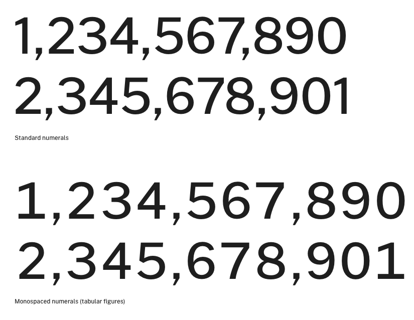
- Allow for good data design with tabular figures.
- Be strong and neutral.
- Encourage continuous improvement — strive to be better, not necessarily perfect.
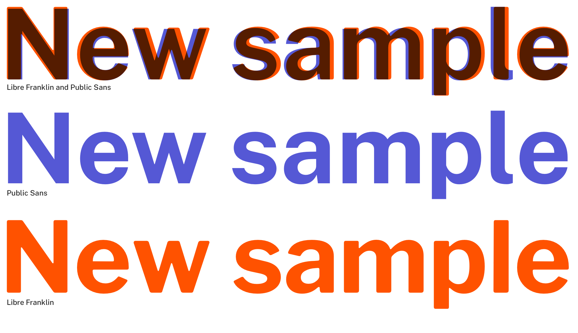
How Public Sans differs from Libre Franklin
Public Sans is a fork of the SIL Open Licensed face Libre Franklin. Public Sans has many similarities with its parent, but differs enough in its particulars that its effect is distinct.
Adjusted vertical metrics. Public Sans is about 2% shorter than Libre Franklin, and has slightly looser default line spacing.
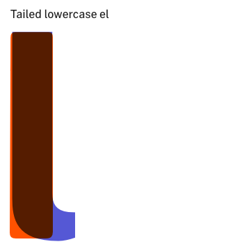
Tailed lowercase l. The lowercase l character has a hooked tail for disambiguation. (There is also an optional untailed l .)
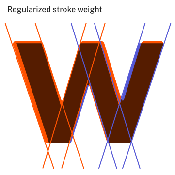
Regularized stroke weight. Public Sans provides a more regular letterform from the conventional Franklin shape for a cleaner, more consistent letterform, especially at small sizes.
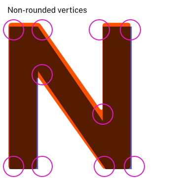
Non-rounded vertices. Conventional angled vertices result in a sharper, stronger form.
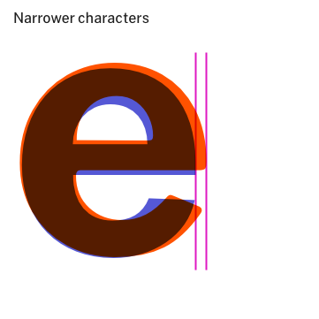
Narrower characters. Public Sans is narrower, especially in rounded characters like lowercase e to help with reading flow, especially in longer texts.
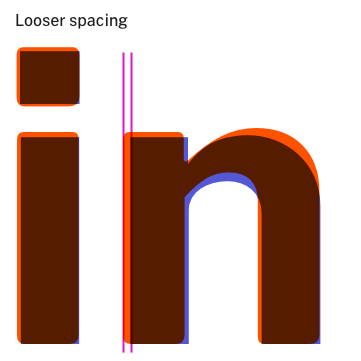
Looser letterspacing. Public Sans has relatively loose letterspacing for reading, especially when compared with Libre Franklin, which is quite compact.
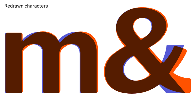
Redrawn characters. Public Sans tends to use more consistent curves in its letterforms and has a focus on a smooth shape for its counters.
Overall, Public Sans differs from Libre Franklin in its focus on longform reading and neutral UI applicability. It takes inspiration from geometric sans faces of the 20th century, as well as the original Franklins of the 19th, resulting in something of a mongrel face that retains its American origin.
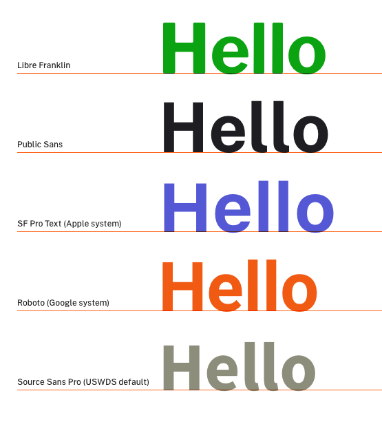
Public Sans and comparable sans-serif faces
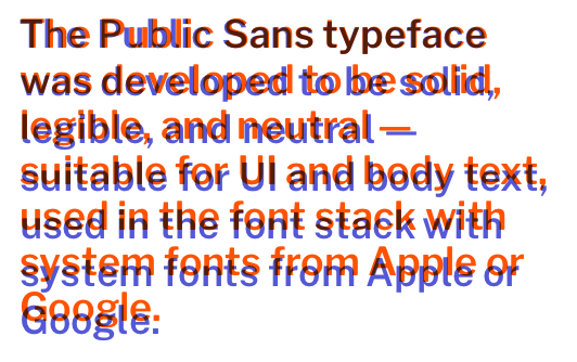
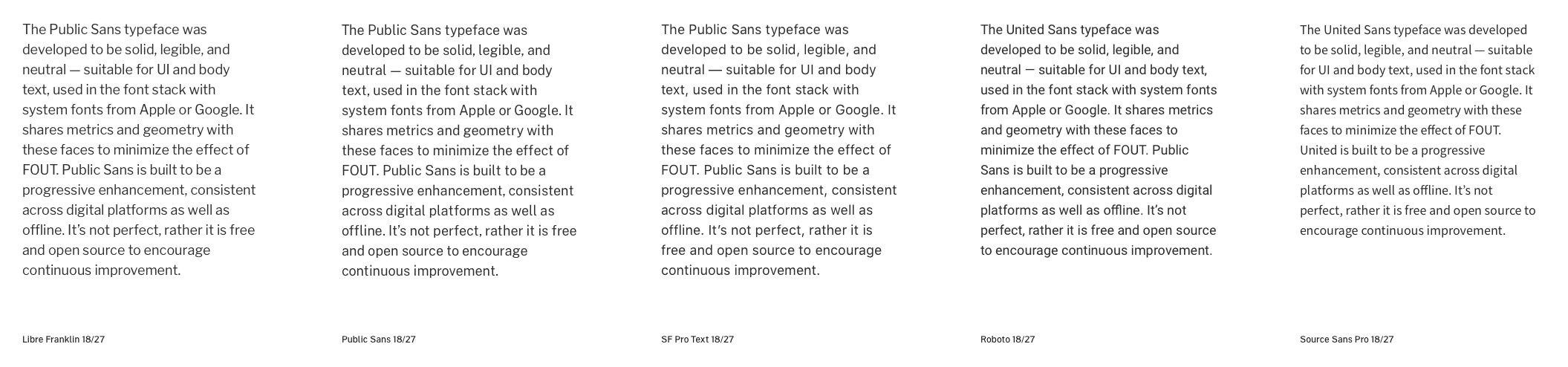
Public Sans is designed to be a progressive enhancement webfont, and to work well with Apple and Google system fonts as the base in its font stack. It's designed to have metrics most similar to SF Pro Text (the Apple system font) and to fall somewhere between SF Pro Text and Roboto (the Google system font) in its overall size and appearance. If a user's machine does not display webfonts, sites designed with Public Sans should appear close to the designer's intention.
Public Sans is a good option for sites that currently use Open Sans, Tahoma, Libre Franklin, Arial, or Helvetica.
Public Sans is sized somewhere between SF Pro Text and Roboto
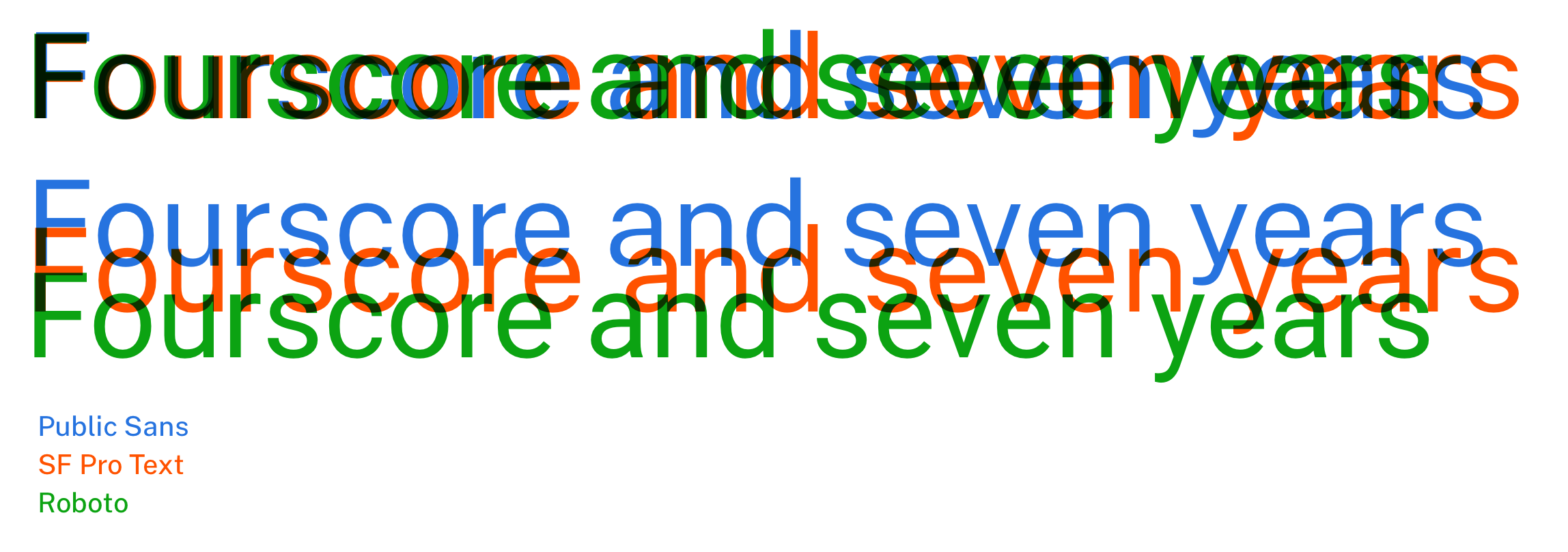
Text set in Public Sans has a similar shape and color to SF Pro Text
Additional features
Tabular figures (monospaced numerals)
License
Public Sans is licensed under the SIL Open Font License, Version 1.1
License of USWDS’s Modified Version is based on the Libre Franklin SIL Open Font License, Version 1.1 section of LICENSE.md. The terms and conditions for modifications made to the original font by USWDS in the USWDS Modified Version can be found at https://github.com/uswds/public-sans/blob/master/LICENSE.md.