
puppertino-table
v0.14.0
Published
Composable Finder-style React components and accessible TanStack tables, styled with Puppertino.

Maintainers
 kahwee
Readme
Puppertino Table
Build Finder-style React workspaces, accessible tables and resizable column browsers with Puppertino and TanStack Table. Compose the window, toolbar, sidebar, previews and menus around your own data and actions.
Live Storybook · Finder walkthrough · API guide · npm
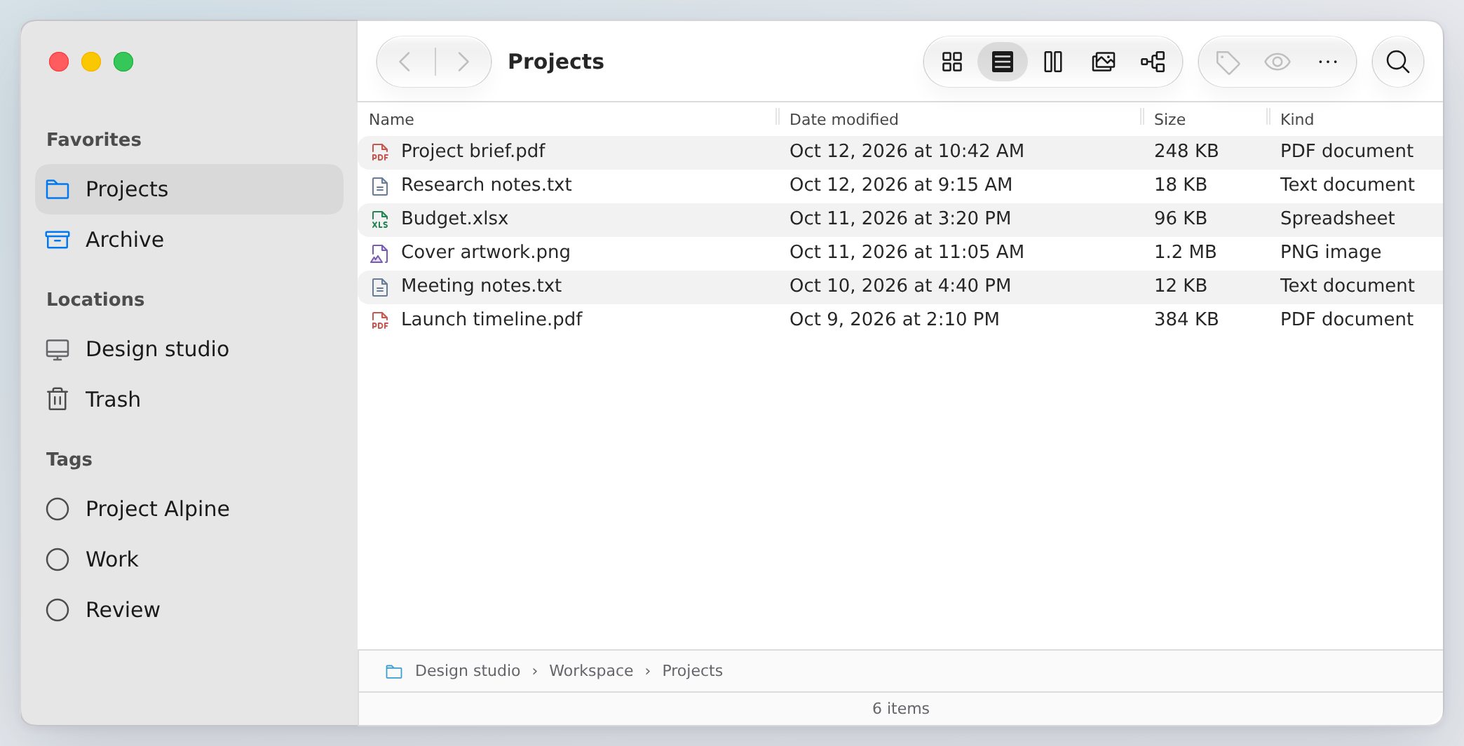
Choose your starting point
| Build | Use | Explore |
| --- | --- | --- |
| A complete table | TableView and typed column helpers | Table stories |
| A hierarchy with lazy children | OutlineView with app-owned loadChildren | Outline stories |
| Resizable sidebar/content/detail panes | SplitView | Split stories |
| A standalone navigation sidebar | Sidebar, SidebarGroup, SidebarItem | Sidebar playground |
| A Finder workspace | Window, toolbar, sidebar, views, preview and status primitives | Composition recipes |
| A column browser | ColumnView with caller-rendered columns and items | Browser stories |
Tables support local or server-owned sorting, shared range selection and bounded pointer/keyboard resizing. Browser panels resize independently. Density, dark themes, menus and optional width persistence work across the shared primitives. Fine-grained sizing subscriptions keep the memoized row body out of resize renders.
Sidebar
Use the sidebar on its own or inside your own split view. Your app supplies selection and navigation.
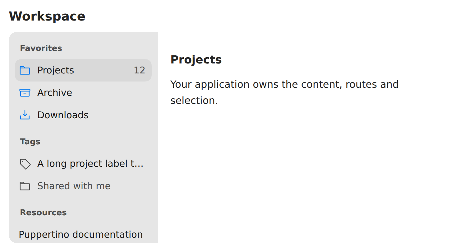
import { Sidebar, SidebarGroup, SidebarItem } from 'puppertino-table';

<Sidebar aria-label="Sections">
  <SidebarGroup label="Favorites">
    <SidebarItem selected={section === 'projects'} onClick={() => setSection('projects')}>
      Projects
    </SidebarItem>
    <SidebarItem href="/archive" detail={12}>Archive</SidebarItem>
  </SidebarGroup>
</Sidebar>
Import Puppertino's sidebar CSS and puppertino-table/style.css. Use size="small", "medium", "large" (default), or "touch"; icons, details, native props and refs are supported. Touch pointers receive larger row targets. FinderSidebar uses the same primitives within the Finder layout.
Install
pnpm add [email protected] @tanstack/[email protected] @codedgar/puppertino@2 [email protected] [email protected]React and React DOM (^19.3.0), TanStack Table and Puppertino are peer dependencies. Base UI is included as a runtime dependency for shared context-menu behavior. Import the Puppertino styles used by your components, followed by the library stylesheet:
import { TableView, createPuppertinoColumnHelper } from 'puppertino-table';
import '@codedgar/puppertino/colors';
import '@codedgar/puppertino/lists';
import '@codedgar/puppertino/forms';
import 'puppertino-table/style.css';

const helper = createPuppertinoColumnHelper<{ id: string; name: string }>();
const columns = helper.columns([
  helper.accessor('name', { header: 'Name', size: 280, minSize: 160 }),
]);
const items = [{ id: 'brief', name: 'Project brief.pdf' }];

export function Files() {
  return (
    <TableView
      data={items}
      columns={columns}
      getRowId={item => item.id}
      getRowLabel={item => item.name}
      ariaLabel="Files"
      density="compact"
      selectable
    />
  );
}
Sorting automatically orders the supplied rows by default. Set manualSorting for server-paginated data or other app-owned ordering. The API guide covers controlled state, server pagination, persistence, styling and primitive composition.
Five views, one workspace
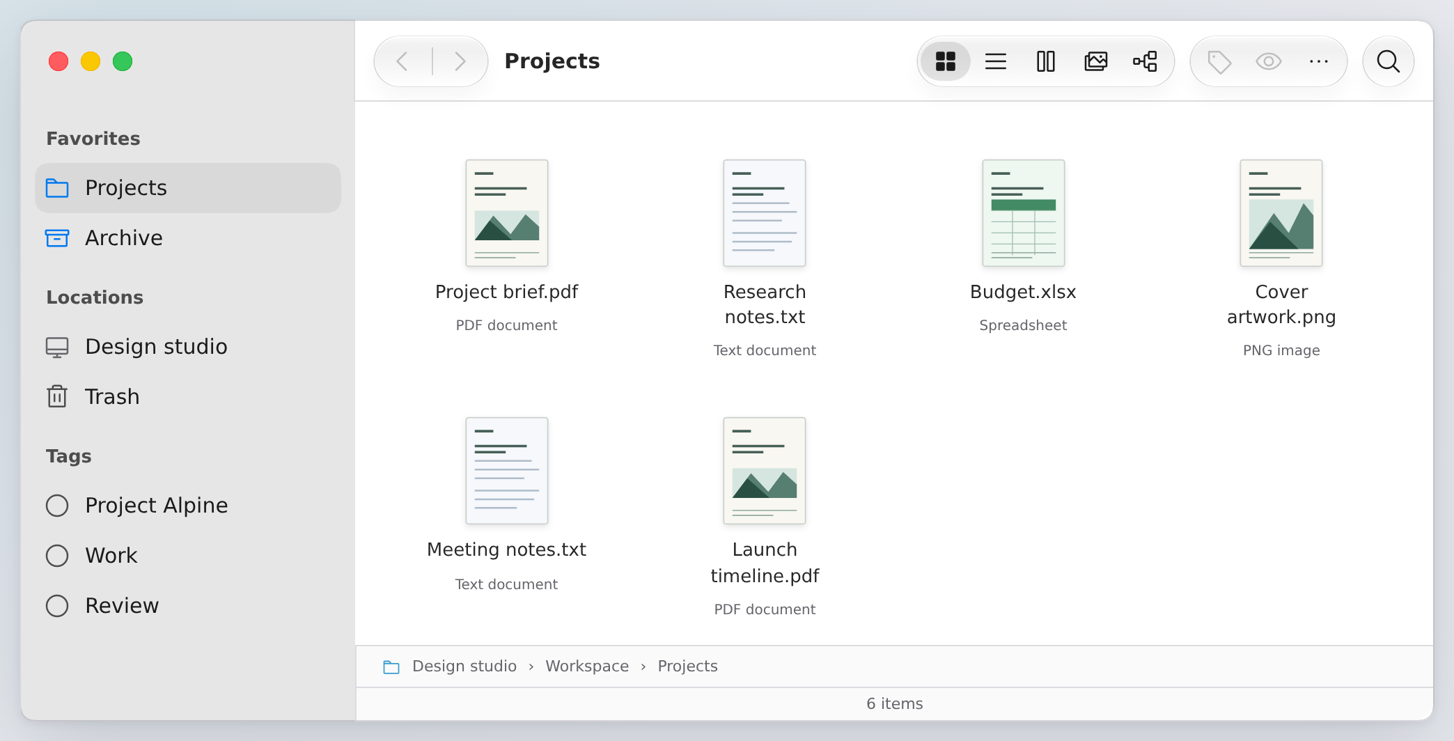
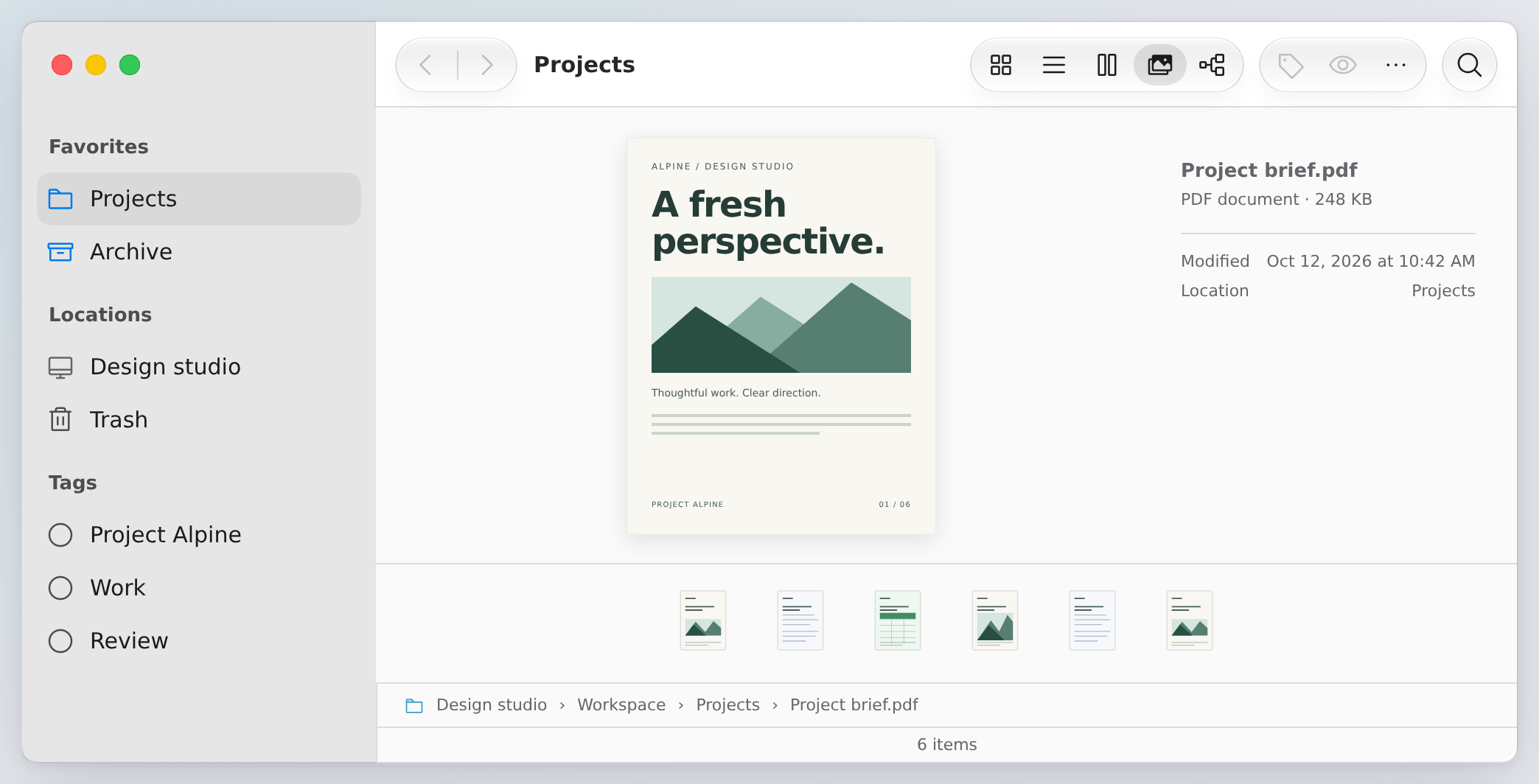
The Finder example shares selection between List, Icons, Columns, Gallery and Outline. Search, folder history, tags, previews and in-memory file operations belong to the example app. The public components provide layout, table/browser geometry, gestures and menus.
For Tahoe-style chrome, use FinderWindow appearance="tahoe". Add keyboardNavigation to FinderToolbar for one Tab stop and arrow-key navigation; Search keeps native editing keys. Button label provides an accessible name and hover hint. Toolbar recipe · Apple references and next steps.
FinderToolbarItems moves optional tools into overflow and lets users choose their tools and order. Give items a group label to separate view choices from commands. Keyboard focus follows tools into overflow when the window narrows. FinderWindow active="auto" softens an unfocused window while preserving selection. In the Finder List view, use a header’s ⋯ button, right-click, or Shift+F10 to sort and choose columns; Name stays visible.
Agent Browser critique and comparison, with screenshots.
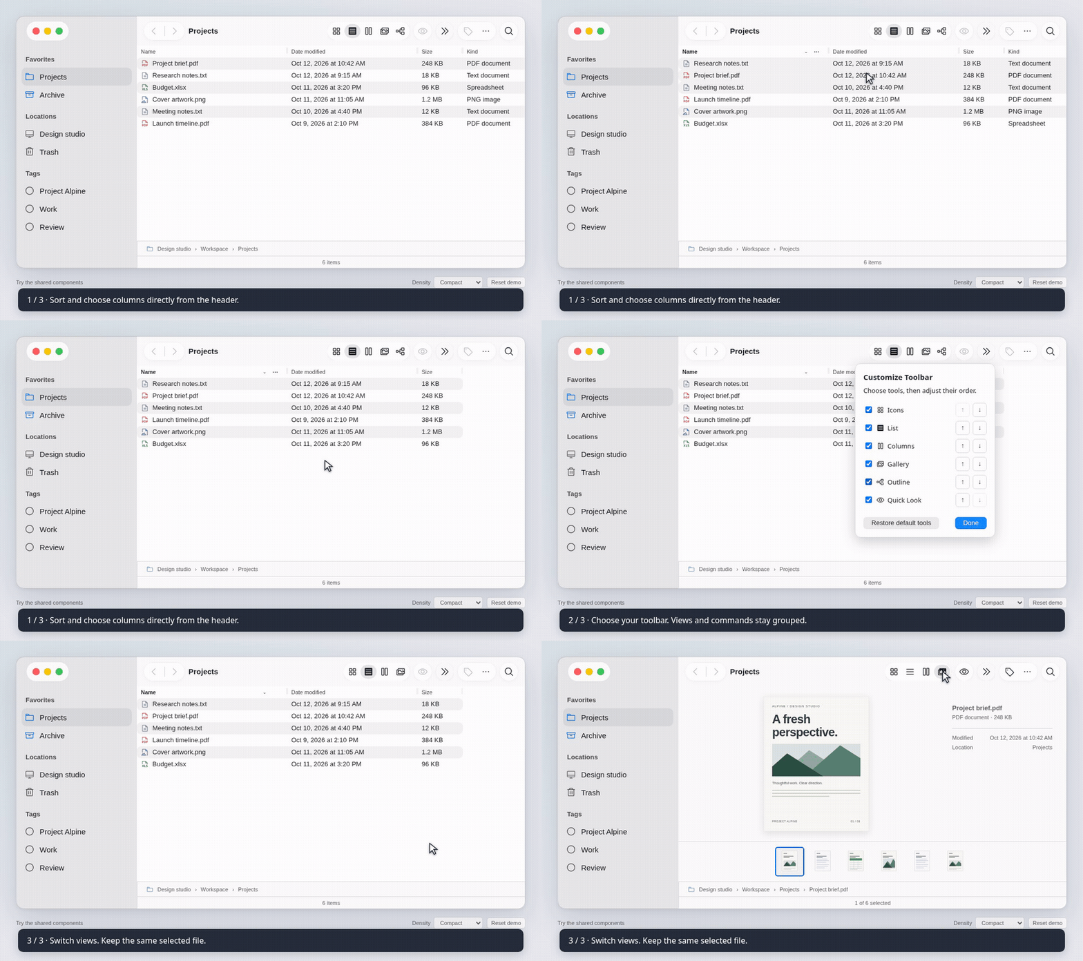
Watch the Finder workflow (MP4) · Toolbar screenshot
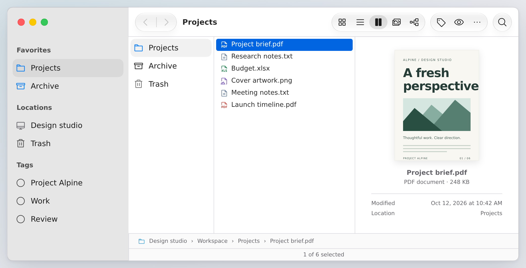
| Icons | Gallery |
| --- | --- |
|  |
 |
Try Outline in Finder · Try the Finder · Build it from public components
Selection, spacing and themes
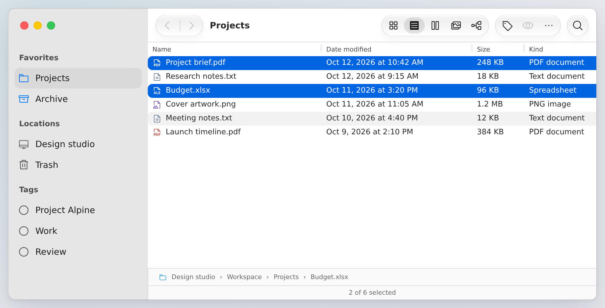
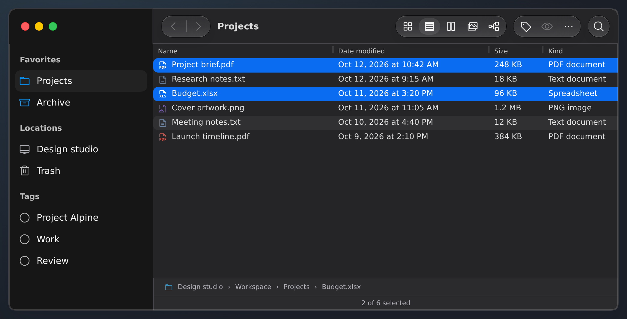
Command/Ctrl-click toggles an item; Shift-click extends a range from a fixed anchor. Change density or theme while keeping your workspace state.
| Compact selection | Dark theme |
| --- | --- |
|  |
 |
Compare comfortable spacing · Dark columns · Narrow columns
Hierarchy and split views
Finder’s Outline view groups the current file collection into expandable Documents, PDFs, Notes, Spreadsheets and Artwork. It shares file IDs, selection, commands and sorting with the other views; List and Outline also share column widths. The demo groups are app-owned collections, not filesystem access.
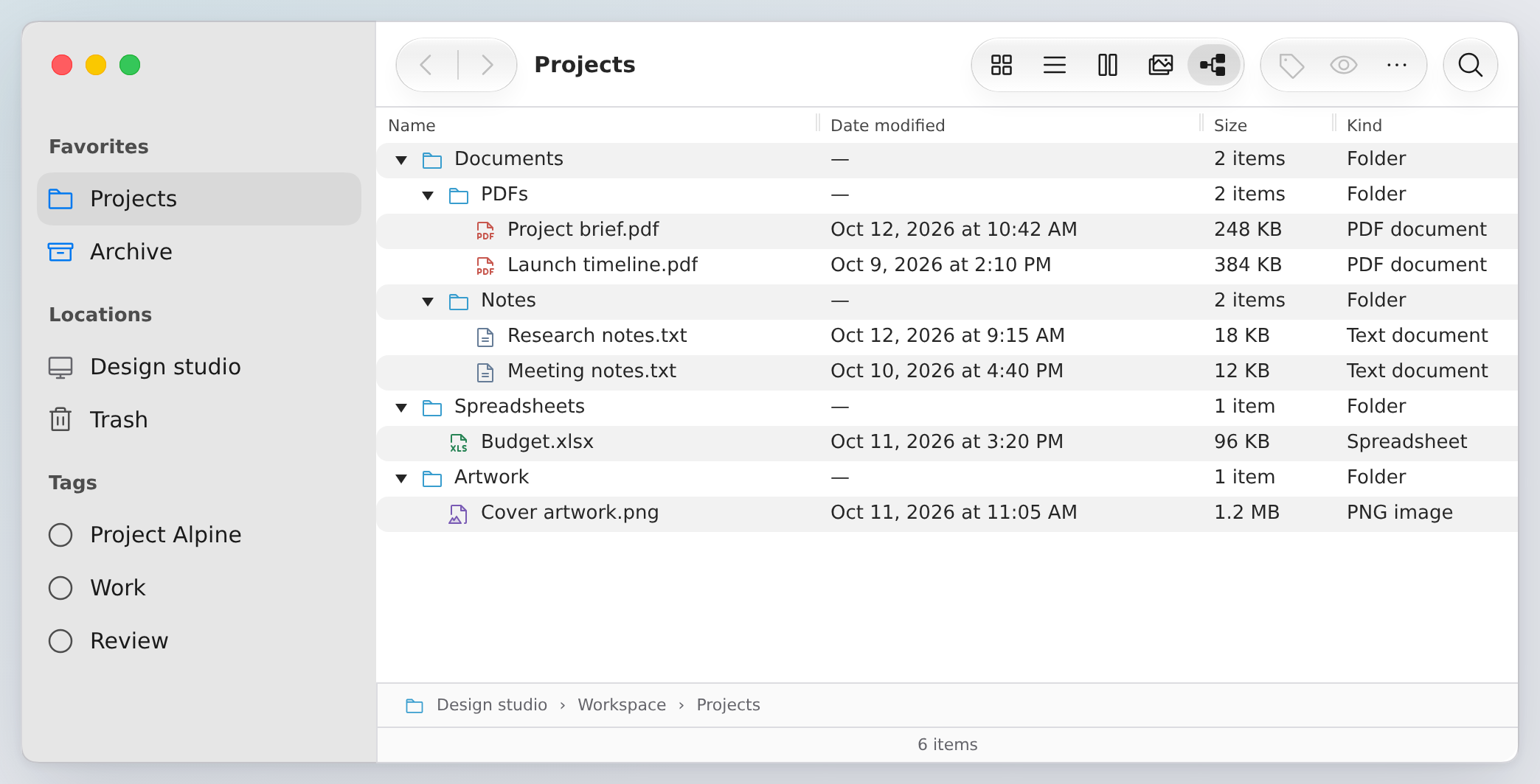
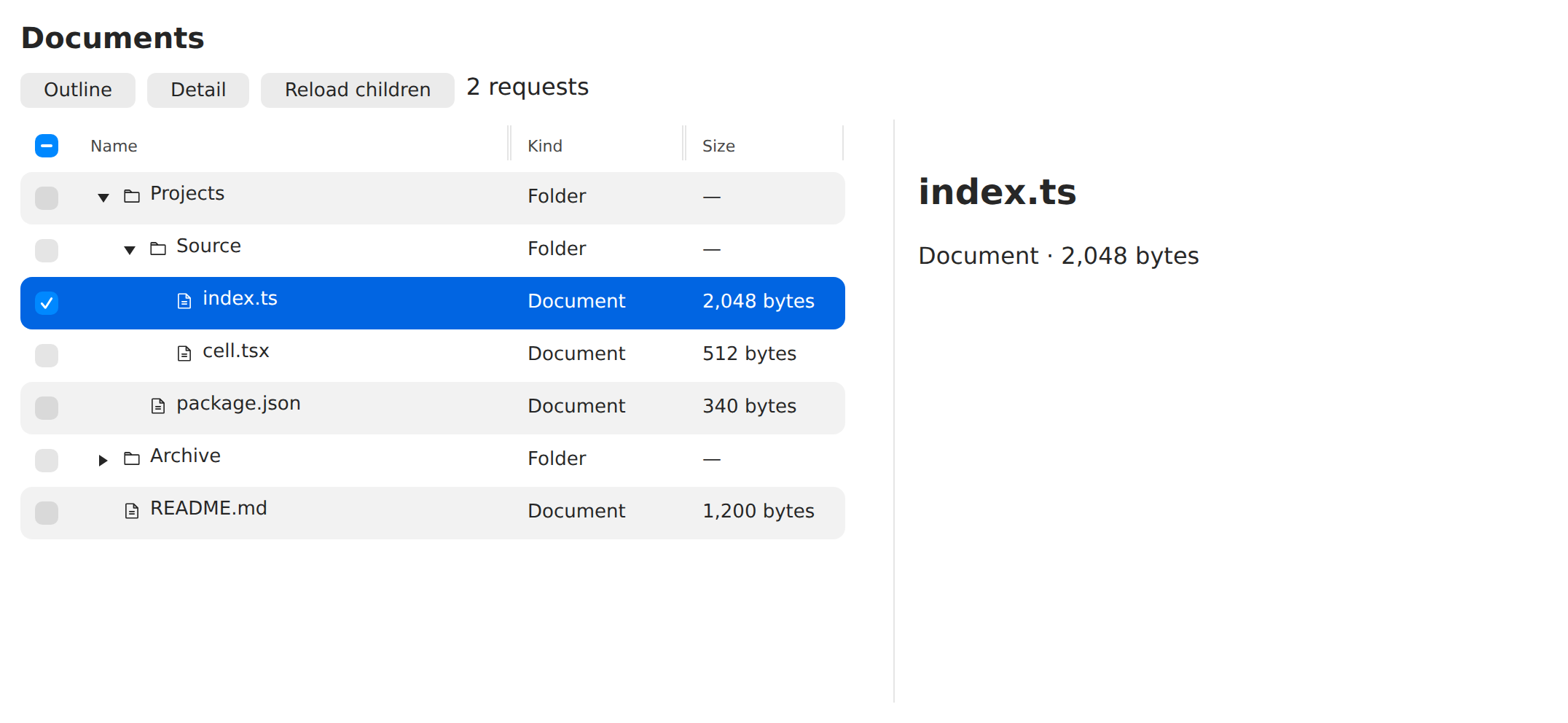
OutlineView keeps disclosure in the first column, sorts siblings together, and supports keyboard navigation and visible-row bulk selection. Supply loadChildren(item, { signal }) to fetch a branch on expansion. Loading, retry, cancellation and caching stay scoped to that branch.
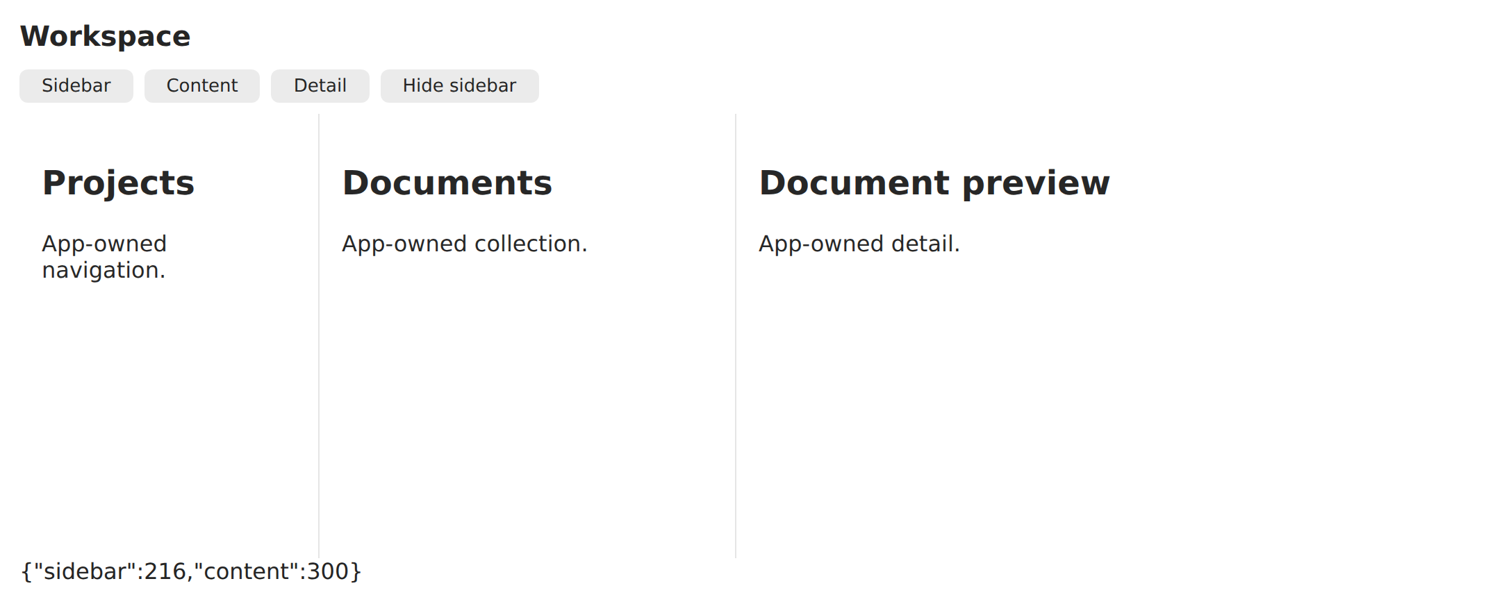
SplitView arranges sidebar, content and detail panes with bounded resizing. Hide and restore panes without losing app state; compact layouts show the active pane. Use horizontal or vertical orientation and completion callbacks to persist finished sizes.
Outline playground · Split playground · Touch sidebar · Dark outline
Watch the interactions
Real Storybook workflows with fictional data, short captions and a visible pointer. Full-size videos are available as WebM and MP4.
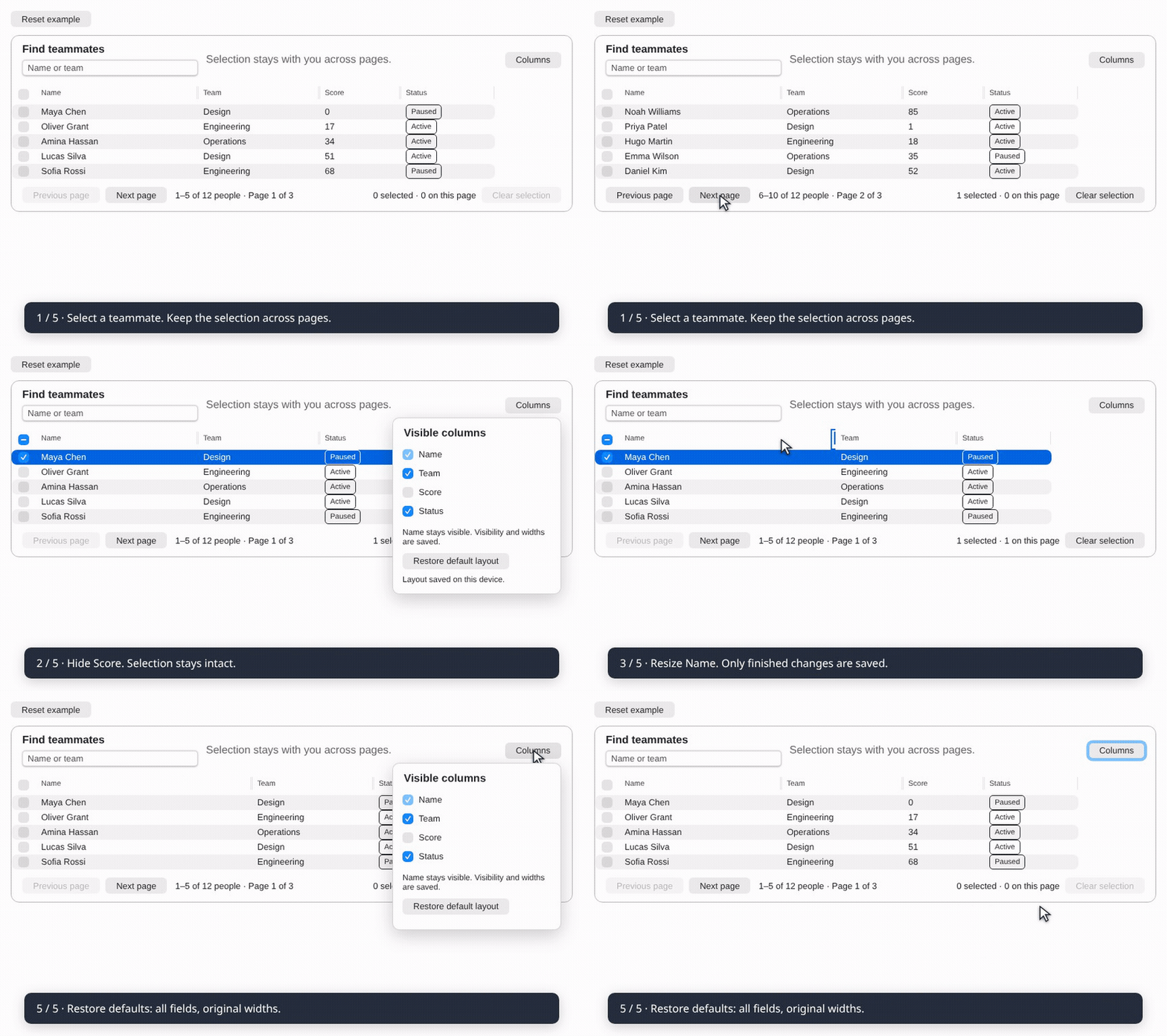
Saved columns and selection across pages
WebM · MP4 · Try the Paged workspace
The Columns menu hides optional fields and remembers visibility, order and completed widths on this device. Name stays visible and first; hidden fields keep their widths. Open a header’s column options to move it earlier or later. Restore default layout resets both. Selection survives paging, search and sorting; reloading starts a fresh selection.
Resize and reset
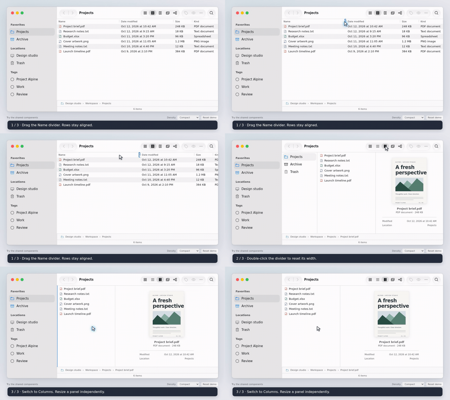
WebM · MP4 · Try resizing
Drag a divider or use arrow keys. Shift-arrows take larger steps, Home/End reach the limits, and Enter or double-click resets the width. Escape cancels an unfinished drag. Completion callbacks report committed widths; preview callbacks can report each change.
File commands, with a keyboard alternative
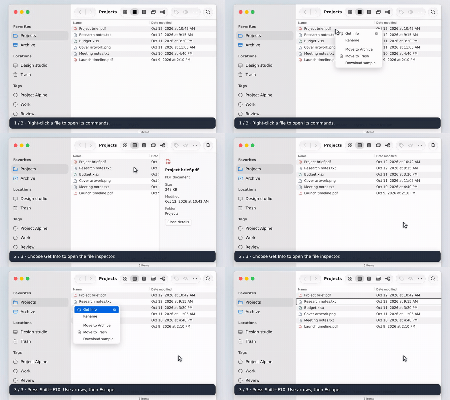
WebM · MP4 · Menu recipe
The shared ContextMenu composes Base UI’s context-menu primitives, retaining Puppertino styling. Right-click or press Shift+F10 on a focused item. Arrow keys navigate menu items; disabled entries cannot activate. Escape closes the menu and restores focus. Your app supplies commands such as Get Info, Move to Archive and Move to Trash.
Move a file and verify its destination
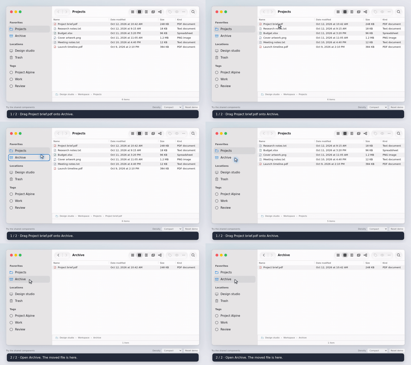
WebM · MP4 · Demo source
The example composes native HTML drag/drop with shared rows and items. Moves update in-memory state; Move to Archive provides a keyboard alternative. The package does not supply filesystem operations or a drag/drop engine.
Load and retry a hierarchy
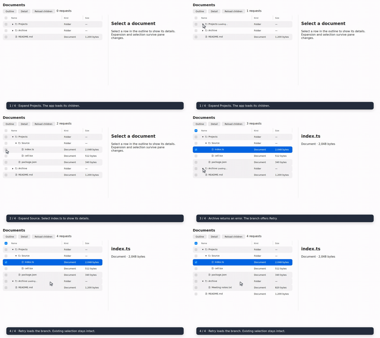
WebM · MP4 · Lazy-loading recipe
Resize, hide and restore split panes
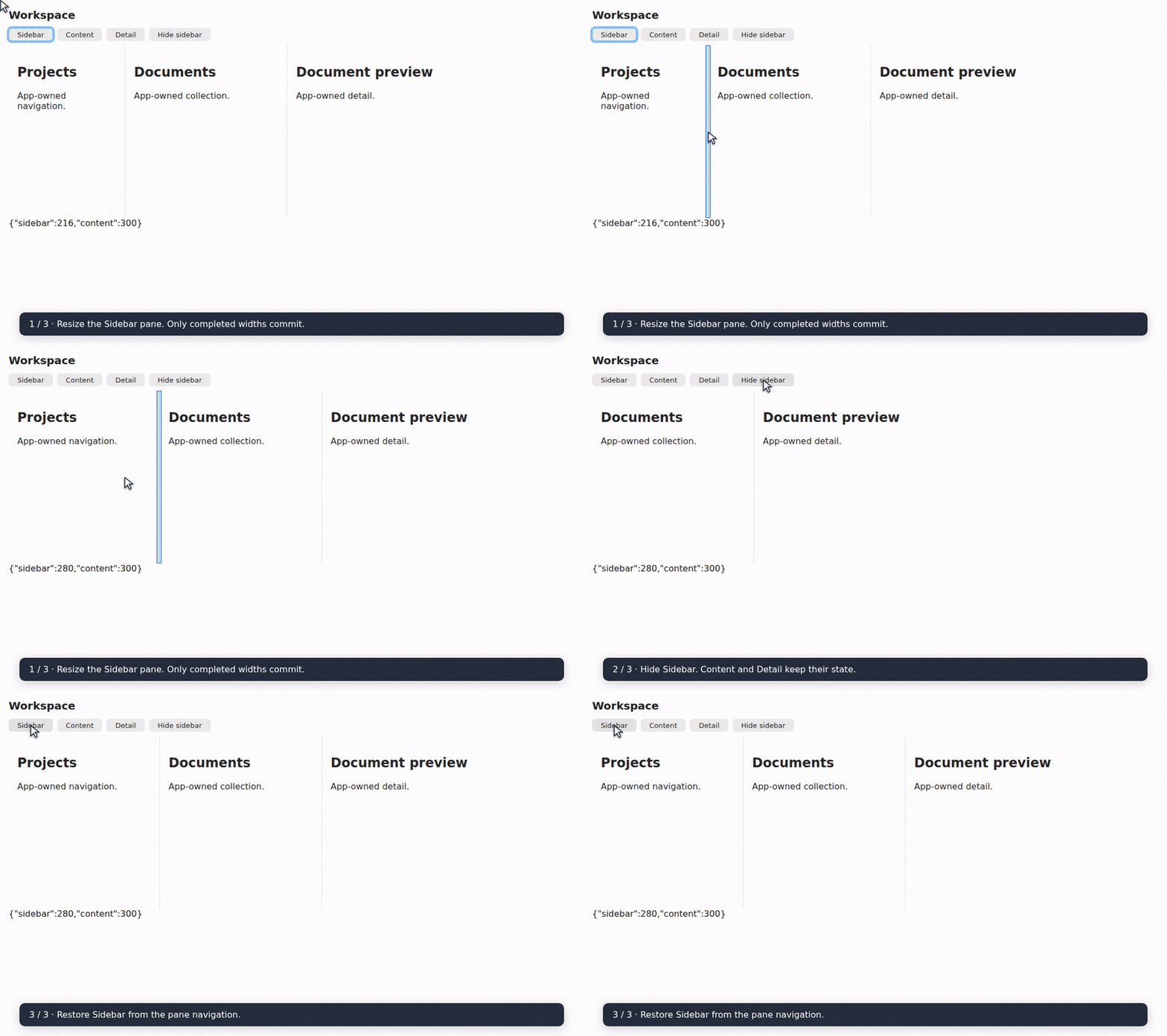
WebM · MP4 · Split-view recipe
Tags
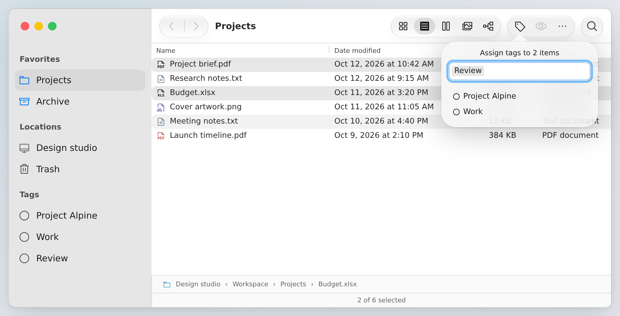
TagPicker is independent of Finder and tables. It takes stable tag IDs and
controlled values; your application owns creation, persistence and bulk updates.
import { useState } from 'react';
import { TagPicker, type TagOption } from 'puppertino-table';
import '@codedgar/puppertino/colors';
import '@codedgar/puppertino/buttons';
import '@codedgar/puppertino/popovers';
import 'puppertino-table/style.css';

const options: TagOption[] = [
  { id: 'review', label: 'Review' },
  { id: 'work', label: 'Work' },
];

function DocumentTags() {
  const [value, setValue] = useState<string[]>(['review']);
  return <TagPicker options={options} value={value} onValueChange={setValue} />;
}
Pass mixedValue for tags present on only some selected records. Choosing one
adds it to value; apply that addition to every selected record. Optional
onCreate(label) receives a trimmed name: add its option and assigned ID in your
application. Existing labels match without case sensitivity, preventing duplicate
creation suggestions. IDs must be unique; unknown assigned IDs remain visible.
Arrow keys navigate suggestions; Enter assigns or creates. Backspace in an empty field focuses the last token before a second Backspace removes it. Escape closes and returns focus. Disabled options cannot be assigned or removed. The native Popover API keeps the panel above clipping containers; current browsers supporting that API are required. Puppertino supplies its material, arrow, shadow and theme.
Icons
Use trigger for your own icon and triggerClassName for a Puppertino toolbar
button. The library has no icon dependency. The Finder examples use
Phosphor Icons through @phosphor-icons/react,
following Puppertino’s icon guidance:
20px regular toolbar icons, filled selected views, and duotone file-type icons.
To use the same icons in your application:
pnpm add @phosphor-icons/reactimport { FolderIcon } from '@phosphor-icons/react';
import { FinderSidebarItem } from 'puppertino-table';
<FinderSidebarItem selected icon={<FolderIcon weight="fill" aria-hidden="true" />}>
Documents
</FinderSidebarItem>Icon slots accept any React node. Label the enclosing control; decorative icons use aria-hidden="true".
State and resize contracts
Checkboxes and row gestures share a fixed range anchor. Pass selectionAnchor to share selection across layouts. Each state slice has one owner: internal state, a controlled value/callback, or an external atom. Standalone change callbacks observe internal state; atom owners subscribe to their atom.
PuppertinoTable.onColumnSizingCommit and ColumnBrowser.onWidthsCommit receive completed resize snapshots. Cancelled gestures do not persist widths. State and persistence guide · Migrating to 0.8
Storybook playgrounds
Code starts with a short integration; expand Supporting code in Docs for the complete files. Try empty, long-name, large and read-only datasets through args in Table and the composed workspace. Selection counts, command results and empty-state recovery stay visible in the workspace.
Install @tanstack/react-store for atom-owned examples. The Paged workspace filters and sorts before paging, keeps selection by stable ID, and subscribes to footer counts. Actions shows callbacks; Interactions checks each workflow.
Added in 0.14.0: saved layouts, named presets and column ordering.
useColumnLayout({ columns: schema, storageKey }) saves visibility, order and completed widths. Keep schema stable, give each field a label and width bounds, and mark Name pinned: true. Filter definitions through layout.hidden; TanStack owns the order through layout.columnOrder. Then connect:
<PuppertinoTable
  data={rows} columns={visibleColumns}
  getRowId={row => row.id} ariaLabel="Items"
  atoms={{ columnSizing: layout.columnSizing, columnOrder: layout.columnOrder }}
  onColumnSizingCommit={layout.commitWidths}
  onColumnOrderCommit={layout.commitOrder}
  reorderable={layout.ready} lockedColumns={['name']}
  resizable={layout.ready}
  getHeaderMenu={column => layout.ready
    ? columnLayoutMenu({ ...layout, columns: schema }, column.id) : []}
/>
Drag headers to reorder; Escape or dropping outside the headers cancels. Name stays first. Keyboard reordering remains in column options. Grouped headers keep their declared structure. Sorting and resizing retain their separate gestures.
Import Puppertino’s forms and buttons CSS for the picker. Pass named presets to useColumnLayout and render <ColumnLayoutPicker controller={layout} /> for a compact picker with save, rename and delete. Built-ins are protected; personal snapshots persist separately from the current layout. Unsaved edits show Custom layout.
Restore defaults resets visibility, order and widths. Hidden fields retain widths; stale IDs and malformed preferences are discarded. Restoration runs after hydration. Optional legacyWidthsKey migrates width-only preferences. The app owns selection and sorting, including recovery when the sorted field is hidden.
These examples follow Storybook args, interaction testing, and TanStack Table v9 guidance for state ownership and row selection.
Choose flat rows (Table), a tree (Outline), a folder path (Column view), or adjacent panes (Split view). Internal state stays local; React owns values/callbacks; atoms share state. Set manualSorting for server-owned order.
Open named scenarios from the component docs to start with typed args presets. Table Controls group appearance, selection, sorting, sizing and accessibility; State ownership compares React and atoms with matching recipes. The composed document workspace combines locations, resizable panes, previews, tags and Trash/undo. Named Interactions steps explain each workflow; Reset example restores local data and argument defaults.
Each component opens with a typed Playground that stays at its declared defaults. Component docs pair live Controls with concrete scenarios, integration decisions and keyboard guidance. Use Controls for prop variants, shared Theme and Viewport toolbars for appearance and responsive layouts, and the native Code panel for complete public integration recipes. Outline disclosure/selection and Split pane visibility/navigation synchronize with args and expose callbacks in Actions. Named Interactions steps make workflows replayable. Regression-only canvases are excluded from navigation and Autodocs. Column view combines table/column layouts, internal/controlled/read-only/persistent widths, density and menu triggers. Tag picker offers option datasets, mixed values, disabled tags and optional creation. Finder views and checkbox settings use args; the Theme toolbar applies across stories. Distinct API recipes and interaction workflows keep their own examples.
Develop
pnpm install --frozen-lockfile
pnpm storybook       # interactive examples
pnpm check           # lint, types, unit/browser/hydration and packed-consumer checks
pnpm profile:resize-bursts # compare immediate and frame-batched pointer previews
pnpm profile:columns # production drag/resize profile and render-count assertions
pnpm capture:readme  # regenerate screenshots and screencasts; Chromium + ffmpeg
GitHub Actions runs the same gates as pnpm check in seven independent runner jobs: quality (lint/types/unit tests), packed-consumer verification (including a fresh library build and checked-in dist comparison), demo/hydration, and four Storybook suites (interactions, tables, Finder workflows and docs). The Storybook interaction runner reuses an empty host and caches shared assets, while each story receives a fresh iframe to isolate its state. Each browser job builds its own fixture; Storybook suites use separate runners and browser contexts. PUPPERTINO_BROWSER_SUITE=demo or stories selects a shard; the default local browser command runs every suite with concurrency capped at two. Use stories-interactions, stories-table, stories-finder or stories-docs to run one Storybook suite. Only browser jobs install Chromium; its download is cached by OS, architecture and lockfile. CI, npm preparation and release verification share this workflow. Release jobs download the already-verified package instead of rebuilding it, then retain the exact-tag, SHA and integrity checks. Pages deployment and npm publication wait for every verification job; superseded pull-request runs are cancelled. This trades additional runner minutes for a shorter critical path. Media is kept in the repository and Pages, outside the npm package. See media capture, releasing and pointer profiling.
Collection benchmarks: run pnpm profile:collections to record seven warmed samples for selection and navigation at 100, 1,000 and 10,000 rows. Results include medians and environment details in test-results/performance/collections.json; CI uploads them as collection-performance. Compare reports on equivalent machines rather than treating shared-runner timings as pass/fail thresholds. Browser runs also write test-results/browser/timings-<suite>.json, including failed phases, alongside the browser evidence artifacts.
For repeated nextItemId calls with an unchanged order, pass a stable frozen array (Object.freeze(ids)) to reuse its deduplicated navigation index. Replace the array when the order changes. Mutable arrays remain supported and are recomputed on each navigation; ignored keys and Home do not build an index. The first supported navigation through a frozen array still pays the preparation cost; the benchmark measures warmed calls.
Outline keeps its navigation index until the visible hierarchy changes and uses a linear wrapped typeahead search. Column resize previews are applied at most once per animation frame; completion flushes the latest position before persistence, and cancellation discards queued previews. Keyboard resize, reset and coupled-pane normalization remain immediate. See pointer profiling for the synthetic burst comparison and its limits.
MIT. React, React DOM, TanStack Table, Puppertino, Base UI and Phosphor retain their respective licenses.