
q-former
v1.0.6
Published
vue json form 生成器, 适配element iview
Downloads
15
Maintainers
 venus_jin
Readme
QFormer (前身vue-form-creator) (element ui/ iview适配版本)
QFormer 谐音
kill former、cute former, 表单大杀器帮助开发者迅速搞定vue生态(element-ui、iview)表单开发
- el-form 在复杂表单上代码量较大
- 动态校验表单项比较麻烦
- 表单多字段联动在tempalte 与 js中穿插 代码混乱
解决方案 使用json方案描述表单,对表单数据自动更新,对elment表单控件只做适配(采用jsx透传ui控件属性)
vue-cli 3.0引入jsx写法编译
vue 版本要求 > 2.6.0
npm install @vue/babel-preset-jsx @vue/babel-helper-vue-jsx-merge-props -D修改 babel.config.js/.babelrc
module.exports = {
    presets: [
       ['@vue/app', {
           useBuiltIns: 'entry'
       }],
        ['@vue/babel-preset-jsx',
        {
            "injectH": false
        }]
    ]
}
注意:@vue/babel-preset-jsx默认会注入一个h语法糖,会与vue本身冲突,这个配置要设置false,否则项目启动会报错
qformer api
参数 | 说明 | 类型 ---|--- | --- v-model | 表单值(对应el-form model)| object option | el-form 配置透传,除了disabled以外,详见 option| object fields | 表单域数组 | Array( item 可以是object 或 array ) @submit | options.buttonGroup 为true时,提交点击| function(form) @cancel | options.buttonGroup 为true时,取消点击 |
qformer 对外暴露一个 getFormRef() 来返回el-form的ref
option api
参数 | 说明 | 类型 | 可选值 | 默认值 ---|--- |--- |--- |--- status | 代替disabled(boolean)| string |edit、disabled、 preview| edit debug | boolean, 快捷调试入口 | boolean | - | false autoAuffix(后续会使用colon替代) | el-form-item label 后缀自动补齐(如: '姓名' -> '姓名:') | boolean | - | false colon | 是否自动补齐label冒号 | boolean | - | false itemSpan | formItem span全局参数,优先级itemSpan < formItem.span | number | 0~24 | 24 itemGutter | el-row gutter参数 | number | 0~24 | 0 buttonGroup | 表单 submit、cancel按钮组合| boolean/function| true/false,function 返回按钮数组| false
fields item api
参数 | 说明 | 类型 | 可选值 | 默认值 ---|--- |--- |--- |--- tag | 标签, 与component不同时使用| string | - | el-input component | 组件,适用于自定义表单控件值 | function | - | - formItemComponent(0.12.0) | 组件,适用纯ui展示 | function | - | - label | label展示值,同下item(label),优先级 label < item.label name | 表单对应字段 | string | - | - options| select checkbox-group时使用 | {label: '', value: ''}[] | formItemStatus (0.12.0) | 优先级高于 option.status,便于表单部分字段特殊状态处理 | string | edit、preview | edit previewValue/previewFormItemValue| 可选参数,当option.status 为preview时生效,展示文字自定义 | - | (value, h) => value| form[name] scopedSlots | 可选参数,动态slot,必须使用h函数 | jsx component[] on | 控件事件透传,在需要做字段联动时使用| object rules | 该字段校验规则,与el-form一致 gutter | 可选参数,布局 对应el-row, 只在config item 为Array时配置在Array[0]上 span | 可选参数,布局 对应el-col item| 对应el-form-item 属性透传,(prop 对应 name, 不需要再声明prop)| object| | {label: ''}
fieldsGroup api
参数 | 说明 | 类型 | 可选值 | 默认值 ---|--- |--- |--- |--- wrapperComponent | 包裹表单区域 (content) => ({content}) | function | - | - fieldsGroup | 同fields | Array | - | -
在component/scopedSlots中 组件书写方式(0.10.0之前版本)
- component: import 过来以.vue结尾的,以jsx functional component 实现的,直接写变量;
- scopedSlots: 要以jsx形式书写
h => jsx component
0.10.0以后的版本不需要再写 h 函数了(可选)
example
- 全局引入
import QFormerCreator from 'q-former'
Vue.use(QFormerCreator, {
    // 默认使用element-ui,可不填写,可选element、iview
  ui: 'element',
  // 默认在开发模式开启表单debug, 可不填写
  debug: process.env.NODE_ENV === 'development', 可不填写
  // 组件名默认 q-form, 可不填
  name: 'q-former',
})
<template>
<q-former
v-model="formData"
:option="option"
:fields="fields"
/>
</template>
<script>
export default {
data() {
return {
option: {
'label-width': '100px',
inline: false,
colon: true,
buttonGroup: true, // 默认false
status: 'edit', // 表单状态 edit disabled preview
debug: process.env.NODE_ENV === 'development', // 高于全局优先级
},
formData: {
title: '标题',
age: null,
selectVal: ['1', '2'],
goods: [
{ id: '', name: '2' },
],
}
}
},
computed: {
fields() {
return [
{
item: {// el-form-item
label: '标题',
style: { // 自定义style
'border-bottom': '1px solid red',
},
class: '', // 自定义class
},
tag: 'el-input',
name: 'title',
span: 12, // 布局 el-col 对应的span
},
{
label: '年龄',
item: {
label: '展示年龄', // 优先级高于label
},
tag: 'el-input-input',
name: 'age',
span: 12, // 布局 el-col 对应的span
},
{
tag: 'el-select',
span: 14,
item: {
label: 'select',
scopedSlots: [
h => (<span>元</span>),
],
},
name: 'selectVal',
clearable: true,
multiple: true,
options: [
{ label: '下拉1', value: '1' },
{ label: '下拉2', value: '2' },
{ label: '下拉3', value: '3' },
],
on: {
change: this.selectValChange
},
scopedSlots: [
]
},
...this.getGoods(), // 注意这里是一个数组 数组每一项在一个row里,主要是为了做布局
]
}
},
methods() {
getGoods() {
const goodItem = (i) => [
{
tag: 'el-input',
suffixIcon: 'el-icon-date',
gutter: 10, // gutter 必须在数组第一个
span: 4,
item: {
label: `goodid ${i}`,
},
name: `goods[${i}].id`,
on: {
change: this.titleChange
},
rules: [
{ required: true, message: '请输入编号' }
]
},
{
// tag: 'el-input',
span: 8,
item: {
label: `goodname ${i}`,
},
name: `goods[${i}].name`,
on: {
change: this.titleChange
},
rules: [
{ required: true, message: '请输入name' }
]
},
{
component: (h) => (
<span>
<el-button type="primary" icon="el-icon-plus" circle onClick={this.addGood} ></el-button>
<el-button type="danger" icon="el-icon-minus" circle onClick={() => this.minus(i)}></el-button>
</span>
)
}
]
return this.formData.goods.map((ele, i) => goodItem(i))
},
selectValChange(value) {
console.log('slelect回调', value)
},
submit() {
this.$refs.formbuild.getFormRef().validate(valid => {
console.log(valid)
})
},
},
}
</script>注意 表单fields 不要放在data里, computed 里可以自动关联this、依赖更新响应
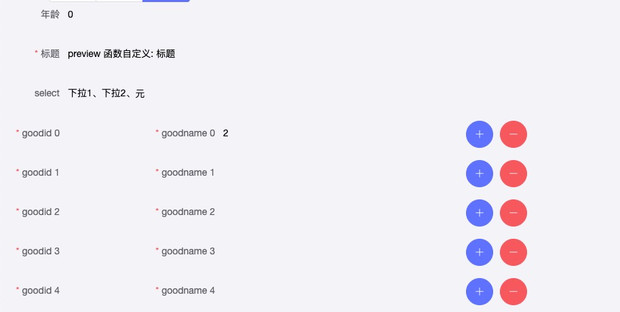
一个带有校验、布局配置的复杂form实现了
- 编辑状态(edit)
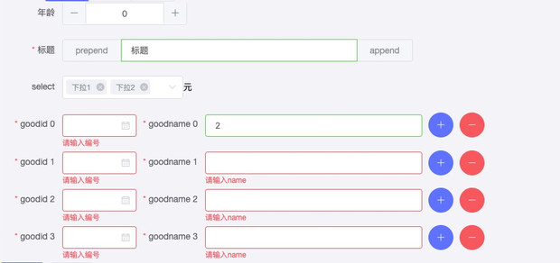
- 禁用状态(disabled)
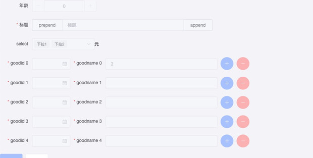
- 预览状态(preview)
- iview 版本demo
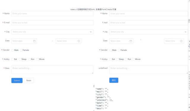 项目代码示例
element
项目代码示例
element
http://gitlab.ywwl.com/H5/xiaoy-zhibo-saas/blob/formcreate/src/views/Demo/FormBuild.vueiview
http://gitlab.ywwl.com/yfe/vue-form-creator/blob/master/src/components/FormDemo.vue项目内网git地址http://gitlab.ywwl.com/yfe/vue-form-creator
工具链tools
rules
为了便于开发,内置了常见校验规则库,使用示例
import {
    validatorFunc,
    decimal0To100, integer, ...
} from 'q-former/lib/rules.js'

fields() {
  return [
    {
      label: '名称',
      name: 'name',
      placeholder: 'Enter your name',
      // formItemStatus: 'edit',
      rules: [
        'required', limitLength(6),
      ],
    },
    {
      label: '价格',
      name: 'fee',
      placeholder: '请输入价格',
      // formItemStatus: 'edit',
      rules: [
        'required', decimal0To100,
      ],
    },
    {
      label: '年龄',
      name: 'age',
      rules: 'required'
    }
  ]
}
已内置规则示例
limitLength(max, min = 0) // 长度限制 0 ~ max

export const regs = {
  // 1 ~ 100之间的整数
  integer1To100: [/^(([1-9]\d?)|100)$/, '请输入非零正整数且不大于100'],
  // 非负整数
  positiveInteger: [/^[0-9]*$/, '请输入整数'],
  // 整数 包含: 正 负 0
  integer: [/^-?[0-9]*$/, '请输入非负整数'],
  // 最多保留2位小数
  maxDecimal2: [
    /^-?[0-9]+(.[0-9]{1,2})?$/,
    '请输入数字,最多保留2位小数',
  ],
  // 0 ~ 100 最多2位小数 包含0
  decimal0To100: [
    /^([0-9]\d?(\.\d{1,2})?|0.\d{1,2}|100|100.0|100.00)$/,
    '100之间数字,最多保留2位小数'
  ],
  email: [
    /^([0-9]\d?(\.\d{1,2})?|0.\d{1,2}|100|100.0|100.00)$/,
    '邮箱格式有误',
  ],
  phone: [
    /^1[0-9]{10}$/,
    '手机号格式有误'
  ],
  url: [
    /^(ht|f)tps?:\/\//i,
    '网址格式有误'
  ],
}
validatorFunc 是对校验写法做一个封装,只需要传入 元祖[reg, message]即为一个校验,内部实现如下
/**
 * 校验 高阶函数
 * @param {*} regRule [reg, message]
 */
export const validatorFunc = (regRule) => {
  const [reg, message] = regRule
  return (rule, val, callback) => {
    // 有输入值 并且输入值不合法
    if (val && !reg.test(val)) {
      callback(new Error(message))
    }
    callback()
  }
}