
raven-dialog
v0.2.0
Published
An Angular dialog box component that makes use of the HTML DIALOG element for improved accessibility.
Downloads
18
Maintainers
 thomashigginbotham
Readme
Raven Dialog for Angular
An Angular dialog box component that makes use of the HTML <dialog> element for improved accessibility.
Features
- Keyboard/touch accessible
- Easily styled with CSS variables
- Use CSS transforms to customize open/close transitions
Installation
Install into your Angular project using NPM.
npm install raven-dialog --save
Import the DialogModule into your module.
import { DialogModule } from 'raven-dialog';

@NgModule({
  imports: [
    DialogModule,
    // ...
  ],
  // ...
})
export class AppModule { }
Usage
Add a <raven-dialog> element to your template, and open or close it by binding a variable to the open attribute.
import { Component } from '@angular/core';
@Component({
selector: 'app-root',
template: `
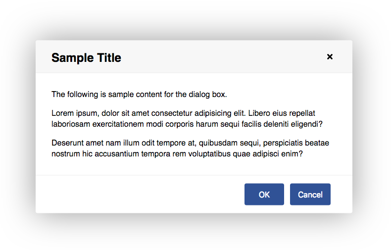
<raven-dialog heading="Sample Title"
[(open)]="isOpen"
[modal]="true">
<p>Dialog box content here.</p>
</raven-dialog>
`,
styles: []
})
export class AppComponent {
isOpen = false;
}Options
| Option | Type | Description | Default Value | :------ | :------ | :----------------------------------------------------- | :------------ | heading | string | An optional heading to place at the top of the dialog. | "" | open | boolean | Whether the dialog is open or not. | false | modal | boolean | Whether the dialog should be modal or not. | false
Styling
CSS variables are used for styling. Example:
raven-dialog {
  --dialog-border: 2px solid #ccc;
  --dialog-border-radius: 5px;
}
Available CSS Variables
| Variable | Description | Default Value | :---------------------------- | :------------------------------------------- | :------------ | --dialog-margin | Minimum left/right margin of the dialog box. | 2rem | --dialog-padding | Padding around the dialog box content. | 2rem; | --dialog-min-width | Minimum width of the dialog box. | 20rem | --dialog-max-width | Maximum width of the dialog box. | 40rem | --dialog-border | Border around the dialog box. | 0 | --dialog-border-radius | Border radius of dialog box. | .25rem | --dialog-transition-in | Transition when opening dialog box. | transform .2s ease-out, opacity .1s ease-out, box-shadow .2s |ase-out | --dialog-transition-out | Transition when closing dialog box. | transform .2s ease-in, opacity .2s ease-in, box-shadow .2s ease-in | --dialog-transform | Transform property of dialog box. | scale(1) | --dialog-transform-in | Transform property when transitioning in. | scale(.9) | --dialog-transform-out | Transform property when transitioning out. | scale(.9) | --dialog-opacity | Opacity of dialog box. | 1 | --dialog-opacity-in | Dialog opacity when transitioning in. | 0 | --dialog-opacity-out | Dialog opacity when transitioning out. | 0 | --dialog-box-shadow | Box shadow around dialog box. | 0 0 7rem rgba(0, 0, 0, .4) | --dialog-box-shadow-in | Box shadow when transitioning in. | 0 0 0 rgba(0, 0, 0, 0.6) | --dialog-box-shadow-out | Box shadow when transitioning out. | 0 0 0 rgba(0, 0, 0, 0.6) | --dialog-header-padding | Amount of padding in the header. | 1rem 2rem | --dialog-header-color | Text color of the header. | #000 | --dialog-header-background | Background of the header. | #f7f7f7 | --dialog-header-border-bottom | Border under the header. | 1px solid #eee | --dialog-backdrop-background | Background of the modal backdrop. | rgba(0, 0, 0, .2)
Browser Compatibility
Many browsers do not have native support for the <dialog> element and will require a polyfill. Check the Can I Use database for current compatibility.
The dialog-polyfill polyfill is recommended and is supported by raven-dialog. Follow these steps to install it.
cdto your project's root directory.- Run:
npm install dialog-polyfill --save - Update your angular.json file to include the style sheet and JavaScript file from the polyfill.
"styles": [
  "node_modules/dialog-polyfill/dialog-polyfill.css"
],
"scripts": [
  "node_modules/dialog-polyfill/dialog-polyfill.js"
],
Development
To contribute to the development of this component, clone this repository and run npm install. Then run ng serve -o to start a development server and to open a sample page in your browser.
License
MIT license.