
rc-magnifier
v1.0.7
Published
A React image magnifier component
Downloads
254
Maintainers
 chilliskevin
Readme
rc-magnifier


A powerful and versatile image magnification library for React.
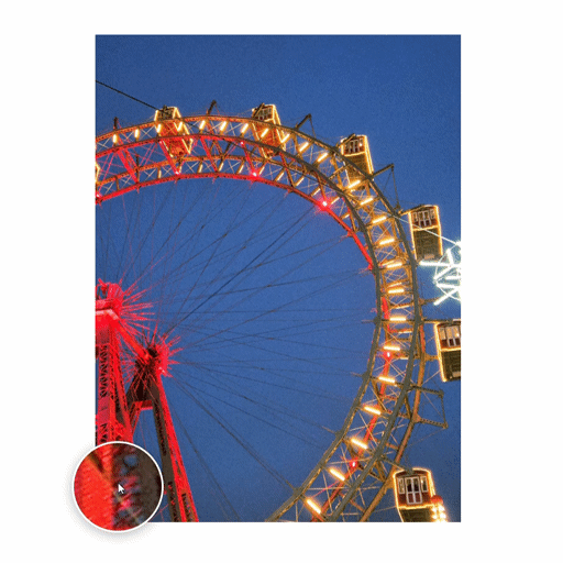
Demo
Installation
Install via npm:
npm install rc-magnifierOr via yarn:
yarn add rc-magnifierOverview
rc-magnifier is a comprehensive React library for implementing various image magnification effects. It provides several specialized components to enhance user experience when viewing detailed images, ranging from standard lens magnification to advanced fullscreen manipulation.
Global Configuration (Common Props)
All magnifier components share a set of base properties defined in BaseMagnifierProps.
| Prop | Type | Default | Description |
| :--- | :--- | :--- | :--- |
| src | string | Required | The main thumbnail image source. |
| largeSrc | string | undefined | High-resolution image source for the zoomed view. |
| width | number \| string | '100%' | Width of the image container. |
| height | number \| string | 'auto' | Height of the image container. |
| zoomFactor| number | 2.5 | Initial magnification level. |
| minZoom | number | 1 | Minimum allowed zoom level (via wheel). |
| maxZoom | number | 10 | Maximum allowed zoom level (via wheel). |
| alt | string | '' | Image alternative text for accessibility. |
| className | string | undefined | Custom CSS class for the container. |
| style | React.CSSProperties| undefined | Custom inline styles for the container. |
Core Components
1. Magnifier
The standard magnification component with a "lens" effect.
| Prop | Type | Default | Description |
| :--- | :--- | :--- | :--- |
| lensSize | number | 120 | Size (diameter/width) of the lens or fixed panel. |
| lensShape | 'circle' \| 'square' | 'circle' | Shape of the lens when position="follow". |
| position | 'follow' \| 'left' \| 'right' \| 'top' \| 'bottom' | 'follow' | Where the zoomed view appears. |
| borderColor| string | '#fff' | Border color of the lens/panel. |
| borderWidth| number | 3 | Border width of the lens/panel in pixels. |
Usage
import { Magnifier } from 'rc-magnifier';

<Magnifier
  src="image-thumb.jpg"
  lensSize={150}
  position="follow"
/>
2. PiPMagnifier (Picture-in-Picture)
A magnifier where the zoomed view is pinned to a corner.
| Prop | Type | Default | Description |
| :--- | :--- | :--- | :--- |
| pipSize | number | 200 | Size of the fixed preview window. |
| pipPosition| 'top-left' \| 'top-right' \| 'bottom-left' \| 'bottom-right' | 'bottom-right' | Corner position of the PiP window. |
| borderColor| string | '#fff' | Border color of the PiP window. |
Usage
import { PiPMagnifier } from 'rc-magnifier';

<PiPMagnifier
  src="image-thumb.jpg"
  pipSize={250}
  pipPosition="top-right"
/>
3. SplitMagnifier
Splits the view into a navigator and a dedicated zoom panel.
| Prop | Type | Default | Description |
| :--- | :--- | :--- | :--- |
| splitRatio | number | 0.5 | The ratio (0 to 1) between the navigator and zoom panel. |
Usage
import { SplitMagnifier } from 'rc-magnifier';

<SplitMagnifier
  src="image-thumb.jpg"
  splitRatio={0.4}
/>
4. GridMagnifier
Shows several magnification levels at once in a grid layout.
| Prop | Type | Default | Description |
| :--- | :--- | :--- | :--- |
| levels | number[] | [1.5, 2, 3, 4] | Array of zoom factors to display in the grid. |
| position | 'top' \| 'bottom' \| 'left' \| 'right' | 'bottom' | Grid placement relative to the image. |
Usage
import { GridMagnifier } from 'rc-magnifier';

<GridMagnifier
  src="image-thumb.jpg"
  levels={[2, 4, 8]}
  position="right"
/>
5. FullscreenMagnifier
Opens a fullscreen overlay with image manipulation tools.
| Prop | Type | Default | Description |
| :--- | :--- | :--- | :--- |
| triggerText | string | '🔍 Zoom' | Text for the open button. |
| allowZoom | boolean | true | Enables/disables the zoom toggle button. |
Usage
import { FullscreenMagnifier } from 'rc-magnifier';

<FullscreenMagnifier
  src="image-thumb.jpg"
  triggerText="Inspect Image"
/>
License
MIT © Yusuf Yılmaz