
rdropdown
v1.2.0
Published
A ReactJS component to render a Github-style dropdown
Maintainers
 jamhall
Readme
RDropdown
A github flavoured dropdown menu for ReactJS.
Demo: https://jamhall.github.io/rdropdown/
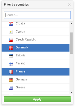
Screenshot
Installation
npm install rdropdown --saveImport RDropdown and its styles in your application as follows:
import RDropdown from 'rdropdown';
import 'rdropdown/dist/rdropdown.css';
Example usage
A simple example:
import React, { Component } from 'react';
import RDropdown from 'rdropdown';
import 'rdropdown/dist/rdropdown.css';

class App extends Component {
  constructor(props) {
    super(props);
    this.handleClose = this.handleClose.bind(this);
    this.handleOpen = this.handleOpen.bind(this);
    this.handleSelectedOptions = this.handleSelectedOptions.bind(this);
    this.state = {
      isOpen: false,
      selectedOptions: null
    };
  }

  handleClose() {
    this.setState({
      isOpen: false
    });
  }

  handleOpen() {
    this.setState({
      isOpen: true
    });
  }


  handleSelectedOptions(options) {
    this.setState({
        isOpen: !this.state.isOpen,
        selectedOptions: options
    });
  }

  renderOption(option) {
    return (<div>{option.name}</div>);
  }

  renderDropdown() {
    const countries = [
              { name: "France", code: "FR" },
              { name: "Italy", code: "IT"  },
              { name: "United Kingdom", code: "GB" }
    ];
    if(this.state.isOpen) {
      return (
          <RDropdown
                    options={countries}
                    onClose={ this.handleClose }
                    onSelectedOptions={ this.handleSelectedOptions }
                    selectedOptions={ this.state.selectedOptions }
                    renderOption={ this.renderOption }/>

      );
    }
  }

  renderSelected() {
    const {selectedOptions} = this.state;
    if(selectedOptions) {
      return (<span>{ selectedOptions.name }</span>);
    }
    return (<span>No option selected</span>)
  }

  render() {
    return (
      <div>
        <button onClick={this.handleOpen}>Open</button>
        { this.renderDropdown () }
        <p>Selected options: {this.renderSelected() }</p>
      </div>
    );
  }
}
Please look at the example source code in the demo folder for a good example of how to use the component: https://github.com/jamhall/rdropdown/tree/master/demo
Properties
Name | Type | Required | Description
------------------- | ---------------- | ------------------------- | ---------------------------------------------------------------------------------------------------------------------------
options | Array or promise | Yes | Options to be used for the list
renderOption | Function | Yes | Callback used to render an option item in the dropdown list
onSelectedOptions | Function | Yes | Callback when an option item(s) is selected. If set to multiple, it will return an array otherwise it will return an object
selectedOptions | Any | Yes | An an array of options or an option object. This is used to pre-select the options in the list
title | String | No | The title of the dropdown (default: 'Filter')
searchable | Bool | No | Activate or disactivate searching. (default:false)
searchPlaceholder | No | String | The search input box placeholder (default: Search)
searchTimeout | No | Number | When to start searching after the user stops typing (default: 200ms) |
noResultsText | String | No | Text to be displayed when no options are found (default: 'No results')
onSearch | Function | Yes if searchable enabled | Callback or a promise for when a user starts typing to search the list
onClose | Function | Yes | Close the menu
enableEsc | Bool | No | Allow the user to press ESC to close the menu (default: true)
errorText | String | No | String to be displayed to the user when an error occurs (default: 'An error occurred')
height | Number | No | The maximum height of the dropdown list (default: 300)
multiple | Bool | No | Allow multiple selected options (default: false)
applyOptions | Bool | No | Make the use manually apply the options selected (default: false)
applyOptionsText | String | No | The text to be displayed for the apply button (default: 'Apply' ) |
Running the examples
Clone the repository:
git clone [email protected]:jamhall/rdropdown.git && cd rdropdown
Install the dependencies:
npm install
Run the demo:
npm start
Navigate to:
http://localhost:3001/
License
MIT Licensed. Copyright (c) Jamie Hall 2016.