
re3ve-month-picker
v2.1.12
Published
Simple, modern and customizable month picker component for React.
Maintainers
 johnluke
Readme
Re3ve Month Picker


Simple, modern and customizable month picker component for ReactJS.
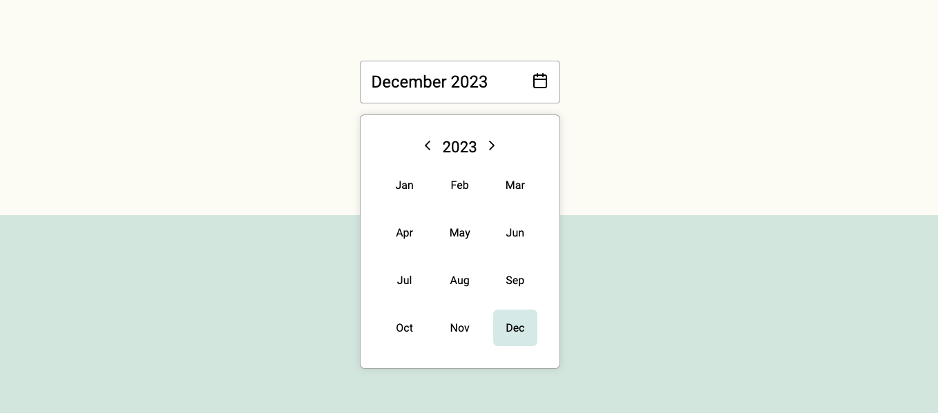
✨ Features
✅ React 18 Compatible
🧠 Written in TypeScript
⚡ Lightweight: No runtime dependencies
🎨 Customizable via CSS Variables
🌍 Supports 40+ languages (via Intl API)
♿ Accessible (WCAG 2.1 compliant)
📥 Installation
Using npm:
npm install re3ve-month-picker --saveUsing yarn:
yarn add re3ve-month-pickerUsing bun:
bun install re3ve-month-picker💻 Usage
import { useState } from "react";
import { MonthPicker, MonthInput } from "re3ve-month-picker";

function Example() {
  const [selectedMonthData, setSelectedMonthData] = useState({
    month: 4,
    year: 2025,
  });

  return (
    <div>
      <MonthPicker
        selected={selectedMonthData}
        onChange={setSelectedMonthData}
      />
    </div>
  );
}

export default Example;
Selected month data
Currently selected month data is an object with the following structure:
{
  from: "Thu Apr 24 2025 20:05:27 GMT-0300 (Brasilia Standard Time)";
  to: "Thu Apr 24 2025 20:05:27 GMT-0300 (Brasilia Standard Time)";
}
It will get saved on set parent component state with onChange event.
Customization
You can customize the behavior and styling of the MonthPicker using the following props:
📅 Value & onChange
The component works with JavaScript Date objects for range selection:
from: represents the first day of the selected start monthto: represents the last day of the selected end month
type MonthDateRange = {
  from?: Date;
  to?: Date;
};
🧩 Behavior Props
| Prop name | Description | Type | Default |
| --------------- | -------------------------------------------------------- | -------------------------------------------------- | ----------- |
| value | The current selected range { from, to } | { from?: { year, month }, to?: { year, month } } | undefined |
| onChange | Callback fired on selection change | (range: { from, to }) => void | — |
| lang | Language locale used to format month names (uses Intl) | string | 'en' |
| disablePast | Disables months before the current month | boolean | false |
| disableFuture | Disables months after the current month | boolean | false |
| minMonth | Disables all months before a specific { year, month } | { year: number; month: number } | — |
| maxMonth | Disables all months after a specific { year, month } | { year: number; month: number } | — |
| maxRange | Maximum number of months allowed between from and to | number |
| disableMonths | Custom logic to disable specific months dynamically | (month: { year, month }) => boolean | — |
🎨 Styling with classNames
You can style the component using the classNames prop. It accepts an object with the following optional keys:
type MonthPickerClassNames = {
  wrapper?: string;
  header?: string;
  navButton?: string;
  yearLabel?: string;
  monthGrid?: string;
  monthButton?: string;
  monthButtonActive?: string;
  monthButtonRange?: string;
};
Example with Tailwind:
<MonthPicker
  value={range}
  onChange={setRange}
  classNames={{
    wrapper: "bg-white p-4 rounded-md border shadow",
    header: "flex justify-between items-center mb-2",
    navButton: "text-gray-500 hover:text-black",
    yearLabel: "text-lg font-semibold",
    monthGrid: "grid-cols-4 gap-2",
    monthButton: "text-sm text-gray-700 hover:bg-slate-100",
    monthButtonActive: "bg-blue-600 text-white",
    monthButtonRange: "bg-blue-200 text-blue-900",
  }}
/>
License
MIT © henripar