
react-animation-library
v0.2.2
Published
React Animations
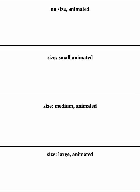
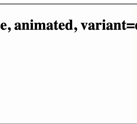
Maintainers
 jaysongiroux
Readme
react-animations
custom react toast animations with different variants/animations Minimalistic elements meant to be stylized and placed within your project
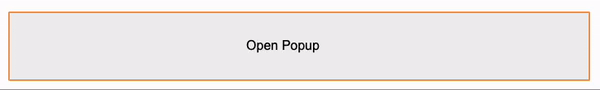
Popup
position is meant to pop up not be inline with other components or containers
Usage
<Popup show={show} animated={true} onClose={closed}/>Props
|prop| type | comment| |----|------|--------| |show|bool| true = popup opens| |animated|bool|If popup is animated| |onClose|callback|called when popup is closed| |variant|string | success(default), warning, danger, trash|
InLinePopup
position is meant to fit within buttons, cards, and other containers
Usage
<InLinePopup show={show} animated={true} onClose={closed}/>Props
|prop| type | comment| |----|------|--------| |show|bool| true = popup opens| |animated|bool|If popup is animated| |onClose|callback|called when popup is closed| |variant|string | success(default), warning, danger, trash|
Modal
Position is absolute and meant to be displayed over everything
Usage
<Modal show={showModal} onClose={closeModal} variant="success" backdrop={false} message="saved!"/>Props
|prop| type | comment| |----|------|--------| |show|bool| true = popup opens| |onClose|callback|called when popup is closed| |message|string|message displayed below the icon| |backdrop|bool|Makes background dark temporarily| |variant|string | success(default), warning, danger, trash|
importing
import { Modal } from 'react-animation-library/dist/'Environment Setup
Demo
git clone https://github.com/jaysongiroux/react-animations.git
cd react-animations/react-animations
npm install
npm start
Building
git clone https://github.com/jaysongiroux/react-animations.git
cd react-animations/react-animations
npm run build or yarn build
deploy
yarn build or npm run build
npm publish