
react-app-limitless-scroller
v1.0.1
Published
React website scroller for a limitless amount of content.

Readme
react-app-limitless-scroller
React website scroller for a limitless amount of content.

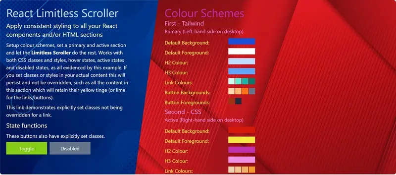
Features
- Mobile and desktop styling automatically applied
- Add any number of colour schemes to differentiate between sections
- Use Tailwind (recommended), your own classes and in-line CSS
- Will NOT override any explicitly set colours
- Add consistent headings to each section
- Navigates to sections based on URL
Demo

Install
npm install --save react-app-limitless-scrollerTailwind CSS is a pre-requisite of this project. If you haven't installed Tailwind yet, follow the official Tailwind installation guide.
Once Tailwind is installed, add react-app-limitless-scroller to your Tailwind config:
content: [
	...
	"/node_modules/react-app-limitless-scroller/**/*.{js,jsx,ts,tsx}"
]
Usage
To use the scroller, you first have to configure a set of <Scroller.ColourScheme> datasets within a <Scroller.Theme>. Then, simply wrap all your React components or HTML elements inside <Scroller.Items>, apply the theme and it will do the rest.
All components/elements are visible in mobile view. In desktop view, only the 'primary' and 'active' sections are shown. The primary section is always visible, while the active section is either:
- The second element in the children array
- Set via <Scroller.Items> props
- Determined by the URL path.
Note: The scroller does not provide any navigation or menu system to navigate between sections in desktop view - you will need to provide this outside of the <Scroller.Theme> component.
<Scroller.Items>
This is the core component in which you should place all the sections of your site. It will take every direct descendant HTML element as representing a section.
| Prop | Description | Type | Optional/Mandatory |
| --------- | -------------------------------------------------------------------------------------------------------------------------------------- | -------------- | ---------------------- |
| theme | The theme with which you want your content styled up. | Scroller.Theme | Mandatory |
| primary | The data-url attribute of the section that will be permanently present on the left in desktop view. | string | Optional |
| active | The data-url attribute of the section that will appear by default on the right in desktop view (if no data-url is present in the URL). | string | Optional |
| verbose | Whether to output debug comments to the console. | boolean | Optional |
Children of <Scroller.Items>
There are certain rules that any children of Scroller.Items must follow:
| Prop | Description | Type | Optional/Mandatory |
| ------------ | -------------------------------------------------------------------------------------------------------------------------------------------------------------------------------------------------------------------------------------------------- | -------- | ---------------------- |
| data-url | The path part of the URL representing this item in the scroller - (e.g. scroller-domain.com/path, when passed in, will scroll to the item with this data-url prop. Must be unique. | string | Mandatory |
| data-title | Any item with this attribute will have a H2 element inserted at the top - potentially useful for keeping consistent styling of section titles. | string | Optional |
| data-async | When set to "true", indicates the content for this item is loaded asynchronously after the item is initially mounted. This needs to be set for any such item in order for the scroller to accurately scroll to the location of the active section. | string | Optional |
<Scroller.Theme>
This represents the collection of colour schemes that are used for each section of the scroller.
| Prop | Description | Type | Optional/Mandatory |
| --------- | --------------------------------------------------------------------------------------------------------------------------------------------------------------------------------------------------------- | -------- | ---------------------- |
| stretch | Whether each section should stretch to fill the browser height if the content does not fill the screen. Defaults to true. | boolean | Optional |
| padding | The padding that should be applied to each section, in pixels. | integer | Optional |
| schemes | An array of colour schemes, in sequential order, that will be applied to each section. If there are more sections than there are colour schemes, it will restart at the first colour scheme in the array. | array | Mandatory |
<Scroller.ColourScheme>
This represents the colours to apply to each element present within a section (unless a colour has already been explicitly set within the HTML).
| Prop | Description | Type | Optional/Mandatory |
| ------------------ | ------------------------------------------------------------------------------------------------------------------------------------------------------------------- | -------------------------- | ---------------------- |
| foregroundColour | The colour to apply to all text within the section by default - either a CSS class (or collection of, preferably Tailwind) or an RGB hex value (prefixed with #). | boolean | Mandatory |
| backgroundColour | The colour to apply to the background of the section by default - either a CSS class (or collection of, preferably Tailwind) or an RGB hex value (prefixed with #). | boolean | Mandatory |
| backgroundImage | An image to apply as the background for the section. | string OR HTMLImageElement | Optional |
| headingColour | A colour set containing the default text colour for any H2 elements and, optionally, a background colour. | Scroller.ColourSet | Optional |
| subheadingColour | A colour set containing the default text colour for any H3 elements and, optionally, a background colour. | Scroller.ColourSet | Optional |
| linkColours | A colour set containing the default text colour for any links, plus the colours for the hover state and active state and, optionally, the visited state. | Scroller.LinkColourSet | Optional |
| buttonColours | A colour set containing the default text colour for any button elements, plus the colours for the hover state, active state and the disabled state. | Scroller.ButtonColourSet | Optional |
It is worth noting that the scroller expects valid HTML to be generated and thus does not provide styling options for a H1 element in any colour scheme, as there should only ever be one H1 tag on a HTML page - therefore, it expects H2 tags to be the highest level of heading element for any section and colour scheme.
<Scroller.ColourSet>
This represents the minimal colour set that should be applied to heading or sub-heading elements (<H2> or <H3> tags).
| Prop | Description | Type | Optional/Mandatory |
| --------- | --------------------------------------------------------------------------------------------------- | ----------------------------- | ---------------------- |
| default | Either the text colour to apply to the relevant elements, or a pair of text and background colours. | Scroller.ColourPair OR string | Mandatory |
<Scroller.LinkColourSet>
This represents the colour set that should be applied to any link elements (<A> tags).
| Prop | Description | Type | Optional/Mandatory |
| --------- | ----------------------------------------------------------------------------------------------------- | ----------------------------- | ---------------------- |
| default | Either the text colour to apply to links as default, or a pair of text and background colours. | Scroller.ColourPair OR string | Mandatory |
| hover | Either the text colour to apply to links when hovered over, or a pair of text and background colours. | Scroller.ColourPair OR string | Mandatory |
| active | Either the text colour to apply to links when active, or a pair of text and background colours. | Scroller.ColourPair OR string | Mandatory |
| visited | The text colour to apply to visited links (only works with CSS classes). | string | Optional |
<Scroller.ButtonColourSet>
This represents the colour set that should be applied to any button elements (<BUTTON> tags or <INPUT> tags with a type of "button" or "submit").
| Prop | Description | Type | Optional/Mandatory |
| --------- | ------------------------------------------------------------------------------------------------------- | ----------------------------- | ---------------------- |
| default | Either the text colour to apply to buttons as default, or a pair of text and background colours. | Scroller.ColourPair OR string | Mandatory |
| hover | Either the text colour to apply to buttons when hovered over, or a pair of text and background colours. | Scroller.ColourPair OR string | Mandatory |
| active | Either the text colour to apply to buttons when active, or a pair of text and background colours. | Scroller.ColourPair OR string | Mandatory |
| visited | Either the text colour to apply to disabled buttons, or a pair of text and background colours. | Scroller.ColourPair OR string | Mandatory |
<Scroller.ColourPair>
This represents a combination of text and background colours (either as CSS classes or RGB hex values beginning with #).
| Prop | Description | Type | Optional/Mandatory |
| ------------ | --------------------------------------------------------------------------------------------------------------- | -------- | ---------------------- |
| text | Either a CSS class name or an RGB hex value beginning with # representing the colour to use for the text. | string | Mandatory |
| background | Either a CSS class name or an RGB hex value beginning with # representing the colour to use for the background. | string | Mandatory |
Note: Presently, the scroller will only retain explicitly set colours if applied either by Tailwind classes (e.g. bg-slate-100 or text-slate-100) or CSS styles (e.g. color: #000 or background-color: #fff).
Example
import React from 'react';

import { Scroller } from 'react-app-limitless-scroller';

const theme = {
	padding: 20,
	schemes: [
		{
			foregroundColour: 'text-white',
			backgroundColour: 'bg-black',
			backgroundImage: '/dark-bg.jpg',
			headingColour: {
				default: 'text-amber-300'
			},
			subheadingColour: {
				default: 'text-amber-100'
			},
			linkColours: {
				default: 'text-yellow-200',
				hover: 'hover:text-yellow-300',
				active: 'active:text-yellow-400'
			},
			buttonColours: {
				default: {
					background: 'bg-lime-300',
					text: 'text-lime-950'
				},
				hover: 'hover:bg-lime-400',
				active: 'active:bg-lime-500',
				disabled: {
					background: 'disabled:bg-slate-600',
					text: 'disabled:text-slate-50'
				}
			}
		},
		{
			foregroundColour: '#000',
			backgroundColour: '#fff',
			headingColour: {
				default: '#115e59'
			},
			subheadingColour: {
				default: '#0d9488'
			},
			linkColours: {
				default: '#06b6d4',
				hover: '#22d3ee',
				active: '#67e8f9'
			}
		}
	]
};

const Example = () => {
	return (
		<Scroller.Items theme={theme} primary='foo' active='bar'>
			<div data-url='foo' data-title='Title'>
				<h3>Primary Section</h3>
				<p>
					This will be at the top on mobiles, and on the left on
					desktop.
				</p>
			</div>
			<div data-url='bar' data-title='Another Title'>
				<p>
					This is the "active" section, that will be on the right on
					desktop (unless there's a path in the URL).
				</p>
			</div>
			<div data-url='baz'>
				<p>
					This won't appear on the desktop, unless the URL is /baz. It
					will always appear on mobile, of course.
				</p>
			</div>
		</Scroller.Items>
	);
};
License
Apache 2.0 © awpeacock