
react-autocomplete-tagbox
v1.0.1
Published
React Autocomplete Tagbox is a modern, customizable React component for tag input with optional autocomplete. Effortlessly add, remove, and select tags with keyboard or mouse. Supports both free-form and restricted tag entry, smart suggestions, and a clea
Maintainers
 ecargsid-eht
Keywords
Readme
React Autocomplete Tagbox is a modern, flexible, and fully customizable React component for tag input with optional autocomplete. Effortlessly add, remove, and select tags with keyboard or mouse. Supports both free-form and restricted tag entry, smart suggestions, and a clean, accessible UI. Perfect for forms, search bars, and dynamic filters. Easy to integrate and fully styleable to match your project.
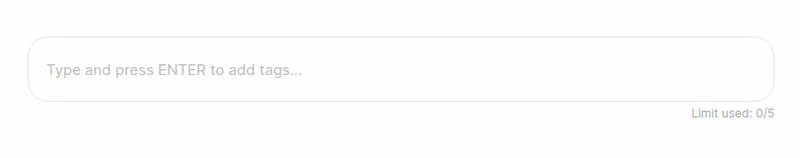
🎬 Without Autocomplete
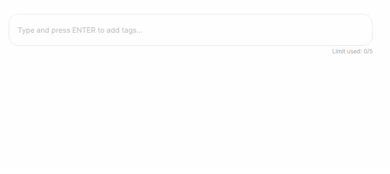
🎬 With Autocomplete
✨ Features
- Autocomplete Suggestions: Show relevant tag options as users type.
- Free-form or Restricted Tags: Allow any input or restrict to a predefined list.
- Custom Tag Validation (
filterData): Accept only tags that match your custom logic (e.g., only URLs, emails, etc.). - Keyboard & Mouse Friendly: Full keyboard navigation and intuitive mouse interactions.
- Customizable UI: Easily style to match your design system.
- Tag Removal: Remove tags with a click or keyboard.
- Tag Limit: Optionally limit the number of tags.
- Paste Multiple Tags: Paste a list of tags separated by space/comma/newline.
- Accessible: Built with accessibility in mind (ARIA roles, keyboard support).
- TypeScript Support: Fully typed for a great developer experience.
- Lightweight: Small bundle size, no heavy dependencies.
- Easy Integration: Plug-and-play with minimal setup.
🚀 Installation
npm install react-autocomplete-tagbox
# or
yarn add react-autocomplete-tagbox
🛠️ Usage
import React, { useState } from "react";
import ReactAutocompleteTagbox from "react-autocomplete-tagbox";

const options = [
  "React",
  "JavaScript",
  "TypeScript",
  "GraphQL",
  "Redux",
  "Bootstrap",
];

// Example filter: only allow options that are at least 5 characters
const filterData = (str: string) => str.length >= 5;
const filteredOptions = options.filter(filterData);

export default function App() {
  const [tags, setTags] = useState<string[]>([]);

  return (
    <ReactAutocompleteTagbox
      tags={tags}
      onChange={setTags}
      options={filteredOptions} // Filtered options
      filterData={filterData}
      limit={5}
      placeholder="Add technologies..."
    />
  );
}
Note:
If you use bothoptionsandfilterData, only options that passfilterDatawill be selectable or added as tags.
It's recommended to filter youroptionswithfilterDatabefore passing them to the component.
⚙️ Props
| Prop | Type | Default | Description |
| ---------------- | --------------------------- | --------------------------------------- | ------------------------------------------------------------------- |
| tags | string[] | [] | The current list of tags. |
| onChange | (tags: string[]) => void | | Callback when tags change. |
| options | string[] | undefined | Optional. Restricts tags to these options and enables autocomplete. |
| limit | number | undefined | Optional. Maximum number of tags allowed. |
| placeholder | string | "Type and press ENTER to add tags..." | Placeholder text for the input. |
| containerStyle | React.CSSProperties | undefined | Optional. Inline styles for the container. |
| className | string | undefined | Optional. Additional class for the container. |
| filterData | (data: string) => boolean | undefined | Optional. Custom validation/filter function for tags. |
🧠 Filtering Options
If you use both options and filterData, make sure your options match your filter. For example, to only allow URLs:
const filterData = (str: string) => {
  try {
    const url = new URL(str.trim());
    return url.protocol === "http:" || url.protocol === "https:";
  } catch {
    return false;
  }
};
const filteredOptions = options.filter(filterData);

<ReactAutocompleteTagbox
  tags={tags}
  onChange={setTags}
  options={filteredOptions}
  filterData={filterData}
/>;
🎨 Customization
- Styling: The component uses CSS Modules. You can override styles by importing your own CSS or using the
classNameprop. - Accessibility: Keyboard navigation and ARIA attributes are included for a11y. You can further enhance accessibility by providing descriptive labels and ensuring color contrast in your custom styles.
🧑💻 Development
Clone the repo and run:
npm install
npm run dev
📝 License
💡 Contributing
Contributions, issues, and feature requests are welcome!
Feel free to check issues page.
React Autocomplete Tagbox — The smart, beautiful way to manage tags in your React apps!