
react-awesome-grid
v1.0.0
Published
Awesome grid-layout components for React, based on flexbox. Making layouts in React have never been easier.
Downloads
36

Readme
React Awesome Grid 👌
Awesome grid-layout components for React, based on flexbox. Making layouts in React have never been easier.
Installation
npm install react-awesome-grid --save
Background
Flexbox is great, but the syntax is not. Was it direction: row or direction: column I should use? Did justify-content or align-items center my content vertically?
Coming from a background working with XAML (created by Microsoft and used in Xamarin, UWP and WPF), and especially the XAML Grid component, we know how easy it could be.
This is an attempt of making a flexbox-based grid component that is just as or even easier to use.
Usage
React Awesome Grid contains three different components that should be used together:
<Grid><Row><Column>
A <Grid> will contain <Row> and <Column> components. These can be nested together to create more advanced layouts.
Rows and columns
Width and height
Rows will lay out content from top to bottom and have a height property. Columns will be layed out from left to right and have a width property. The height and width property can use three different type of units:
- Auto (
auto) - the height/width will automatically size to the content of the row/column. - Proportional (
*) - fill the available space proportional to other row/columns also using the star unit. This is like working with percentages but better since we don't have to make sure the sum is 100%. Three columns using1*,1*,2*for example is the same as25*,25*,50*which in percent would be 25%, 25%, 50%. Two rows using1*,1*would give us two equally sized rows (50% each). - Absolute - use absolute (pixel, em, rem etc) values (eg.
20,20pxor20rem).
Content alignment
The content inside rows and columns can also be aligned by using the verticalContentAlignment and horizontalAlignment properties. The following alignments are available:
Horizontal content alignment:
leftcenterrightspace-aroundspace-between
Vertical content alignment:
topcenterbottomspace-aroundspace-between
Examples
Importing components
import { Grid, Column, Row } from "react-awesome-grid";Even distribution
Three rows height: 1*, 1*, 1* (33% each)
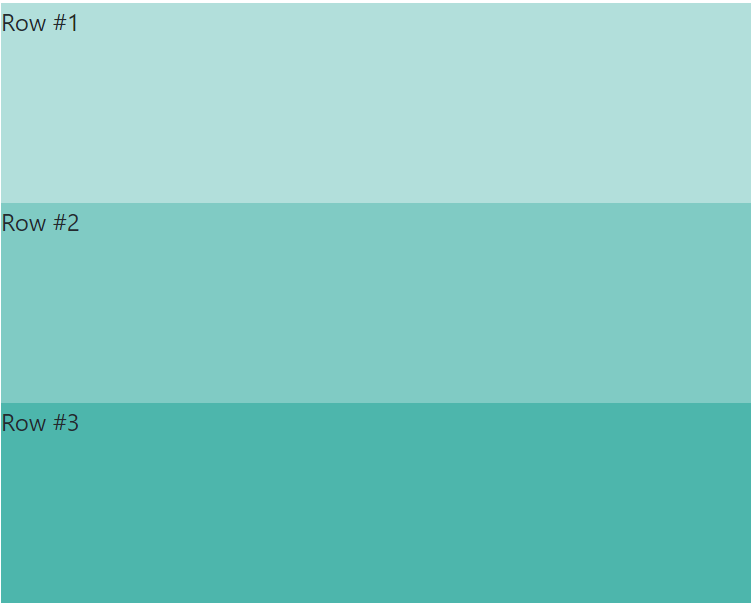
<Grid>
  <Row height="1*">Row #1</Row>
  <Row height="1*">Row #2</Row>
  <Row height="1*">Row #3</Row>
</Grid>
Two columns width: 1*, 1* (50% each)
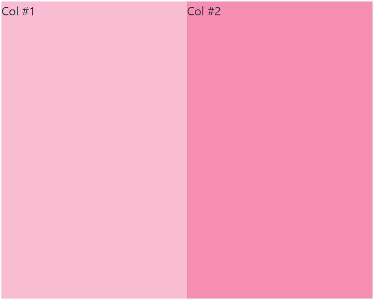
<Grid>
  <Column>Col #1</Column>
  <Column>Col #2</Column>
</Grid>
Variable height
Three rows height: 1*, 2*, auto, 100px
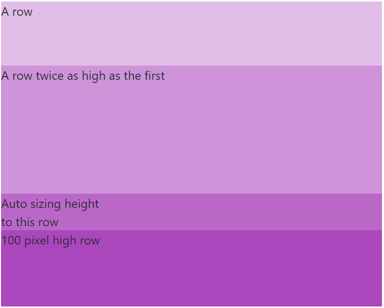
<Grid>
  <Row height="1*">A row</Row>
  <Row height="2*">A row twice as high as the first</Row>
  <Row height="auto">
    Auto sizing height<br />to this row
  </Row>
  <Row height="100px">100 pixel high row</Row>
</Grid>
Variable width
Three columns width: 2*, 3*, auto, 50px
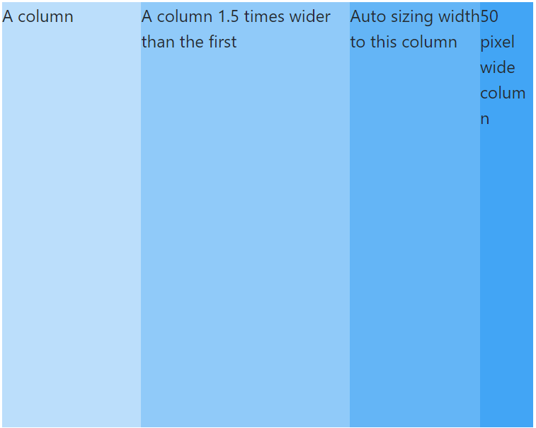
<Grid>
  <Column width="2*">A column</Column>
  <Column width="3*">A column 1.5 times wider than the first</Column>
  <Column width="auto">
    Auto sizing width<br />to this column
  </Column>
  <Column width="50px">50 pixel wide column</Column>
</Grid>
Combining rows and columns
Rows with inner columns
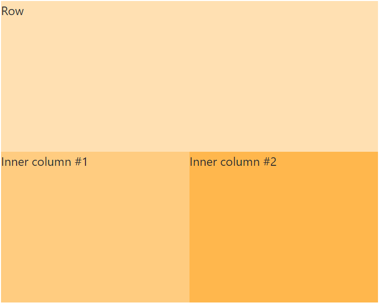
<Grid>
  <Row height="1*">Row</Row>
  <Row height="1*">
    <Column width="1*">Inner column #1</Column>
    <Column width="1*">Inner column #2</Column>
  </Row>
</Grid>
Columns with inner rows
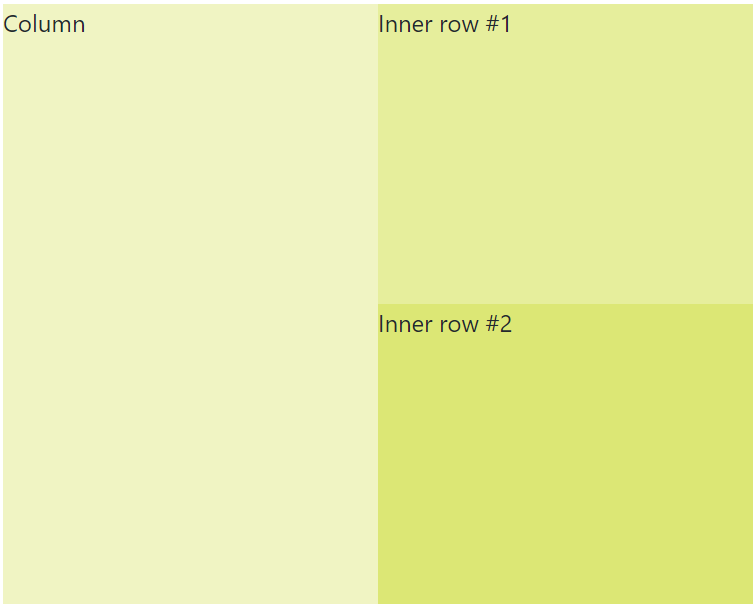
<Grid>
  <Column width="1*">Column</Column>
  <Column width="1*">
    <Row height="1*">Inner row #1</Row>
    <Row height="1*">Inner row #2</Row>
  </Column>
</Grid>
Content alignment
Horizontal content alignment

<Grid>
  <Row height="1*" horizontalContentAlignment="left">
    Left
  </Row>
  <Row height="1*" horizontalContentAlignment="center">
    Center
  </Row>
  <Row height="1*" horizontalContentAlignment="right">
    Right
  </Row>
  <Row height="1*" horizontalContentAlignment="space-around">
    <span>Space around</span>
    <span>Space around</span>
    <span>Space around</span>
  </Row>
  <Row height="1*" horizontalContentAlignment="space-between">
    <span>Space between</span>
    <span>Space between</span>
    <span>Space between</span>
  </Row>
</Grid>
Note: Horizontal content alignment with
space-aroundorspace-betweenonly works in a<Row />
Vertical content alignment
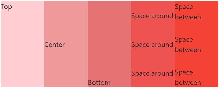
<Grid>
  <Column width="1*" verticalContentAlignment="top">
    Top
  </Column>
  <Column width="1*" verticalContentAlignment="center">
    Center
  </Column>
  <Column width="1*" verticalContentAlignment="bottom">
    Bottom
  </Column>
  <Column width="1*" verticalContentAlignment="space-around">
    <span>Space around</span>
    <span>Space around</span>
    <span>Space around</span>
  </Column>
  <Column width="1*" verticalContentAlignment="space-between">
    <span>Space between</span>
    <span>Space between</span>
    <span>Space between</span>
  </Column>
</Grid>
Note: Vertical content alignment with
space-aroundorspace-betweenonly works in a<Column />
Enjoy!
PS. This library is also available for react native here: http://www.github.com/johot/react-native-awesome-grid