
react-basic-mentions
v1.0.3
Published
Simple mention plugin for react
Downloads
10
Maintainers
 xavier-lefevre
Readme
React Basic Mentions
React Basic Mentions is a first shot at a mention system : a user can mention someone in a comment (like Twitter or Facebook) with a "@".
The user will enter a comment in the text-area, and when needed mention someone with a "@". The list of potential users will appear below the text-area, and on select, the matching string will be replaced by the name of the user with a specific style. Any modification to the mentioned user will remove it.
Getting started
Install react-basic-mentions package with NPM:
npm install react-basic-mentions --saveImport the package in the react component where you need it:
import { Mentions } from 'react-basic-mentions/lib'And then add it somewhere in your JSX:
<Mentions
list={ [ { name: "Paul", id: 1 }, { name: "Jenny", id: 2 } ] }
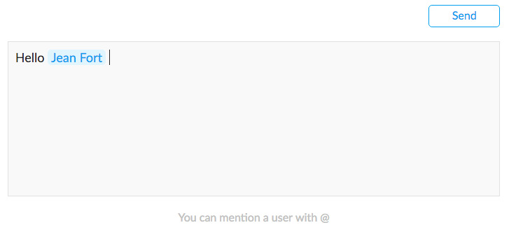
/>It should then, look like this (with the default styling):
Props
Main props
// The array list from which to mention, must include a "name" and an "id" property, the first for display, the second as the key for your API
list: PropTypes.array.isRequired,
// Setter building the final comment all along the typing of the comment, in order to retrieve it and send it to your API
// If the comment is : Hello Daniel, How are you?
// The parsedComment is : Hello [144342], how are you?
setParsedComment: PropTypes.func,
// The placeholder of the text-area
placeholder: PropTypes.string,
// The message to display when the user does not try to mention
unactiveListMessage: PropTypes.string,
// The message to display when there are no other matching elements of the list
emptyListMessage: PropTypes.string,
// You can change the mention trigger, by default "@", by setting this prop
mentionTrigger: PropTypes.string,
Style props
There is a default styling for all these elements:
// The style of the text-area
textareaStyle: PropTypes.object,
// The style of the text-area div when the placeholder is displayed
placeholderStyle: PropTypes.object,
// The style of the mentionned name, by default the text is blue, and the background light-blue
mentionStyle: PropTypes.object,
// The style of the container around the list
listContainerStyle: PropTypes.object,
// The style of the message when the list is not displayed
emptyMessageStyle: PropTypes.object,
// The style around each item of the list
itemContainerStyle: PropTypes.object,
// The style of the item itself
itemStyle: PropTypes.object,
To notice
Before anything, this is my first package. I am doing my best to make it great. If you encounter either a bug, or a lacking feature, don't hesitate to raise an issue! It is always amazing to have feedbacks from other developers, and much needed, otherwise my package has no purpose.
Do not hesitate to go check the other react package "React Mentions", much more advanced. Simply that it was not exactly fitting my needs, hence I prefered to build another one.
What did I do differently?
- You can "only" mention with a "@" for the moment
- The list of users appear beneath the text-area and is not floating, it was necessary for making it work well on mobile
- I used a div content-editable for the text-area
Check the "to improve" section below to understand what's remaining to do and not yet perfect
To improve
Key
- [X] - Retrieve the full comment from the parent component
Bugs
- [ ] - iOS: a weird behavior of copy/pasting can happen
- [ ] - Refine which key when hit can delete a mentioned user
- [ ] - The first time you hit "enter" at the end of the text-area, it won't yet break the line, the following "enter" will work
- [ ] - If the user selects half of a mention and a bit of other texts, then deletes, it won't make the mention disappear
- [X] - When the user types very fast to mention, it can disrupt the logic and hide the list
- [ ] - If you start mentioning (a first @, not validated), then continue typing your sentence, then mention someone (a second @, validated this time), then come back to the first un-complete mention, after one typed letter, it won't directly show the list
Features
- [ ] - Allow for other "markers" and not only "@"
- [X] - Offer the possibility to put a placeholder in the text-area
- [ ] - Option to filter the list through your own back-end calls
- [ ] - Think of a loader
- [ ] - Add a feedback on click or touch
- [X] - Message for the list container, when un-active or no match
Readme
- [X] - Show a picture of the component
- [ ] - In GH Pages, set up a test zone
- [ ] - Detail default style
- [ ] - Give examples