
react-bootstrap-hooks-alert
v2.0.3
Published
Simple alerts/notifications built with react+react-bootstrap
Downloads
123
Maintainers
 tofsjonas
Readme
react-bootstrap-hooks-alert
Using React Bootstrap (Alerts) and React Hooks I built a simple way to generate, well, Alerts!
(Personally I think they are more like notifications than alerts, but maybe that's just me 🤔 )
Screenshot
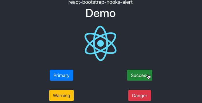
Demo
A very basic demo: https://tofsjonas.github.io/react-bootstrap-hooks-alert-demo/
Installation
react-bootstrap@2 is in beta! (at the time I am writing this) Bootstrap 5! 🥳
[email protected]
yarn add react-bootstrap@next react-bootstrap-hooks-alert(Once react-bootstrap leaves dev, "@next" will need to be replaced with something else...)
[email protected]
yarn add [email protected] [email protected]How to use
import React, { useEffect } from 'react'
import { AlertProvider, AlertOutlet, useAlert } from 'react-bootstrap-hooks-alert'
import 'react-bootstrap-hooks-alert/dist/Alert.css'

const App = () => {
  return (
    <AlertProvider timeouts={{ warning: 2000, success: 1000 }}>
      <AlertOutlet />
      <DemoDiv />
    </AlertProvider>
  )
}

const DemoDiv = () => {
  const { warning, info } = useAlert()
  useEffect(() => {
    warning('This is a warning!')
  }, [warning])
  const infoClick = () => {
    info('This is information!')
  }
  return <div onClick={infoClick}>Demo</div>
}

export default App
AlertProvider
AlertProvider should be somewhere top-level, so the alerts don't go away if you change page.
By passing timeouts to AlertProvider you can set how long before they disappear by themselves.
<AlertProvider timeouts={{ info: 2000, dark: 3000, [etc...] }}>
...
By default there are no timeouts, so unless you pass them as a prop here or in the function calls as a parameter, the alerts will stay until the user clicks them away.
AlertOutlet
You can put AlertOutlet anywhere you like, so long as it's "inside" AlertProvider.
You can even have more than one of them if it tickles your fancy. Using className and styling they can appear different on different pages.
  <AlertOutlet className="do-be-do" />
  <AlertOutlet className="hubba-bubba" />
useAlert functions
The available useAlert functions are named after the Bootstrap Alert variants:
- primary
- secondary
- success
- danger
- warning
- info
- light
- dark
const { success, danger, [info, dark, etc...] } = useAlert()If you for some reason wish to override the defaults, or lack thereof, you can set timeouts on this level as well.
success('Still alive!', { timeout: 2000 }) // two seconds
info('The earth is round!', { timeout: 1500 }) // 1.5 seconds
warning('Fear the reaper!', { timeout: null }) // no timeout
Customizing
The Alerts will follow the styling from react-bootstrap, so if you make global changes there, they will be reflected here.
CSS
The CSS in Alert.css is just to make the container fixed, and add some animation.
If you wish to alter it, the simplest way would be to not import 'react-bootstrap-hooks-alert/dist/Alert.css' and instead use your own css.
You can find the SCSS in the github package.
Custom message
If you wish to pass something other than plain text as a message, go right ahead. This would work fine, for instance:
import Alert from 'react-bootstrap/Alert'
...
...
success(
  <>
  <Alert.Heading>Hey, nice to see you</Alert.Heading>
  <p>
    Aww yeah, you successfully read this important alert message. This example
    text is going to run a bit longer so that you can see how spacing within an
    alert works with this kind of content.
  </p>
  <hr />
  <p className="mb-0">
    Whenever you need to, be sure to use margin utilities to keep things nice
    and tidy.
  </p>
  </>
  )
Bootstrap's CSS
You will need Bootstrap's CSS, but if you are using react-bootstrap, you most likely already have it. But just in case you don't, here's an easy way to get it.
Copy the <link /> below and paste it inside the <head>-tag of your public/index.html:
[email protected] stylesheet
<!-- COPY FROM HERE -->
<link
  rel="stylesheet"
  href="https://cdn.jsdelivr.net/npm/[email protected]/dist/css/bootstrap.min.css"
  integrity="sha384-KyZXEAg3QhqLMpG8r+8fhAXLRk2vvoC2f3B09zVXn8CA5QIVfZOJ3BCsw2P0p/We"
  crossorigin="anonymous" />
<!-- TO HERE -->
[email protected] stylesheet
<!-- COPY FROM HERE -->
<link
  rel="stylesheet"
  href="https://cdn.jsdelivr.net/npm/[email protected]/dist/css/bootstrap.min.css"
  integrity="sha384-B0vP5xmATw1+K9KRQjQERJvTumQW0nPEzvF6L/Z6nronJ3oUOFUFpCjEUQouq2+l"
  crossorigin="anonymous" />
<!-- TO HERE -->
public/index.html
<head>
  <meta charset="utf-8" />
  <link rel="icon" href="%PUBLIC_URL%/favicon.ico" />
  ...
    <!-- PASTE IT SOMEWHERE HERE -->
  ...
  <title>React App</title>
</head>