
react-calendar-plus
v1.3.0
Published
React date picker and calendar: TypeScript, time picker, range & multi-day selection, month/week/day views, i18n, themes, and accessible keyboard navigation.
Downloads
45

Maintainers
 sandeepbhatkande
Readme
React Calendar Plus




A comprehensive React calendar and date/time picker: single date, range, and multi-day selection; month, week, and day views; i18n and theming. Built with TypeScript for modern React apps.
🎯 Try the Live Demo - See all features in action!
Preview
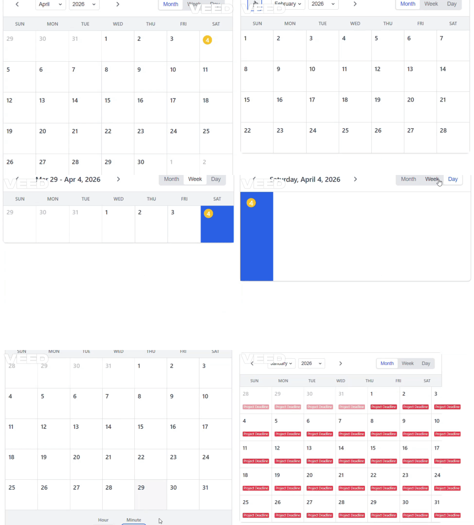
✨ Features
- 🗓️ Multiple Views: Month, Week, and Day views
- 📅 Flexible Selection: Single date, date range, and multiple date selection
- 🎛️ Two Interaction Modes: Standalone calendar or input field with dropdown
- ⏰ Time Picker: Integrated time selection with 12h/24h formats
- 🌍 Internationalization: Full locale support with customizable week start
- 🌐 Time zones: Optional IANA time zone so the calendar matches a specific region (not only the browser clock)
- 🎨 Theming: Extensive theming and custom styling support
- 📱 Responsive Design: Mobile-first responsive design
- ♿ Accessibility: WCAG compliant with keyboard navigation
- 🎯 Events: Display and manage calendar events
- 🔧 Custom Renderers: Custom day and header renderers
- 📦 TypeScript: Full TypeScript support with comprehensive types
- 🧪 Well Tested: Comprehensive test suite with Vitest
📦 Installation
npm install react-calendar-plus
# or
yarn add react-calendar-plus
# or
pnpm add react-calendar-plus
🚀 Quick Start
Standalone Calendar
import React, { useState } from 'react'
import { Calendar } from 'react-calendar-plus'
import 'react-calendar-plus/dist/style.css'

function App() {
  const [date, setDate] = useState(new Date())

  return (
    <Calendar
      value={date}
      onChange={setDate}
      selectionMode="single"
    />
  )
}
Input with Dropdown Calendar
import React, { useState } from 'react'
import { CalendarInput } from 'react-calendar-plus'
import 'react-calendar-plus/dist/style.css'

function App() {
  const [date, setDate] = useState(null)

  return (
    <CalendarInput
      value={date}
      onChange={setDate}
      placeholder="Select a date..."
      clearable={true}
    />
  )
}
🎛️ Interaction Modes
React Calendar Plus provides two distinct interaction modes to suit different use cases:
1. Standalone Calendar (Calendar)
Perfect for:
- Dashboard widgets
- Full-page calendar applications
- Event management interfaces
- Date browsing and navigation
<Calendar
  value={date}
  onChange={setDate}
  selectionMode="single"
  view="month"
  showTimePicker={true}
/>
2. Input with Dropdown (CalendarInput)
Perfect for:
- Form inputs
- Date picker fields
- Compact UI designs
- Mobile applications
<CalendarInput
  value={date}
  onChange={setDate}
  placeholder="Select a date..."
  clearable={true}
  closeOnSelect={true}
  dropdownPosition="auto"
/>
📖 Usage Examples
Basic Calendar
import { Calendar } from 'react-calendar-plus'

<Calendar
  defaultValue={new Date()}
  onChange={(date) => console.log('Selected:', date)}
/>
Range Selection
<Calendar
  selectionMode="range"
  onChange={(range) => {
    console.log('Start:', range.start)
    console.log('End:', range.end)
  }}
  onRangeSelect={(range) => {
    console.log('Range completed:', range)
  }}
/>
Multiple Date Selection
<Calendar
  selectionMode="multiple"
  onChange={(dates) => {
    console.log('Selected dates:', dates)
  }}
/>
With Time Picker
<Calendar
  showTimePicker
  timeFormat="12h"
  minuteStep={15}
  onChange={(datetime) => {
    console.log('Selected datetime:', datetime)
  }}
/>
Custom Theme
const theme = {
  primary: '#059669',
  secondary: '#d1fae5',
  selected: '#047857',
  today: '#f59e0b',
  background: '#ffffff',
  text: '#374151',
  border: '#d1d5db',
}

<Calendar
  theme={theme}
  // ... other props
/>
Custom Calendar Size
Option 1: Inline Styles (Quick Changes)
<Calendar
  value={date}
  onChange={setDate}
  style={{
    minWidth: '500px',
    maxWidth: '700px'
  }}
/>
Option 2: CSS Classes (Component Level)
<Calendar
  value={date}
  onChange={setDate}
  className="my-custom-calendar"
/>

<style>
.my-custom-calendar {
  min-width: 500px;
  max-width: 700px;
}

.my-custom-calendar .rcp-calendar-day {
  min-height: 60px;
  padding: 15px 8px;
}
</style>
Option 3: CSS Custom Properties (Theme-based)
<Calendar
  value={date}
  onChange={setDate}
  className="large-calendar"
/>

<style>
.large-calendar {
  --rcp-calendar-min-width: 500px;
  --rcp-calendar-max-width: 700px;
  --rcp-day-min-height: 50px;
}
</style>
Option 4: Global CSS Changes
Add to your global CSS file:
/* Change overall calendar size */
.rcp-calendar {
  min-width: 400px; /* Increase from 320px */
  max-width: 800px; /* Add max-width */
}

/* Change responsive breakpoints */
.rcp-calendar--responsive {
  max-width: 600px; /* Increase from 420px */
}

@media (min-width: 768px) {
  .rcp-calendar--responsive {
    max-width: 700px; /* Increase from 500px */
  }
}

/* Change day cell size */
.rcp-calendar-day {
  min-height: 50px; /* Increase from 40px */
  padding: 12px 6px; /* Increase padding */
}
Size Control Reference
| Element | CSS Class | Property | Default |
|---------|-----------|----------|---------|
| Overall Calendar | .rcp-calendar | min-width | 320px |
| Responsive Calendar | .rcp-calendar--responsive | max-width | 420px |
| Day Cells | .rcp-calendar-day | min-height | 40px |
| Day Padding | .rcp-calendar-day | padding | 8px 4px |
| Header | .rcp-calendar-header | padding | 16px 20px |
Responsive Breakpoints
- Mobile:
max-width: 640px- Full width - Tablet:
min-width: 768px- Max 500px - Desktop:
min-width: 1024px- Max 600px
With Events
const events = [
  {
    id: '1',
    title: 'Team Meeting',
    start: new Date(2024, 1, 15, 9, 0),
    end: new Date(2024, 1, 15, 10, 0),
    color: '#3b82f6',
  },
  {
    id: '2',
    title: 'Project Deadline',
    start: new Date(2024, 1, 20),
    color: '#ef4444',
  },
]

<Calendar
  events={events}
  view="week"
  // ... other props
/>
Different Views
// Month view (default)
<Calendar view="month" />

// Week view
<Calendar view="week" />

// Day view
<Calendar view="day" />
Locale Support
<Calendar
  locale={{
    locale: 'es-ES',
    weekStartsOn: 1, // Monday
    formatOptions: {
      weekday: 'short',
      month: 'long',
      day: 'numeric',
    },
  }}
/>
Time zone (IANA)
Pass a time zone name (for example America/New_York, Europe/London, Asia/Tokyo, or UTC) so the month grid, “today”, disabled ranges, events, and the time picker are interpreted in that zone instead of the user’s local offset only.
Plain date picks are emitted as real Date values (UTC instants) for midnight at the start of that calendar day in the chosen zone. Omit timeZone to keep the previous behavior (browser local time).
<Calendar
  timeZone="America/Los_Angeles"
  value={date}
  onChange={setDate}
/>
Use the same prop on CalendarInput so the text field formats the value in that zone:
<CalendarInput
  timeZone="Europe/London"
  value={date}
  onChange={setDate}
  inputFormat="yyyy-MM-dd HH:mm"
/>
Helper functions are exported for apps that need the same semantics outside the component: getCalendarClockNow, toWallInTimeZone, wallDayStartUtc, wallDayEndUtc, and isSameWallDayAsInstant.
Disable Dates
<Calendar
  // Disable weekends
  disableWeekends

  // Disable specific dates
  disabledDates={[
    new Date(2024, 1, 14),
    new Date(2024, 1, 15),
  ]}

  // Disable specific days of week (0 = Sunday, 1 = Monday, etc.)
  disabledDaysOfWeek={[0, 6]}

  // Set min/max dates
  minDate={new Date()}
  maxDate={new Date(2024, 11, 31)}
/>
Custom Renderers
// Custom day renderer
const dayRenderer = ({ date, isToday, isSelected, onClick }) => (
  <div
    className={`custom-day ${isToday ? 'today' : ''} ${isSelected ? 'selected' : ''}`}
    onClick={() => onClick(date)}
  >
    <span>{date.getDate()}</span>
    {isToday && <div className="today-indicator" />}
  </div>
)

// Custom header renderer
const headerRenderer = ({ date, view, onPrevious, onNext, onViewChange }) => (
  <div className="custom-header">
    <button onClick={onPrevious}>←</button>
    <h2>{date.toLocaleDateString()}</h2>
    <button onClick={onNext}>→</button>
    <div>
      {['month', 'week', 'day'].map(v => (
        <button
          key={v}
          onClick={() => onViewChange(v)}
          className={view === v ? 'active' : ''}
        >
          {v}
        </button>
      ))}
    </div>
  </div>
)

<Calendar
  dayRenderer={dayRenderer}
  headerRenderer={headerRenderer}
/>
🔧 API Reference
Calendar Props
| Prop | Type | Default | Description |
|------|------|---------|-------------|
| value | Date \| Date[] \| DateRange \| null | undefined | Controlled value |
| defaultValue | Date \| Date[] \| DateRange \| null | undefined | Default value for uncontrolled usage |
| onChange | (value: Date \| Date[] \| DateRange \| null) => void | undefined | Value change handler |
| view | 'month' \| 'week' \| 'day' | undefined | Controlled view |
| defaultView | 'month' \| 'week' \| 'day' | 'month' | Default view |
| onViewChange | (view: CalendarView) => void | undefined | View change handler |
| selectionMode | 'single' \| 'range' \| 'multiple' | 'single' | Date selection mode |
| showTimePicker | boolean | false | Show integrated time picker |
| timeFormat | '12h' \| '24h' | '24h' | Time format |
| minuteStep | number | 1 | Minute step for time picker |
| locale | LocaleConfig | DEFAULT_LOCALE | Locale configuration |
| timeZone | string | undefined | IANA time zone (e.g. America/New_York); calendar and selection use this zone’s calendar |
| className | string | undefined | Additional CSS class |
| theme | CalendarTheme | undefined | Custom theme |
| responsive | boolean | true | Enable responsive design |
| showWeekNumbers | boolean | false | Show week numbers |
| showOtherMonths | boolean | true | Show dates from other months |
| fixedWeekCount | boolean | false | Always show 6 weeks |
| minDate | Date | undefined | Minimum selectable date |
| maxDate | Date | undefined | Maximum selectable date |
| disabledDates | Date[] | undefined | Specific disabled dates |
| disabledDaysOfWeek | number[] | undefined | Disabled days of week |
| disableWeekends | boolean | false | Disable weekends |
| events | CalendarEvent[] | [] | Calendar events |
| dayRenderer | (props: DayRendererProps) => ReactNode | undefined | Custom day renderer |
| headerRenderer | (props: HeaderRendererProps) => ReactNode | undefined | Custom header renderer |
Event Handlers
| Handler | Type | Description |
|---------|------|-------------|
| onDateClick | (date: Date, event: MouseEvent) => void | Date click handler |
| onRangeSelect | (range: DateRange) => void | Range selection complete handler |
| onMonthChange | (date: Date) => void | Month change handler |
| onWeekChange | (startOfWeek: Date) => void | Week change handler |
| onDayChange | (date: Date) => void | Day change handler |
Types
interface DateRange {
  start: Date | null
  end: Date | null
}

interface CalendarEvent {
  id: string
  title: string
  start: Date
  end?: Date
  color?: string
  textColor?: string
}

interface LocaleConfig {
  locale: string
  weekStartsOn: 0 | 1 | 2 | 3 | 4 | 5 | 6
  formatOptions?: {
    weekday?: 'narrow' | 'short' | 'long'
    month?: 'numeric' | '2-digit' | 'narrow' | 'short' | 'long'
    day?: 'numeric' | '2-digit'
  }
}

interface CalendarTheme {
  primary?: string
  secondary?: string
  background?: string
  text?: string
  textSecondary?: string
  border?: string
  hover?: string
  selected?: string
  disabled?: string
  today?: string
}
🎨 Styling
The calendar comes with a default theme that can be customized via CSS custom properties or the theme prop.
CSS Custom Properties
.rcp-calendar {
  --rcp-primary: #2563eb;
  --rcp-secondary: #e5e7eb;
  --rcp-background: #ffffff;
  --rcp-text: #374151;
  --rcp-text-secondary: #6b7280;
  --rcp-border: #d1d5db;
  --rcp-hover: #f3f4f6;
  --rcp-selected: #2563eb;
  --rcp-disabled: #9ca3af;
  --rcp-today: #fbbf24;
}
Custom CSS Classes
All elements have BEM-style classes for easy customization:
/* Calendar container */
.rcp-calendar { }

/* Header */
.rcp-calendar-header { }
.rcp-calendar-header__navigation { }
.rcp-calendar-header__title { }
.rcp-calendar-header__view-selector { }

/* Calendar body */
.rcp-calendar__body { }
.rcp-calendar__weekdays { }
.rcp-calendar__grid { }

/* Days */
.rcp-calendar-day { }
.rcp-calendar-day--today { }
.rcp-calendar-day--selected { }
.rcp-calendar-day--disabled { }
.rcp-calendar-day--out-of-month { }

/* Time picker */
.rcp-time-picker { }
.rcp-time-picker__container { }
.rcp-time-picker__select { }
🧪 Development
# Install dependencies
npm install

# Start development server
npm run dev

# Run tests
npm test

# Build library
npm run build

# Build demo
npm run build:demo
📱 Browser Support
- Chrome ≥ 60
- Firefox ≥ 60
- Safari ≥ 12
- Edge ≥ 79
🤝 Contributing
Contributions are welcome! Please read our Contributing Guide for details on our code of conduct and the process for submitting pull requests.
📄 License
This project is licensed under the MIT License - see the LICENSE file for details.
🙏 Acknowledgments
- Built with date-fns and date-fns-tz for dates and time zones
- Inspired by various calendar libraries in the React ecosystem
- Icons from Heroicons
📚 Examples
Check out the demo for interactive examples and all features in action.
🐛 Issues
If you find a bug or have a feature request, please create an issue on GitHub.