react-checkbox-component
v0.1.15
Published
This component was built to give the developer a partially customizable checkbox component. In this component the developer can customize the size, color, shape, initial value and onchange handle event.
Readme
react-checkbox-component
This component was built to give the developer a partially customizable checkbox component. In this component the developer can customize the size, color, shape, initial value and onchange handle event.
To install this component run npm i react-checkbox-component in your project folder and import it like import Checkbox from 'react-checkbox-component'.
Example:
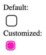
Default:
<Checkbox onChange={this.handler}/>
Customized:
<Checkbox size="small" isChecked={this.state.checked} onChange={this.handler}
    color="#fc14bb"/>
isChecked
The isChecked prop is used to set the initial state of the checkbox. The state can either be:
- True (Checked)
- False (Unchecked, default)
Example:
<Checkbox isChecked="true"/>onChange
The onChange prop is used to set the handle function of the component. It is required to receive a function receiving one parameter, that parameter being the new value of the checkbox.
Example:
handler(newVal){
    this.setState({
        checkboxChecked: newVal
    })
}

...
render(){
    return(
        ...
        <Checkbox onChange={this.handler}/>
        ...
    )
}
size
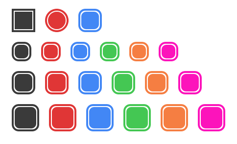
The size prop sets the size of the checkbox.
This prop can take the following values:
- small
- medium (default)
- big
Example:
<Checkbox size="small" onChange={this.handler}/>
<Checkbox size="medium" onChange={this.handler}/>
<Checkbox size="big" onChange={this.handler}/>
shape
The shape prop sets the shape of the checkbox. This can be:
- square
- circle
- round
Example:
<Checkbox shape="square" onChange={this.handler}/>
<Checkbox shape="circle" onChange={this.handler}/>
<Checkbox shape="round" onChange={this.handler}/>
color
The color prop is used to set the color of the checkbox. It can take the component default values as well as hex, rgb/rgba and hsl/hsla values.
The component default values are the following:
- grey (when there is no color prop being passed to the component)
- red
- blue
- green
- orange
Example:
<Checkbox onChange={this.handler}/>
<Checkbox onChange={this.handler}
    color="red"/>
<Checkbox onChange={this.handler}
    color="blue"/>
<Checkbox onChange={this.handler}
    color="green"/>
<Checkbox onChange={this.handler}
    color="orange"/>
<Checkbox onChange={this.handler}
    color="#fc14bb"/>
Full example

