
react-colrow
v2.0.7-beta2
Published
Smarter react layout components. Based on css flexbox. Support responsive design, Typescript, server side render

Readme
react-colrow
Smarter layout components. Based on css flexbox. Support responsive design, Typescript, server side render. 3 KB gzipped.
更智能的布局组件. 基于css flexbox. 支持响应式布局, Typescript, 服务端渲染. 3 KB gzipped.
- Typedoc Types document generated according to Typescript.
- Demo A full project demo in codesandbox. It can run online.
Col's width can be fixed number, percentage or auto grow. Support responsive layout. Row has gutter to set column spacing. This libarary based on css flexbox, not js. So it support ssr(server side render).
I created vue-colrow first. react-colrow is developed with Typescript, so I don’t want to write a repeat detailed document. If you want know more, you can refer to vue-colrow's documentation.
Usage
import {Row, Col, BreakRow, config} from 'react-colrow'

// change default global config
config.DEFAULT_GUTTER_X = 16
config.DEFAULT_GUTTER_Y = 16
<Row gutter={16} gutter={[16, 16]} gutter={[null, 16]} smGutterX={6}>
<Col width={1} width={1/3} width={500}></Col>
<BreakRow /><!-- break row manually -->
</Row>css is included in js. Row, Col and BreakRow are components, config is global config.
Col's prop width can pass in number, number greater than 1 is considered to be pixels of the specified length, number less than or equal to 1 is considered to be percentage, so 1 represents 100%. Its default is 1, representing full row width. You can pass in a non-number, this will directly pass to the css width, but in this case you need to adjust it yourself, this project does not deal with it. Check documentation to learn more props.
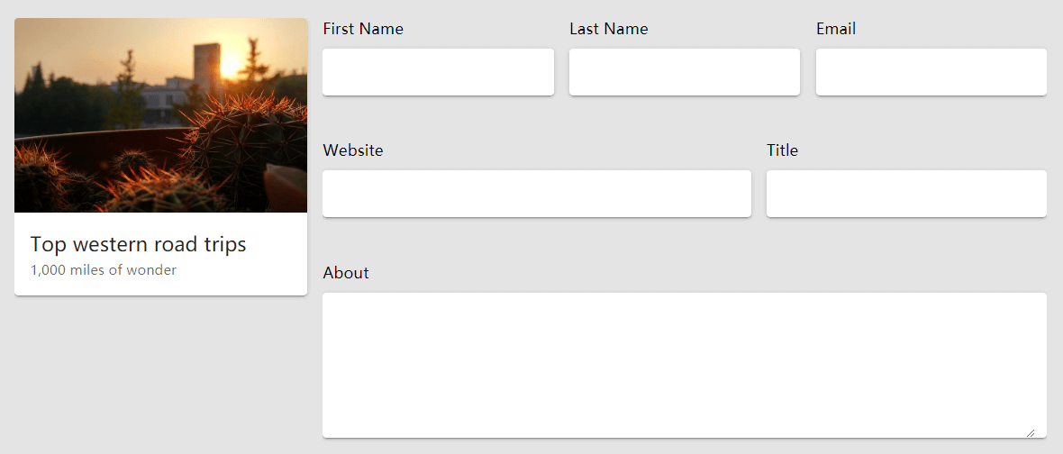
Demo
Follow screenshot images are from vue-colrow, but it also works with react-colrow.
In small screen:
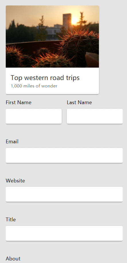
The code should be:
<Row>
  <Col width={300}><Card1 /></Col>
  <Col grow xs={1}>
    <Row>
      <Col width={1/3} xs={1/2}>
        <label>First Name</label><v-text-field solo></v-text-field>
      </Col>
      <Col width={1/3} xs={1/2}>
        <label>Last Name</label><v-text-field solo></v-text-field>
      </Col>
      <Col width={1/3} xs={1}>
        <label>Email</label><v-text-field solo></v-text-field>
      </Col>
      <Col width={3/5} xs={1}>
        <label>Website</label><v-text-field solo></v-text-field>
      </Col>
      <Col width={2/5} xs={1}>
        <label>Title</label><v-text-field solo></v-text-field>
      </Col>
      <Col>
        <label>About</label><v-textarea solo></v-textarea>
      </Col>
    </Row>
  </Col>
</Row>
Demo 2: Responsive card list with gutter

<Row>
  <Col xl={1/5} lg={1/4} md={1/3} sm={1/2} xs={1}><Card1 /></Col>
  <Col xl={1/5} lg={1/4} md={1/3} sm={1/2} xs={1}><Card1 /></Col>
  <Col xl={1/5} lg={1/4} md={1/3} sm={1/2} xs={1}><Card1 /></Col>
  ...
</Row>