
react-column-drag-resize-table
v0.1.3
Published
React data table component: draggable column reorder, resizable columns, text filters, pagination, optional localStorage column layout, CSS variables theming. For admin dashboards and internal tools.
Maintainers
 armineinants
Readme
react-column-drag-resize-table
A highly customizable React data table component for admin dashboards and internal tools. Features include draggable column reordering, resizable columns, built-in text filtering, pagination, optional persisted layouts, and easy theming via CSS variables. Optimized for usability and simple integration with a modern, Material-inspired design.
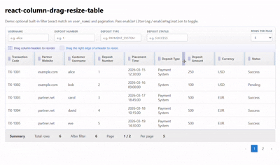
Live demo: react-data-table-topaz.vercel.app
Installation
npm install react-column-drag-resize-tablePeers: React and React DOM ≥ 16.8.
How to use
Import DataTable and the stylesheet once (for layout and theme tokens):
import { DataTable } from 'react-column-drag-resize-table';
import 'react-column-drag-resize-table/styles.css';
Pass columns (definitions) and rows (your data). Turn on enableFiltering / enablePagination when you need those toolbars. For controlled filter or page state, pair the value props with their on*Change handlers.
Short example
import { DataTable } from 'react-column-drag-resize-table';
import 'react-column-drag-resize-table/styles.css';

const columns = [
  { id: 'id', title: 'ID', accessor: 'id' },
  { id: 'name', title: 'Name', accessor: 'name' }
];

const rows = [
  { id: 1, name: 'Ada Lovelace' },
  { id: 2, name: 'Alan Turing' }
];

export function Example() {
  return <DataTable columns={columns} rows={rows} />;
}
Advanced example
Filtering, pagination, a renderSummary line, and custom cells with render (see Column cells):
import { useMemo } from 'react';
import { DataTable } from 'react-column-drag-resize-table';
import 'react-column-drag-resize-table/styles.css';

const money = (n) =>
  new Intl.NumberFormat(undefined, { style: 'currency', currency: 'USD' }).format(n);

const rows = [
  { id: 1, user_name: 'alice', amount: 100, status: 'ok' },
  { id: 2, user_name: 'bob', amount: 200, status: 'pending' }
];

export function AdvancedExample() {
  const columns = useMemo(
    () => [
      { id: 'id', title: 'ID', accessor: 'id' },
      { id: 'user_name', title: 'User', accessor: 'user_name' },
      {
        id: 'amount',
        title: 'Amount',
        accessor: 'amount',
        render: (row) => money(row.amount)
      },
      {
        id: 'status',
        title: 'Status',
        accessor: 'status',
        render: (row) => (
          <span
            style={{
              display: 'inline-block',
              padding: '2px 8px',
              borderRadius: 4,
              fontSize: '0.875rem',
              background: row.status === 'ok' ? '#e8f5e9' : '#fff3e0'
            }}
          >
            {row.status}
          </span>
        )
      }
    ],
    []
  );

  return (
    <DataTable
      columns={columns}
      rows={rows}
      enableFiltering
      filterFields={[
        { field: 'user_name', label: 'Username', placeholder: 'e.g. alice' },
        { field: 'status', label: 'Status', placeholder: 'e.g. ok' },
      ]}
      enablePagination
      defaultPageSize={10}
      pageSizeOptions={[5, 10, 20]}
      renderSummary={({ filteredCount, totalRows, currentPage, pageSize, totalPages }) => (
        <div className="summary-line grey lighten-3">
          <span>
            Rows: {filteredCount} of {totalRows} · Page {currentPage}/{totalPages} · {pageSize} per page
          </span>
        </div>
      )}
    />
  );
}
DataTable props
| Property | Required | Type | Default | Possible values / notes | Description |
|----------|----------|------|---------|-------------------------|-------------|
| columns | yes | Column<T>[] | — | See Column | Column definitions (id, title, cell content). |
| rows | yes | T[] | — | — | Row data; each row is a record (often with id). |
| getRowId | no | (row: T, index: number) => string \| number | row.id if present, else index | — | Stable id for React keys and layout storage keys. |
| loading | no | boolean | false | true / false | Shows a loading state instead of the table body. |
| emptyMessage | no | string | 'No rows to display.' | — | Shown when there are no rows (after filter). |
| summary | no | ReactNode | — | — | Static summary node above the table (if you do not use renderSummary). |
| renderSummary | no | (ctx: DataTableSummaryContext) => ReactNode | — | See DataTableSummaryContext | Summary slot with counts and pagination info. |
| className | no | string | '' | — | Class on the outer wrapper. |
| tableClassName | no | string | 'highlight' | — | Class on the <table> (e.g. zebra striping). |
| columnOrder | no | string[] | internal order | Array of column ids | Controlled: current column order. Omit for internal state. |
| onColumnOrderChange | no | (order: string[]) => void | — | — | Fires when the user reorders columns. If omitted while columnOrder is also omitted, reorder changes are persisted to localStorage (see layoutStorageKey). |
| enableColumnReorder | no | boolean | true | true / false | Allow drag-and-drop column reorder. |
| columnWidths | no | Record<string, number> | internal widths | Pixel numbers per column id | Controlled: column widths. |
| onColumnWidthsChange | no | (widths: Record<string, number>) => void | — | — | Fires when the user resizes a column. If omitted while columnWidths is undefined, width changes are persisted to localStorage (see layoutStorageKey). |
| enableColumnResize | no | boolean | true | true / false | Allow drag resize on column edges. |
| minColumnWidth | no | number | 64 | ≥ 0 | Minimum width when resizing (px). |
| layoutStorageKey | no | string | — | — | Optional id segment for localStorage keys. When omitted, a key is derived from the column ids. Order and widths persist under react-column-drag-resize-table:v1:* when the matching prop is uncontrolled and its on*Change handler is omitted. |
| enableFiltering | no | boolean | false | true / false | Show the filter toolbar and apply filter rules to rows. |
| filterFields | no | FilterField[] | [] | See FilterField | Fields listed here get text inputs; empty string means “no filter” for that key. |
| filters | no | Record<string, unknown> | — | — | Controlled: current filter object. Pair with onFiltersChange. |
| onFiltersChange | no | (filters: Record<string, unknown>) => void | — | — | Called when filters change (built-in UI or your controlled updates). |
| defaultFilters | no | Record<string, unknown> | — | — | Initial filters when uncontrolled (filters omitted). |
| enablePagination | no | boolean | false | true / false | Paginate after filtering. |
| defaultPageSize | no | number | 10 | Positive integer | Initial page size when pageSize is uncontrolled. |
| pageSizeOptions | no | number[] | [5, 10, 20, 50] | Positive integers | Options in the page-size <select>. |
| currentPage | no | number | internal | ≥ 1 | Controlled: current page (1-based). |
| onPageChange | no | (page: number) => void | — | — | Fires when the user changes page. |
| pageSize | no | number | internal | Positive integer | Controlled: rows per page. |
| onPageSizeChange | no | (size: number) => void | — | — | Fires when the user changes page size. |
| filterBarClassName | no | string | '' | — | Extra class on the filter toolbar row. |
| paginationClassName | no | string | '' | — | Extra class on the pagination row. |
Column
Used for each entry in columns.
Column cells: accessor and render
- Plain value: use a string
accessorwith the row field name (e.g.accessor: 'user_name'), or omitaccessorand rely onidmatching a key on the row (row[id]). - Custom content: use
render: (row) => …for formatting, badges, links, or any JSX. Whenrenderis set, it replaces the default cell value for that column (stringaccessoris then only documentary for you; it is not used for display). - A function
accessoris still accepted for custom cells, butrenderis the preferred API for that so the column definition stays clear: field key vs cell UI.
| Property | Required | Type | Default | Possible values / notes | Description |
|----------|----------|------|---------|-------------------------|-------------|
| id | yes | string | — | Unique among columns | Stable id (order, resize, filters, storage). |
| title | yes | string | — | — | Header label. |
| accessor | no | keyof T \| ((row: T) => ReactNode) | — | — | Row field key for simple columns, or legacy function form; see above. If omitted, cell value defaults to row[id]. |
| render | no | (row: T) => ReactNode | — | — | Custom cell; if set, used instead of the value from string accessor / row[id]. |
FilterField
Used for each entry in filterFields when the built-in filter bar is enabled.
| Property | Required | Type | Default | Possible values / notes | Description |
|----------|----------|------|---------|-------------------------|-------------|
| field | yes | string | — | Must match a key you filter on | Filter object key (e.g. user_name). |
| label | yes | string | — | — | Label for the input. |
| placeholder | no | string | — | — | Input placeholder. |
DataTableSummaryContext
Argument to renderSummary when that prop is provided.
| Property | Type | Description |
|----------|------|-------------|
| totalRows | number | Number of rows in rows before filtering. |
| filteredCount | number | Number of rows after filtering. |
| currentPage | number | Current page (1-based). |
| pageSize | number | Current page size. |
| totalPages | number | Total page count after filtering. |
Filter value rules
When enableFiltering is on, each key in the active filter object is applied to rows as follows:
| Key pattern | Effect |
|-------------|--------|
| name_from / name_to | Numeric range on field name |
| name_datefrom / name_dateto | Date range on field name |
| Other keys | row[key] == filter[key] (equality); empty values are ignored |
You can drive the same keys from filterFields (one input per field) or from filters / onFiltersChange with your own UI.
Styling
Below are the CSS variables used for DataTable styling.
To customize the appearance, place overrides in the `:root` of your stylesheet:

```css
:root {
  /* Borders */
  --rdt-border: #c5cae9;
  --rdt-border-divider: #e0e0e0;
  --rdt-border-cell: #f0f0f0;

  /* Accent & interactive */
  --rdt-accent: #3949ab;
  --rdt-accent-soft: #e8eaf6;
  --rdt-accent-muted: #5c6bc0;
  /* Primary blue used for pagination, spinner, links */
  --rdt-accent-blue: #1976d2;
  --rdt-accent-blue-soft: #e3f2fd;
  --rdt-pagination-active-bg: var(--rdt-accent-blue);
  --rdt-pagination-hover-bg: var(--rdt-accent-blue-soft);
  --rdt-spinner-track: var(--rdt-accent-blue-soft);
  --rdt-spinner-thumb: var(--rdt-accent-blue);
  --rdt-resize-hover: rgba(57, 73, 171, 0.35);
  --rdt-resize-handle-mid: rgba(25, 118, 210, 0.12);
  --rdt-resize-handle-end: rgba(25, 118, 210, 0.22);
  --rdt-resize-handle-inset: rgba(25, 118, 210, 0.12);
  --rdt-focus-ring: rgba(57, 73, 171, 0.2);
  --rdt-focus-outline-contrast: #ffffff;

  /* Surfaces */
  --rdt-surface: #ffffff;
  --rdt-surface-elevated: #f5f5f5;
  --rdt-surface-muted: #eeeeee;
  --rdt-surface-toolbar-start: #ffffff;
  --rdt-surface-toolbar-end: #f5f5f5;
  --rdt-surface-hints-start: #fafbff;
  --rdt-surface-hints-end: #eef0fb;
  --rdt-surface-header-start: #f5f5f5;
  --rdt-surface-header-end: #eeeeee;
  --rdt-surface-summary: #eeeeee;
  --rdt-surface-row-hover: #f5f5f5;

  /* Text */
  --rdt-text: #424242;
  --rdt-text-strong: #263238;
  --rdt-text-muted: #757575;
  --rdt-text-label: #546e7a;
  --rdt-text-hint-drag: #283593;
  --rdt-text-hint-resize: #1565c0;

  /* Form controls */
  --rdt-input-border: #b0bec5;
  --rdt-input-border-hover: #78909c;

  /* Pagination */
  --rdt-pagination-active-fg: #ffffff;
  --rdt-pagination-disabled-opacity: 0.45;

  /* Misc */
  --rdt-hint-icon-opacity: 0.85;
  --rdt-drag-grip-opacity: 0.85;
}
Development
npm install && npm run dev   # demo: example/
npm run build                # dist/ + types
License
MIT — LICENSE