
react-cookie-tailor
v1.0.2
Published
A small, customizable, and fully compliant cookie consent bar for React.
Maintainers
 hopingsteam
Readme
👔 React Cookie Tailor


ℹ️ This is a fork of react-cookie-consent

🖼️ Default look
| Footer |
|:-------------------------------------------------------------------------------------------------------:|
| 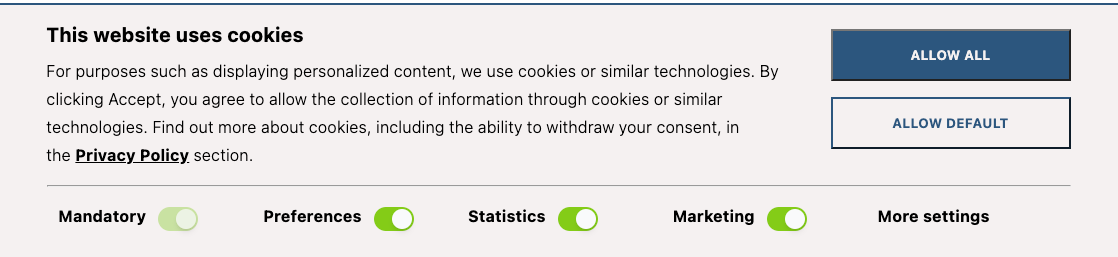 |
|
| Details | About |
|:-------------------------------------------------------------------------------------------------------:|:----------------------------------------------------------------------------------------------------:|
| 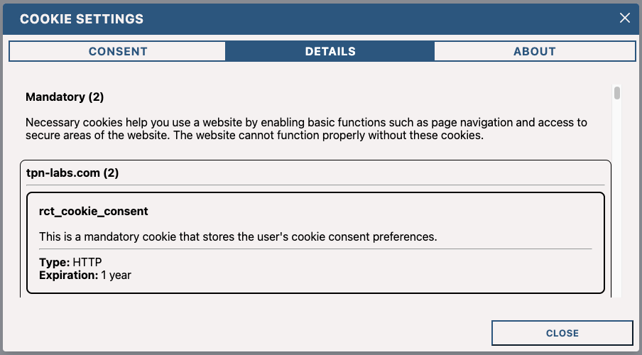 |
| 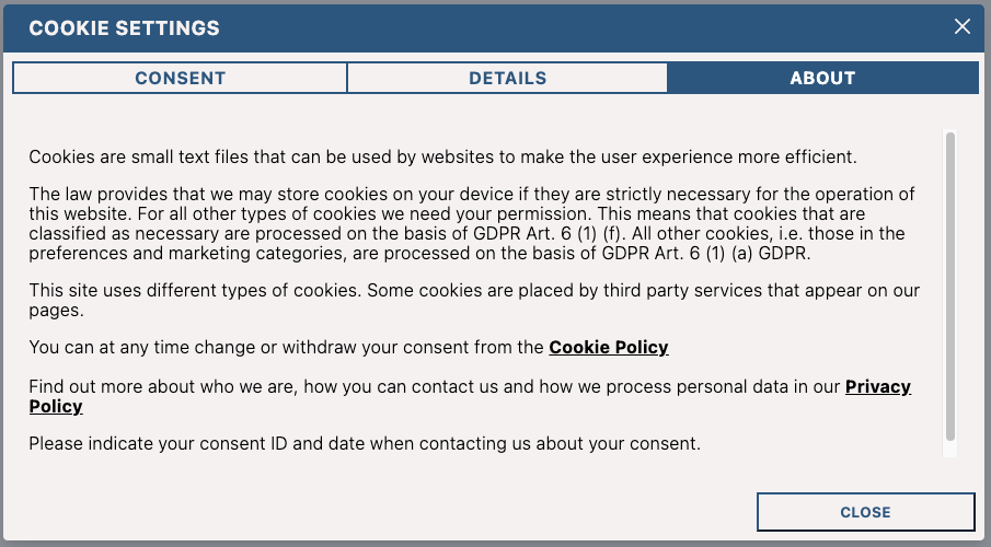 |
|
🎬 Demo
You can find a demo here.
📦 Installation
npm install react-cookie-tailoror use yarn:
yarn add react-cookie-tailor📚 About
Our team was looking for a cookie consent solution that was easy to use and looked good. We initially found another library, but it was not suitable for our needs. More precisely, we wanted to comply with the GDPR and CPRA regulations, which require that the user must be able to decline cookies.
To summarize what these regulations require, you need to:
- provide a compliant cookie policy
- display a cookie consent banner at the user's first visit
- store the proof of consent
- block non-exempt cookies before obtaining the user's consent
- release the cookies only after the user has given their consent
🔨 Using it
You can import the cookie bar like this:
import { CookieTailor } from "react-cookie-tailor";Then you can use the component anywhere in your React app like so:
<CookieTailor/>Translations
You can provide translations for the text using the labels property. By default, the library will use the English
translations. The default values can be found in constants/defaultLabels.ts
You can provide your own translations like so:
import CookieTailor, { Label } from "react-cookie-tailor";

const labels: Label = {
  // ...
  main: {
    buttonAllow: "Allow all",
    buttonDefault: "Allow default",
    moreSettings: "More settings",
    title: "This website uses cookies"
  }
  // ...
};

<CookieTailor labels={labels}/>
Customizing the colors
You can customize the colors by using the colors property. By default, the library will use the following colors:
import CookieTailor, { TailorColors } from "react-cookie-tailor";

const colors: TailorColors = {
  primary: "#2B567D",
  background: "#F5F1F1",
  white: "#FFFFFF",
  black: "#000000",
}

<CookieTailor colors={colors}/>
Providing your cookies details
You can provide your cookies details by using the cookies property. By default, the library will use the cookies
listed in constants/defaultCookies.ts
You can provide your own cookies details like so:
import CookieTailor, { TailorCookiesDetails } from "react-cookie-tailor";

const cookies: TailorCookiesDetails = {
  categories: [
    CookieCategory.MANDATORY,
    CookieCategory.MARKETING,
    CookieCategory.PREFERENCES,
    CookieCategory.STATISTICS,
    CookieCategory.UNCLASSIFIED,
  ],
  data: [
    // ...
    {
      domain: "<your_domain>",
      title: "rct_cookie_consent",
      description: "This is a mandatory cookie that stores the user's cookie consent preferences.",
      expiration: "1 year",
      type: "HTTP",
      category: CookieCategory.MANDATORY,
    },
    {
      domain: "Google",
      title: "IDE",
      description:
        "Used by Google DoubleClick to register and report the website user's actions after viewing or clicking " +
        "one of the advertiser's ads with the purpose of measuring the efficacy of an ad and to " +
        "present targeted ads to the user.",
      expiration: "1 year",
      type: "HTTP",
      category: CookieCategory.MARKETING,
    },
    {
      domain: "Google",
      title: "test_cookie",
      description: "Used to check if the user's browser supports cookies.",
      expiration: "Session",
      type: "HTTP",
      category: CookieCategory.MARKETING,
    },
    // ...
  ],
};

<CookieTailor cookies={cookies}/>
Cookie categories
By default, the library will use the following cookie categories:
MANDATORYfor cookies that are necessary for the website to functionMARKETINGfor marketing cookiesPREFRENCESfor cookies that store user preferencesSTATISTICSfor cookies that analyzes user statisticsUNCLASSIFIEDfor cookies that do not fall into any of the above categories
You can enable/disable the categories by using the categories property. By default, all categories are enabled.
const categories = [
  CookieCategory.MARKETING,
  CookieCategory.PREFERENCES,
  CookieCategory.STATISTICS,
  CookieCategory.UNCLASSIFIED,
];

<CookieTailor categories={categories}/>
Using the onAccept callbacks
You can use the onAccept callback to react to the user clicking the accept button. The callback will be called with
the following TailorResponse object:
- cookieId:
string | null- The id of the cookie that was created when the user visited the website for the first time
- cookieCreation:
string | null- The date when the cookie described above was created
- categories:
CookieCategoryDefinition[]- The categories that were accepted by the user
import CookieTailor, { TailorResponse } from "react-cookie-tailor";

const acceptFunction = (response: TailorResponse) => {
  console.log("Accept function called");
  console.log(response.cookieId);
  console.log(response.cookieCreation);
  console.log(response.categories);
};

<CookieTailor onAccept={acceptFunction}/>
Getting the cookies value in your code
react-cookie-tailor exports a function called getCookieConsentValue(cookieName: string). You can use it in your own code like so:
import CookieTailor, { Cookies, getCookieConsentValue } from "react-cookie-tailor";

console.log(getCookieConsentValue("your_custom_cookie_name"));
Reset the cookies value in your code
react-cookie-tailor exports a function called resetCookieConsentValue. You can use it in order to remove cookie in client-site:
import CookieTailor, { Cookies, resetCookieConsentValue } from "react-cookie-tailor";

console.log(resetCookieConsentValue());
📝 Props
| Prop | Type | Default value | Description |
|-------------------------------|:-------------------------------------------:|------------------------------------|-----------------------------------------------------------------------------------------------------------------------------------------------------------------------------------------------------------------------|
| ButtonComponent | React component | button | React Component to render as a button. |
| acceptOnOverlayClick | boolean | false | Determines whether the cookies should be accepted after clicking on the overlay |
| acceptOnScroll | boolean | false | Defines whether "accept" should be fired after the user scrolls a certain distance (see acceptOnScrollPercentage) |
| acceptOnScrollPercentage | number | 25 | Percentage of the page height the user has to scroll to trigger the accept function if acceptOnScroll is enabled |
| ariaAcceptLabel | string | Accept cookies | Aria label to set on the accept button |
| ariaDeclineLabel | string | Decline cookies | Aria label to set on the decline button |
| colors | TailorColors | See README.md | Colors being used for the cookie consent bar |
| containerClasses | string | "" | CSS classes to apply to the surrounding container |
| contentClasses | string | "" | CSS classes to apply to the content |
| cookies | TailorCookiesDetails | See README.md | Default cookies being used for obtaining consent |
| cookieName | string | "CookieConsent" | Name of the cookie used to track whether the user has agreed. Note that you also have to pass this to the getCookieConsentValue and resetCookieConsentValue functions as they default to "CookieConsent" as well. |
| cookieSecurity | boolean | undefined | Cookie security level. Defaults to true unless running on http. |
| cookieValue | string or boolean or number | true | Value to be saved under the cookieName. |
| customButtonProps | object | {} | Allows you to set custom props on the button component |
| customButtonWrapperAttributes | React.HTMLAttributes<HTMLDivElement> | {} | Allows you to set custom (data) attributes on the button wrapper div |
| customContainerAttributes | object | {} | Allows you to set custom (data) attributes on the container div |
| customContentAttributes | object | {} | Allows you to set custom (data) attributes on the content div |
| customDeclineButtonProps | object | {} | Allows you to set custom props on the decline button component |
| debug | boolean | undefined | Bar will be drawn regardless of cookie for debugging purposes. |
| declineButtonClasses | string | "" | CSS classes to apply to the decline button |
| declineButtonId | string | "" | Id to apply to the decline button |
| declineButtonText | string or React component | "I decline" | Text to appear on the decline button |
| declineCookieValue | string or boolean or number | false | Value to be saved under the cookieName when declined. |
| disableButtonStyles | boolean | false | If enabled the button will have no default style. (you can still supply style through props) |
| disableStyles | boolean | false | If enabled the component will have no default style. (you can still supply style through props) |
| enableDeclineButton | boolean | false | If enabled the decline button will be rendered |
| expires | number | 365 | Number of days before the cookie expires. |
| extraCookieOptions | object | {} | Extra info (apart from expiry date) to add to the cookie |
| flipButtons | boolean | false | If enabled the accept and decline buttons will be flipped |
| hideOnAccept | boolean | true | If disabled the component will not hide it self after the accept button has been clicked. You will need to hide yourself (see onAccept) |
| labels | Label | See README.md | Labels being used for the cookie consent bar, you can modify the translations here |
| onAccept | function | (response: TailorResponse) => {} | Function to be called after the accept button has been clicked. |
| onDecline | function | () => {} | Function to be called after the decline button has been clicked. |
| onOverlayClick | function | () => {} | allows you to react to a click on the overlay |
| overlay | boolean | false | Whether to show a page obscuring overlay or not. |
| overlayClasses | string | "" | CSS classes to apply to the surrounding overlay |
| sameSite | string, "strict", "lax" or "none" | none | Cookies sameSite attribute value |
| setDeclineCookie | boolean | true | Whether to set a cookie when the user clicks "decline" |
| visible | string, "show", "hidden" or "byCookieValue" | "byCookieValue" | Force the consent bar visibility. If "byCookieValue", visibility are defined by cookie consent existence. |
🐞 Debugging it
Because the cookie consent bar will be hidden once accepted, you will have to set the prop debug={true} to evaluate styling changes:
<CookieConsent debug={true}></CookieConsent>❔Questions
Why are there two cookies? One of which named "Legacy"
The short story is that some browsers don't support the SameSite=None attribute. The modern browsers force you to have SameSite set to something other than none.
So react-cookie-tailor fixes this like so:
- set the fallback cookie (e.g -legacy) first, this will always succeed (on all browsers)
- set the correct cookie second (this will work on modern browsers, fail on older ones)
When checking the cookie it'll do it in reverse. If the regular cookie exists, it'll use that. If no regular cookie exists it'll check whether the legacy cookie exists. If both are non-existent no consent was given.
The long story can be found here: #PR 68
💻 Contributor information
When making a PR please think about the following things:
- Update the ChangeLog (or include what you did in the PR and I'll add it, up to you)
- No need to build or update the package.json. I will do both on release.
- Please don't change code convention / style