
react-country-state-fields
v1.2.1
Published
React country and state field components that can auto-detect user's IP geolocation to prefill.

Maintainers
 chaomingli
Readme
react-country-state-fields




The country, state, and city fields are the most annoying fields to fill because of the long list of options. The VisitorAPI React components are designed to smooth the user experience by prefilling the fields based on the user's IP location.
The component package comes with <CountryField>, <StateField>, and <CityField> components. Country/state/city data is sourced from the country-state-city package: 250 countries, 5,000+ states/provinces, and 150,000+ cities, so <StateField> and <CityField> cascade correctly for virtually every country, not just a handful. The components are built with Material-UI as shown in the screenshots below.
Don't use MUI? All the cascading/auto-detect logic is also available as headless hooks with zero MUI dependency, see Headless usage below to build your own UI in whatever you're already using.
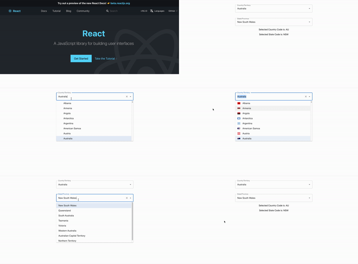
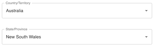
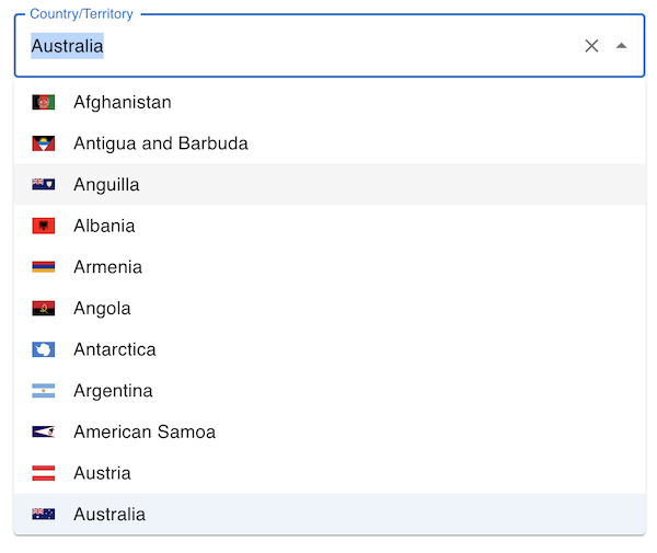
See here for the example repo: https://github.com/visitorapi/react-country-state-fields-example
Installation
npm i react-country-state-fieldsreact and react-dom are required peer dependencies. @mui/material (plus @emotion/react/@emotion/styled, MUI's own peer requirements) is an optional peer dependency, only needed if you use the pre-built <CountryField>/<StateField>/<CityField> components. If you're using the headless hooks to build your own UI, you don't need to install MUI at all.
npm i react react-dom @mui/material @emotion/react @emotion/styledSetup a VisitorAPI project
The components require a VisitorAPI project as the API endpoint to detect your React application users' IP locations. Go to VisitorAPI to create a free plan or a paid-as-you-go plan, depending on the usage you expect. Once a project is created, you will see the project ID which will be needed to enable the auto-detecting feature of the field components.
In the VisitorAPI project settings, you will also need to specify the domain names of your Reactjs application to authorise the API calls. VisitorAPI doesn't require any API key as an API designed for front-end use, instead, it uses the domain names to authorise the API calls so that it will be safe for you to call the APIs from the front-end.
Use the field components
First, you will need to import the <VisitorAPIComponents> component which is responsible for auto-detecting the user's IP location and passing the country, state, and city data back to your state. Then you can use the <CountryField>, <StateField>, and <CityField> components to show the fields.
import { CountryField, StateField, CityField, VisitorAPIComponents } from 'react-country-state-fields';
import React, { useState } from 'react';

export const MyForm = () => {
  const [country, setCountry] = useState({}); // the selected country
  const [state, setState] = useState({}); // the selected state
  const [city, setCity] = useState({}); // the selected city
  const visitorApiPrjectId = ""; // assign your project ID here

  return(
    <VisitorAPIComponents
      projectId={visitorApiPrjectId}
      handleCountryChange={(countryObj) => setCountry(countryObj)}
      handleStateChange={(stateObj) => setState(stateObj)}
      handleCityChange={(cityObj) => setCity(cityObj)}
    >
      <CountryField label="Country/Territory"></CountryField>
      <StateField label="State/Province"></StateField>
      <CityField label="City"></CityField>
    </VisitorAPIComponents>
  );
}
<VisitorAPIComponents>
The <VisitorAPIComponents> component is invisible and you can put other form field components in it as children components. It has three purposes:
- Auto-detecting the user's IP location and setting the default country, state, and city objects
- Passing the country, state, and city objects back through
handleCountryChange,handleStateChange, andhandleCityChangefunctions - Exposing
loadinganderroron context, so you can render a loading or error state while the auto-detect call is in flight
<VisitorAPIComponents
  projectId={visitorApiPrjectId}
  handleCountryChange={(countryObj) => setCountry(countryObj)}
  handleStateChange={(stateObj) => setState(stateObj)}
  handleCityChange={(cityObj) => setCity(cityObj)}
>
  // other field components here...
  <CountryField label="Country/Territory"></CountryField>
  <StateField label="State/Province"></StateField>
  <CityField label="City"></CityField>
  // other field and button components here...
</VisitorAPIComponents>
Props
projectId- the VisitorAPI project ID from your VisitorAPI project. Without the project ID (and withoutdefaultCountryCode), your fields will not be able to auto-detect users' IP locations.handleCountryChange- the function to handle changes in the<CountryField>component so that you can retrieve the selected country. The country object is a JSON in the format{code: "US", label: "United States"}. You can use.codeto get the country code or.labelto get the country's full name.handleStateChange- the function to handle changes in the<StateField>component so that you can retrieve the selected state. The state object is a JSON in the format{code: "CA", label: "California"}.handleCityChange- the function to handle changes in the<CityField>component so that you can retrieve the selected city. The city object is a JSON in the format{code: "Los Angeles", label: "Los Angeles"}(cities have no distinct ISO code in the underlying dataset, so the city name is used as bothcodeandlabel).defaultCountryCode/defaultStateCode/defaultCityCode- set an initial country/state/city without waiting for (or instead of) IP-based auto-detection.defaultStateCoderequiresdefaultCountryCode;defaultCityCoderequiresdefaultStateCode(or a country with no state-level data, see<CityField>below).loading(via context, not a prop you pass in) -truewhile the IP auto-detect call is in flight. Read it withuseContext(VisitorAPIContext).error(via context) - theErrorfrom a failed auto-detect call, ornull. The fields simply stay empty on failure; checkerrorif you want to show a message.
<CountryField>
The <CountryField> component is a selection field for users to input their countries. If auto-detection is enabled by giving a valid VisitorAPI project ID, the field will set the country automatically based on the user's IP location.
Props
label- the field label such as "Country/Territory". Leave it blank if you have a separate component for the field's label.showFlag(defaulttrue) - set tofalseto hide the flag icon in the option list.renderFlag- a function(countryOption) => ReactNodeto render a custom flag/icon in place of the default one (fetched fromflagcdn.com). Ignored whenshowFlagisfalse.sx,className,variant,fullWidth,size- passed straight through to the underlying MUIAutocomplete/TextField, so you can restyle the field to match your app's design system.
<CountryField
  label="Country/Territory"
  showFlag={false}
  variant="filled"
  fullWidth
  sx={{ backgroundColor: '#fafafa' }}
/>
<StateField>
The <StateField> component is a selection field for users to input their state. It shows a searchable dropdown for countries that have state/province data, or an open text field for the small number of countries/territories that don't. If auto-detection is enabled by giving a valid VisitorAPI project ID, the field will set the state automatically based on the user's IP location.
Props
label- the field label such as "State/Province". Leave it blank if you have a separate component for the field's label.sx,className,variant,fullWidth,size- same style passthrough as<CountryField>.
<CityField>
The <CityField> component is a selection field for users to input their city, cascading from the currently selected state (or directly from the country, for the countries that have no state-level data). Falls back to an open text field where no city data is available for the current selection.
City data is inherently less complete than country/state data, there's no ISO standard for cities the way there is for countries and states, and the bundled dataset (150,000+ cities) still won't cover every small town, neighborhood, or business-specific service area. Because of that, <CityField> defaults to freeSolo: users can always type a value that isn't in the list. If your valid cities are a specific, known set (a delivery zone, a set of branch locations, etc), pass your own list via the cities prop instead of relying on the bundled dataset at all.
Props
label- the field label such as "City". Leave it blank if you have a separate component for the field's label.sx,className,variant,fullWidth,size- same style passthrough as<CountryField>.freeSolo(defaulttrue) - lets the user type and commit a city that isn't in the suggested list (still shows suggestions from the cascaded/custom city list as they type). Set tofalseto require selecting from the list only.cities- an array of{code, label}objects that overrides the auto-cascaded country-state-city list entirely. Use this when your valid cities are a known, specific set rather than "any city in this state."
// Restrict to a specific set of cities instead of the full bundled dataset
<CityField
  label="City"
  cities={[
    { code: "Downtown", label: "Downtown" },
    { code: "Uptown", label: "Uptown" },
  ]}
/>

// Require a selection from the list, no free typing
<CityField label="City" freeSolo={false} />
Headless usage (no MUI)
Everything the MUI components do, auto-detecting from the visitor's IP, cascading state from country, cascading city from state, guarding against clobbering a value the user is actively editing, is implemented as plain React hooks with no MUI/emotion import anywhere in the dependency chain. <CountryField>/<StateField>/<CityField> are thin wrappers around these hooks. If you're building your own UI (Tailwind, Chakra, plain HTML, a design system, whatever), import from the /headless subpath instead and skip the MUI peer dependency entirely.
import { VisitorAPIComponents, useCountryField, useStateField, useCityField } from 'react-country-state-fields/headless';

function MyCountrySelect() {
  const { value, options, onChange } = useCountryField();
  return (
    <select value={value?.code ?? ''} onChange={(e) => onChange(e.target.value)}>
      <option value="">Select a country</option>
      {options.map((c) => <option key={c.code} value={c.code}>{c.label}</option>)}
    </select>
  );
}

function MyForm() {
  return (
    <VisitorAPIComponents projectId="<visitorapi-project-id>">
      <MyCountrySelect />
    </VisitorAPIComponents>
  );
}
<VisitorAPIComponents> is exported from both the default entry point and /headless, it's the same context provider either way, so headless hooks and the pre-built MUI fields can share the same provider and stay in sync (mix and match freely).
useCountryField()
Returns { value, options, onChange }.
value- the currently selected country object ({ code, label }), ornull.options- the full list of country objects to render as choices.onChange(countryCodeOrObject)- call with a country code string (e.g. from a<select>'sevent.target.value) or a country object. Clears the selected state and city, matching the cascading behavior of<CountryField>.
useStateField()
Returns { value, options, onChange }.
value- the currently selected state object, ornull.options- the list of state objects for the current country, ornullif the current country has no state-level data (render a free-text input in that case, same fallback<StateField>uses).onChange(stateCodeOrObject)- call with a state code string or object. Clears the selected city.
useCityField({ cities, freeSolo } = {})
Returns { value, options, freeSolo, onChange }.
value- the currently selected/typed city object, ornull.options- the list of city objects cascaded from the current state (or country, where there's no state-level data), ornull/empty if none are available (render a free-text input in that case).cities- optional override: pass your own array of{ code, label }objects to replace the auto-cascaded list entirely, same as<CityField>'scitiesprop.freeSolo(defaulttrue) - whetheronChangeshould accept a typed value that isn't inoptions.onChange(cityNameOrObject)- call with a city name string or object.
useVisitorLocationStatus()
Returns { loading, error } — the same values exposed on VisitorAPIContext, for rendering a loading or error state around your custom fields.