
react-custom-ratings
v0.1.76
Published
**react-custom-ratings** react-custom-ratings is a react rating component which supports custom icons and styles and also provides progress bar which shows detailed information on ratings.

Readme
react-custom-ratings
react-custom-ratings is a react rating component which supports custom icons and styles and also provides progress bar which shows detailed information on ratings.
Installation
npm install react-custom-ratingsDemo
https://codesandbox.io/s/interesting-knuth-rjg53s?file=/src/App.js
Usage
import {Ratings, Rating, ProgressBar} from 'react-custom-ratings'
const Demo=()=>{
return(
<!-- Use Ratings component to display both ratings and progress bar -->
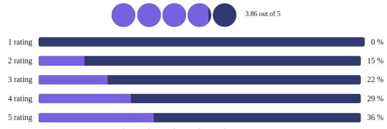
<Ratings data={[{count:10,rating:5},{count:13,rating:4},{count:10,rating:3},{count:8,rating:2},{count:4,rating:1}]}/>
<!-- Use Rating component to display ratings -->
<Rating data={[{count:10,rating:5},{count:13,rating:4},{count:10,rating:3},{count:8,rating:2},{count:4,rating:1}]}/>
<!-- Use ProgresBar component to display ProgressBar -->
<ProgressBar data={[{count:10,rating:5},{count:13,rating:4},{count:10,rating:3},{count:8,rating:2},{count:4,rating:1}]}/>
)};
API
This a list of props that you can pass down to the Ratings component: | Property | Description | Default Value|Type| | ----------- | ----------- | ------------ |----| |data|Data for Ratings|NA|array| | options | Props applied to the Rating and ProgressBar elements.|{ratings:{},progressBar:{}}|object|
List of props that you can pass down to the Rating Component:
| Property | Description | Default Value | Type | | ------------------- | -------------------------------------------------------------------------------------------------- | ---------------------------------- | ---------------------------------------- | | show | If it is true the rating component is visible | true | boolean | | filledColor | Filled rating icon color | '#ffa41c' | string | | unfilledColor | Empty rating icon color | '#ffa41c' | string | | ratingIconClassname | Classname for rating Icon | 'star' | string | | className | classname for rating header text | 'rating' | string | | FilledRatingIcon | Custom react element for filled rating icon | from react-icons | React element | | UnfilledRatingIcon | Custom react element for unfilled rating icon | from react-icons | React element | | headerText | headerText is function which takes 'percent' type of number as parameter and returns react element | NA | (percent: number) => React.ReactElement; |
List of props that you can pass down to the ProgressBar Component: | Property | Description | Default Value|Type| | ----------- | ----------- | ------------ |----| |filledColor|Filled start rating color|'#ffa41c'|string| |unfilledColor|Empty star rating color|'#ffa41c'|string| |className|classname for rating header text|'rating'|string| |progressBarText|To display custom text on left side of progress bar use progressBarText function.progressBarText takes function with parameter 'data' which should return react element|(data) => React.ReactElement;|React Element| |percentage|To display custom percentage of ratings on rigt side of progress bar use percentage function.perecentage takes fucntion with two parameters 'data and 'percent' which should return react element|(percent: number, data) => React.ReactElement;|React Element| |onClick|onClick is event handler function which gets executed when clicked on any of the progress bar,first parameter for onClick function is data of the progress bar clicked on. |(data) => void;|Function
Help improve the component
Build on your machine:
Clone the repo
git clone https://github.com/Roxiler/react-ratings.git
Install dependancies
npm install