
react-custom-sidebar
v1.0.6
Published
React Custom Sidebar is a fully customizable sidebar component for React. - Can be used a docked or over content. - Docked version has open and close state. - Fully customizabe light and dark theme option. - User profile section. - Dedicated logout b
Downloads
34
Maintainers
 vijaykumawat897
Readme
React Custom Sidebar
React Custom Sidebar is a fully customizable sidebar component for React.
- Can be used a docked or over content.
- Docked version has open and close state.
- Fully customizabe light and dark theme option.
- User profile section.
- Dedicated logout button
- Auto adjusted on mobile devices to 'Over content' mode
- Custom styles supported
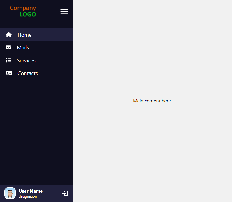
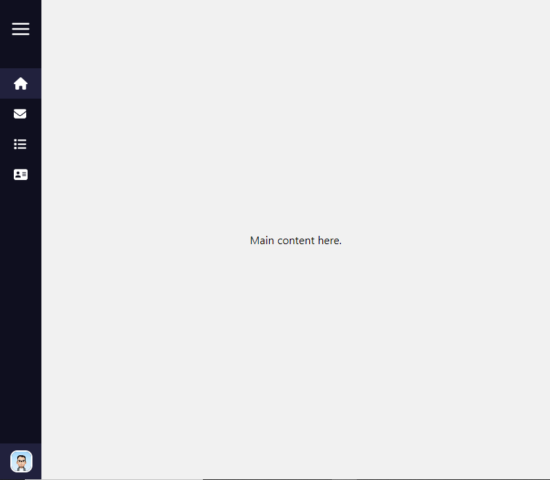
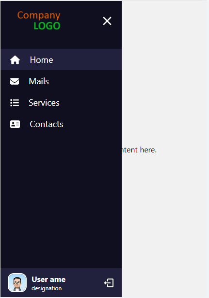
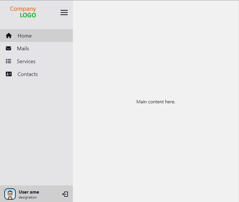
Screenshots
desktop view
desktop view menu closed
mobile view menu opened
light theme
Installation
npm install react-custom-sidebar
Getting started
import { Sidebar } from "react-custom-sidebar";

const themeColors = {
  light: {
    bgColor: "#e4e4e6",
    textColor: "#0f0f1f",
    highlights: "#cfcfcf",
  },
  dark: {
    bgColor: "#0f0f1f",
    textColor: "#ffffff",
    highlights: "#21213d",
  },
};

function App() {
  // sidebar toggle status
  const [isMenuOpen, setIsMenuOpened] = useState(false);

  // menu list
  const menuItems = [
    {
      title: "Home",
      link: "/",
      icon: <FontAwesomeIcon icon={faHome} />,
    },
    {
      title: "Mails",
      link: "/mails",
      icon: <FontAwesomeIcon icon={faEnvelope} />,
    },
    {
      title: "Services",
      link: "/services",
      icon: <FontAwesomeIcon icon={faList} />,
    },
    {
      title: "Contacts",
      link: "/contacts",
      icon: <FontAwesomeIcon icon={faContactCard} />,
    },
  ];

  // logout click handler
  const handleLogout = () => {
    console.log("logout clicked");
  };

  return (
    <div className="App">
      <BrowserRouter>
        <Sidebar
          menuItems={menuItems}
          theme="light"
          logoUrl="add logo url here"
          logoSmallUrl="add small logo url here which will be visible in closed state"
          themeColors={defaultThemeColors}
          showLogout={true}
          handleLogout={handleLogout}
          userDetails={{
            name: "User name",
            description: "designation",
            avatar: "add user avatart url here",
          }}
          closeOnLinkClick={false}
          closeOnOutsideClick={false}
          isSidebarOpened={isMenuOpen}
          handleSidebarToggle={setIsMenuOpened}
          showToggleButton={true}
        >
          // main content here
          <Routes>
            <Route path="/" element={<Home />} />
            <Route path="mails" element={<Mails />} />
            <Route path="contacts" element={<Contacts />} />
            <Route path="services" element={<Services />} />
          </Routes>
        </Sidebar>
      </BrowserRouter>
    </div>
  );
}

export default App;
Supported props
| Property name | Type | Default | Description |
| ------------------ | ------------------------- | -------------------- | ------------------------------------------------------------------------------------------------------------------------------------------------------------------------ |
| docked | boolean | true for desktop/tablet and false for mobiles | If the sidebar is docked with main content or float over it
| menuItems | array of objects | Empty array | The list of menu items to be rendered |
| logoUrl | string | NULL | Logo url
| logoSmallUrl | string | NULL | Small Logo for closed state, only visible if showToggleButton is false url |
| theme | string | dark | light/dark |
| themeColors | object | default colors | Theme colors |
| showLogout | boolean | false | To show/hide logout button |
| handleLogout | function | NULL | Logout button click listener |
| userDetails | object | NULL | User details to be shown in sidebar. |
| closeOnLinkClick | boolean | false | To close the sidebar on menu item click |
| closeOnOutsideClick | boolean | false | To close the sidebar on outside click on docked state or mobile view |
| isSidebarOpened | boolean | true | If the sidebar should be open |
| showToggleButton | boolean | true | If hamburger menu icon visible |
| handleSidebarToggle | function | n/a | Callback called when the sidebar status changed from hamburger menu icon |
| showTooltipOnClose | boolean | true | If tooltip visible in closed state. |
| styles | object | empty object | Custom styles. |
Default theme colors
{
  light: {
    bgColor: "#e4e4e6", // sidebar background color
    textColor: "#0f0f1f", // text color
    highlights: "#cfcfcf", // bg color of active/hover link item
  },
  dark: {
    bgColor: "#0f0f1f",
    textColor: "#ffffff",
    highlights: "#21213d",
  },
}
Menu items
[
    {
        title: "Home",
        link: "/home",
        icon: "" //  component or img,
    },
    ...
]
userDetails
{
    name: "",
    description: "",
    avatar: ""
}
Styles
Custom styles can be passed as an object with these keys:
{
    sidebar : { /* for main container */},
    logoContainer: {/* for logo container */},
    logo: { /* for logo icon */},
    logoSmall: { /* for small logo icon */},
    toggleIcon: { /* for hamburger menu icon */},
    menuItem: { /* for menu logo and text container */},
    menuItemIcon: { /* for menu item logo */},
    menuItemText: { /* for menu item text */},
    userContainer: { /* for  user details container */},
    username: { /* for username text */},
    avatar: { /* for user avatar */},
    userDescription: { /* for user description text */},
    logout: { /* for logout icon */},
    mainContentContainer: { /* for main content outside the sidebar */}
}