
react-data-table-modify
v1.1.3
Published
React DataTable with enhanced capabilities to replace jQuery datatable
Maintainers
 olivier_bussier
Readme
react-data-table-modify
A simple-to-use React table library with interesting features
- Capability to be configured to display arrays of objects with simple columns configuration
- Multi-criterias sort, including typechecking (dates, numbers & strings).
- Locale display
Short term evolution
- add cell editing (2.0)

:mag_right: Preview
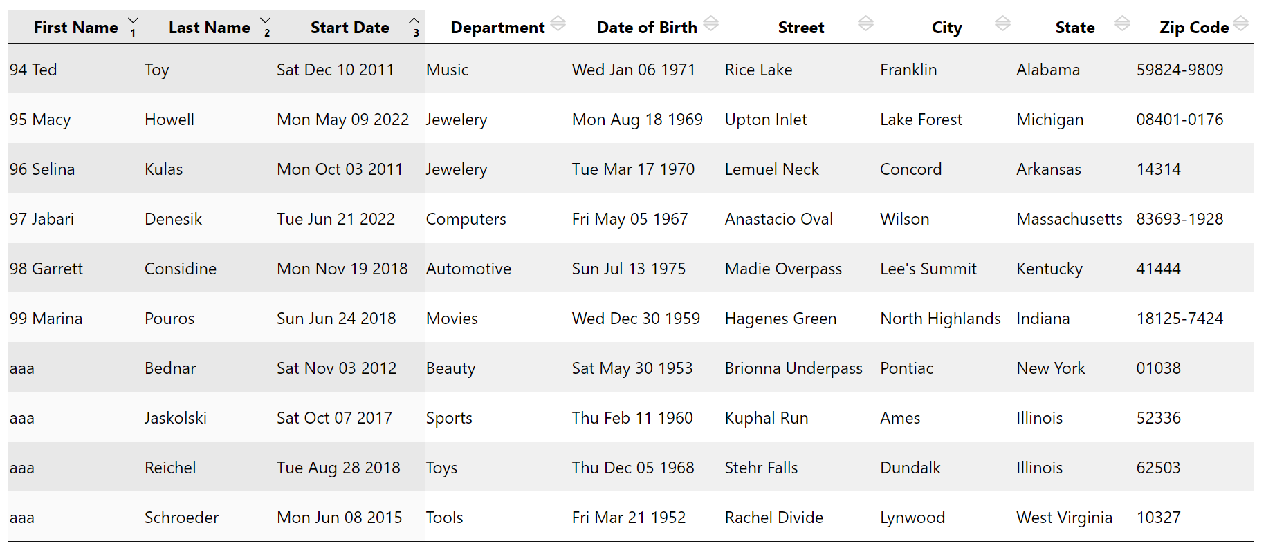
Live demo
https://olivierbussier.github.io/react-data-table-modify/
data for this live demo have been created using faker
Install
npm install react-data-table-modifyUsage
import React, { Component } from 'react'

import {Datatable} from 'react-data-table-modify'

const App = () => {

    return <DataTable formatCols={} data={} curPage={} nbPerPage={} />

}
Description of props
FormatCols
This prop is used to explain to DataTable the structure of data to display. The structure understood by DataTable is an array of objects, each object describe a row of the data.
Consider you want to display an array of objects having the following data structure:
const data = [
  {
    xName: "Calin",
    dateOfBirth: "Thu Feb 11 2020",
    description: "First pet of my wife"
  },
  ...
]
The corresponding 'formatCols' prop will be :
const format = [
  {
    name: "Name of the animal", // Header name of the column
    data: "xName",              // name of the property in the data object
    type: "string"              // Type of the col here 'string'
  },
  {
    name: "Birth Date",
    data: "dateOfBirth" ,
    type: "date"                // Type of the col, here 'date'
  },
  {
    name: "Description",
    data: "description",
    type: "string"
  }
]
And finally, for these data, you will use DataTable this way
<DataTable formatCols={format} data={data}>Pagination
DataTable comes with a Pagination companion component. In this case, you could send to Datatable component whole data and specify by props which part of these data you want to display
The props used to doing that are :
- nbPerPage : Number of items to display
- curPage : The page you want to display (0 to n)
You could maintain a state variable for curPage in your App (with your pagination component) and pass this variable as props to DataTable
Usage of DataTable with Pagination component
At least, you have to declare state variables:
- First one to maintain the value of the current page.
- Second one for the number of items per page if you want this to be dynammicly changed
import {DataTable, Pagination} from 'react-data-table-modify'

const App = () => {
  const nbPerPage = 10
  const [curPage, setCurPage] = useState(0)

  data = ...fetch / Array...

  return (
    <div>
      <DataTable
        formatCols={formatCols}
        data={data}
        curPage={curPage}
        nbPerPage={nbPerPage}
      />
      <Pagination
        nbItems={data.length}
        nbPerPage={nbPerPage}
        curPage={curPage}
        onPageChange={(page) => setCurPage(page)}
      />
    </div>
  )
}
Sorting capabilities
Datatable is able to sort data with 3 colums, ascending/descending
- If you click on a column header you will sort data using this column. If you click again on the same column, this will inverse the sens of sorting.
- If you maintain 'shift key' when you click on header cols, you will preserve previous sort choices (max 3)
- If you have already 3 sort cols selected and you click with shift key pressed, then you erase previous sort choices
Columns are sorted depending of their types, meaning that dates are sorted correctly
CSS Structure
Display of DataTable component could be customised easily using css overriding, hereafter the structure of scss in place
.data-table {
    // Container of whole DataTable component
    th {
        position: relative;  // Origin of children's absolute
        background-image: url(/* Caret up&down*/);
        &.asc {
            background-image: url(/* caret up */);
        }
        &.desc {
            background-image: url(/* caret dpwn */);
        }
        &.sort-col-0 {
            &:after {
                position: absolute;
                content: '1';
            }
        }
        &.sort-col-1 {
            &:after {
                position: absolute;
                content: '2';
            }
        }
        &.sort-col-2 {
            &:after {
                position: absolute;
                content: '3';
            }
        }
    }
    tbody tr {
        background: white;
        &:nth-child(2n+1) {
            background-color: /* color of odd rows */
        }
    }
    tr:nth-child(2n+1) {
        .sort-col-0, .sort-col-1, .sort-col-2 {
            background-color: /* color of odd rows */
        }
    }
    tr:nth-child(2n+2) {
        .sort-col-0, .sort-col-1, .sort-col-2 {
            background-color: /* color of even rows
        }
    }

}
And for Pagination component
.app-pagination {
    // Container of whole Pagination component
    .active {
        // Active button
        &:hover {
          // Active button hovered
        }
    }

    button {
      // Buttons
        &.left-btn {
            //Left Button
        }
        &.middle-btn {
            // Middle Buttons (other than left & right)
        }
        &.right-btn {
            //Right Button
        }
        &:hover {
          // Hovered Buttons
        }
    }
}
License
MIT © olivierbussier