
react-dockbar
v1.3.0
Published
A macOS-Dock-style, animated, drill-down app bar for React 18/19, with pill, glass and solid light/dark themes.

Maintainers
 pilmee
Readme
react-dockbar


















A macOS-Dock-style, animated app bar for React 18 and 19: hover magnification, drill-down navigation with an auto-inserted Back item, and pill, glass and solid themes for light and dark.

Screenshots
| | |
| --- | --- |
| Open windows: hover an app to see its windows as thumbnails.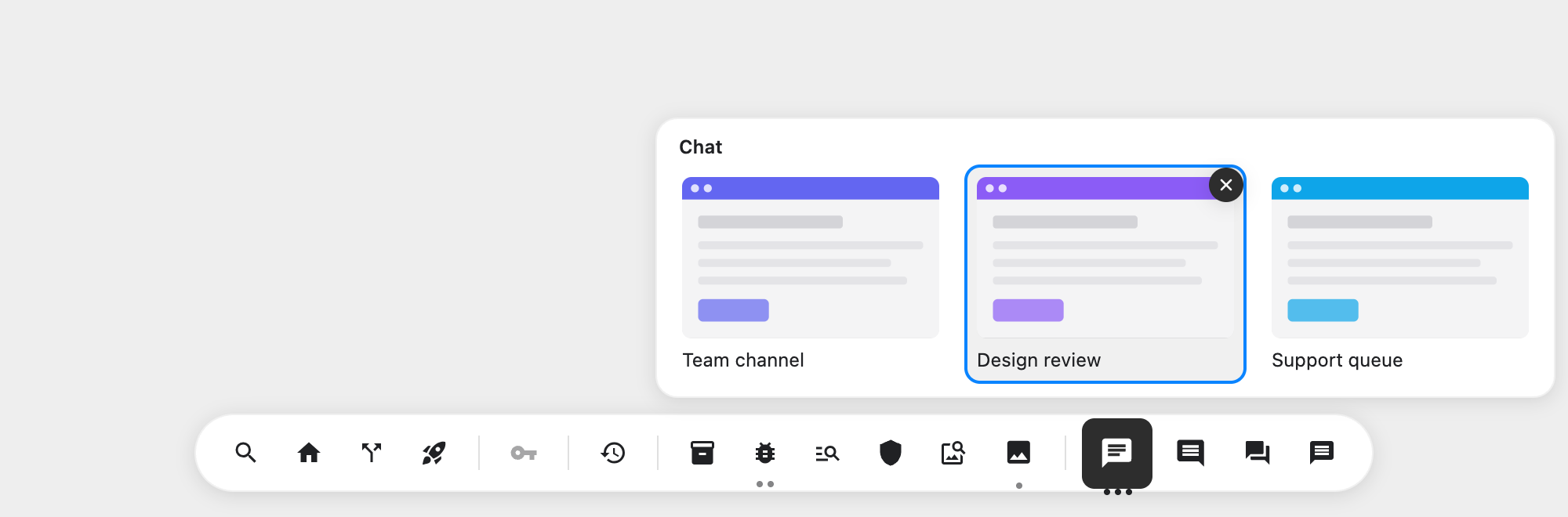 | Drill-down: nested levels with an auto-inserted Back button.
 |
| Dark mode:
|
| Dark mode: colorScheme="dark" (or auto). | Variants:
 pill, glass and solid, light and dark.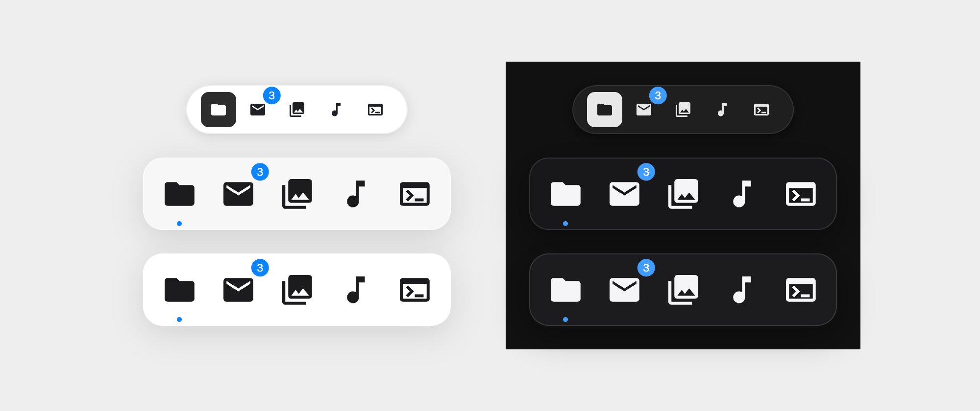 |
|
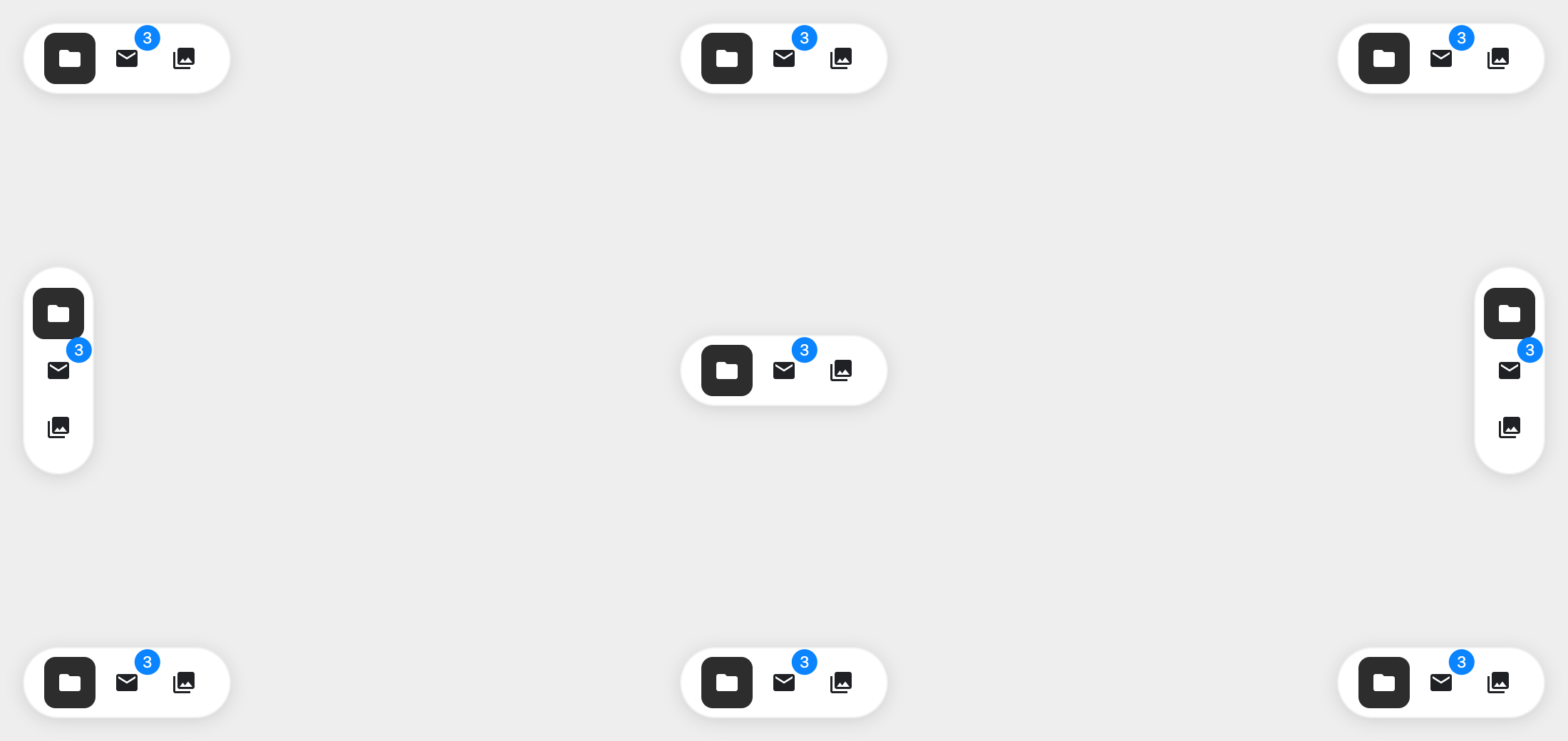
Positions: pin it to any edge or corner with position, or keep it inline.
Installation
npm install react-dockbarEvery release is also published to GitHub Packages as @eljijuna/react-dockbar. GitHub
requires authentication even for public packages: add this .npmrc next to your
package.json, with a token that has the read:packages scope in GITHUB_TOKEN:
@eljijuna:registry=https://npm.pkg.github.com
//npm.pkg.github.com/:_authToken=${GITHUB_TOKEN}
npm install @eljijuna/react-dockbarImport from @eljijuna/react-dockbar (and @eljijuna/react-dockbar/style.css) instead.
import { DockBar } from 'react-dockbar';
import 'react-dockbar/style.css';

function AppMenuBar() {
  return (
    <DockBar
      items={[
        { id: 'finder', label: 'Finder', icon: <FinderIcon />, onSelect: () => openFinder() },
        {
          id: 'settings',
          label: 'Settings',
          icon: <SettingsIcon />,
          children: [
            { id: 'wifi', label: 'Wi-Fi', icon: <WifiIcon />, onSelect: () => openWifi() },
            { id: 'display', label: 'Display', icon: <DisplayIcon />, onSelect: () => openDisplay() },
          ],
        },
      ]}
      colorScheme="auto"
    />
  );
}
Behavior
Position: by default the dock is pinned to the bottom center of the viewport (
position: fixed, respecting safe-area insets).positionaccepts'bottom-center','bottom-left','bottom-right','top-center','top-left','top-right','left-center'and'right-center'(pair the side ones withorientation="vertical"), or'inline'to render it in the document flow inside your own layout. Tooltips and magnification open away from the edge. Tune the edge distance with--dockbar-offset(default16px) and stacking with--dockbar-z-index(default1000).Auto-hide:
autoHidekeeps the pinned dock off-screen, like the macOS Dock. It slides in when the pointer reaches its edge (a--dockbar-reveal-size, default4px, strip along it), stays while the pointer is over it, focus is inside (so Tab always reveals it) or a previews panel is open, and hides again afterautoHide={{ delay }}ms (default400). On touch, a tap on the edge reveals it until the next tap outside. An auto-hiding dock overlays the page, so it does not publish--dockbar-inset-<edge>. Ignored withposition="inline".Reserving space for the pinned dock: while pinned, the dock publishes the space it takes from its edge (distance to the edge plus its thickness) on
<html>as--dockbar-inset-bottom,--dockbar-inset-top,--dockbar-inset-leftor--dockbar-inset-right. It only changes when the dock's size does (not while items magnify) and is removed on unmount or withposition="inline". Use it so content scrolls clear of the dock, and so focused or anchored elements are not scrolled behind it:body { padding-bottom: var(--dockbar-inset-bottom, 0px); } html { scroll-padding-bottom: var(--dockbar-inset-bottom, 0px); }Flat items: leaf items call
onSelect({ item, path, nativeEvent })when activated.Nested items: clicking an item with
childrenshrinks the current level toward the center, then expands into that item's children. A circular Back button appears in its own bubble to the left of the dock (above it when vertical); clicking it (or pressingEscape) reverses the animation back up one level. Spacing is tunable via--dockbar-back-gap.Active item: pass
activeId(controlled, e.g. from your router) ordefaultActiveId(uncontrolled; activating a leaf makes it active). The active item gets a dot indicator andaria-current; parents containing a nested active item get a dimmer dot. AddopenActiveLevelto start inside the submenu that holds the active item (mount only — lateractiveIdchanges never move the user away from the level they are browsing).Hover magnification: items scale up under the pointer, tapering off for nearby neighbors, matching macOS Dock behavior. Defaults depend on the variant (pronounced for
glass/solid, subtle forpill); passmagnification={{ scale, distance }}to override any part of it, orfalseto disable.Badges:
badgeshows a count or short text on the item, and it is included in the accessible name ("Mail, 3 notifications"; wording set bylabels.badge). For a badge that is not text, such as a dot or an icon, passbadgeLabel(e.g.'unread messages') so screen readers get it too. A falsy badge (e.g.0) is neither shown nor announced.Separators: add
{ type: 'separator', id: 'sep-1' }entries to split items into groups.Toggle items: give a leaf item
pressed: booleanto make it a toggle button (aria-pressed) — e.g. panels that can be open at the same time. It is controlled: flip it inonSelect. Toggling never changes the active item, so both can be shown together.Open windows (previews): give a leaf item
previews({ id, title, thumbnail, active?, onSelect?, onClose? }[]) to show its open windows. The item gets up to three dots, and hovering it opens a panel of thumbnails over it (afterpreviewDelay.open, 400ms; it stayspreviewDelay.close, 200ms, after the pointer leaves so the pointer can reach it). Clicking an item with two or more windows pins the panel instead of callingonSelect; with one window the click selects as usual. Selecting a thumbnail calls itsonSelect, closes the panel and makes the item active;onCloseadds a close button (andDelete). The thumbnails are yours to render (<img>,<canvas>,<video>…) and are only mounted while the panel is open. The panel opens away from the screen edge, in the top layer (Popover API), and can be controlled withopenPreviewsId/onPreviewsOpenChange. Keyboard: the arrow pointing at the panel (↑ for a bottom dock) opens it and focuses the front window, arrows move between windows,Escapecloses it and returns focus to the item. Style it with--dockbar-preview-width,--dockbar-preview-aspect-ratio,--dockbar-preview-radiusand--dockbar-preview-bg.Theming:
colorScheme('light' | 'dark' | 'auto') andvariantswitch themes:'pill'(default: a compact rounded toolbar with a filled active item),'glass'(a translucent macOS-style dock with a dot under the active item) or'solid'(the same dock, opaque). Deeper customization is available through CSS custom properties (--dockbar-bg,--dockbar-blur,--dockbar-accent,--dockbar-item-size, ...) documented insrc/theme/tokens.css.Accessibility: renders as a
role="toolbar"of native<button>/<a>elements, moves focus to/from the Back button on navigation, announces level changes via a live region, and respectsprefers-reduced-motion(or force it via thereducedMotionprop). Keyboard follows the WAI-ARIA toolbar pattern: a single Tab stop, arrow keys (↑/↓ when vertical) to move, Home/End, andEscapeto go back. In forced-colors mode (Windows High Contrast) the active, pressed and submenu-parent states, dots, separators, badges and tooltips are redrawn with system colors so they stay distinguishable.
Translating screen-reader texts
The dock name and the Back label are props; the dynamic texts are builder functions, so each language controls its own grammar and plurals. Any builder you omit falls back to English.
<DockBar
  items={items}
  ariaLabel="Barra de herramientas"
  backItem={{ label: 'Atrás' }}
  labels={{
    parentItem: (label, count) => `${label}, abre ${count} ${count === 1 ? 'opción' : 'opciones'}`,
    backTo: (label) => `Volver a ${label}`,
    enteredLevel: (label, depth) => `${label}, nivel ${depth + 1}`,
    returnedTo: (label) => (label ? `De vuelta en ${label}` : 'De vuelta en el menú principal'),
    badge: (name, badge) =>
      typeof badge === 'number'
        ? `${name}, ${badge} ${badge === 1 ? 'notificación' : 'notificaciones'}`
        : `${name}, ${badge}`,
    previewsItem: (label, count) =>
      `${label}, ${count} ${count === 1 ? 'ventana abierta' : 'ventanas abiertas'}`,
    previewsPanel: (label) => `Ventanas de ${label}`,
    closePreview: (title) => `Cerrar ${title}`,
  }}
/>
Migrating from 1.x
2.0 changes two defaults. To keep the 1.x look and layout, pass both props:
<DockBar items={items} variant="glass" position="inline" />variantnow defaults to'pill'(was'glass').positionnow defaults to'bottom-center', pinned to the viewport (1.x rendered it in the document flow, which isposition="inline"now). This change already shipped in 1.2.0.
Development
npm install
npm run dev          # Storybook
npm test             # Jest + Testing Library
npm run lint          # eslint + biome
npm run build         # library build (ESM + CJS + types + style.css)
Linting, formatting, and TypeScript/Jest configuration are provided by
super-configs.
License
MIT