
react-dockeep
v1.1.3
Published
React documentation keeper allows user to create documentation for their components and view them directly with custom configurations in their projects.

Readme
react-dockeep
React documentation keeper allows user to create documentation for their components and view them directly with custom configurations in their projects.
Get started
npm i react-dockeepThen use it in your index.js (if using create-react-app)
import React from 'react';
import ReactDOM from 'react-dom';
import App from './App';
import Doc from 'react-dockeep';

const CONFIG = {/* Your configurations here */}

ReactDOM.render(
  <React.StrictMode>
    <Doc config={CONFIG}>
      <App />
    </Doc>
  </React.StrictMode>,
  document.getElementById('root')
);
Props
|Name|required|type|default|description| |---|---|---|---|---| |config|true|object||The config that controls the components and documentation |url|false|string|'doc'|The url that will be used to browse the components
Config
The documentation will be rendered based on the configuration provided, here are the fields that can be configured.
|Name|required|type|default|description| |---|---|---|---|---| |components|true|array||A list of components with configuration
components
|Name|required|type|default|description| |---|---|---|---|---| |component|true|function | class||The component that will be rendered |name|false|string|The given component's name|The name of the component |description|false|string|'No description'|The description of the component |props|false|array|[]|A list of props that will be applied to the component with documentation |code|false|string||The example code, please notice that the name of the tag must match the component name
props
|Name|required|type|default|description| |---|---|---|---|---| |name|true|string||The name of the prop |value|true|string||The value of the prop |required|false|boolean|false|Whether this prop is required by the component or not |default|false|any||The default value of the prop |type|false|string|'any'|The type of the prop |doc|false|string|''|The documentation of this prop
Example
Here is a screenshot of the example:
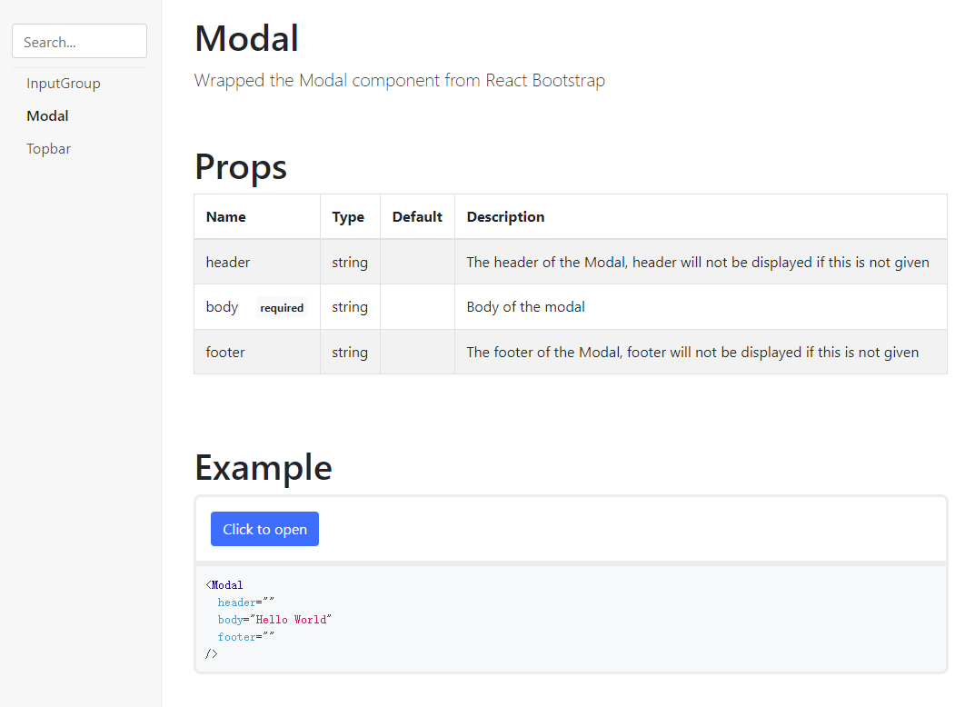
The above documentation can be generated by the following config:
{
  component: Modal,
  description: "Wrapped the Modal component from React Bootstrap",
  props: [
    {
      name: "header",
      value: "",
      default: "",
      doc: "The header of the Modal, header will not be displayed if this is not given",
      type: "string"
    },
    {
      name: "body",
      value: "Hello World",
      required: true,
      doc: "Body of the modal",
      type: "string"
    },
    {
      name: "footer",
      value: "",
      default: "",
      doc: "The footer of the Modal, footer will not be displayed if this is not given",
      type: "string"
    },
  ]
}
To run examples use npm start and go to http://localhost:8080 in your browser, see examples folder for more information
TODO
v1.0.0
- [x] Add example
- [x] Prevent name duplications
- [x] ~Improve add config using functions~ (Push to v1.1.0)
- [x] Change all bootstrap elements to React Bootstrap
- [x] Implement the search feature of the sidebar
- [x] Proper warning and error display
- [x] ~Figure out a way when user deleted required props and error is thrown~ (This only happens in react development mode)
v1.1.0
- [x] Config using functions
- [x] ~Allow users to handle routing by themselves~ (Push to v1.2.0)
- [x] Allow users to write example code by themselves
- [x] ~Allow users to control sections by themselves~ (Push to v1.2.0)