
react-drift-rail
v0.1.1
Published
A small, accessible React rail with native scrolling and pointer dragging.

Maintainers
 saeedet
Readme
Drift Rail

A small React component for a horizontally draggable strip of images, cards, or arbitrary content. It uses native scrolling, preserves touch momentum, and adds mouse/pen dragging and keyboard navigation. No slides, autoplay, or active-item state.
Version: 0.1.1. The package has zero runtime dependencies beyond React peers. No Tailwind or CSS framework required.
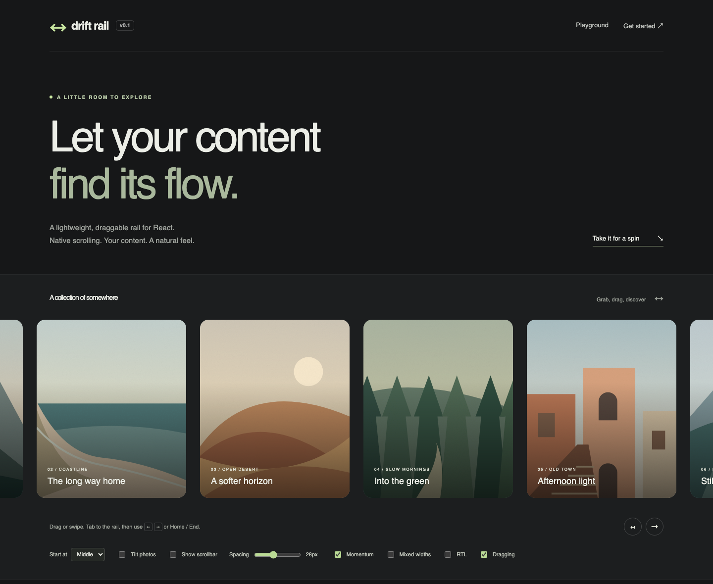
Try the live playground — adjust the photo count, starting position, tilt, scrollbars, spacing, and momentum.
Quick start
npm install react-drift-railimport { DraggableRail } from 'react-drift-rail';
import 'react-drift-rail/styles.css';
export function Gallery() {
return (
<DraggableRail aria-label="Travel photos" gap={24}>
<img src="/coast.jpg" alt="A winding path above the sea" width={320} height={380} />
<img src="/forest.jpg" alt="Morning light through the trees" width={280} height={380} />
</DraggableRail>
);
}Run npm ci && npm run dev in this repository to try the playground locally. To test a local package build in another application, run npm pack here, then install the generated tarball in that application. The package requires its stylesheet; content remains ordinary HTML during SSR.
API
DraggableRail renders a single div. Children remain direct children. All normal div attributes and events pass through, except the two drag callbacks described below.
| Prop | Type | Default | Purpose |
| ----------------------------------- | --------------------------------- | --------- | ----------------------------------------------------------- |
| children | ReactNode | — | Any React content |
| hideScrollbar | boolean | false | Hide native scrollbars, preserving scrolling and focus |
| initialPosition | 'start' \| 'center' \| 'end' | 'start' | Initial viewport; center also aligns fitting content |
| gap | CSS gap value | 16 | Numbers are pixels; strings accept CSS lengths |
| dragEnabled | boolean | true | Enables custom mouse/pen dragging |
| momentum | boolean | false | Adds mouse/pen inertia after release |
| onDragStart | (info: RailDragInfo) => void | — | Runs once when movement passes the threshold |
| onDragEnd | (info: RailDragEndInfo) => void | — | Runs on release or input cancellation |
| ref | Ref<HTMLDivElement> | — | The native scrolling element |
| dir | HTML dir | inherited | Use rtl for right-to-left layouts |
| aria-label / aria-labelledby | string | — | Gives the rail an accessible name and default region role |
| tabIndex | number | 0 | Makes the rail keyboard-focusable |
| className, style, onScroll, … | Normal div props | — | Consumer styling and standard events |
RailDragInfo contains pointerType: 'mouse' | 'pen' and scrollLeft: number. RailDragEndInfo also contains cancelled: boolean. These are rail gesture callbacks, not HTML drag-and-drop events. Native touch scrolling does not invoke them. Cleanup on unmount or a dragEnabled/momentum configuration change stops the gesture without emitting callbacks. Use onScroll to observe all scrolling, including touch and programmatic changes.
Exported types: DraggableRailProps, RailDragInfo, RailDragEndInfo. No private engine types are public exports. React 18.2 and React 19 are supported.
Start in the middle
<DraggableRail initialPosition="center" aria-label="Travel photos">
  {photos.map((photo) => (
    <img key={photo.id} src={photo.src} alt={photo.alt} width={320} height={380} />
  ))}
</DraggableRail>
center starts at the midpoint when content overflows and centers the item group when all content fits within the viewport. The fitting layout stays centered as the viewport changes. end starts at the reading-order end. Both work with dir="rtl". Consumer styles can override the alignment with style={{ justifyContent: 'flex-start' }}.
In the playground, choose Photos: 2 and Start at: Middle, then resize the window to compare fitting and overflowing content.
The position is set when the DOM ref attaches, before the first client paint. It follows item/container size changes and newly added direct children until the first pointer, wheel, keyboard, focus-driven scroll, or programmatic scroll. After that, resizing or new content will not restore the initial scroll offset; fitting content still centers through layout. initialPosition is an initial value: changing it on an existing instance does not reset scrolling. Use the native ref to move later, or change the component's key to start fresh.
SSR HTML itself has no scroll offset; the initial position is applied during hydration. Give images explicit dimensions to reserve space before they load. Resize tracking uses ResizeObserver; where unavailable, initial placement and child-list updates still work.
Programmatic scrolling
The ref exposes the browser's own API instead of a second wrapper API:
import { useRef } from 'react';
import { DraggableRail } from 'react-drift-rail';
import 'react-drift-rail/styles.css';

export function WithControls() {
  const rail = useRef<HTMLDivElement>(null);
  return (
    <>
      <button onClick={() => rail.current?.scrollBy({ left: 300, behavior: 'instant' })}>
        Move right
      </button>
      <DraggableRail ref={rail} aria-label="Cards">
        <article style={{ width: 340 }}>First card</article>
        <article style={{ width: 340 }}>Second card</article>
      </DraggableRail>
    </>
  );
}
Start is scrollTo({ left: 0 }). In LTR, end is scrollWidth - clientWidth; in RTL, negate that value. Native coordinates are physical: positive scrollBy moves right. If you request smooth scrolling yourself, check prefers-reduced-motion first. Avoid starting a programmatic animation while a pointer gesture or optional momentum is running.
Styling and custom children
The stylesheet owns only horizontal flex layout, overflow, focus outline, scrollbar styling, and active-drag feedback. It adds flex-shrink: 0 to direct children; consumers set item dimensions, colors, rounding, and typography. Use one element around each multi-element card. Plain text also renders, but should be wrapped when you need per-item spacing.
<DraggableRail className="products" gap="clamp(12px, 3vw, 32px)" aria-label="Products">
  {products.map((product) => (
    <article key={product.id} className="product-card">
      <a href={product.url}>{product.name}</a>
      <button onClick={() => addToCart(product.id)}>Add to cart</button>
    </article>
  ))}
</DraggableRail>
.products {
padding: 16px 4px;
--drift-rail-scrollbar: #66776688;
}
.product-card {
width: min(320px, 80vw);
border-radius: 16px;
}Scrollbars remain visible according to OS preferences by default. Set hideScrollbar to show only your content, while keeping dragging, touch, trackpad, keyboard, and programmatic scrolling. Provide an accessible label and a clear scrolling affordance when hiding the scrollbar. Do not override display: flex, horizontal overflow, or set scroll-behavior: smooth on the rail: pointer movement requires immediate scrolling. CSS style.gap overrides the gap prop.
<DraggableRail initialPosition="center" hideScrollbar aria-label="Travel photos">
  {photos.map((photo) => (
    <img key={photo.id} src={photo.src} alt={photo.alt} width={320} height={380} />
  ))}
</DraggableRail>
Flat or tilted photos
The component renders flat by default; tilt is entirely optional consumer CSS. The playground has a Tilt photos checkbox. To reproduce it, toggle a class on your rail:
<DraggableRail className={tilted ? 'gallery gallery--tilted' : 'gallery'} aria-label="Photos">
  {children}
</DraggableRail>
.gallery {
padding: 16px 4px;
}
.gallery--tilted > :nth-child(odd) {
transform: rotate(1.2deg);
}
.gallery--tilted > :nth-child(even) {
transform: rotate(-1.2deg);
}Omit the class for a normal, straight rail. Rotation is not built into the library, so arbitrary cards and consumer transforms remain under your control.
Native inputs, selects, textareas, editable content, audio/video controls, and explicitly draggable elements are excluded from custom dragging. Add data-rail-no-drag to any other child area to preserve text selection, custom gestures, or native drag-and-drop there. Links and buttons remain draggable surfaces; a drag suppresses its ensuing pointer click. Tiny movement stays a click, and keyboard activation is preserved. Active dragging prevents selection only inside the rail.
Next.js and SSR
Both published JavaScript formats preserve a top-level 'use client' directive. No module reads window or document at evaluation time. An App Router Server Component can render the rail and pass serializable props and rendered children:
// app/page.tsx — a Server Component
import Image from 'next/image';
import { DraggableRail } from 'react-drift-rail';

export default function Page() {
  return (
    <DraggableRail aria-label="Portfolio" gap={24}>
      <Image src="/work.jpg" alt="A courtyard in afternoon light" width={320} height={400} />
      <Image src="/studio.jpg" alt="A sunlit studio" width={400} height={400} />
    </DraggableRail>
  );
}
Import react-drift-rail/styles.css once in app/layout.tsx (or pages/_app.tsx for the Pages Router). If using refs or callback props, place that composition in your own Client Component with 'use client'. Drift Rail has no Next.js runtime dependency and does not wrap, fetch, or optimize your images. Set image dimensions to avoid layout shift.
See the runnable Next.js example and React playground. Both share the repository's development dependencies; this is a single-package repository, not a workspace monorepo.
Accessibility and input behavior
- Focus the rail with Tab. Left/Right move physically by 80% of the visible width; Home/End move to reading-order start/end, including RTL. Scrolling is immediate.
- Keys from child links, buttons, and inputs are left alone. Modified keys are left alone. A consumer
onKeyDowncan callpreventDefault()to override the rail's handling. - A named rail defaults to
role="region"; an unnamed one gets no invented role. Supply a meaningful label for every navigable rail, or explicitly choose another appropriate role. Avoid adding many redundant landmarks. - Visible focus styling is included. Children retain normal focus order, and native browser scrolling reveals focused offscreen controls.
- Touch panning, pinch zoom, and touch momentum are browser-managed with
touch-action: auto. Pen events use custom dragging when the browser dispatches them; devices that claim the gesture for native panning may issuepointercanceland continue natively. - Optional mouse/pen momentum stops for a new gesture, wheel/keyboard input, focus entry, window blur, cancellation, or cleanup. Reduced-motion preferences disable it, including changes during animation.
- A six-pixel horizontal threshold distinguishes clicks from dragging. Vertical gestures yield. Only an active custom drag calls
preventDefault()on pointer movement. - A child or consumer can veto a pointer start in
onPointerDownCaptureusingpreventDefault(). The controller uses native listeners, so React bubble handlers run after its pointerdown listener.
Automated checks cover interaction and common WCAG rules; they do not replace manual screen-reader and real-device testing. See validation for actual coverage and limits.
Browser support
Target: current evergreen Chrome/Chromium, Firefox, Safari, mobile Safari, and Chromium Android. Required APIs include Pointer Events, pointer capture, requestAnimationFrame, and MediaQueryList.addEventListener; no legacy polyfills are shipped. The test matrix uses Playwright Chromium, Firefox, and WebKit plus mobile viewport/touch emulation. See validation for the full browser results and manual coverage limits.
RTL uses the modern negative scrollLeft model and clamps overscroll. Legacy positive/reversed RTL models are unsupported. See MDN's scrollLeft documentation. Native touch behavior follows touch-action. WebKit automation is useful coverage, but is not a claim of testing physical iPhones or the shipping Safari application.
Development
For repository development, use current Node 24 LTS (24.15+) or Node 26 and npm. The test toolchain requires these newer versions; the published package itself declares Node 22.14+ for Node-based consumers. Commit package-lock.json with dependency changes.
npm ci
npm run dev                  # React playground
npm run build                # ESM, CJS, declarations, CSS, source maps
npm run dev:next             # Build first; Next.js example on port 3001
npm run check                # Build, formatting, lint, types, unit tests, package checks
npx playwright install      # One-time browser downloads
npm run test:e2e             # Chromium, Firefox, WebKit, mobile projects
npm run test:package         # Install tarball with React 18 and 19; verify exports and SSR
npm run build:demo
npm run build:next
npm run test:next             # Production App Router hydration and dragging
npm run format
npm run dev consumes source for fast feedback. Next.js and the tarball smoke tests consume built exports. Rebuild after library edits before using the Next.js example. npm run size budgets each JS entry to 6 KiB gzip and CSS to 1 KiB gzip, verifies package contents, and checks that React is external. Actual sizes and test results are recorded in validation.
Live playground deployment
The playground is hosted on GitHub Pages. Successful pushes to main deploy automatically after all CI checks pass; pull requests run verification only. The repository's Pages source must be set to GitHub Actions. The CI workflow also supports manual runs from main.
To preview the production deployment locally:
npm run build:demo -- --base=/react-drift-rail/
npx vite preview --config examples/react/vite.config.ts --base=/react-drift-rail/
Open the printed local URL under /react-drift-rail/. Demo image paths use Vite's base URL so both the root-path development server and the published project site work.
Contributing and releases
Read CONTRIBUTING.md, CODE_OF_CONDUCT.md, and SECURITY.md. Small focused changes with reproducible interaction tests are welcome. Architecture notes explain the design choices.
Versioning follows SemVer. Before 1.0, breaking API changes increment the minor version and are documented in the changelog. Follow the publishing checklist for each release. The project is maintained at saeedet/react-drift-rail.
Roadmap
- Manual assistive-technology and physical iOS/Android/pen validation before 1.0.
- Improve velocity sampling from real-device feedback.
- Consider an extracted core only if another framework implementation has an actual maintainer.
Autoplay, active slides, infinite looping, virtualization, and lightboxes are outside v1's scope.
MIT licensed. The local landscape SVG artwork is original demo material released under the same license.