
react-dual-field
v1.0.11
Published
A set of bilingual/multilingual React input components for forms, supporting English and Arabic (or any languages). Includes: `DualInput`, `DualSelect`, and more.

Readme
react-dual-field
A set of bilingual/multilingual React input components for forms, supporting English and Arabic (or any languages).
Includes: DualInput, DualSelect, and more.
Installation
npm install react-dual-fieldComponents
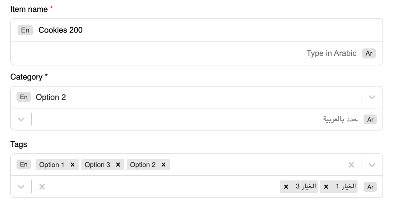
1. DualInput
A simple dual-language text input.
import { DualInput } from "react-dual-field";

<DualInput
  label="Item name"
  required
  englishValue={english}
  arabicValue={arabic}
  onEnglishChange={setEnglish}
  onArabicChange={setArabic}
/>
Props:
label(string): Field labelrequired(boolean): Show required indicatorenglishValue(string): Value for English inputarabicValue(string): Value for Arabic inputonEnglishChange(fn): Callback for English input changeonArabicChange(fn): Callback for Arabic input change
2. DualSelect
A select/dropdown for English and Arabic options.
import { DualSelect } from "react-dual-field";

const options = [
  { value: "option1", label: "Option 1", labelAr: "الخيار 1" },
  // ...
];

<DualSelect
  label="Category"
  required
  options={options}
  isMulti={false}
  value={category}
  onChange={setCategory}
/>
Props:
label(string): Field labelrequired(boolean): Show required indicatoroptions(array): Array of{ value, label, labelAr }isMulti(boolean): Multi-select modevalue(object):{ en, ar }selected valuesonChange(fn): Callback with{ en, ar }
Example Usage
See example/src/App.tsx for a full demo.
Styling
- Components include default CSS.
- You can override styles by importing your own CSS or using Tailwind classes.
Development
- Build:
npm run build - Dev (auto-build on changes):
npm run dev(uses nodemon + rollup) - Type definitions are generated automatically.
License
MIT