
react-duration
v1.1.0
Published
Duration input field for react.
Downloads
74

Readme
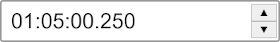
React Duration Input


A simple, customizable duration input field for React with Typescript support.
Installation
npm install react-durationUsage
import { useState } from 'react';
import DurationInput from 'react-duration';

function App() {
  const [duration, setDuration] = useState(125.4); // Duration in seconds

  return (
    <DurationInput
      value={duration}
      onChange={setDuration}
    />
  );
}
Props
| Prop | Type | Description |
|------|------|-------------|
| value | number | Initial duration value in seconds |
| onChange | (seconds: number) => void | Callback fired when duration changes |
| buttonIncrement | number | Seconds to increment/decrement when buttons are pressed (default: 0.1) |
| minValue | number | Minimum allowed value in seconds |
| maxValue | number | Maximum allowed value in seconds |
| noButtons | boolean | Hide the increment/decrement buttons |
| style | CSSProperties | Custom styles for the wrapper element |
| className | string | Custom class name for the wrapper element |
| name | string | Name attribute for the input element |
Styling
The component exposes the following CSS classes for customization:
| Class | Element |
|-------|---------|
| duration-input-wrapper | Outer wrapper |
| duration-input | Text input field |
| duration-input-button-wrapper | Button container |
| duration-input-button | Both buttons |
| duration-input-up-button | Increment button |
| duration-input-down-button | Decrement button |
License
MIT