
react-emoji-popup-lister
v0.2.27
Published
React emoji search & select by colon syntax, with keyboard navigation
Downloads
102
Maintainers
 ngpfontaine
Readme
React Emoji Popup Lister
Slack-lick emoji list and select via keyboard

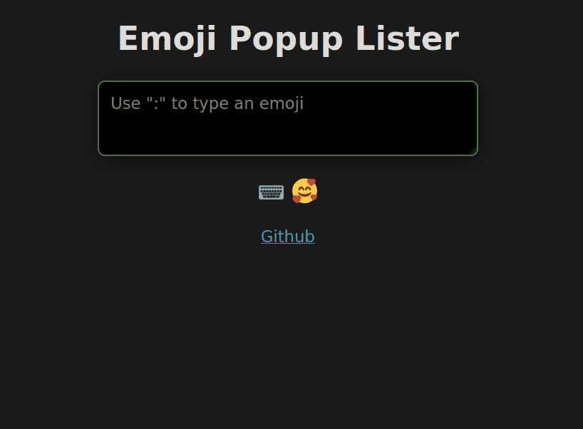
📁 About
Type and insert emojis within your inputs, via their shortcode values. Written in Typescript.:cool: :cool:
⌨️ Install
npm i -s react-emoji-popup-lister🚀 Usage
1. Basic
import EmojiPopup from "react-emoji-popup-lister"

export default function ExampleA () {
  return <EmojiPopup />
}
2. Custom styling with props
import EmojiPopup from "react-emoji-popup-lister"

export default function ExampleB () {
  return (
    <EmojiPopup
      listMax={40}
      maxHeight="200px"
      maxWidth="300px"
      placeholder="Add a profile description"
      theme="light"
      ariaLabel="Profile description input"
    />
  );
}
3. Provide an input component, state, and events from your parent component
Also wrap in a container div, to align the input and popup
import { useState, useEffect } from "react";
import EmojiPopup from "react-emoji-popup-lister"

// Your input with props passed, including input value state
function Input (props: any) {

  useEffect(() => { }, [props.value]);

  return (
    <input
      // Required. Anything after is optional, and will override values
      {...props}
      // Override or extend default values
      className="your-class-name"
      placeholder="Your placeholder text"
      style={{ ...props.style, width: "100%" }}
    />
  );
}

// Parend component with state, passed input, events, etc.
export default function ExampleC () {

  const [text, setText] = useState("");
  useEffect(() => { }, [inputText]);

  const handleChange = function (e: React.ChangeEvent) { };

  return (
    {/* Container to align input and popup together */}
    <div style={{ maxWidth: "400px", margin: "1rem auto 0"}}>
      <EmojiPopup
        input={Input}
        value={text}
        setValue={setText}
        onChange={handleChange}
      >
        <div>Child content...</div>
      </EmojiPopup>
    </div>
  );
}
🗃️ Prop Options
All are optional
| Prop | Type | Default | Description |
| --- | --- | --- | --- |
| input | input/textarea component | <input> | Pass your own input element or component |
| value | useState string value | "" | Store state in your parent component |
| setValue | useState function | setState | Set value from inside Emoji component |
| listMax | number | 6 | Max number of emoji matches to display |
| theme | string | auto | Popup display theme style. light dark auto |
| strict | boolean | true | Strict mode will ignore a:b, 👋:ab |
| maxWidth | number/string | 400px | Scroll container width cap |
| maxHeight | number/string | 250px | Scroll container height cap |
| footer | boolean | true | Display or hide footer info bar |
| placeholder | string | "" | Input placeholder value |
| ariaLabel | string | "" | Input aria-label value |
🪅 Prop Events
Place on
<EmojiPopup>component, Not your custom<input>- as this will override necessary events
| Prop | Description |
| --- | --- |
| onClick | Input element Click event (* Not emoji list) |
| onChange | Input value Change event |
| onKeyDown | Input KeyDown event |
| onKeyUp | Input KeyUp event |
| onFocus | Input Focus event |
| onBlur | Input Blur event |
🗺️ Shortcuts
These will
preventDefaultin the input while the popup is active
| Key | Function |
| --- | --- |
| ArrowUp | Up in emoji list |
| ArrowDown | Down in emoji list |
| Home | Start of emoji list |
| End | End of emoji list |
| Enter or Tab | Choose highlighted emoji |
🏗️ Todo
Feature
- Add CSS classes for user styling
- Option to turn off Home/End shortcut
- Option to replace full emoji string automatically (2 colons)
- Add better positioning support
Bugs
- Cursor over list, while using keyboard navigation still triggers hover change
- Deleting "combo" emojis on Firefox doesn't remove the entire emoji
- Escape to hide gets reset on successive typing
- Cursor changing caret position not triggering changes
🖊️ License
MIT © nicfontaine