
react-enhanced-glow
v3.0.8
Published
A performant, highly-customizable animated glow effect for React Native, powered by Skia and Reanimated.
Downloads
322
Maintainers
 codyanon
Readme
React Native Animated Glow v3.0.8


A performant, highly-customizable animated glow effect component for React Native, powered by Skia and Reanimated 3.
Live Demo & Builder
Check out the live web demo and interactive builder to see the component in action, browse tutorials, and create your own presets.
Features
- GPU-Powered Performance: Built with Skia for smooth, 60 FPS animations that run on the UI thread.
- Intelligent State Blending: Responds to
hoverandpressevents by smoothly interpolating between different glow configurations. - Highly Customizable: Control colors, speed, shape, size, opacity, and more through a flexible
glowLayersAPI. - Advanced Effects:
- Create flowing gradient glows and borders.
- Render glows
behind,inside(clipped), oroveryour component. - Achieve "comet trail" effects with variable
glowSizearrays.
- Easy Web Setup: Skia's CanvasKit WASM file is loaded automatically from a CDN, no extra configuration needed.
- Presets Included: Ships with professionally designed presets to get you started instantly.
Installation
1. Install the library:
npm install react-enhanced-glow2. Install Peer Dependencies:
The library depends on Skia, Reanimated, and Gesture Handler.
npm install @shopify/react-native-skia react-native-reanimated react-native-gesture-handler3. Configure Dependencies:
You must follow the installation guides for the peer dependencies to ensure they are configured correctly for your project.
- React Native Skia Docs
- Reanimated Docs (Remember to add the Babel plugin!)
- Gesture Handler Docs (Remember to add
GestureHandlerRootView!)
Usage
The best way to use the component is with a PresetConfig object, which makes your styles reusable and type-safe.
import React from 'react';
import { View, Text, StyleSheet } from 'react-native';
import AnimatedGlow, { type PresetConfig } from 'react-enhanced-glow';

// 1. Define your preset
const myCoolPreset: PresetConfig = {
  metadata: {
    name: 'My Cool Preset',
    textColor: '#FFFFFF',
    category: 'Custom',
    tags: ['interactive']
  },
  states: [
    {
      name: 'default', // The base style for the component
      preset: {
        cornerRadius: 50,
        outlineWidth: 2,
        borderColor: '#E0FFFF',
        glowLayers: [
          { colors: ['#00BFFF', '#87CEEB'], opacity: 0.5, glowSize: 30 },
        ]
      }
    },
    // 2. Define interactive states
    {
      name: 'hover',
      transition: 300, // 300ms transition into this state
      preset: {
        glowLayers: [{ glowSize: 40 }] // On hover, make the glow bigger
      }
    },
    {
      name: 'press',
      transition: 100, // A faster transition for press
      preset: {
        glowLayers: [{ glowSize: 45, opacity: 0.6 }]
      }
    }
  ]
};

// 3. Use it in your component
export default function MyGlowingComponent() {
  return (
    <AnimatedGlow preset={myCoolPreset}>
      <View style={styles.box}>
        <Text style={styles.text}>I'm Interactive!</Text>
      </View>
    </AnimatedGlow>
  );
}

const styles = StyleSheet.create({
  box: { paddingVertical: 20, paddingHorizontal: 40, backgroundColor: '#222' },
  text: { color: 'white', fontWeight: 'bold' }
});
Controlling States
The AnimatedGlow component is stateless by default and is controlled via the activeState prop. This gives you complete control to connect it to any gesture or state management system.
The recommended way to handle user interactions is to wrap your content in a Pressable and use React.useState and React.useRef to manage the component's state between 'default', 'hover', and 'press'.
Here is a robust example demonstrating how to handle both press and hover events correctly:
import React, { useState, useRef } from 'react';
import { View, Text, StyleSheet, Pressable } from 'react-native';
// Import the GlowEvent type for type safety
import AnimatedGlow, { glowPresets, type GlowEvent } from 'react-enhanced-glow';
export default function MyInteractiveButton() {
// 1. State for the active glow effect ('default', 'hover', 'press')
const [glowState, setGlowState] = useState<GlowEvent>('default');
// 2. Ref to track if the cursor is currently hovering over the element
const isHovered = useRef(false);
return (
<AnimatedGlow
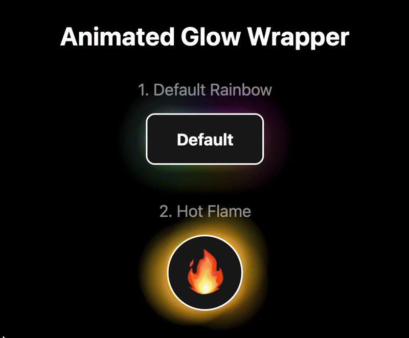
preset={glowPresets.defaultRainbow}
// 3. Pass the state to the activeState prop to control the glow
activeState={glowState}
>
<Pressable
style={styles.button}
onPress={() => console.log('Button Pressed!')}
// --- Press Events ---
onPressIn={() => setGlowState('press')}
onPressOut={() => {
// When the press is released, transition to 'hover' if the cursor
// is still over the button, otherwise return to 'default'.
setGlowState(isHovered.current ? 'hover' : 'default');
}}
// --- Hover Events (for Web, macOS, Windows) ---
onHoverIn={() => {
isHovered.current = true;
// Only transition to hover state if not being actively pressed.
if (glowState !== 'press') {
setGlowState('hover');
}
}}
onHoverOut={() => {
isHovered.current = false;
// Only transition to default state if not being actively pressed.
if (glowState !== 'press') {
setGlowState('default');
}
}}
>
<Text style={styles.buttonText}>Tap or Hover Me</Text>
</Pressable>
</AnimatedGlow>
);
}
const styles = StyleSheet.create({
button: {
paddingVertical: 20,
paddingHorizontal: 40,
backgroundColor: '#222'
},
buttonText: {
color: 'white',
fontWeight: 'bold',
textAlign: 'center'
}
});API Reference
For a complete list of all available props and their descriptions, please see the Docs Tab in the live demo app.
Changelog
v3.0.8
- Added
activeStateprop. - Removed insternal state management
v3.0.0 (Breaking Changes)
This version introduces a more powerful and intelligent animation system along with a complete restructuring of the preset API for better organization and type safety.
- New Feature: Intelligent Animation Blending: A new animation system powered by Reanimated worklets smoothly interpolates between state configurations. When you hover, press, or return to default, every animatable property (colors, sizes, opacity, etc.) will transition gracefully over the specified duration.
- New Feature: Reworked State Management API: The
presetprop now expects aPresetConfigobject with astatesarray. All visual styles, including thedefaultlook, are defined within this array. This makes presets more organized and powerful. - Architectural Improvement: All glow layers, placements (
behind,inside,over), and the animated border are now rendered in a single, unified Skia shader for maximum efficiency. - BREAKING CHANGE: The
presetprop format has been completely overhauled. Old flat preset objects are incompatible and must be migrated to the newPresetConfigstructure, which includes ametadataobject and astatesarray. - BREAKING CHANGE: The
randomnessprop has been removed from the core API.
v2.0.0
This version marked a complete architectural rewrite for maximum performance and flexibility.
- Complete Rewrite with Skia: The library is now powered by Skia and Reanimated 3, running animations smoothly on the UI thread.
- Interactive States: Added support for
hoverandpressevents with configurable transitions usingreact-native-gesture-handler. - BREAKING CHANGE: The library now requires
@shopify/react-native-skia,react-native-reanimated, andreact-native-gesture-handleras peer dependencies. The old props (glowColor,glowSize, etc.) have been replaced by theglowLayersAPI.
v1.0.0
- Initial release using glow particles and reanimated
License
This project is licensed under the MIT License.