
react-event-calendar-suite
v2.5.1
Published
React Event Calendar Suite - Production-ready React event calendar & scheduler with month/week/day/list/year views, drag-and-drop, RRULE recurrence, ICS import/export, i18n, and timezone support. Style-isolated Ant Design UI for safe embedding in any host
Maintainers
 sameedhasan
Keywords
Readme
react-event-calendar-suite
React event calendar & scheduler component — month, week, day, list, and year views with drag-and-drop, recurring events, locales, timezones, and ICS export. Built for React 18/19, TypeScript, Vite, and Next.js.

npm install react-event-calendar-suiteLive demo (Storybook) · npm package · GitHub · Changelog
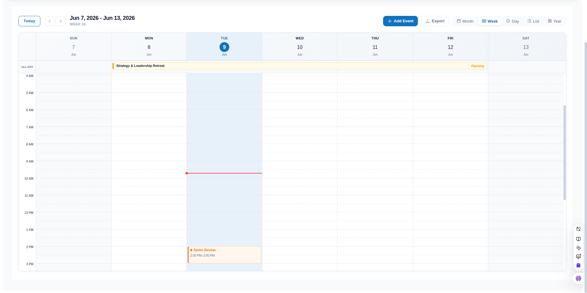
Table of contents
- Why use this calendar?
- Installation
- Quick start
- Features
- Storybook
- Examples
- Design philosophy
- Props reference
- Event schema
- FAQ
- License
Why use this calendar?
Looking for a React calendar component, event scheduler, or appointment booking UI? react-event-calendar-suite is a drop-in library for apps that need:
- A FullCalendar-style month / week / day grid without a heavy commercial license
- Drag-and-drop rescheduling with optional disable flags
- Recurring events (RFC 5545 RRULE) and ICS / iCal export
- Internationalization (30+ locales) and IANA timezone display
- TypeScript types, accessibility basics, and Next.js App Router support
Minimal by default — pass events and render. Enable CRUD, DnD, export, and recurrence only when you need them.
📖 Storybook
Interactive demos for every major feature — views, controlled mode, theming, and customization slots.
npm run storybookPublished build: GitHub Pages Storybook (after the Storybook workflow runs on main).
📁 Examples
| Example | Description |
| :--- | :--- |
| examples/minimal-vite | Smallest Vite + React setup |
| examples/nextjs-app-router | Next.js App Router with "use client" |
The Vite example bundles from source (no pre-build needed). For npm installs, use import Calendar from 'react-event-calendar-suite' directly.
Additional guides: docs/installation.md · docs/ssr-nextjs.md · docs/migration-v2.md
🎯 Design philosophy
The calendar is a display component by default — pass events and it renders. Every interactive feature requires an explicit opt-in:
| Feature | Default | Enable with |
| :--- | :--- | :--- |
| Add / edit / delete | off (no modal) | onAddEvent + onUpdateEvent + onDeleteEvent |
| Export button | off | showExportButton={true} |
| Import button | off | showImportButton={true} + onImportEvents (controlled) |
| Drag-and-drop | off | onEventDrop handler |
| Event resize / extend | off | onEventResize handler |
| Date click to create | on | allowDateClick={false} to turn off |
✨ Features
- 📅 5 Interactive Views: Standard Month, Time-Grid Week, Time-Grid Day, Agenda List view, and comprehensive Year overview with mini-calendars.
- ⚙️ Localization & Format Settings: Fully configurable week start day (any day of the week, e.g.,
'monday','sunday','wednesday', etc.) and time format ('12h'or'24h') passed directly as props. All grid columns, boundary offsets, hour gutters, time-indicator lines, overnight range formats, and tooltips automatically sync dynamically to these selections. - 🔗 Advanced Spanning & Overnight Support:
- Month View: Renders multi-day events as continuous horizontal spanning bars across columns; single-day events as compact colored pills with time + title.
- Week View: Features a sticky All-day row showing multi-day events as continuous spanning bars aligned perfectly with the column grid.
- Day View: Includes a dedicated header section for All-day & Spanning Events.
- List View: Spans overnight and multi-day events across dates, displaying relative times (e.g. including dates on boundary days) and a custom
SPANNINGtag. - Contextual Continuation Labels: Spanning segments rendered on subsequent days automatically display a
← Cont.(Continuation) label instead of original start times.
- 🎨 Dynamic Color Hash Engine: Pass any custom string category as the event
type(e.g.'Workshop','Review','Sync') and the suite automatically generates a consistent, modern HSL-based style palette (text, background, border) for it. Custom colors can also be specified per-event. - 📐 Pure CSS Grid & Flexbox: Built with high performance in mind, using a fully responsive, native CSS Grid design. Synchronized layouts ensure sticky headers, all-day rows, and grid columns align perfectly under uniform scrollbar rules.
- 🚀 Prop-Driven State Engine: Completely data-agnostic. Manage calendar data globally by simply changing the
eventsarray prop. Powered internally by a lightweight Zustand store. - 🔍 Tooltips & Detailed Aggregates: Auto-calculating status legends, busy metrics, real-time current time tracker lines, and clean tooltip overlays for overlapping event blocks.
- ⌨️ Keyboard Shortcuts: Built-in keyboard navigation for fast, mouse-free control — switch views, navigate periods, and jump to today instantly.
- 📤 iCal / ICS Export: Export calendar events directly to standard iCalendar (
.ics) format, ready to be imported into Google Calendar, Apple Calendar, or Outlook. - 📥 iCal / ICS Import (v2.5): Import
.icsfiles via the toolbar or the standaloneparseICSutility — supports UTC, local datetimes, all-day events, RRULE, and common VEVENT fields. - 🖱️ Drag-and-drop scheduling (v2.0): Move and resize events in month, week, and day views — with 15-minute snap on timed grids, both-edge span resize on month/week all-day bars, and optional
disableDrag/disableResizeflags. - 🌍 Locale / i18n (v2.3): Pass any BCP-47 tag (e.g.
'de','zh-cn','ja') via thelocaleprop to translate month names, weekday abbreviations, and Ant Design UI (date picker, modals).startOfWeekauto-derives from the locale when not set explicitly. - 🔁 Recurring events (v2.4): Add
recurrence(RRULE) on events for daily, weekly, or monthly repeats. Instances expand for the visible range only; modal picker + ICSRRULEexport included.
⌨️ Keyboard Shortcuts
The calendar includes built-in keyboard shortcuts for efficient navigation. Shortcuts are automatically disabled when focus is inside an input, textarea, or editable element.
| Key | Action |
| :--- | :--- |
| T | Jump to today |
| M | Switch to Month view |
| W | Switch to Week view |
| D | Switch to Day view |
| L | Switch to List view |
| Y | Switch to Year view |
| ← | Navigate to previous period (month/week/day depending on current view) |
| → | Navigate to next period |
| ? | Open keyboard shortcuts help |
Shortcuts are disabled while focus is inside inputs. Press ? anywhere on the calendar to open the help dialog.
♿ Accessibility
The calendar targets WCAG 2.1 AA on the toolbar and month view (more views in follow-up releases).
| Feature | Behavior |
| :--- | :--- |
| Landmarks | Root role="application"; toolbar role="toolbar" |
| View switcher | role="tablist" with aria-selected on the active tab |
| Month / week grids | role="grid" with gridcell days; today uses aria-selected="true" |
| Event chips (month) | Roving tabindex with arrow-key focus; aria-label includes title, type, and time |
| Screen reader updates | Polite aria-live region announces view and date changes |
| Keyboard hints | aria-keyshortcuts on toolbar controls; press ? for the full list |
📤 Exporting to iCalendar (iCal / ICS)
The calendar includes built-in support for exporting events to standard RFC 5545 .ics format.
- Header Toolbar Button: A pre-styled, responsive Export button is rendered on the right side of the header. Clicking it downloads the active calendar events.
- Standalone Export API: You can also import the utility helpers directly into your app to build custom export flows:
import { exportEventsToICS } from 'react-event-calendar-suite/utils/icsExport';

// Trigger download of .ics file
exportEventsToICS(events, {
  calendarName: 'React Event Calendar Suite',
  filename: 'calendar-events.ics'
});
📥 Importing from iCalendar (iCal / ICS)
Import events from .ics files via the toolbar or programmatically.
- Header Toolbar Button: Set
showImportButton={true}. In controlled mode, passonImportEventsto merge parsed events into your state. - Standalone Import API:
import { parseICS, parseICSFile } from 'react-event-calendar-suite/utils/icsImport';

// Parse a string
const events = parseICS(icsContent);

// Parse a File from an <input type="file" />
const imported = await parseICSFile(file);
<Calendar
events={events}
showImportButton
onImportEvents={(imported) => setEvents((prev) => [...prev, ...imported])}
/>📦 Installation
Install the package via npm:
npm install react-event-calendar-suiteEnsure you have the required peer dependencies installed (antd and @ant-design/icons v5 or v6):
npm install react react-dom antd dayjs zustand @ant-design/icons🚀 Quick Start
Import the calendar component and pass in your array of events:
import React from 'react';
import Calendar from 'react-event-calendar-suite';
import 'react-event-calendar-suite/style.css';

// Sample events data
const myEvents = [
  {
    id: 1,
    title: 'Product Review',
    start: new Date(2026, 5, 5, 10, 0), // June 5, 2026 at 10:00 AM
    end: new Date(2026, 5, 5, 11, 30),   // June 5, 2026 at 11:30 AM
    type: 'Review',                      // Auto-colors this type consistently
    description: 'Weekly team sync and design critique'
  },
  {
    id: 2,
    title: 'Investor Pitch',
    start: new Date(2026, 5, 6, 14, 0),
    end: new Date(2026, 5, 6, 15, 0),
    type: 'Investor',
    color: '#e11d48',                   // Optional override with custom hex color
    description: 'Pitch deck presentation'
  }
];

function App() {
  const [events, setEvents] = React.useState(myEvents);

  const handleAdd = (newEvent) => setEvents(prev => [...prev, newEvent]);
  const handleUpdate = (updatedEvent) => setEvents(prev => prev.map(e => e.id === updatedEvent.id ? updatedEvent : e));
  const handleDelete = (eventId) => setEvents(prev => prev.filter(e => e.id !== eventId));

  return (
    <div style={{ height: '100vh', padding: '20px' }}>
      <Calendar
        events={events}
        defaultView="month"
        startOfWeek="sunday"
        timeFormat="12h"
        onAddEvent={handleAdd}
        onUpdateEvent={handleUpdate}
        onDeleteEvent={handleDelete}
      />
    </div>
  );
}

export default App;
Props reference
| Prop | Type | Default | Description |
| :--- | :--- | :--- | :--- |
| events | Array | [] | Required. Array of event objects following the schema below. |
| defaultView | 'month' \| 'week' \| 'day' \| 'list' \| 'year' | 'month' | The initial active view when the component mounts (uncontrolled mode only). |
| view | 'month' \| 'week' \| 'day' \| 'list' \| 'year' | undefined | Optional. Controlled active view. Pair with onViewChange. |
| readOnly | boolean | false | Optional. Disables create, edit, delete, day-click actions, and all drag-and-drop. onEventClick still fires. |
| startOfWeek | 'sunday' \| 'monday' \| 'tuesday' \| 'wednesday' \| 'thursday' \| 'friday' \| 'saturday' | 'monday' | Configures which weekday the calendar views, headers, and column grids start on (supports any of the 7 weekdays). |
| timeFormat | '12h' \| '24h' | '12h' | Configures whether hour labels, event cards, overnight ranges, and current-time indicators use a 12-hour (AM/PM) or 24-hour display. |
| categories | string[] | ['Meeting', ...] | Optional. List of event categories/types available for creating or editing events. |
| primaryColor | string | '#1272bf' | Optional. Configures the primary theme color dynamically across all views and components (including internal Ant Design components). |
| currentDate | Date \| string | undefined | Optional. Controls the calendar's currently focused date from the parent. |
| onDateChange | (date: Date) => void | undefined | Optional. Fires when the active calendar date/range changes. |
| onViewChange | (view: string) => void | undefined | Optional. Fires when the active calendar view switches. |
| hideWeekends | boolean | false | Optional. Hides Saturday and Sunday columns in Month, Week, and List views. |
| showWeekNumbers | boolean | false | Optional. Shows the week number column on Month and Week views. |
| showToolbar | boolean | true | Optional. Renders the main header navigation toolbar. |
| showExportButton | boolean | false | Optional. Renders the toolbar "Export" iCal button. Opt-in. |
| showImportButton | boolean | false | Optional. Renders the toolbar "Import" iCal button. Opt-in. Use with onImportEvents in controlled mode. |
| showAddEventButton | boolean | true | Optional. Renders the toolbar "+ Add Event" button. |
| allowDateClick | boolean | true | Optional. Enables/disables the click-to-add event action on empty day slots. |
| eventColors | object | {} | Optional. Custom color overrides per category (e.g. { Meeting: '#ef4444' }). |
| theme | 'light' \| 'dark' | 'light' | Optional. Applies light or premium dark styles to the calendar. |
| onEventClick | (event: CalendarEvent) => void \| boolean | undefined | Optional. Intercepts event clicks. Return false to block the default edit modal. |
| onEventDrop | ({ event, start, end }) => void | undefined | Optional. Fires after moving an event via drag-and-drop. Disabled when readOnly or disableDrag. |
| onEventResize | ({ event, start, end }) => void | undefined | Optional. Fires after extending or resizing an event. Disabled when readOnly or disableResize. |
| disableDrag | boolean | false | Optional. Disables event moving (drag handles) while keeping resize and other handlers active. |
| disableResize | boolean | false | Optional. Disables event extending/resizing (edge handles) while keeping move and other handlers active. |
| onDateClick | (date: Date) => void \| boolean | undefined | Optional. Intercepts empty cell clicks. Return false to block the default creation modal. |
| onAddEvent | (event: CalendarEvent) => void | undefined | Optional. Callback triggered when a new event is created. If not provided, updates local state automatically. |
| onUpdateEvent | (event: CalendarEvent) => void | undefined | Optional. Callback triggered when an existing event is edited. If not provided, updates local state automatically. |
| onDeleteEvent | (id: string \| number) => void | undefined | Optional. Callback triggered when an event is deleted. If not provided, updates local state automatically. |
| onImportEvents | (events: CalendarEvent[]) => void | undefined | Optional. Callback when the user imports a .ics file. If not provided, merges into internal state automatically. |
| className | string | undefined | Optional. Additional CSS class names for the calendar root element. |
| style | React.CSSProperties | undefined | Optional. Inline styles for the calendar root element. The root uses height: 100%, so wrap it in a sized container. |
| loading | boolean | false | Optional. Shows a spinner overlay on the active view while async data loads. |
| timezone | string \| null | null | Optional. IANA timezone string (e.g. 'America/New_York'). Displays all event times in this zone. ICS exports use DTSTART;TZID=.... |
| locale | string \| null | null | Optional. BCP-47 locale tag (e.g. 'de', 'fr', 'zh-cn', 'ja'). Translates month names, weekday labels, and Ant Design UI components. startOfWeek defaults to the locale's natural week-start when not explicitly set. Bundles load asynchronously; the calendar renders in English for a brief moment. |
| renderEvent | (event, context) => ReactNode | undefined | Optional. Custom event chip/card renderer for month, week, day, and list views. |
| renderEventTooltip | (events, date) => ReactNode | undefined | Optional. Custom tooltip for month view "+X more" overflow. |
| renderToolbar | (api) => ReactNode | undefined | Optional. Replace the default header toolbar entirely. |
| renderEmpty | (view) => ReactNode | undefined | Optional. Custom empty state when the visible range has no events (list, year, week, day). |
Drag-and-drop
Provide onEventDrop and/or onEventResize to enable drag-and-drop. If omitted, onUpdateEvent is used as a fallback for the corresponding interaction.
| Control | Effect |
| :--- | :--- |
| readOnly | Disables all drag-and-drop (and create/edit/delete) |
| disableDrag | Disables moving only — resize handles still work |
| disableResize | Disables extending/resizing only — move handles still work |
| No handlers | No drag handles rendered (onEventDrop, onEventResize, or onUpdateEvent required) |
| View | Move | Resize | | :--- | :--- | :--- | | Month | Drop on another day cell (whole-day shift, time preserved) | Left edge → change start day · Right edge → change end day (live stretch preview) | | Week (all-day row) | Drop on another day column | Left / right edge → extend or shrink span to earlier or later days | | Week / Day (timed) | Vertical drag + column change (15-min snap) | Bottom edge handle (can cross into next day) |
<Calendar
  events={events}
  defaultView="week"
  onEventDrop={({ event, start, end }) => {
    setEvents((prev) =>
      prev.map((e) => (e.id === event.id ? { ...e, start, end } : e))
    );
  }}
  onEventResize={({ event, start, end }) => {
    setEvents((prev) =>
      prev.map((e) => (e.id === event.id ? { ...e, start, end } : e))
    );
  }}
/>
Selective disable — keep handlers wired but turn off one interaction:
// Move only, no extending
<Calendar events={events} onEventDrop={handleDrop} onEventResize={handleResize} disableResize />

// Extend only, no moving
<Calendar events={events} onEventDrop={handleDrop} onEventResize={handleResize} disableDrag />
In month and week all-day views, drag an event onto another day to move it, or drag the left or right edge onto a day to extend or shorten the span (the bar stretches live from the anchored edge). In week/day timed grids, drag vertically to change time (15-min snap) and use the bottom edge to resize duration.
See the Storybook Drag And Drop story (npm run storybook) for a live demo.
🌍 Locale / i18n
Pass a BCP-47 locale tag via the locale prop to translate the entire calendar into any of the supported languages.
What gets translated
| Element | Behaviour |
| :--- | :--- |
| Month names | Derived from the dayjs locale bundle (e.g. January → Januar in 'de') |
| Weekday abbreviations | Mon/Tue/… → Mo/Di/… (all 5 views) |
| Ant Design components | Date picker, confirmation modals, and other antd UI elements |
| startOfWeek default | Auto-derived from the locale (e.g. Sunday for 'en', Monday for most European locales) |
Basic usage
<Calendar events={events} locale="de" />
<Calendar events={events} locale="zh-cn" />
<Calendar events={events} locale="ja" />
<Calendar events={events} locale="ar" />
Override auto week start
{/* German locale, but force Monday (already the default for 'de') */}
<Calendar events={events} locale="de" startOfWeek="monday" />
Compose with timezone
<Calendar
  events={events}
  locale="zh-cn"
  timezone="Asia/Shanghai"
/>
Supported locales
| BCP-47 tag | Language |
| :--- | :--- |
| ar | Arabic |
| bg | Bulgarian |
| cs | Czech |
| da | Danish |
| de | German |
| el | Greek |
| es | Spanish |
| fi | Finnish |
| fr | French |
| he | Hebrew |
| hi | Hindi |
| hr | Croatian |
| hu | Hungarian |
| id | Indonesian |
| it | Italian |
| ja | Japanese |
| ko | Korean |
| lt | Lithuanian |
| lv | Latvian |
| ms | Malay |
| nb | Norwegian Bokmål |
| nl | Dutch |
| pl | Polish |
| pt | Portuguese |
| pt-br | Portuguese (Brazil) |
| ro | Romanian |
| ru | Russian |
| sk | Slovak |
| sl | Slovenian |
| sr | Serbian |
| sv | Swedish |
| th | Thai |
| tr | Turkish |
| uk | Ukrainian |
| vi | Vietnamese |
| zh-cn | Chinese (Simplified) |
| zh-tw | Chinese (Traditional) |
Note: Locale bundles load asynchronously. The calendar briefly renders in English, then re-renders once the bundle is ready. If you pass an unsupported code, the calendar falls back to English and logs a warning.
Customization examples
<Calendar
  events={events}
  loading={isFetching}
  renderEvent={(event, { view, onClick }) => (
    <button type="button" onClick={onClick} className="my-event">
      {event.title}
    </button>
  )}
  renderToolbar={({ view, previous, next, goToToday, setView }) => (
    <div>
      <button type="button" onClick={previous}>Back</button>
      <button type="button" onClick={goToToday}>Today</button>
      <button type="button" onClick={next}>Forward</button>
      <button type="button" onClick={() => setView('week')}>Week ({view})</button>
    </div>
  )}
  renderEmpty={(view) => <p>No events in {view} view</p>}
/>
🎨 Styles
The calendar ships with a separate stylesheet. Import it once in your app entry or page:
import 'react-event-calendar-suite/style.css';
// or
import 'react-event-calendar-suite/dist/react-event-calendar-suite.css';
📋 Event Schema
Each object in the events array should adhere to the following structure:
interface CalendarEvent {
  id: string | number;        // Unique identifier for the event
  title: string;              // Name of the event displayed on calendar cards
  start: Date | string;       // Event start date-time
  end: Date | string;         // Event end date-time
  type: string;               // Category string (e.g. 'Call', 'Lunch', 'Social')
  color?: string;             // Optional hex/CSS color override (e.g. '#10b981')
  description?: string;       // Optional descriptive text shown in details/tooltips
  location?: string;          // Optional. Included in ICS export
  allDay?: boolean;           // Optional. Renders in the all-day / spanning row
  recurrence?: string;        // Optional. RRULE body (e.g. 'FREQ=WEEKLY;BYDAY=MO;COUNT=10')
  recurrenceMasterId?: string | number; // Set on expanded instances (read-only, internal)
  metadata?: Record<string, unknown>; // Optional. App-specific data (not rendered by default)
}
Recurring events
Add an RRULE string to the master event, or use the Repeats field in the event modal:
{
  id: 'standup',
  title: 'Daily Standup',
  type: 'Meeting',
  start: new Date(2026, 5, 9, 9, 0),
  end: new Date(2026, 5, 9, 9, 30),
  recurrence: 'FREQ=DAILY;COUNT=10',
}
The calendar expands occurrences for the visible date range only (not an infinite pre-computed list). ICS export writes the master event with RRULE:. Drag-and-drop is disabled on expanded instances — edit the series via the modal.
🎨 Theme Styling & Customization
The calendar is designed with clean, premium vanilla CSS variables and supports both prop-driven and style-driven overrides.
Dynamic Theme Customization (Prop)
You can customize the accent color of the calendar dynamically by passing the primaryColor prop. This will style all buttons, select boxes, calendars, indicators, active highlights, and hover states to match:
<Calendar
  events={events}
  primaryColor="#e11d48" // A vibrant ruby red theme!
/>
CSS Overrides
Alternatively, you can adjust theme colors globally by overriding these custom properties in your global stylesheet:
:root {
  --primary-color: #1272bf;      /* Theme main accent color */
  --white-color: #ffffff;        /* Container backgrounds */
  --bg-color: #f8fafc;           /* Global calendar grid backdrop */
  --border-color: #e2e8f0;       /* Divider and cell borders */
  --text-primary: #1e293b;       /* Primary text */
  --text-secondary: #64748b;     /* Secondary details */
}
🧪 Testing
npm test              # run once
npm run test:watch    # watch mode
npm run test:coverage # coverage report (utils ≥ 90%)
npm run ci            # build + lint + test
FAQ
Is this a FullCalendar alternative for React?
It covers the same core use cases — month/week/day views, timed events, drag-and-drop, recurring rules, and ICS export — as a lightweight, MIT-licensed React component. It is a good fit when you already use Ant Design and want a prop-driven API with minimal setup.
Does it work with Next.js and Vite?
Yes. See examples/nextjs-app-router for App Router ("use client") and examples/minimal-vite for Vite. Import react-event-calendar-suite/style.css in your client bundle.
Is TypeScript supported?
Yes. Types ship in types/index.d.ts — no @types/ package required.
How do I search for this on npm?
Package name: react-event-calendar-suite. Keywords: react-calendar, react-scheduler, event-calendar, appointment-calendar, drag-and-drop, recurring-events, ics-export.
How do I improve discoverability after publishing?
- Publish with
npm publish --access public(first time). - Add GitHub topics:
react,calendar,scheduler,react-component,typescript,drag-and-drop,fullcalendar-alternative,event-calendar. - Link to the Storybook demo from your README and portfolio.
📄 License
MIT © Sameed Hasan