
react-fancy-vitrine
v1.2.2
Published
A fancy vitrine to your products and galleries in react.
Downloads
15

Readme
React Fancy Vitrine
A fancy vitrine to your products and galleries in react.

Credits
A lib based on react-image-carousel and react-image-magnifiers.
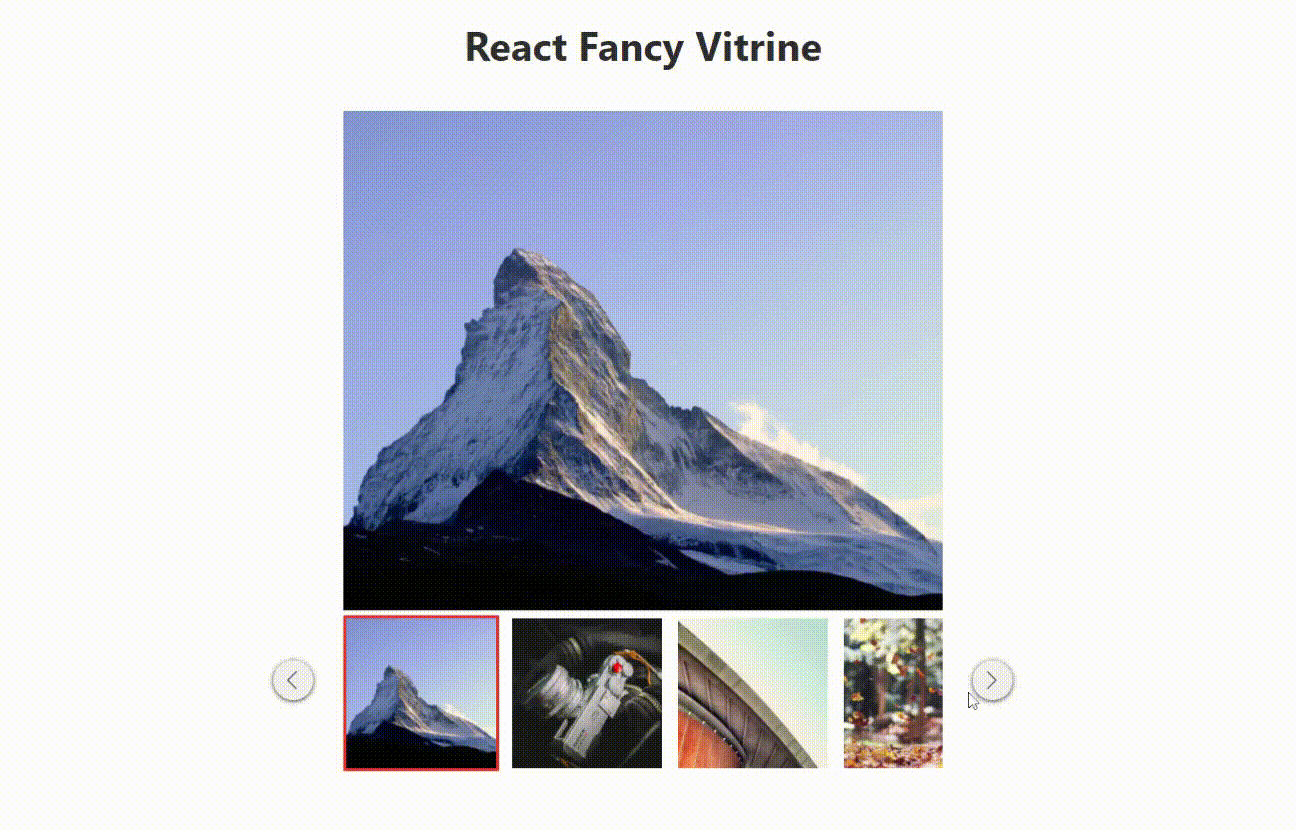
Demo
Install
npm install --save react-fancy-vitrineor
yarn add react-fancy-vitrineUsage
import ReactFancyVitrine from 'react-fancy-vitrine'

function App () {
    return (
      <div>
        <ReactFancyVitrine
          images={images}
          containerWidth={600}
          effect='fade'
          timingEffect={300}
          buttonPosition="default"
          borderColorSelected='#f4442e'
          buttonBgColor={{
            default: '#f1f1f1',
            hover: '#ddd'
          }}
        />
      </div>
    )
}
Props
| Attr | Required | Default values | Accept values | | -------------- | --------- | --------- | ---- | | images | yes | - | - | | containerWidth | no | 600 | - | | borderColorSelected | no | '#f4442e' | - | | buttonPosition | no | 'default' | default | default-outer | center | center-outer | | buttonBgColor.default | no | '#f1f1f1' | - | | buttonBgColor.hover | no | '#ddd' | - | | effect | no | 'default' | 'default' | 'fade' | | timingEffect | no | 300 | - | | className | no | - | - | | hasButtons | no | true | true | false | | theme | no | default | default | fancy |
{
  images?: ImageType[];             // Array with ImageType objects
  theme?: string                    // Theme plugin default or fancy
  containerWidth?: string | number; // Container element width
  borderColorSelected?: string;     // Border color for selected thumb
  hasButtons?: boolean              // If show buttons
  buttonPosition?: string;          // Positions of buttons Prev and Next
  buttonBgColor?: {
    default?: string; // Buttons color default
    hover?: string;   // Buttons color when hover it
  };
  effect?: string;          // Carousel effect
  timingEffect?: number;    // Timing transition between effects in milliseconds
  className?: string;       // Your custom className
}
ImageType
{
  id?: number;
  url: string;
}
License
MIT © leoncarey