
react-flicka-carousel
v1.1.1
Published
FlickaCarousel is a lightweight, fully customizable, and animated image carousel.

Maintainers
 rishi007
Readme
🎠 FlickaCarousel
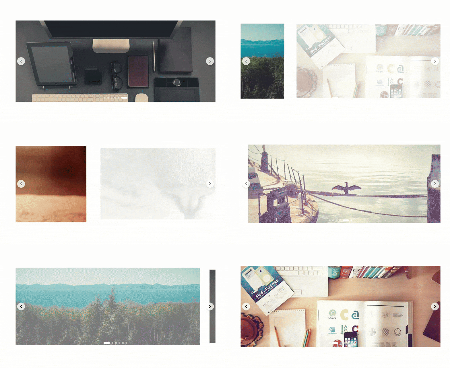
FlickaCarousel is a lightweight, fully customizable, and animated image carousel. It supports autoplay, swipe wheel navigation, arrows, pagination, and full styling control via props.
📽️ Showcase
📦 Installation
Using npm:
npm install react-flicka-carouselUsing Yarn:
yarn add react-flicka-carousel▶️ Usage
import FlickaCarousel from "react-flicka-carousel";

const images = [
  "https://picsum.photos/id/10/1000/500",
  "https://picsum.photos/id/20/1000/500",
  "https://picsum.photos/id/30/1000/500",
  "https://picsum.photos/id/40/1000/500",
  "https://picsum.photos/id/50/1000/500",
  "https://picsum.photos/id/60/1000/500",
];

const App: React.FC = () => {
  return (
    <div className="h-svh flex flex-col justify-center items-center">
      <FlickaCarousel
        images={images}
        containerClassName="max-w-5xl max-h-[50%]"
      />
    </div>
  );
};

export default App;
🎨 Usage with Tailwind CSS
When using Tailwind CSS, you can apply the ! prefix to a utility class to force override the default styles and ensure that your custom styles take precedence.
For detailed information, check out the Tailwind CSS documentation on using the ! prefix for overriding styles.
⚙️ Props
| Prop | Type | Default | Description |
| -------------------- | ---------- | ------------------------- | ---------------------------------- |
| images | string[] | Required | Required. Array of image URLs. |
| autoPlay | boolean | false | Automatically transition images. |
| hideArrowButtons | boolean | false | Hides arrow navigation buttons. |
| hidePagination | boolean | false | Hides pagination dots. |
| containerClassName | string | container | Extra class for outer container. |
| containerStyle | object | undefined | Inline styles for outer container. |
🖼️ Carousel Props
| Prop | Type | Default | Description |
| ---------------------------- | -------- | -------------------------------- | ------------------------------------- |
| carouselContainerClassName | string | carouselContainer | Class for carousel wrapper. |
| carouselContainerStyle | object | undefined | Inline styles for carousel wrapper. |
| carouselItemClassName | string | carouselItem | Class for animated item container. |
| carouselItemStyle | object | undefined | Inline styles for animated container. |
| imageClassName | string | image | Class for <img> tag. |
| carouselImageStyle | object | undefined | Inline style for image. |
⬅️➡️ Arrow Button Props
| Prop | Type | Default | Description |
| ---------------- | -------- | ----------------- | ------------------------ |
| arrowClassName | string | arrow | Class for arrow buttons. |
| arrowStyle | object | undefined | Inline style for arrows. |
🔘 Pagination Props
| Prop | Type | Default | Description |
| ------------------------------ | -------- | ------------------------------------ | -------------------------------------- |
| paginationContainerClassName | string | paginationContainer | Class for pagination container. |
| paginationContainerStyle | object | undefined | Inline style for pagination container. |
| dotClassName | string | dot | Class for all dots. |
| dotStyle | object | undefined | Style for all dots. |
| activeDotClassName | string | activeDot | Class for the active dot. |
| activeDotStyle | object | undefined | Style for active dot. |
| inActiveDotClassName | string | inactiveDot | Class for inactive dots. |
| inActiveDotStyle | object | undefined | Style for inactive dots. |
🎛️ Default Styles
FlickaCarousel provides default styles for various elements to ensure a seamless experience. You can override these styles using the provided props.
📦 Container
container {
  overflow: hidden;
  width: 100%;
  height: 100%;
}
🎠 Carousel
carouselContainer {
  position: relative;
  height: 100%;
  width: 100%;
}

carouselItem {
  position: absolute;
  top: 0;
  right: 0;
  bottom: 0;
  left: 0;
  display: flex;
  justify-content: center;
  align-items: center;
}

image {
  object-fit: cover;
  width: 100%;
  height: 100%;
}
⬅️➡️ Arrow Buttons
arrow {
  position: absolute;
  top: 50%;
  z-index: 10;
  height: 2.5rem;
  width: 2.5rem;
  transform: translateY(-50%);
  border-radius: 9999px;
  background-color: rgba(255, 255, 255, 0.8);
  box-shadow: 0 4px 6px rgba(0, 0, 0, 0.1);
  justify-items: center;
  align-items: center;
}

arrow.left {
  left: 0.5rem;
}

arrow.right {
  right: 0.5rem;
}

arrow:hover {
  background-color: white;
}
🔘 Pagination
paginationContainer {
  position: absolute;
  bottom: 1rem;
  left: 50%;
  z-index: 10;
  display: flex;
  transform: translateX(-50%);
  gap: 0.5rem;
}

dot {
  height: 0.625rem;
  border-radius: 9999px;
  transition: all 0.3s ease;
}

activeDot {
  width: 2rem;
  background-color: white;
}

inactiveDot {
  width: 0.625rem;
  background-color: rgba(255, 255, 255, 0.5);
}

inactiveDot:hover {
  background-color: rgba(255, 255, 255, 0.8);
}
📄 License
MIT