
react-fluid-calendar
v1.1.1
Published
A fluid and highly customizable React calendar component.

Maintainers
 jpetliuk
Readme
React Fluid Calendar
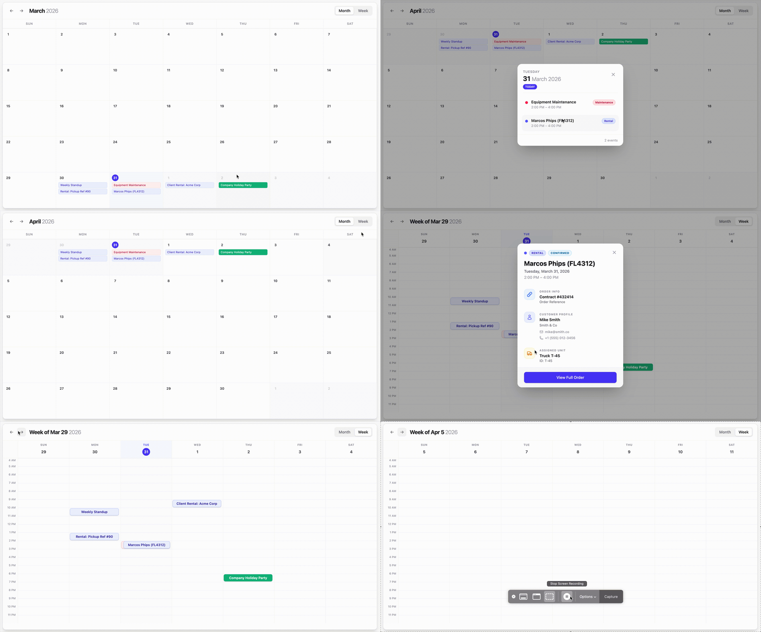
A fluid, modern, and highly-customizable React calendar component designed for flexibility and scale. Features animated transitions, week & month views, custom event rendering, and more.
Installation
npm install react-fluid-calendarPrerequisites
To maintain its fluid performance and tiny bundle size, react-fluid-calendar relies on your project's existing environment:
- React: Version 18.0 or 19.0+
- Tailwind CSS: Designed for Tailwind v3 or v4.
- PostCSS: Used for processing the component's internal styles.
Tailwind Configuration
Since this component uses Tailwind utility classes for its styling, you must include the package in your Tailwind content paths to ensure all styles are correctly generated:
// tailwind.config.ts / tailwind.config.js
export default {
  content: [
    "./index.html",
    "./src/**/*.{js,ts,jsx,tsx}",
    "./node_modules/react-fluid-calendar/dist/*.js", // Add this line!
  ],
  theme: {
    extend: {},
  },
  plugins: [],
}
Quick Start
import React, { useState } from 'react';
import { FluidCalendar, CalendarEvent } from 'react-fluid-calendar';
import 'react-fluid-calendar/dist/style.css';

export default function App() {
  const [events] = useState<CalendarEvent[]>([
    {
      id: '1',
      title: 'Quarterly Review',
      start: new Date(2026, 1, 15, 10, 0),
      end: new Date(2026, 1, 15, 11, 30),
      color: '#4f46e5'
    }
  ]);

  return (
    <div style={{ height: '800px', padding: '20px' }}>
      <FluidCalendar
        events={events}
        view="month"
        theme="light" // "light" or "dark"
        monthlyCalendar={{ dayHeight: 120 }}
        weeklyCalendar={{ startHour: 6, endHour: 22 }}
      />
    </div>
  );
}
Configuration & Themes
Dark Mode
The calendar includes a built-in dark mode that can be toggled via the theme prop.
<FluidCalendar
  events={events}
  theme="dark" // Swaps all UI elements to a refined zinc-based dark theme
/>
Monthly vs Weekly View
You can control the initial view and listen for changes.
const [view, setView] = useState('month');

<FluidCalendar
  view={view}
  onViewChange={setView}
  weeklyCalendar={{
    startHour: 6,
    endHour: 20,
    dayHeight: 1200 // Total vertical scroll area
  }}
/>
Advanced Event Detail UI
The react-fluid-calendar features a highly flexible dynamic rendering system for event details. You can choose to extend our built-in categories or completely redefine the modal's layout.
Clickable Event Links
Make your core event entities actionable by adding a link property. The modal will automatically render the names as interactive links that blend with the ui and highlight smoothly on hover.
const event: CalendarEvent = {
  customer: {
    name: 'Robert Fox',
    link: '/clients/robert-fox', // Makes the customer name clickable
  },
  asset: {
    name: 'Heavy Duty Trailer',
    link: '/assets/trailer-01', // Makes the asset name clickable
  },
  details: {
    name: 'Order #9921',
    link: '/orders/9921', // Makes the order name clickable
  }
};
Option 1: Extend Built-in Categories with extraFields
Add custom fields (like "Driving License" or "VIN") to predefined sections.
const event: CalendarEvent = {
  customer: {
    name: 'Robert Fox',
    extraFields: [
      { label: 'Driving License', value: 'DL-99201-B', icon: <LicenseIcon /> }
    ]
  },
  asset: {
    name: 'Heavy Duty Trailer',
    extraFields: [
       { label: 'Last Inspection', value: 'March 15, 2026' }
    ]
  }
};
Option 2: Add Custom Categories with extraGroups
Add entirely new sections alongside the standard categories.
const event: CalendarEvent = {
  extraGroups: [
    {
      title: 'Regional Info',
      color: 'emerald',
      fields: [
        { label: 'Country', value: 'Germany', icon: '🇩🇪' },
        { label: 'Timezone', value: 'CET (UTC+1)' }
      ]
    }
  ]
};
Option 3: Completely Custom Layout with displayGroups
If displayGroups is provided, the modal layout is completely replaced with your custom-ordered sections.
const event: CalendarEvent = {
  displayGroups: [
    {
      title: 'Business Client',
      color: 'indigo', // indigo, blue, amber, rose, emerald, zinc, or hex #XXXXXX
      icon: 'https://avatar-url.com/sarah.png',
      fields: [
        { value: 'Sarah Williams', size: 'large' },
        { label: 'Organization', value: 'Global Logistics', hideLabel: true }, // Label is hidden visually
        { value: '+1 (555) 777-8888', icon: <PhoneIcon />, size: 'subtle' } // Matches phone style
      ]
    }
  ]
};
Advanced Field Customization
Control how individual fields appear with size and hideLabel:
size: 'large': Bold, primary information (e.g. Name, ID).size: 'subtle': Sophisticated zinc-colored info with medium weight (perfect for replicating the phone/email style).hideLabel: true: Keep the label in your data model but hide it from the UI (useful for simple values like "Acme Corp").
High-Density Enterprise Example
Mix text sizes, direct Hex codes, and animated React components as icons:
const event: CalendarEvent = {
  title: 'Enterprise Rental: VIP Fleet',
  extraGroups: [
    {
      title: 'Rental Policy',
      color: '#4f46e5',
      icon: <PolicyIcon />,
      fields: [
        { label: 'Insurance', value: 'Full Comprehensive', size: 'large' },
        { label: 'Mileage Limit', value: 'Unlimited', icon: '∞', size: 'subtle' } // Refined subtle style
      ]
    },
    {
      title: 'Technical Compliance',
      color: '#ec4899',
      icon: <ShieldIcon />,
      fields: [
        { label: 'Telematics ID', value: 'T-800-CH-01', size: 'small' },
        {
          label: 'Verification Status',
          value: 'Cloud Verified',
          size: 'large',
          icon: <div className="w-2 h-2 rounded-full bg-emerald-500 animate-pulse" />
        }
      ]
    }
  ]
}
Working with JSON / API Data
// Map your JSON result to the rich CalendarEvent structure
const events: CalendarEvent[] = apiResponse.map(item => ({
  id: item.id,
  title: item.title,
  start: new Date(item.start_iso),
  end: new Date(item.end_iso),
  extraGroups: [
    {
      title: 'Logistics',
      color: 'blue',
      // Resolve the string icon key from API to a React component
      icon: item.icon_key === 'truck' ? <TruckIcon /> : <DefaultIcon />,
      fields: [{ label: 'Driver', value: item.driver_name, size: 'large' }]
    }
  ]
}));
Props Reference
| Prop | Type | Default | Description |
|---|---|---|---|
| events | CalendarEvent[] | [] | List of event objects |
| theme | 'light' \| 'dark' | 'light' | Toggle visual theme |
| view | 'month' \| 'week' | 'month' | Active calendar view |
| onViewChange | (view: string) => void | undefined | Callback when view type changes |
| monthlyCalendar | { dayHeight?: number } | - | Month-specific settings |
| weeklyCalendar | { startHour, endHour, dayHeight } | - | Week-specific settings |
| renderEvent | (event: CalendarEvent) => ReactNode | undefined | Custom event card override |
Features
- Blazing Fast: O(N) rendering logic handles tens of thousands of elements without lag.
- Dynamic Animations: Cylinder rolling date transitions and fluid modal entries.
- Smart Stacking: Event chips automatically expand and flip directions to remain visible.
- Tailwind Ready: Fully styled with Tailwind utility classes for easy integration.
License
MIT