
react-grid-heatmap
v1.3.0
Published
A react component for heatmap visualisation in grid layout
Downloads
51,540

Readme
react-grid-heatmap
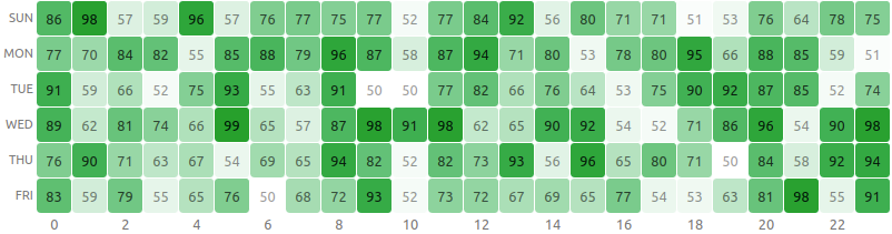
A React component to visualize heatmap in a grid layout without using any 3rd party libraries.


Install
npm install --save react-grid-heatmapUsage
Mandatory fields
| Name | Type | Sample |
| ---- | ------------ | ----------------------------- |
| data | number[][] | [[1,2,3], [4,5,6], [7,8,9]] |
import React from 'react'
import { HeatMapGrid } from 'react-grid-heatmap'

const xLabels = new Array(24).fill(0).map((_, i) => `${i}`)
const yLabels = ['Sun', 'Mon', 'Tue', 'Wed', 'Thu', 'Fri']
const data = new Array(yLabels.length)
  .fill(0)
  .map(() =>
    new Array(xLabels.length).fill(0).map(() => Math.floor(Math.random() * 50 + 50))
  )

const App = () => {
  return (
    <HeatMapGrid
      data={data}
      xLabels={xLabels}
      yLabels={yLabels}
    />
  )
}

export default App
Optional Parameters
| Name | Type | Description/Example | Default Value |
| :----------- | :------- | :------------------------------------------------------ | :------------ |
| xLabels | string[] | ['1am', '2am', '3am'] | null |
| yLabels | string[] | ['Sun', 'Mon'] | null |
| cellHeight | string | Height of each cell of the heatmap | "2rem" |
| onClick | function | Adds an handler to cell click(x, y) => void | null |
| square | boolean | If set to true will render cells as square | false |
| xLabelsPos | string | Location of y labels. It can be top or bottom | "top" |
| yLabelsPos | string | Location of y labels. It can be left or right | "left" |
| cellRender | function | Render custom content in cell.(x, y, value) => () | null |
| cellStyle | function | To set custom cell style(x, y, ratio) => {} | null |
| xLabelsStyle | function | To set custom cell style(index) => {} | null |
| yLabelsStyle | function | To set custom cell style(index) => {} | null |
A sample code with all parameters
import React from 'react'
import { HeatMapGrid } from 'react-grid-heatmap'

const xLabels = new Array(24).fill(0).map((_, i) => `${i}`)
const yLabels = ['Sun', 'Mon', 'Tue', 'Wed', 'Thu', 'Fri']
const data = new Array(yLabels.length)
  .fill(0)
  .map(() =>
    new Array(xLabels.length)
      .fill(0)
      .map(() => Math.floor(Math.random() * 50 + 50))
  )

const App = () => {
  return (
    <div
      style={{
        width: '100%'
      }}
    >
      <HeatMapGrid
        data={data}
        xLabels={xLabels}
        yLabels={yLabels}
        // Render cell with tooltip
        cellRender={(x, y, value) => (
          <div title={`Pos(${x}, ${y}) = ${value}`}>{value}</div>
        )}
        xLabelsStyle={(index) => ({
          color: index % 2 ? 'transparent' : '#777',
          fontSize: '.8rem'
        })}
        yLabelsStyle={() => ({
          fontSize: '.7rem',
          textTransform: 'uppercase',
          color: '#777'
        })}
        cellStyle={(_x, _y, ratio) => ({
          background: `rgb(12, 160, 44, ${ratio})`,
          fontSize: '.8rem',
          color: `rgb(0, 0, 0, ${ratio / 2 + 0.4})`
        })}
        cellHeight='2rem'
        xLabelsPos='bottom'
        onClick={(x, y) => alert(`Clicked (${x}, ${y})`)}
        yLabelsPos='right'
        square
      />
    </div>
  )
}

export default App
Local development
Local development is broken into two parts (ideally using two tabs).
First, run rollup to watch your src/ module and automatically recompile it into dist/ whenever you make changes.
npm start # runs rollup with watch flagThe second part will be running the example/ create-react-app that's linked to the local version of your module.
# (in another tab)
cd example
npm start # runs create-react-app dev server
Now, anytime you make a change to your library in src/ or to the example app's example/src, create-react-app will live-reload your local dev server so you can iterate on your component in real-time.
License
MIT © arunghosh